Bristly Brushing Stick

Bristly Brushing Stick
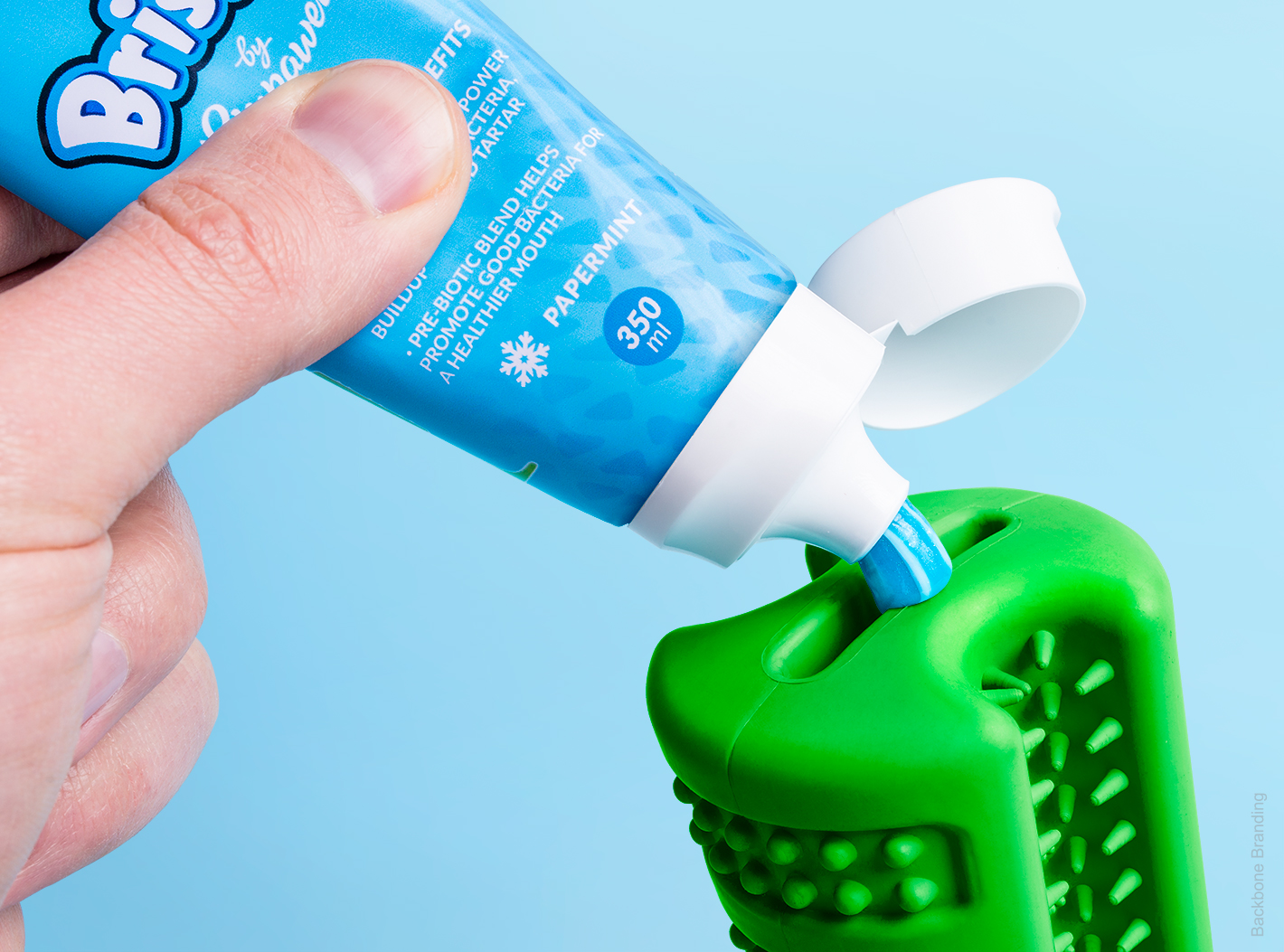
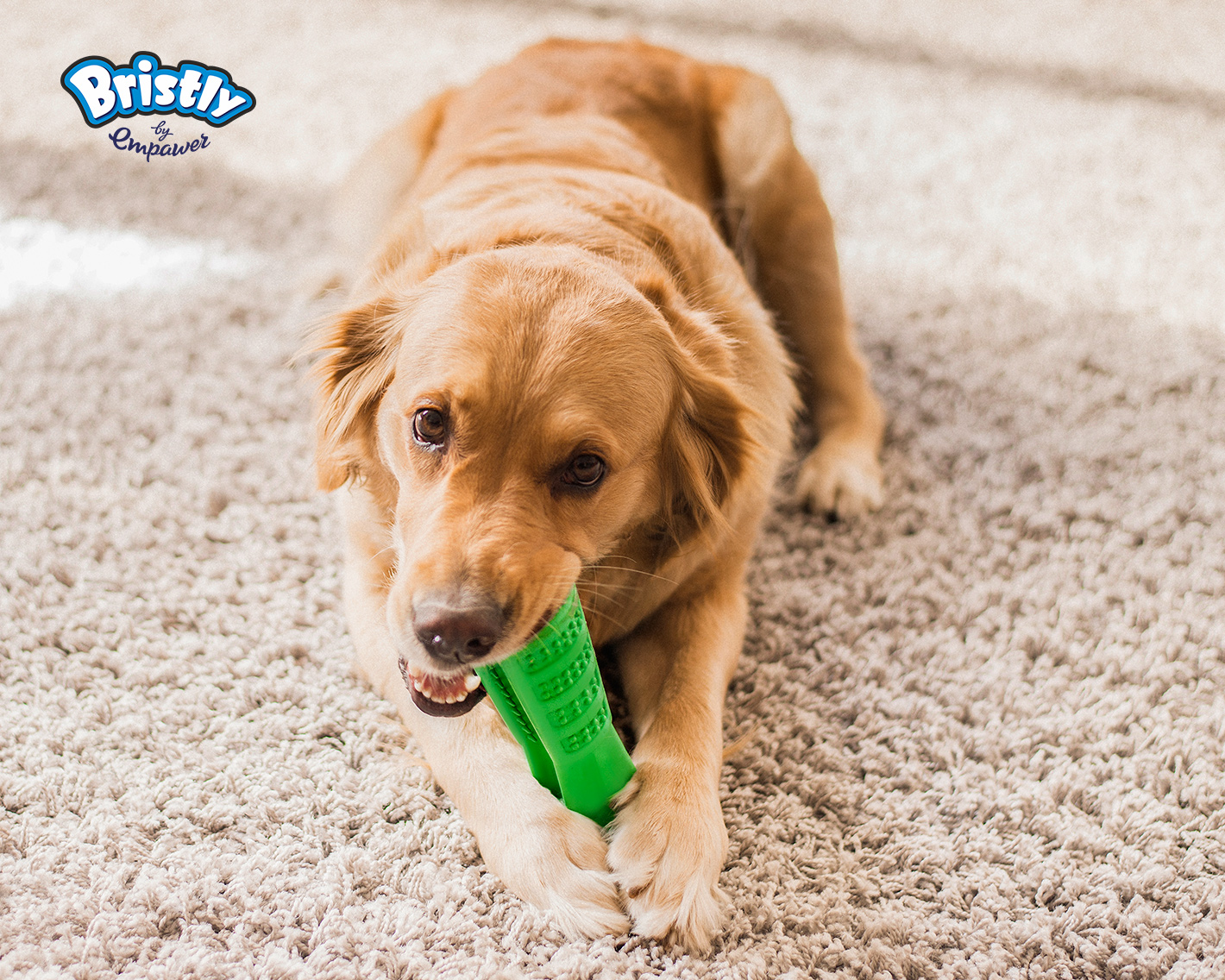
We were assigned by a passionate innovator to create a new brand and develop a packaging design for a new dog’s toothbrush project. According to statistics, 80% of dogs worldwide show signs of periodontal disease by age of 3, which, if left untreated, can create a number of systemic diseases involving the kidneys, liver, heart and lungs. Maintaining proper oral hygiene for a dog is much harder than it is for a human since dogs don’t enjoy the experience and don’t value proper tooth care. The product is a revolutionary “do it yourself” brushing stick for dogs, which perfectly matches dog’s chewing behavior and anatomy to encourage natural teeth cleaning. It transforms the unpleasant routine into a play.
The naming of the product had to be connected with the most obvious advantage feature of it, which are bristles. So we came up with inventive, unifying and descriptive word “Bristly”. It perfectly corresponds to the product: a natural rubber toy covered in bristle line grooves which are the main tools that brush the pup’s teeth. Proceeding further, the logo was developed to showcase the process itself: the illustrated dog is happily chewing the stick which describes the main idea behind the product, the interactive and “do it yourself” way of tooth brushing procedure.
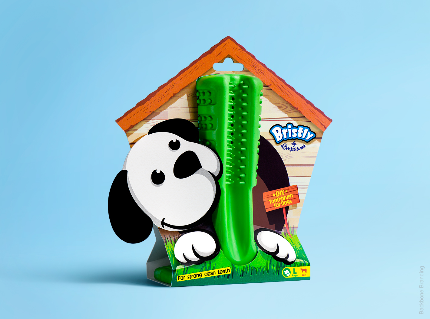
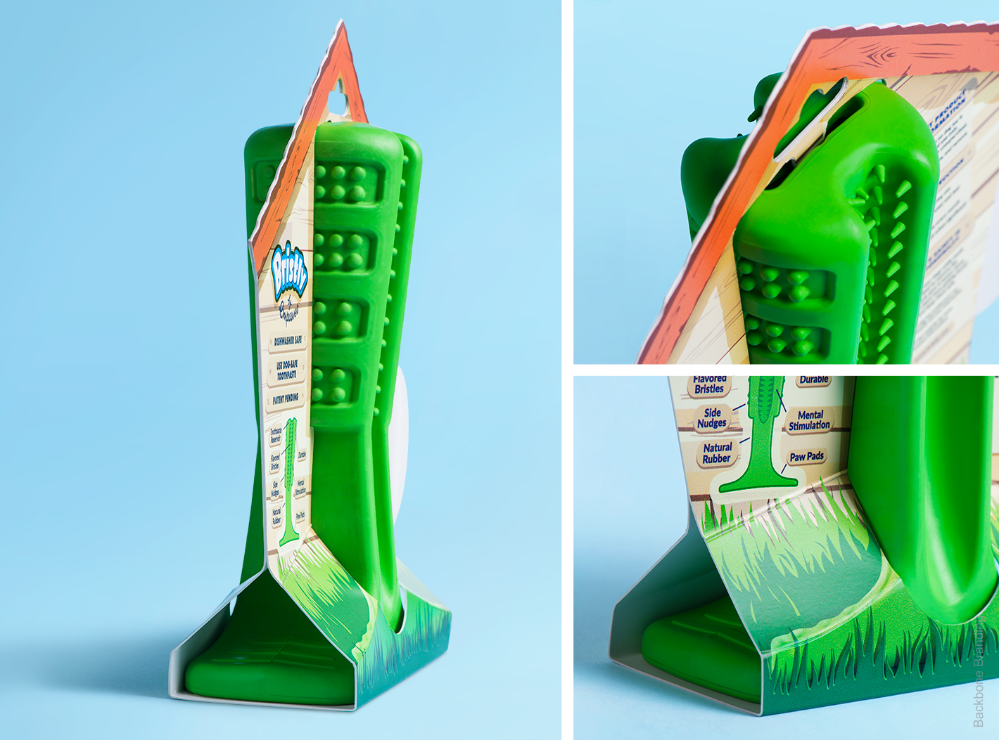
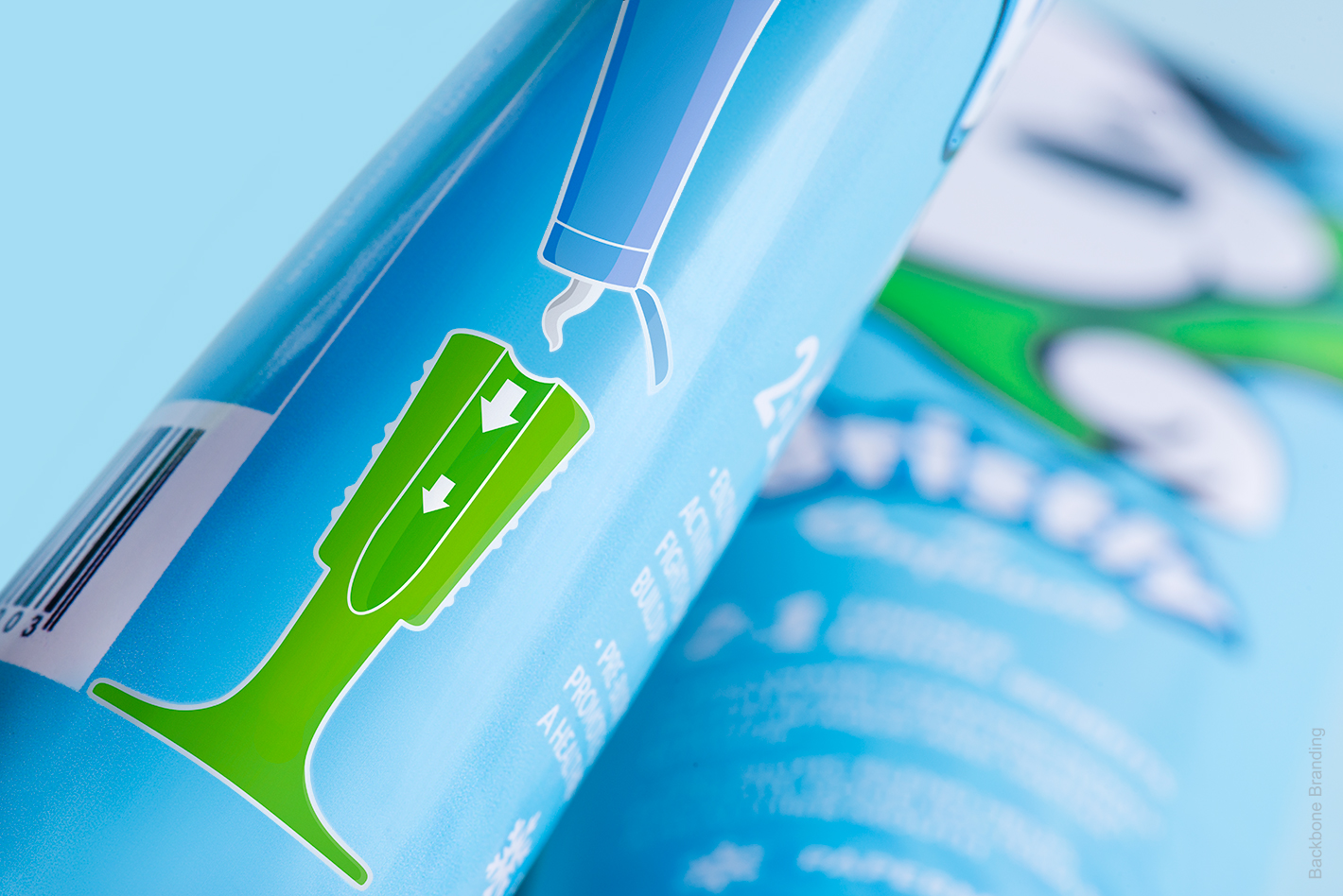
The next step was to develop the logo into the packaging design itself. During the successful crowdfunding campaign, the already beloved logo became a strong communication element. We wanted to expand the communication platform, which logo recognition has given us, into the packaging philosophy. Thinking about the retail market penetration strategy and the packaging, we wanted to visually communicate a combination of 4 elements (product, process, pet humanization, dog’s most safe and comfortable environment). At first glance, the stick alone does not express its purpose clearly, while packaging completely transmits the functionality of the product.
The dog kennel emphasizes the warm, domestic atmosphere and transmits feelings of safety and care. We designed the flat package with volume visualization effect to help the manufacturer keep the cost of packaging at a minimum and make the product affordable. This package solution allows to use less paper and presents functional and emotional benefits of the product.
Credits:
Brand Strategy Director: Stepan Avanesyan
Assistant Brand Strategist: Lusie Grigoryan
Creative Director/ Design idea: Stepan Azaryan
Project Manager: Meri Sargsyan
Design: Gevorg Balyan
Client: Bristly Brushing Stick
Crowdfunding campaign: The Crowdfunding Formula



Bristly Brushing Stick
