Harker Herbals
Nature meets science
Harker Herbals have created a new generation of powerful, 100% natural plant-based formulations that are targeted to support recovery from illness and maintain wellness.
They have been expertly crafted using decisive clinical research and traditional plant medicine know-how. All of the ingredients are sustainably sourced and independently tested for authenticity, providing the very best support for your health.
This symbiotic relationship of nature and science was the first thing that struck a deep resonance with the Curious team. The philosophy of balance and harmony between two seemingly polar opposite worlds was the catalyst that allowed us to expand a ‘dualism’ concept into the brand strategy and packaging.
Modernity blends seamlessly with tradition. Functionality meets form. Efficacy fuses with heart and soul.
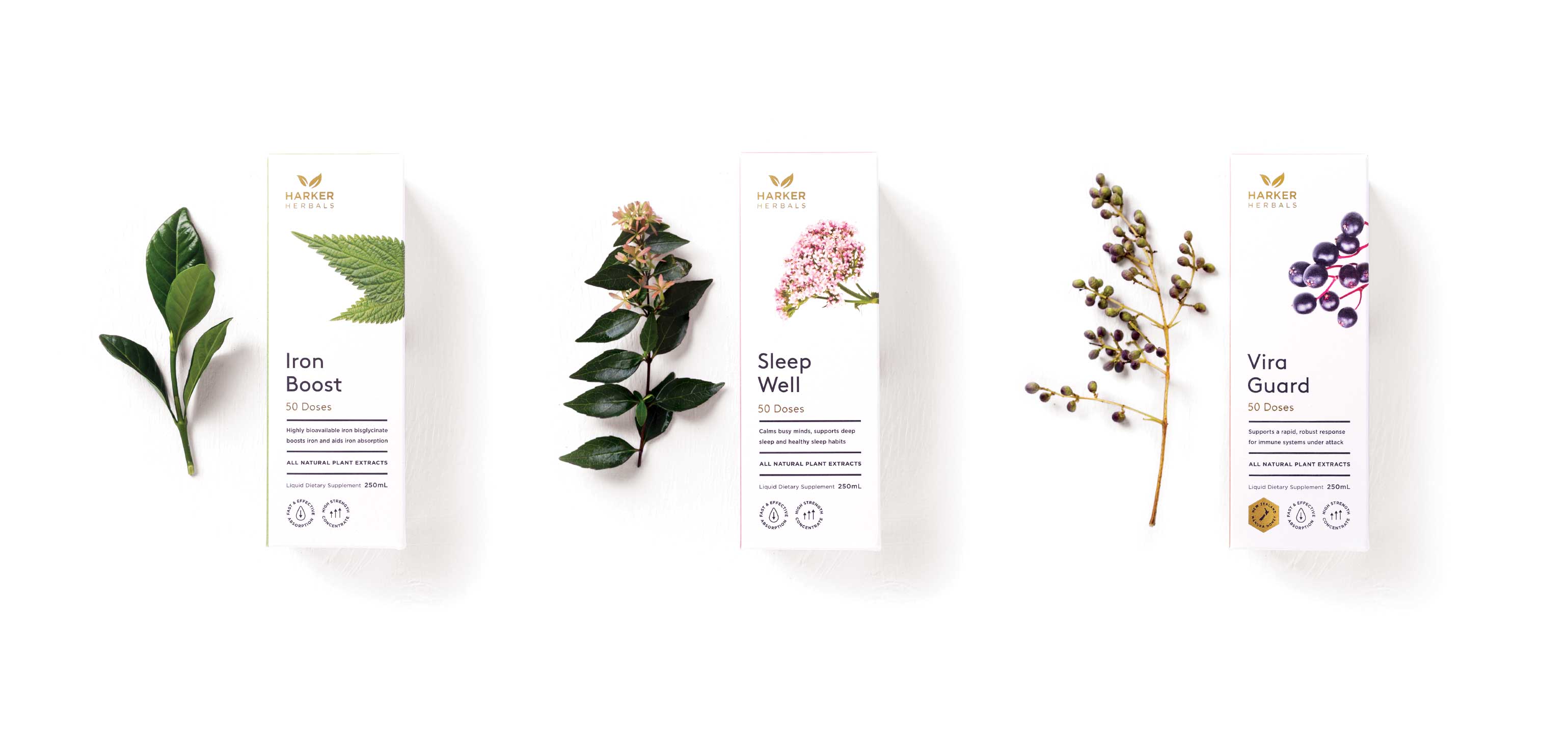
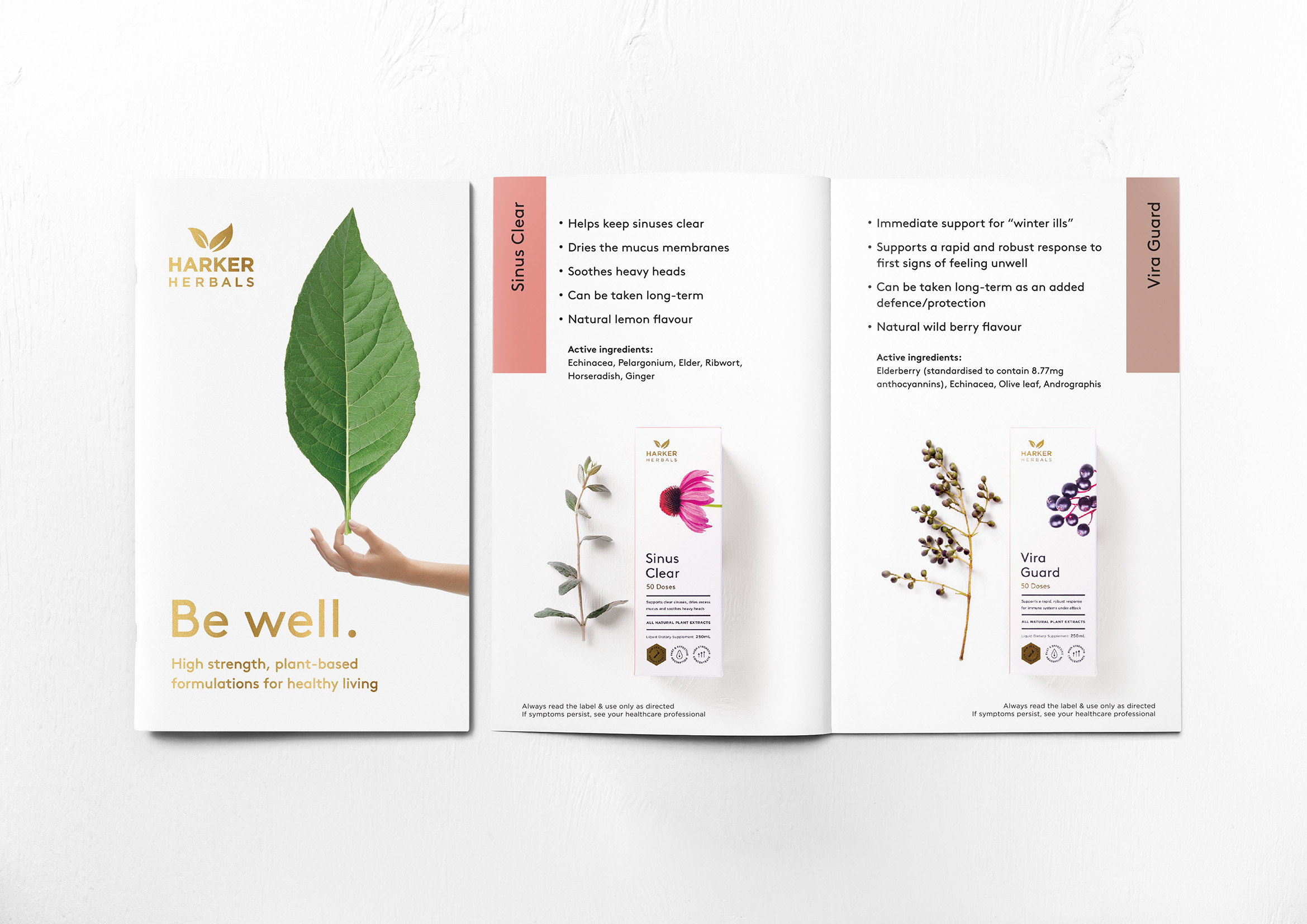
This potent territory has been expertly realised into a visual language for the Harker Herbals Be well range.
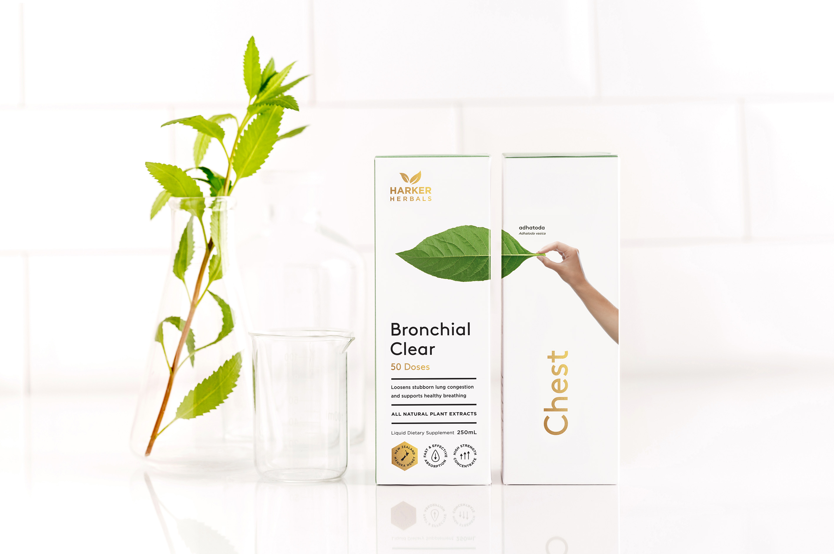
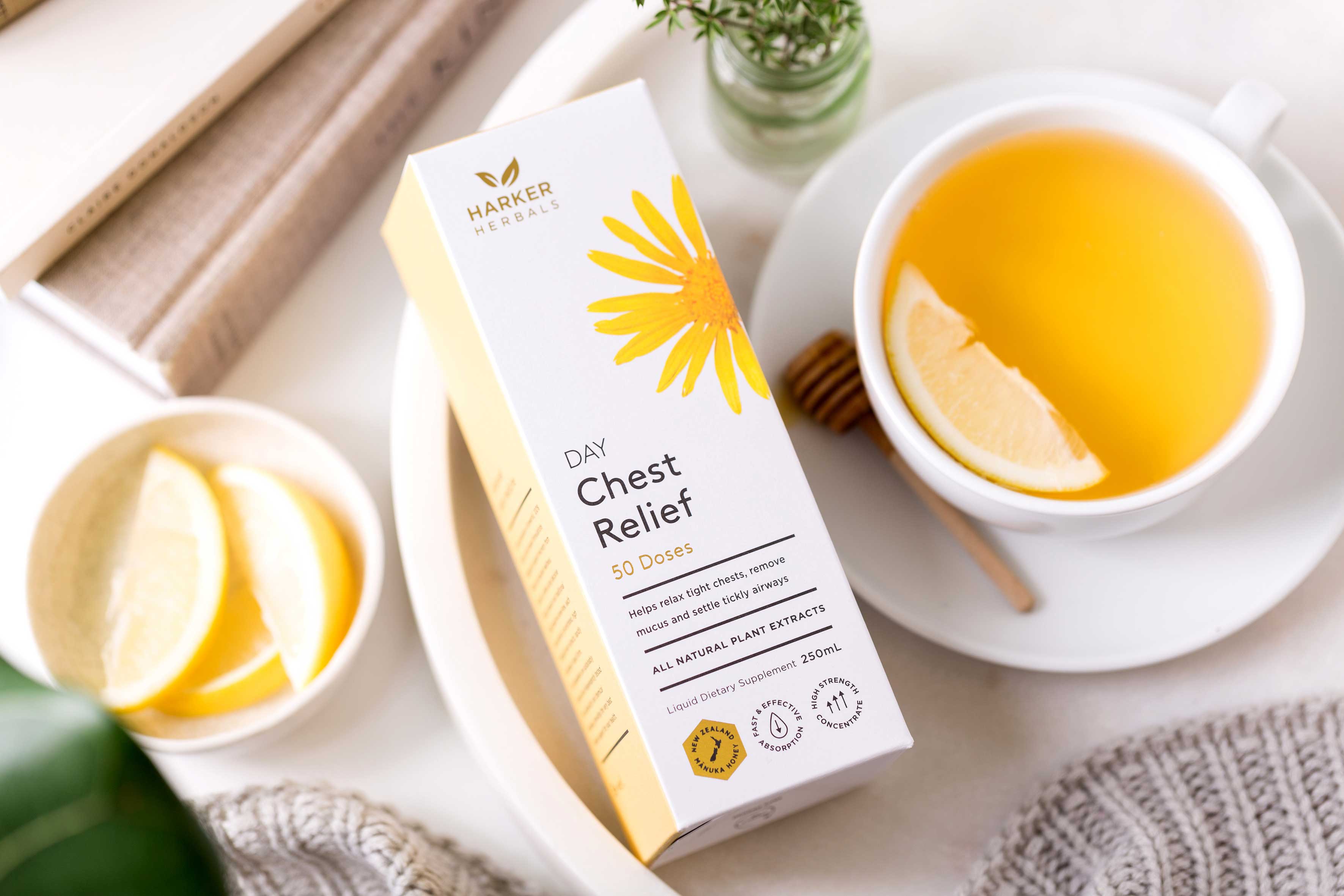
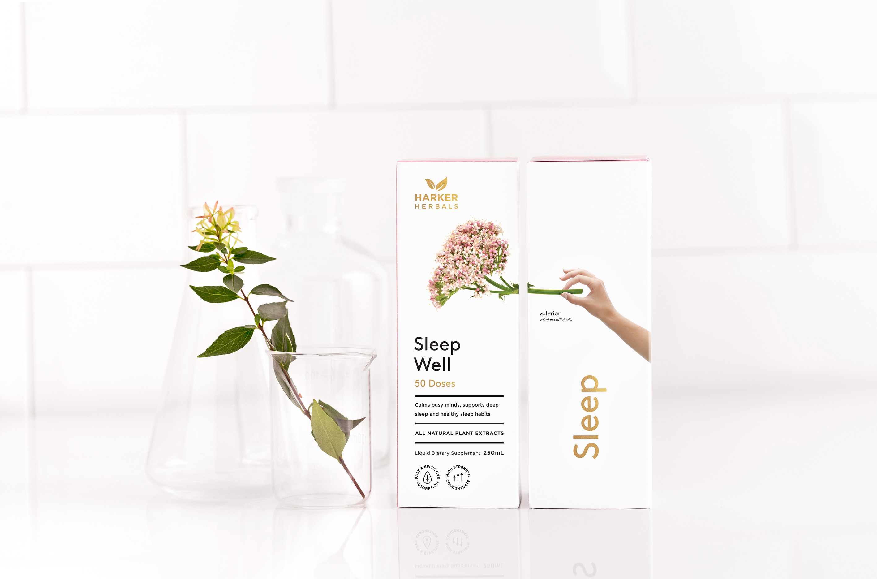
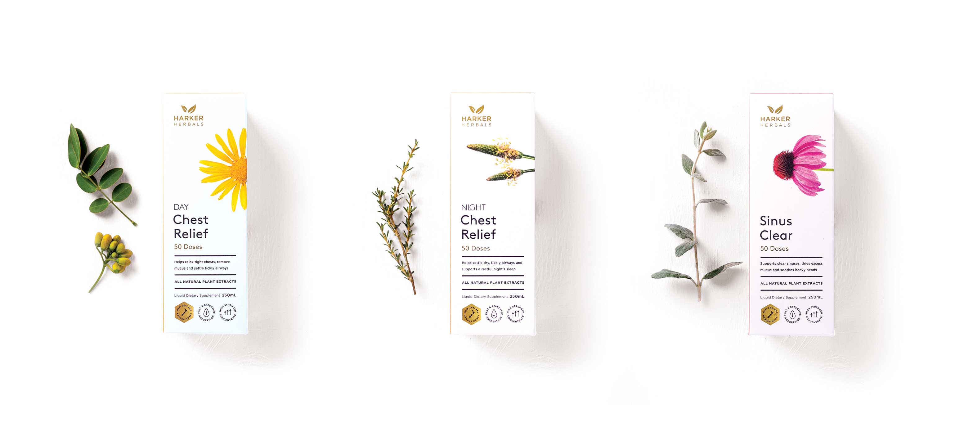
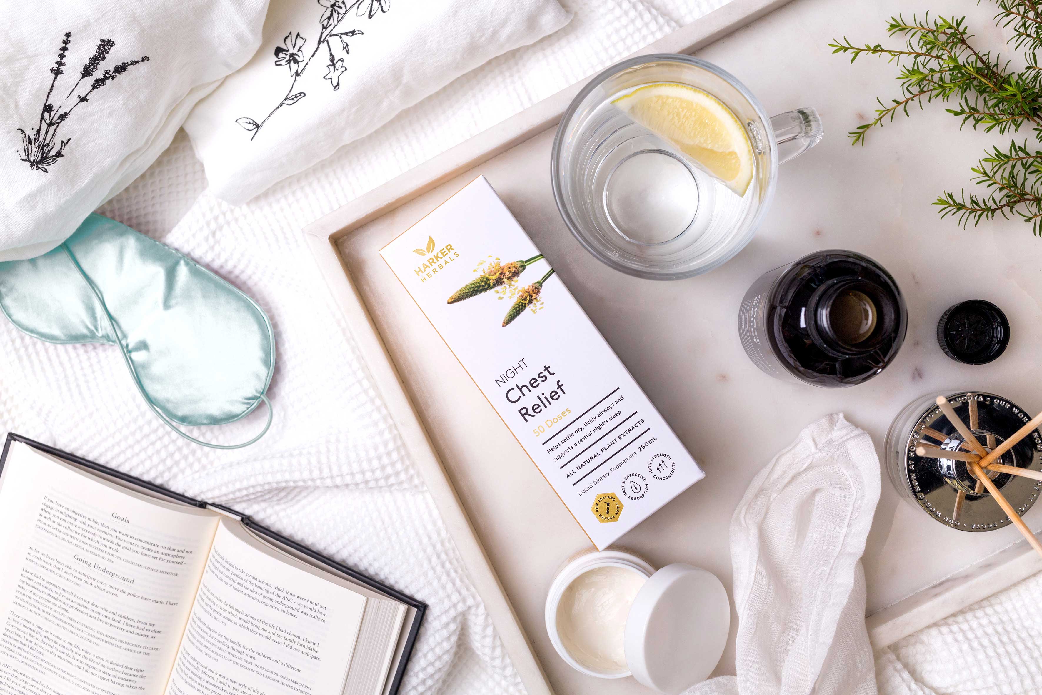
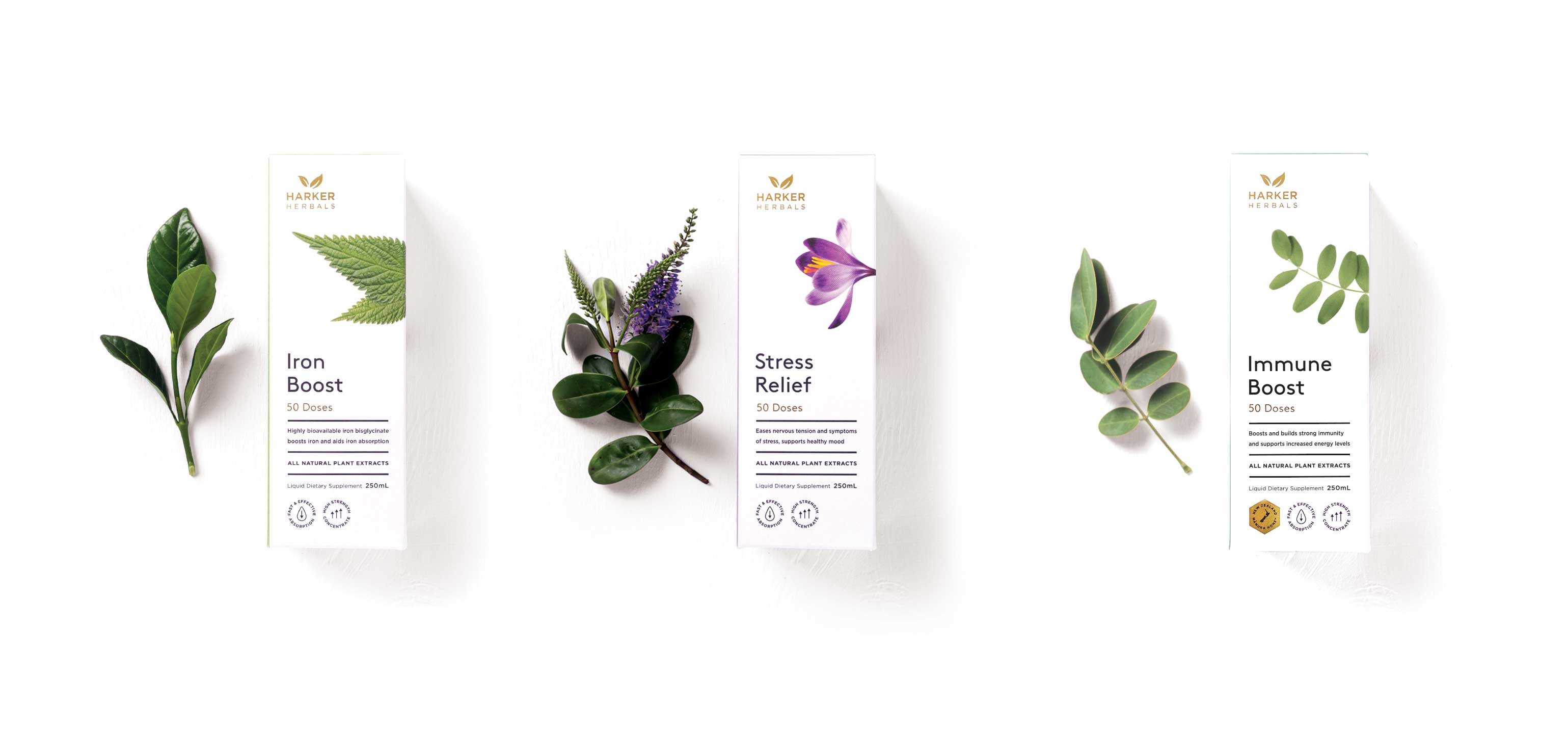
Beautiful photographic images of key ingredients are linked to a human hand, emphasising not only the consumer’s connection to nature with these unique products, but also reflecting the care and crafting that Harker Herbals have invested into them. This evocative imagery has then been complemented with a soft, muted colour palette, allowing each variant to have its own designated identification colour to assist the consumer at point of purchase.
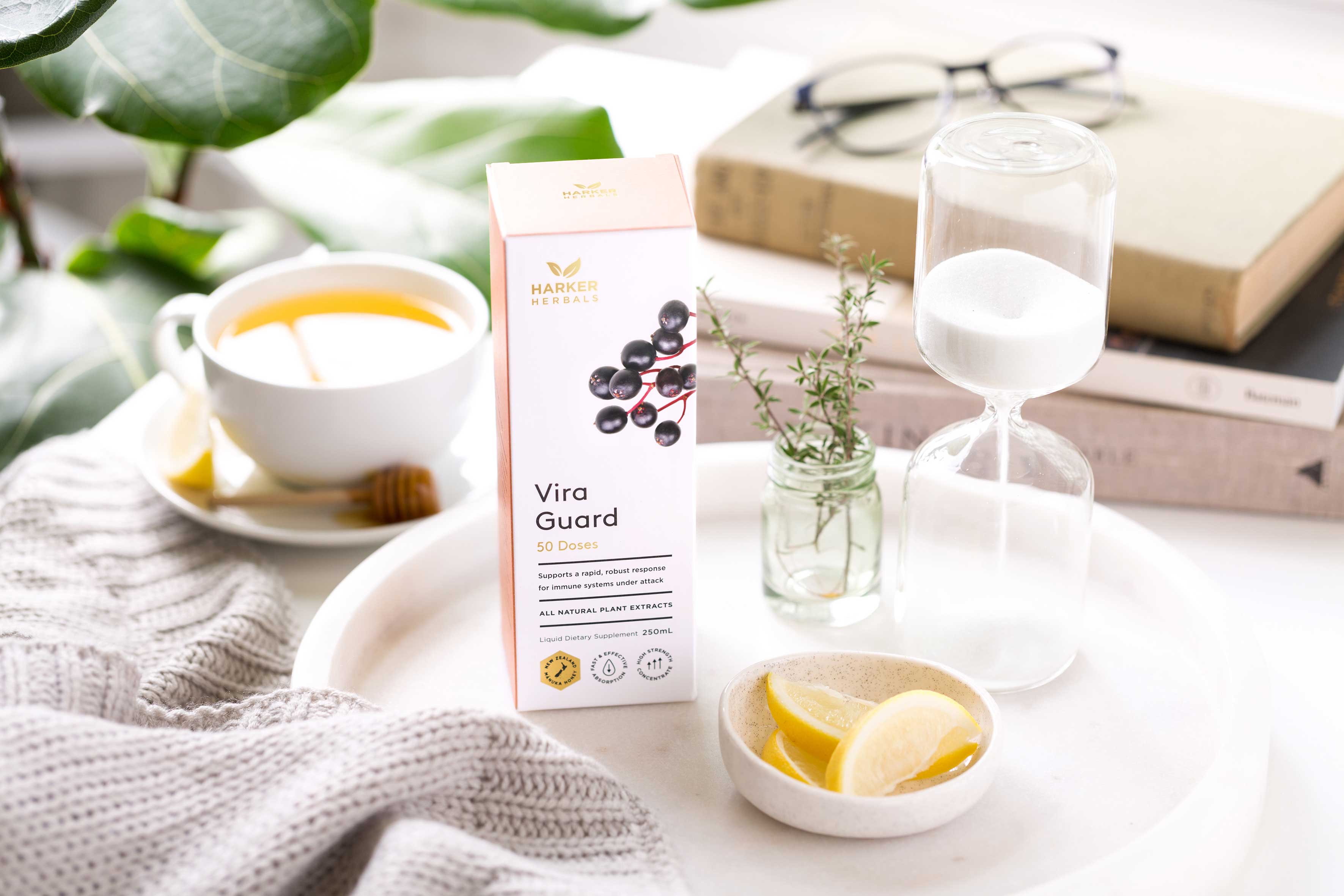
Strong, understated typography and iconography has then been thoughtfully positioned across all of the primary pack facings. The simple black sans serif font stands informatively on a clean, white background creating a scientific counterpoint to the elements of nature. Selected gold foil blocked wording has also been introduced to highlight key information and add premium quality cues.
The final critical detail is the choice of stock. An uncoated, pure white Splendorgel was selected from a range of options to give freshness and a soft, hand crafted texture.
Once the pack is opened, the consumer discovers the traditional amber bottle that exudes authenticity and clarity of message. The pared back colour palette of screen printed white and gold foil block in combination with the signature typography ensures continuity across the whole packaging experience.
The team at Harkers were an absolute dream to work with throughout the entire design process, creating an exemplary model of client and agency partnership. Each open to new ideas and challenges in the pursuit of excellence.
Harker Herbals and Curious, creating a new generation of wellness products for a new generation of consumers.
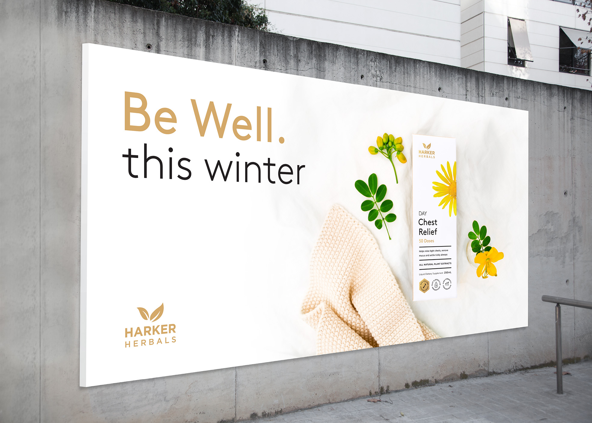
“From day one, Nigel and the team at Curious understood our new range.They conceived and developed a contemporary, beautiful design for our packaging and point of sale materials that positions our products exactly as requested. Importantly, the design look and feel across the entire launch has generated real excitement in the market. Standouts for us are their innovative approach, attention to detail and willingness to work together to achieve a great result. Curious gets five stars from us.”
John Gibson – Director, Harker Herbals
Featured on:

Harker Herbals
