Rotational Music App
Rotational Music App
2017.12
Interaction Design
Concept
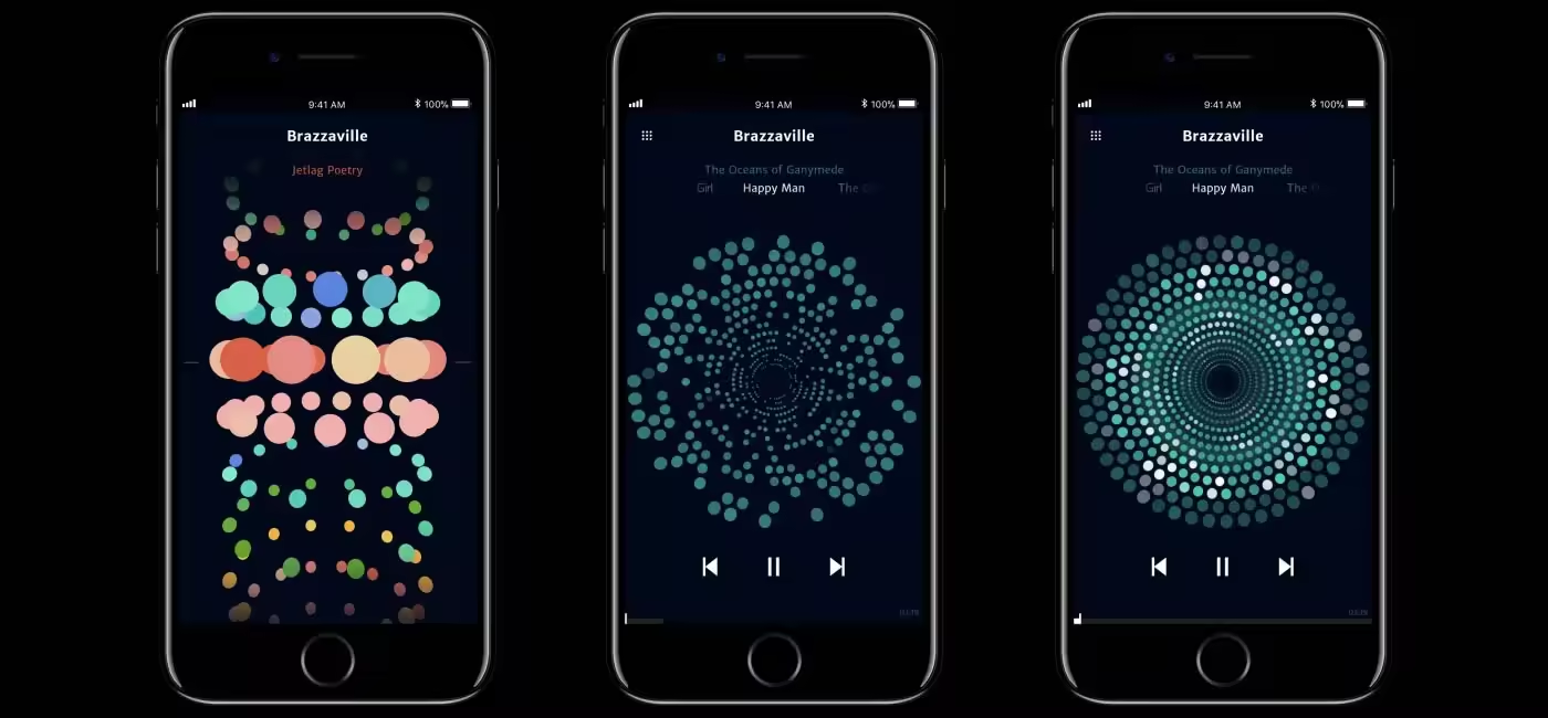
This is a concept interaction design study for a music app. Each song and album is represented by a color, based on its mood. The user can interact with the interface by swiping up/down for the albums and left/right for the songs.
Rotational Interface
The interface concept is based on a three-dimensional tube structure. Users can move the list vertically to switch between albums and rotate each row to select songs. The music application is more focused on the mood of a song than its title. That is why each song is represented by a color, based on its musical properties. Written information for the album and the songs that the user interacts is displayed on top of the screen.

Visualizer
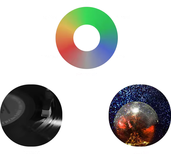
Music visualizer analyzes three different information; tempo, frequency, and mood of the music in real-time. Colors and motion are results of the real-time audio analysis. Their motion and effects also resemble the motion of a turntable and reflections of a disco ball.

Tempo

Frequency Response

Mood by Color

Layers Overlayed


Thank you for watching!
Rotational Music App