elarco
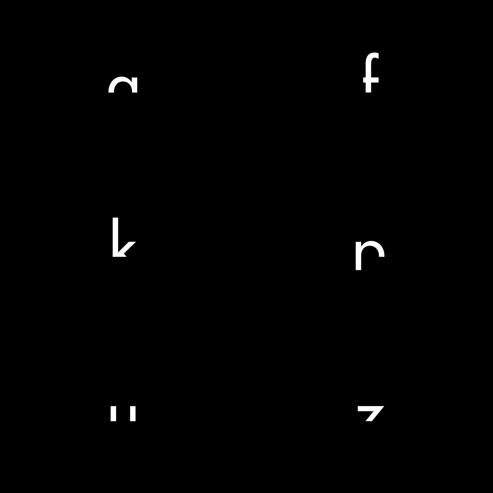
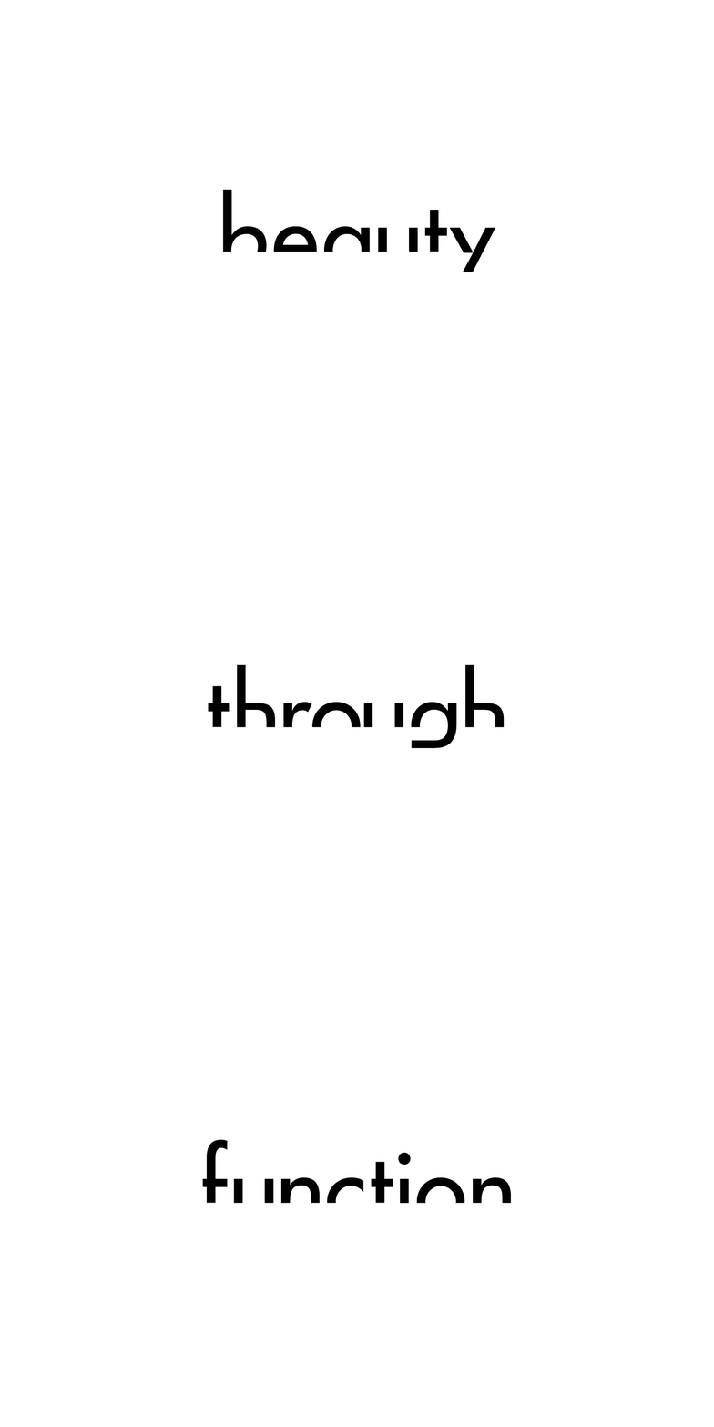
Following their minimalistic approach to design, we realised that just by cutting the bottom half of the futura font we ended up representing the companies naming, the arch. Sometimes at achos! less is more too!


Daniel Wenzel helped us turn the logo into a full typeface for elarco to use,
a modified Futura to fit the arched logo. Thank you Daniel!
a modified Futura to fit the arched logo. Thank you Daniel!
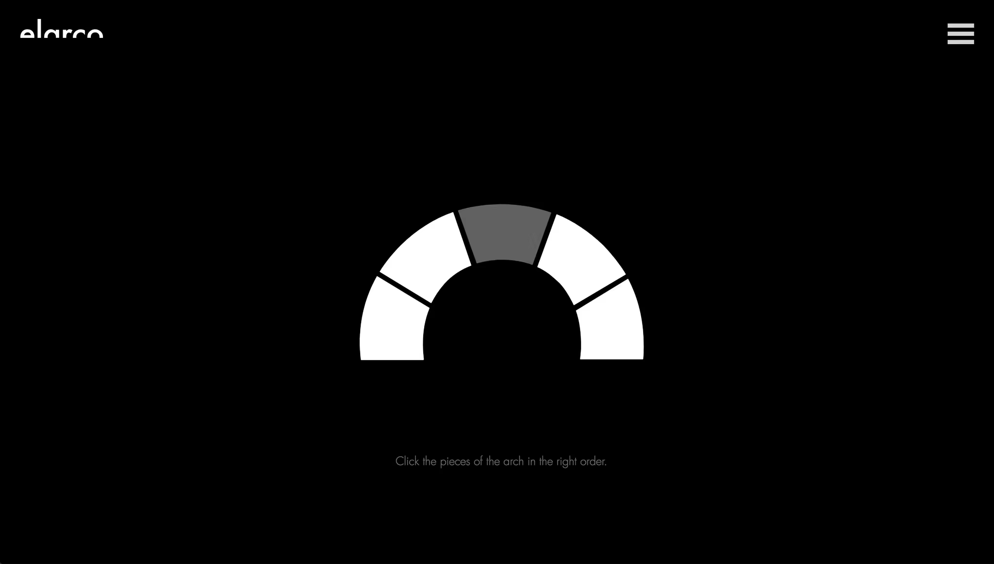
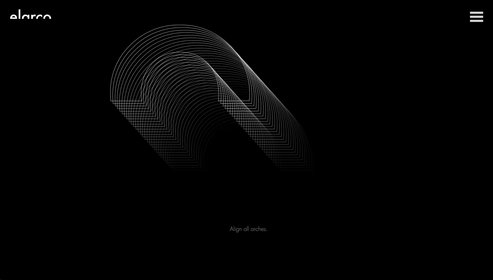
As we always do, We created an interactive home page to entertain our users, 3 mini puzzles allow them to better understand the values of elarco.
Can you figure them out?


To give them some playful party tricks, we created thermo-chromatic business cards that tie the printed element in with the home page concept.
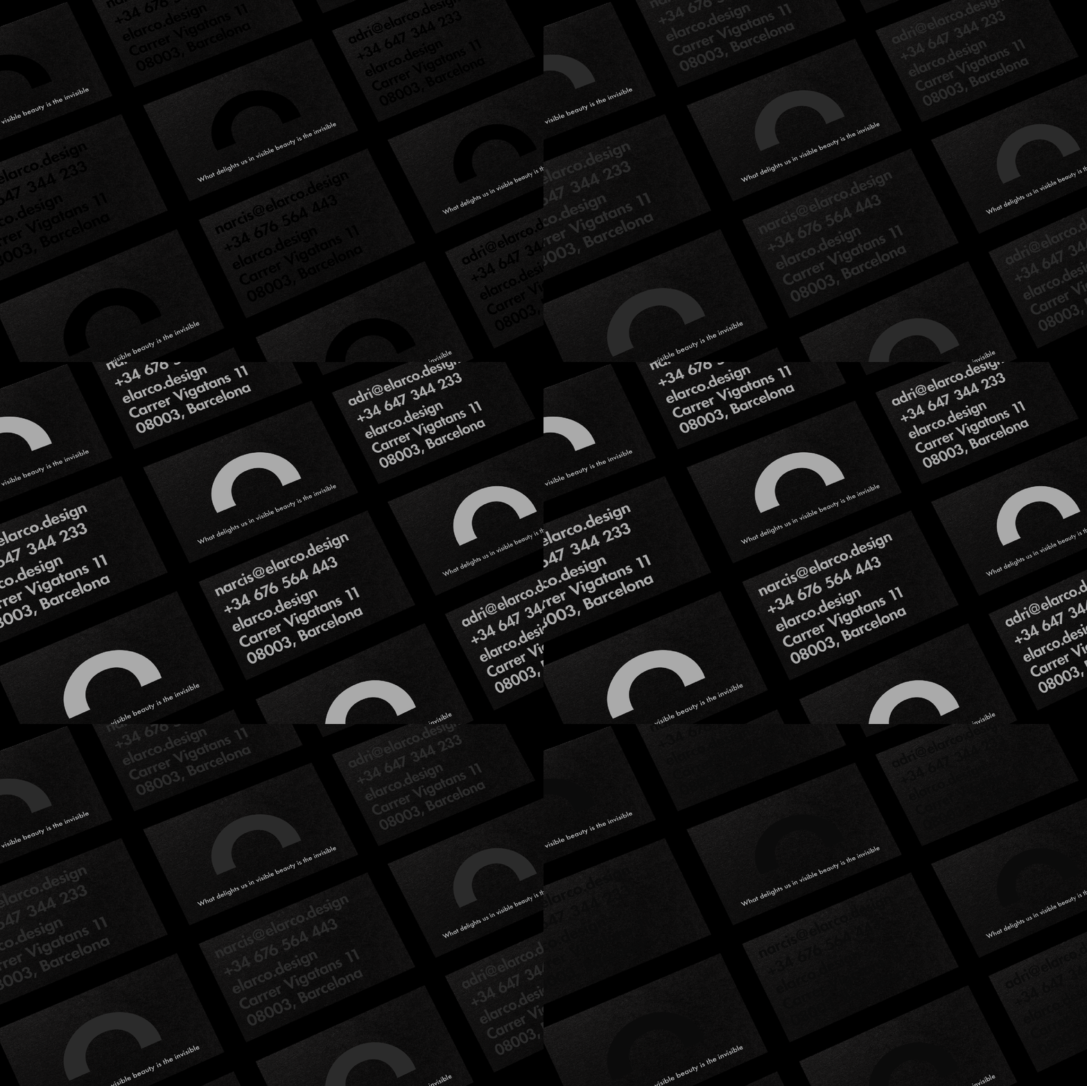

We must say, they we’re pretty close. 😉
elarco