Meetz — Mobile App User Interface Implementation

Meetz —
Find Your Business Meets.
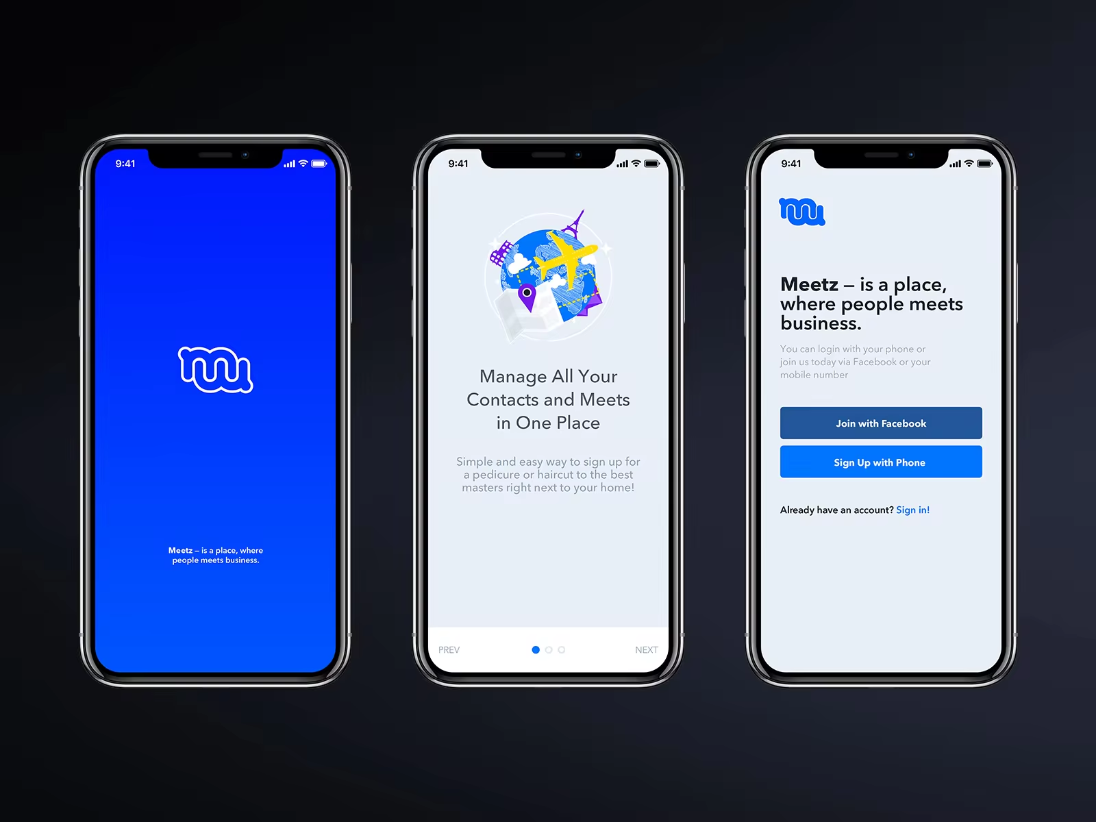
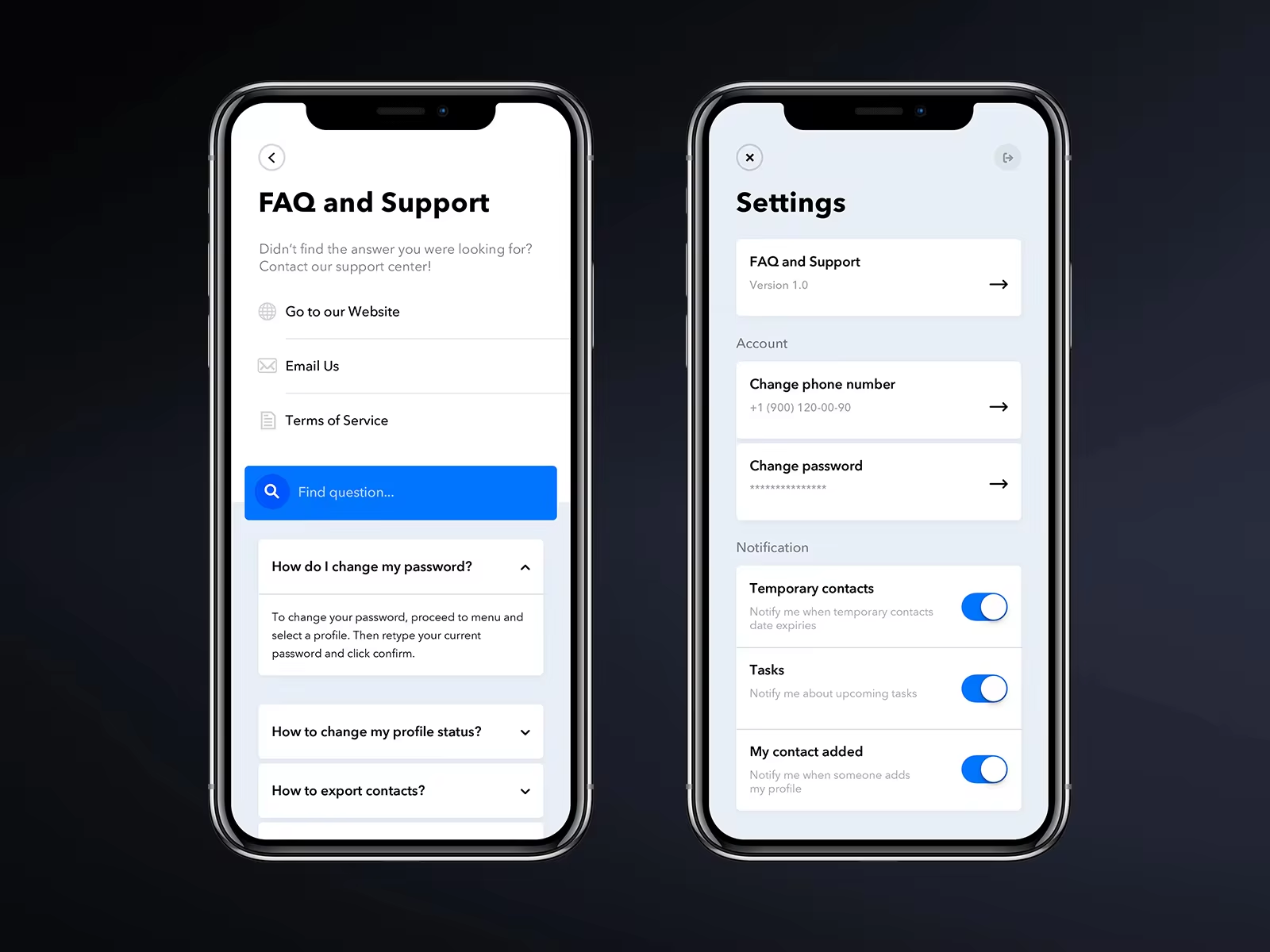
Meetz is a mobile service for searching contacts and adding to your contact book. The application for users whose work is related to communication with people and large number of acquaintances. With a more unified view of your contacts (synced and aggregated across your favorite platforms) you’ll never lose a connection again.
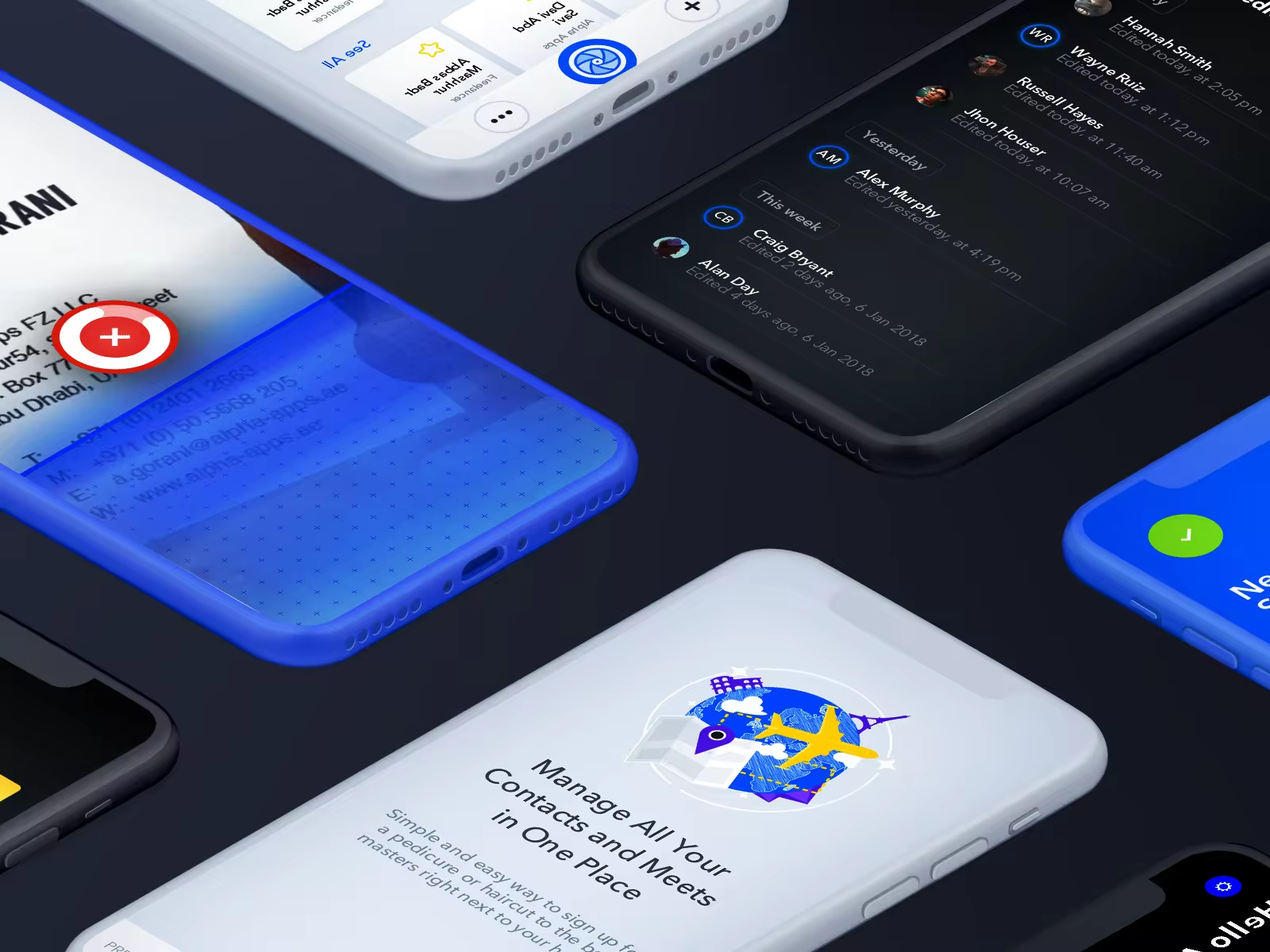
Business people meet / get acquainted, and they want to keep in touch with their potential partners. It is necessary to provide the user with the opportunity not to lose touch with new acquaintances. For this purpose we need to create a convenient tool for saving contact information of a new acquaintance “on the fly.”
We examined the user’s problem, usage methods, and the main user scenarios. Based on the material studied, they offered their solution, as well as the vision of the project as a whole. The study reflects the main use cases: scanning and recognizing the business card, adding and searching a contact.
WHY WOULD ANYONY WANT TO USE SUCH A SOLUTION:

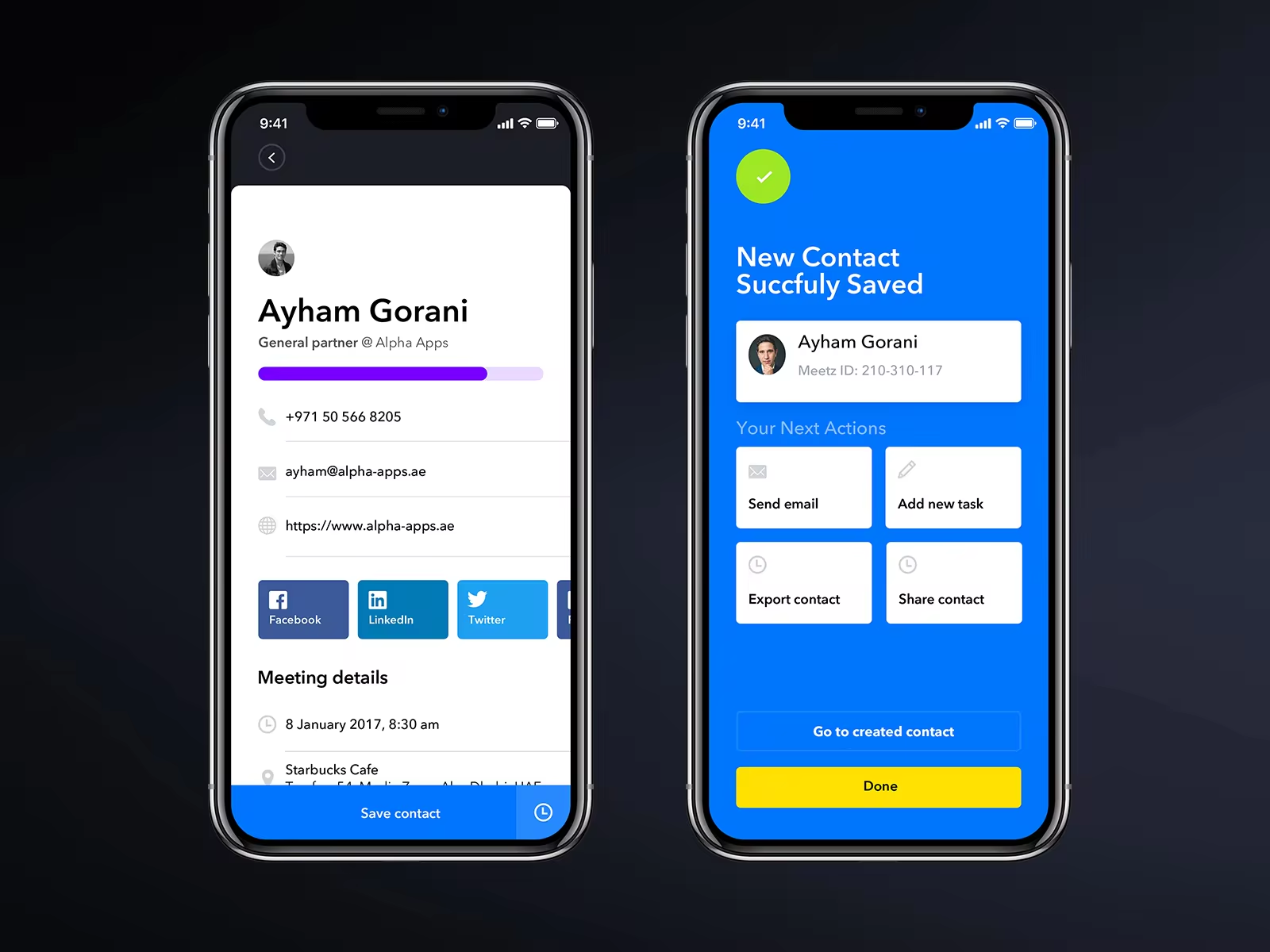
Contact information by itself is not always as important as their continued use: transfer to a notebook, synchronization with CRM or mail, reminder of the action with the contact, setting the task.
Our app should give the user the ability to manage their contacts in the most convenient way. This is an important point, because of which often the acquaintance breaks off and is not brought to the deal. Existing solutions tend to spread for money, have a very poor visual design, can not always be synchronized with the necessary tools, do not allow you to fully manage the contact database.
MAIN PAIN POINTS:
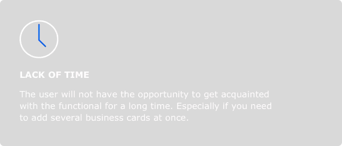
Such an audience does not have time to deal with the interface of the application, with walktrough, no time for long transits. They want to get a quick result and quality service. There should not be unnecessary screens, transitions, or elements.


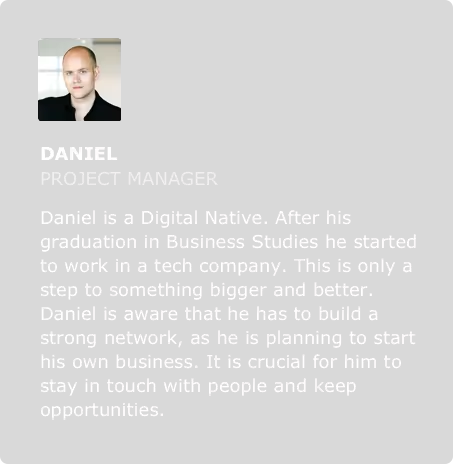
It is useless to try to remove all unnecessary from the use case, because in this way you can skip the important one.

Due to methods of application usage, main thing we need to keep in mind is simplicity and quickness of adding a contact. Just capturing data is not enough. customize his contact processing scenario.
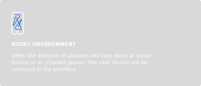
Use cases should be implemented without multi-touch gestures: phone in one hand, business card in another. Also we should remember, that user should do something with added contact in order not to lose connection.
METHODS OF USE:
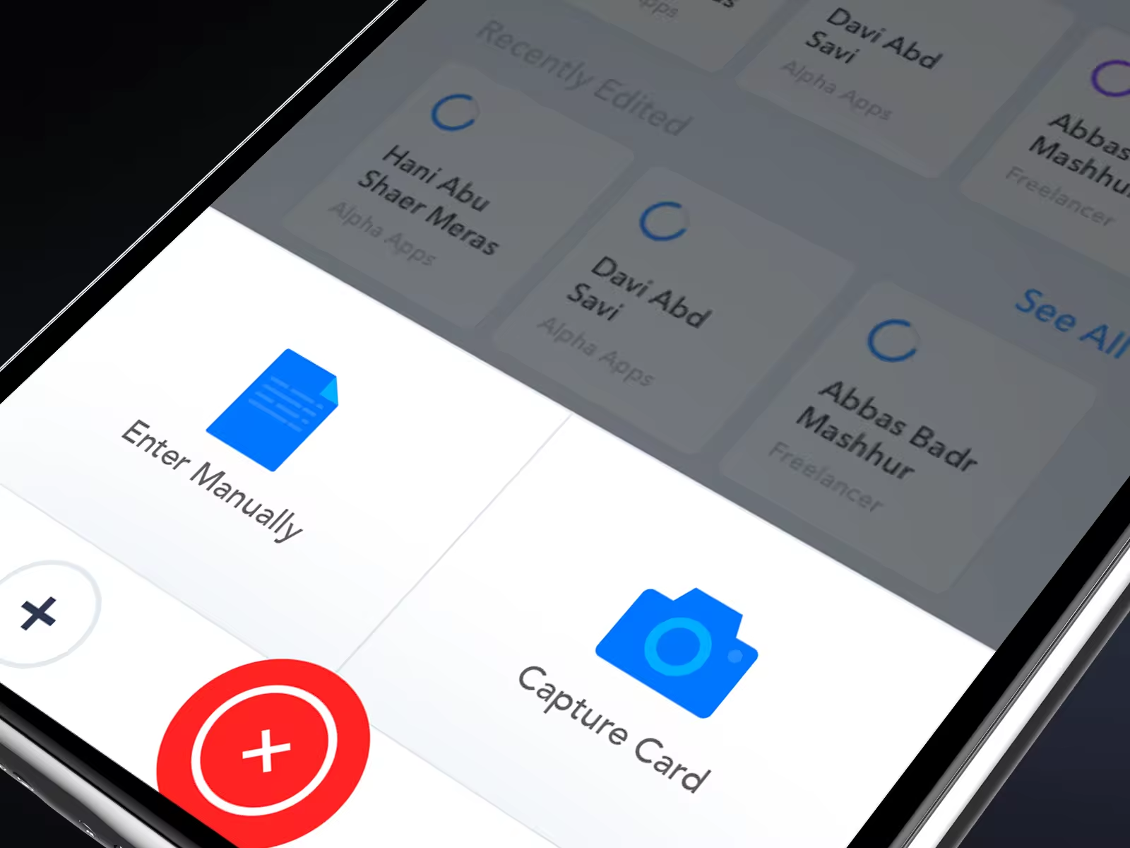
For us, the main thing is for the user to be able to add a contact quickly and from any screen. We solve this problem with the help of the button placed into navigation bar, which is available on all main screens of the application.

To achieve a seamless experience, we used surface design, detailed all the transitions to create the best application UX. Comfortable LinkedIn analogue, which is possible to find the necessary specialists, share contacts, assess the reliability of the partner.
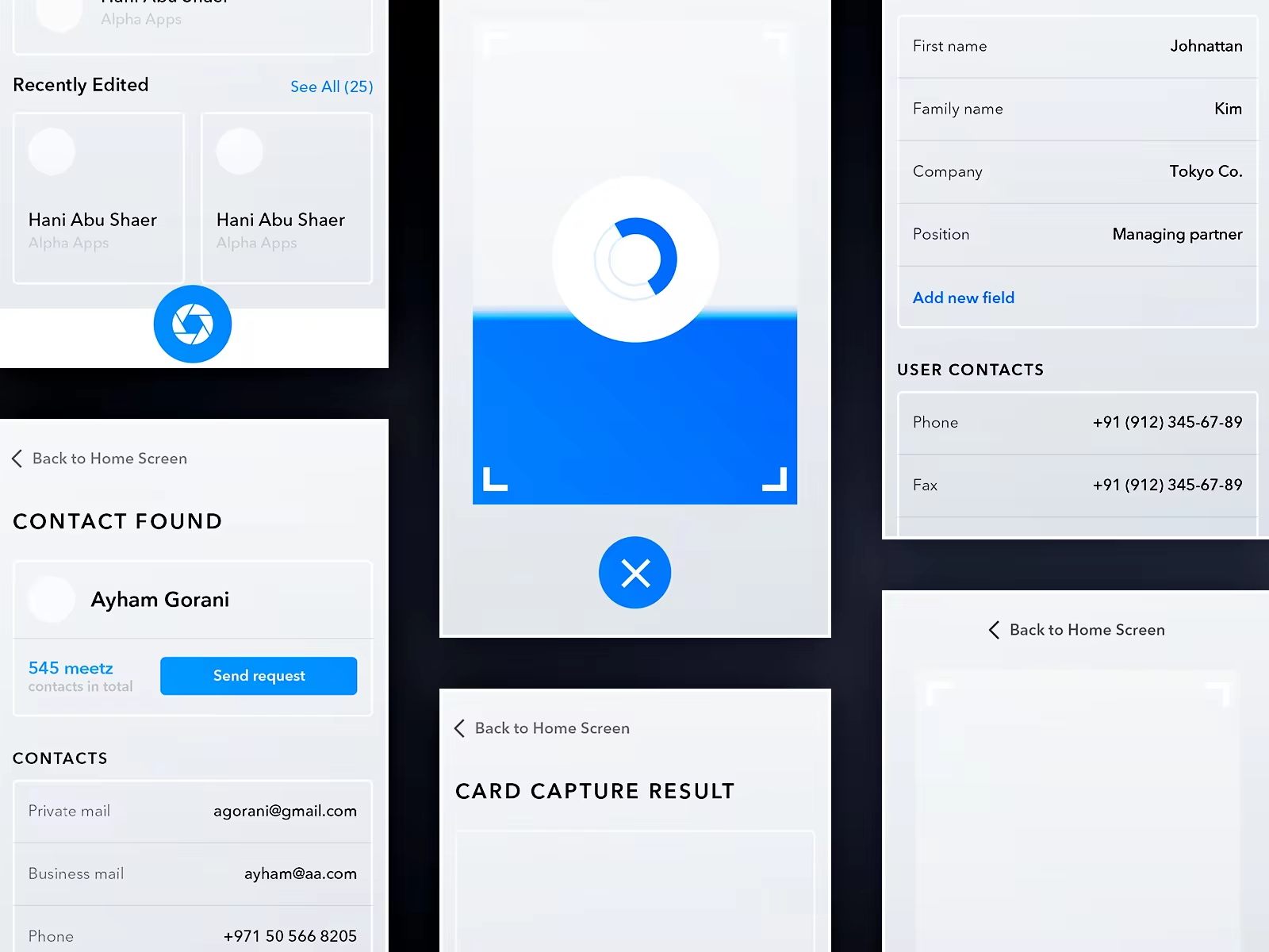
First of all, the user opens the main screen with contacts and main actions: add contact, find contact, do something with contact. This is the main screen on which the quality of the entire application depends.
We need a dashboard to remind the user about the necessary actions with newly added contacts. We put a pipeline on the main screen, which the user configures for his processes. For example, display recently added contacts, a list of unfilled profiles, task lists for contacts, and so on. In the visual design, we used modern trends: fat headlines for accidents, bright colors, card design.

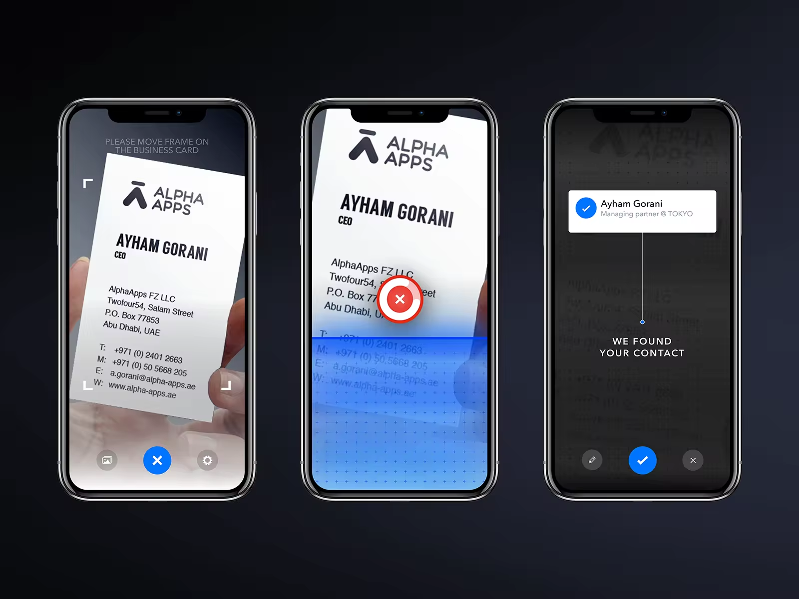
The business card is determined by the camera and scanned automaticaly. The user only needs to point the camera at the card refresh control. We paid special attention to the contact capturing, since if it is inconvenient, the users will not return.
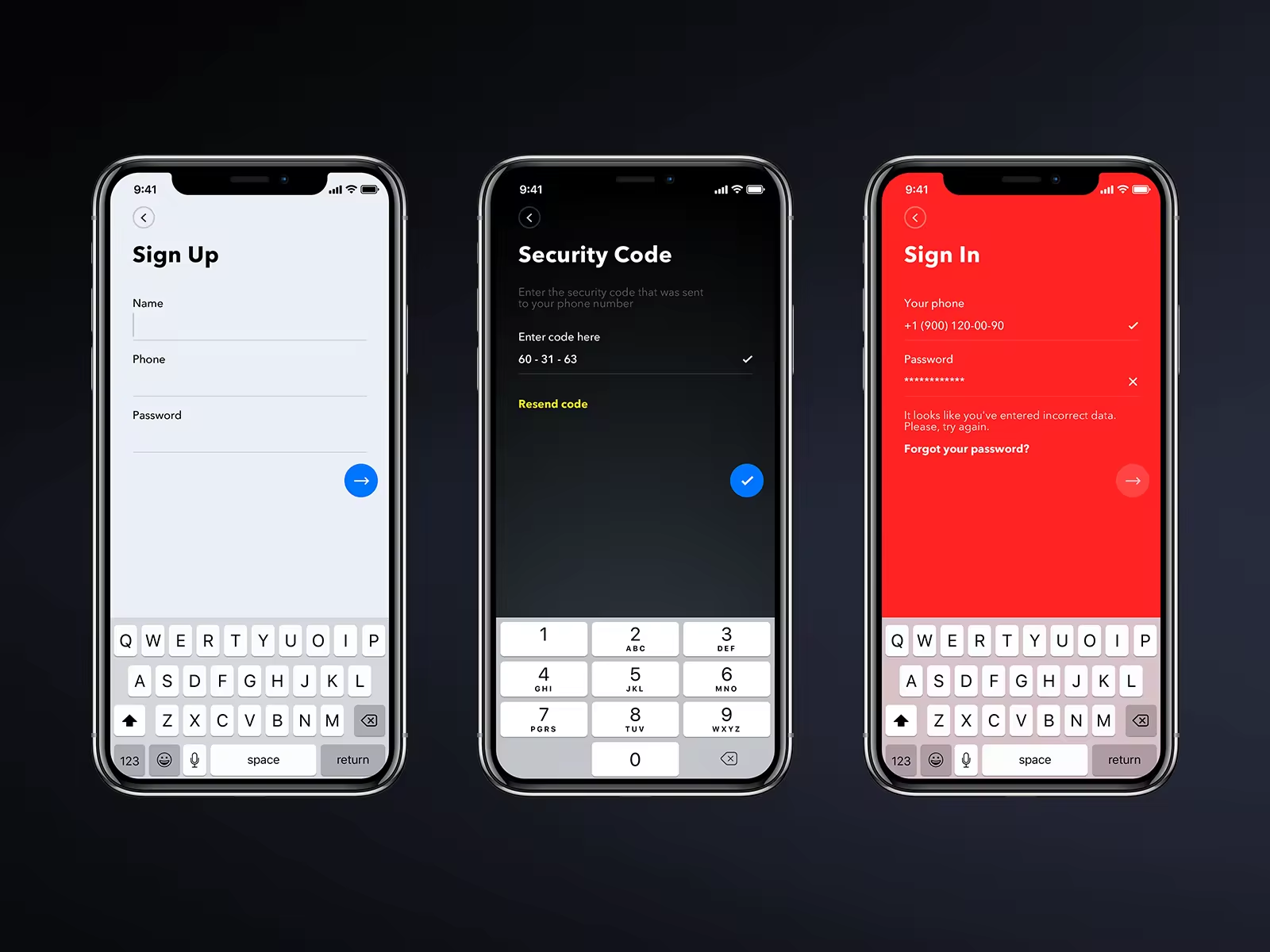
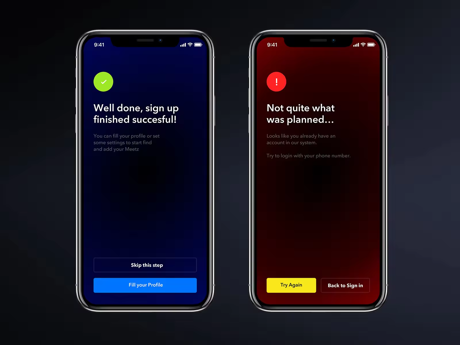
The main problem solved by the application is a fast and convenient saving of the person’s contact after or while your meeting. Our app should give the user the ability to manage their contacts in the most convenient way.
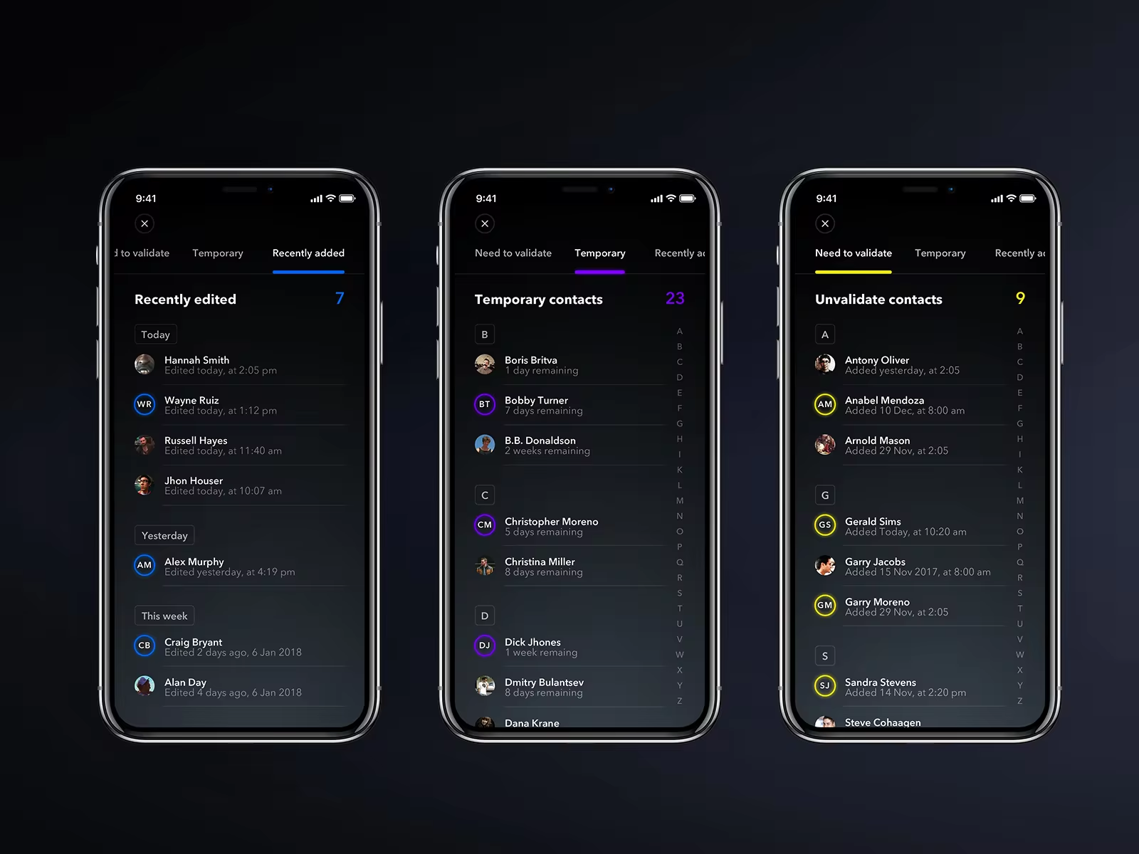
This will allow you to search for different specialists and also will improve the automation of the search for social profiles, tagging.
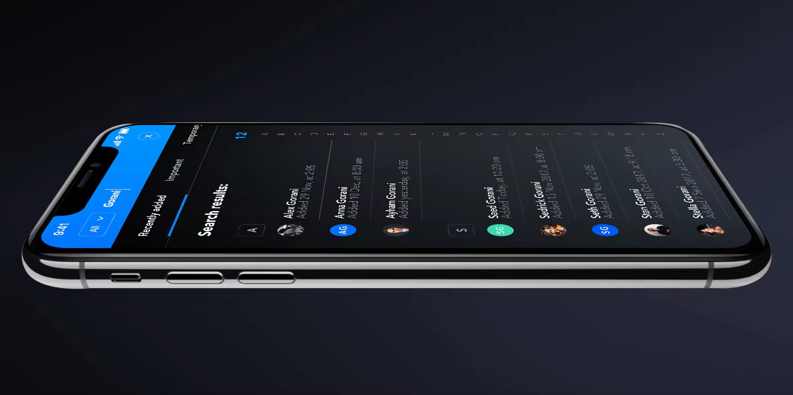
In future development we can connect deep learning to improve the quality of data collection as well as recommendations.
THANKS FOR WATCHING
Visit our site for more:
Meetz — Mobile App User Interface Implementation