NMS — logistics
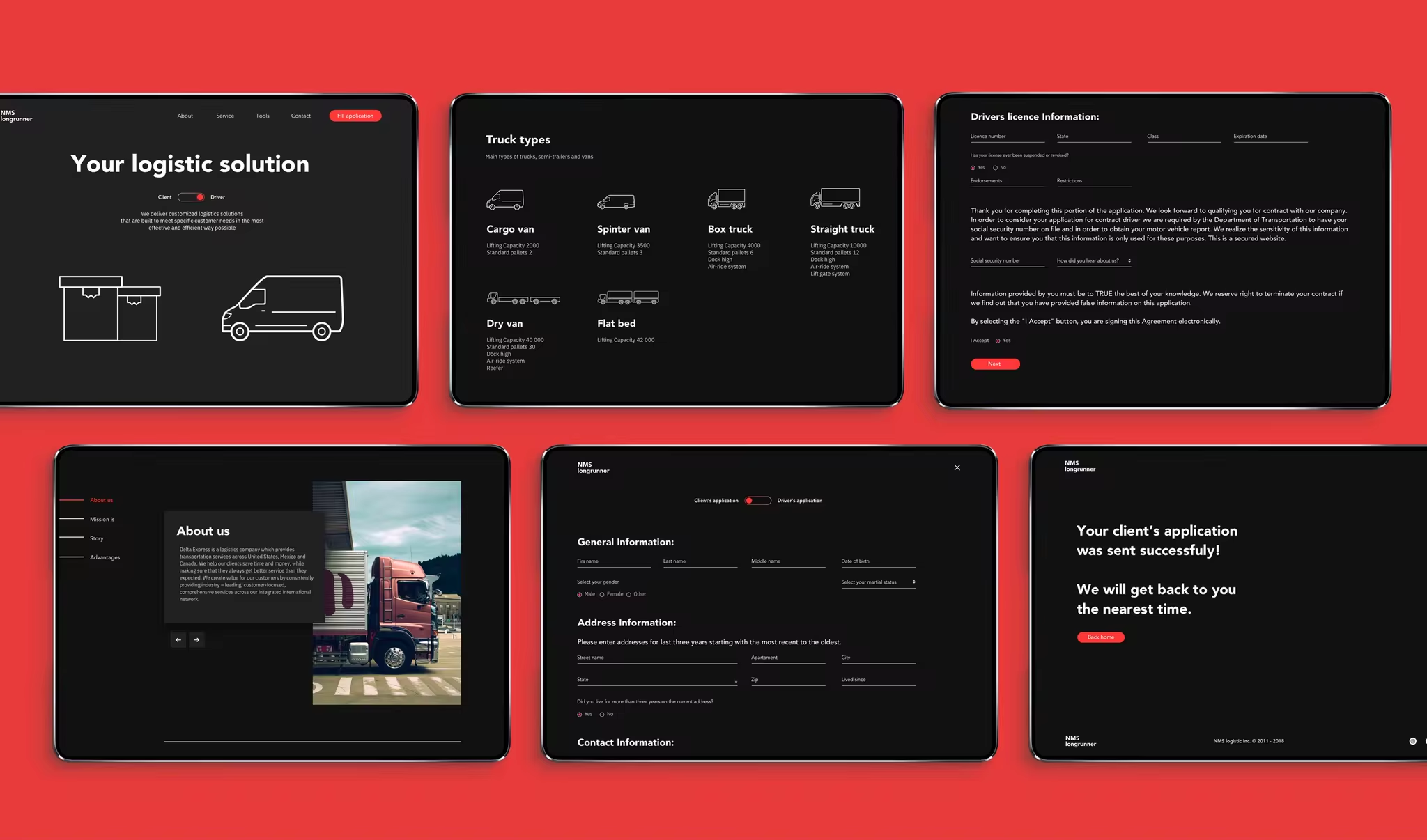
Task
We received a super short brief :
– Create a website for an American logistics company called NMS
– Make a simple landing page with functional contact forms
– Create a website for an American logistics company called NMS
– Make a simple landing page with functional contact forms
Our solution
Since all logistics companies look pretty much the same,
we pitched an idea of creating the interface which would stand out in the niche.
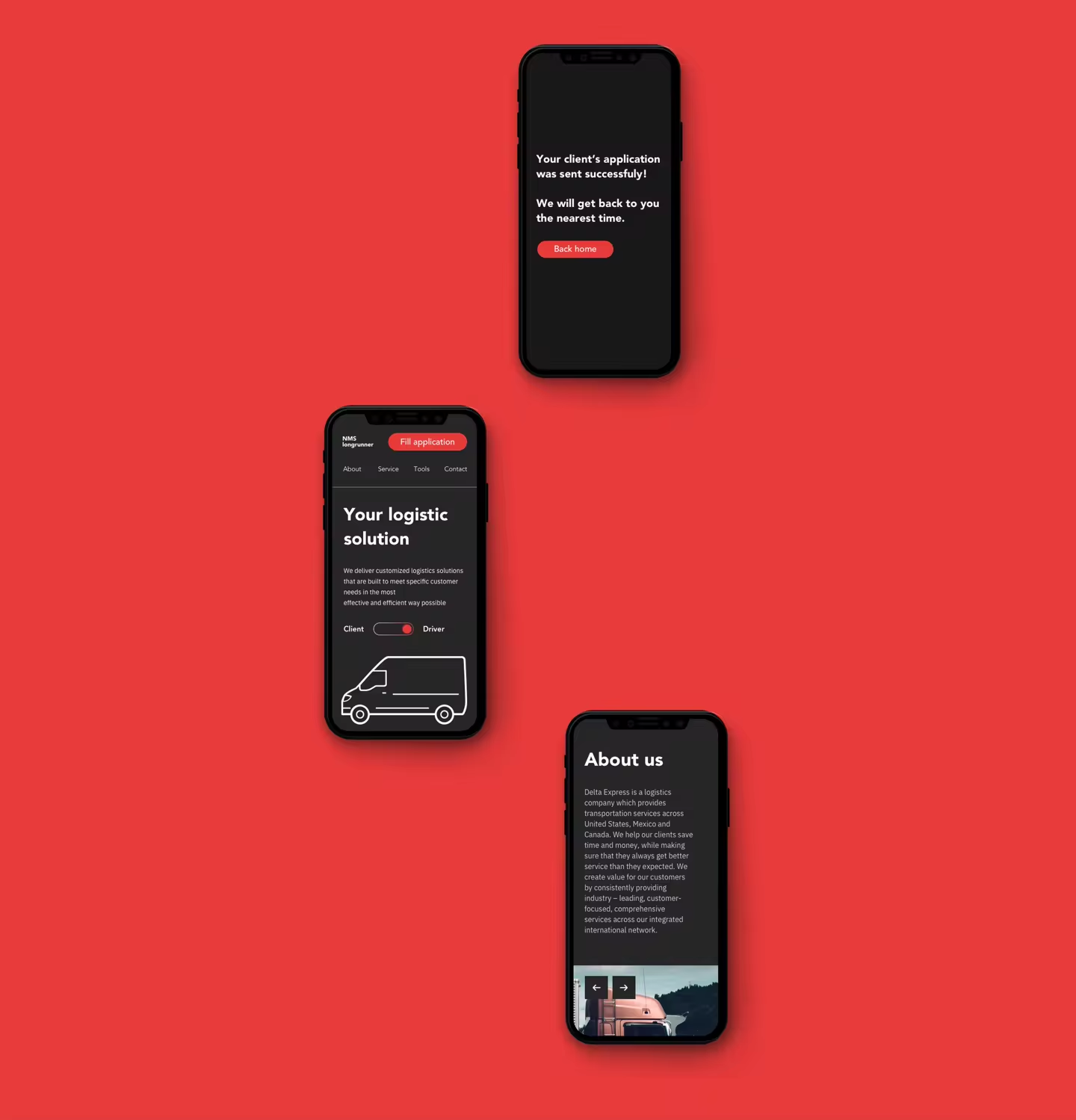
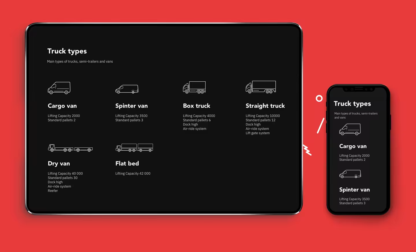
A minimalistic approach implemented in a dark interface with with red accents – this is how we handled it.
Highlighting company’s values on the second block.


Highlighting company’s values on the second block.
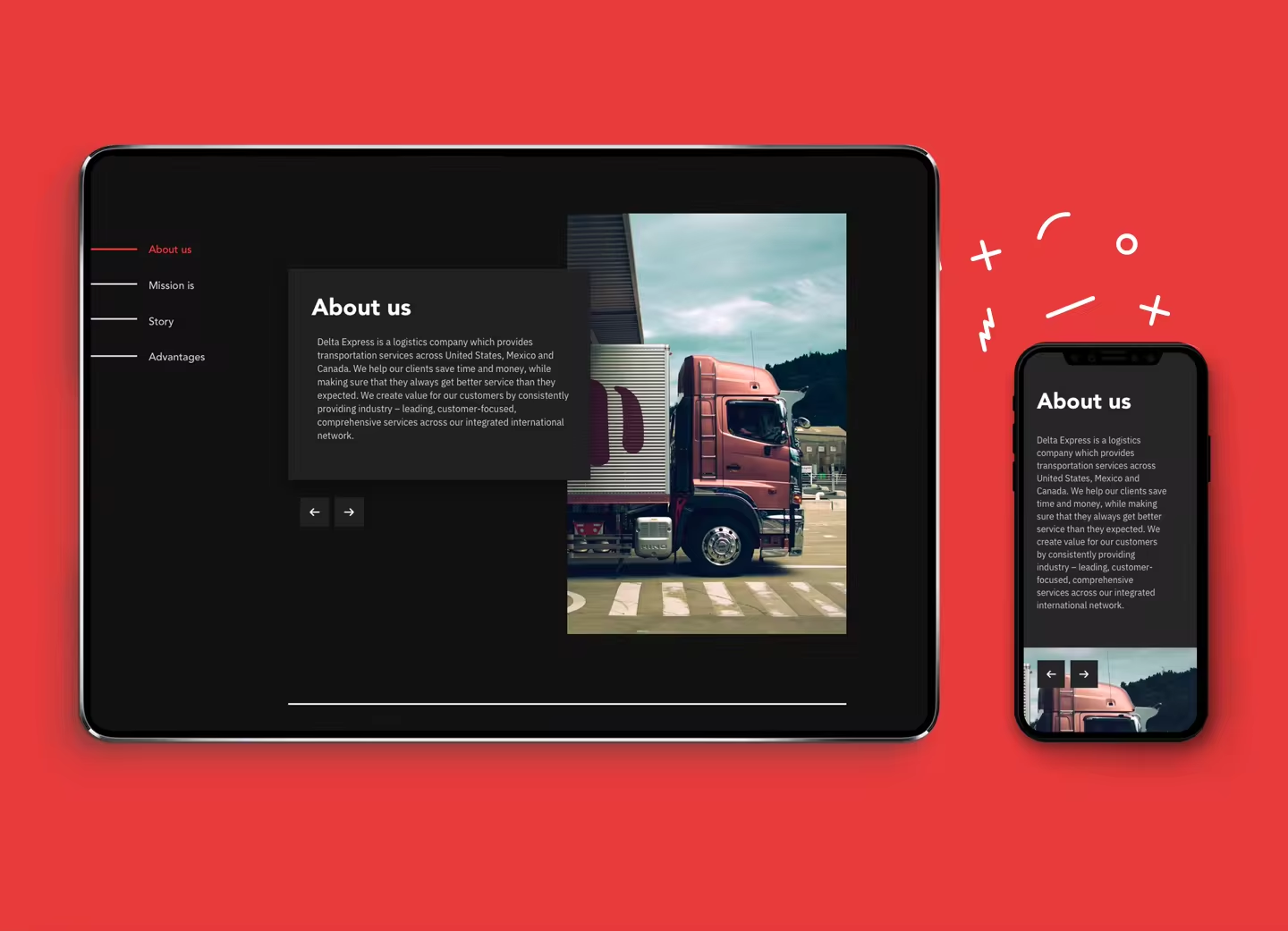
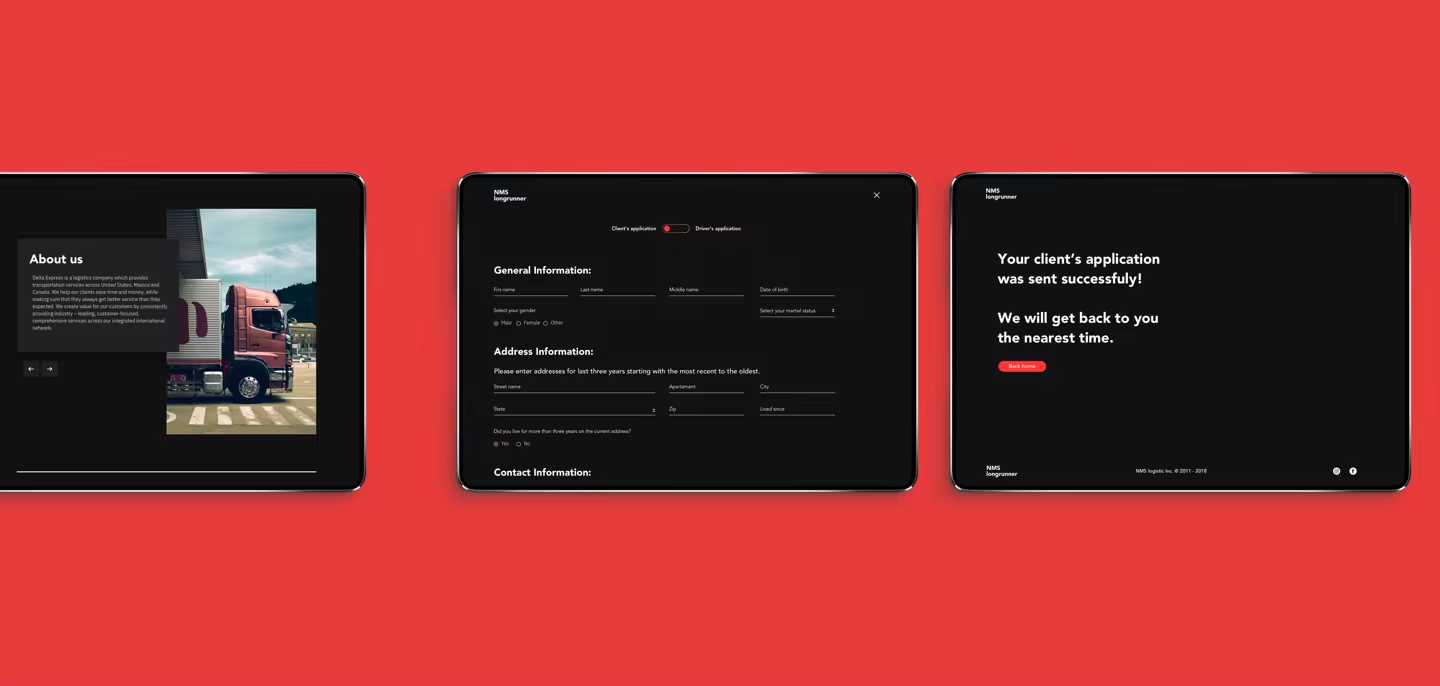
Bold fonts to highlight NMS’s business approach and website style overall.
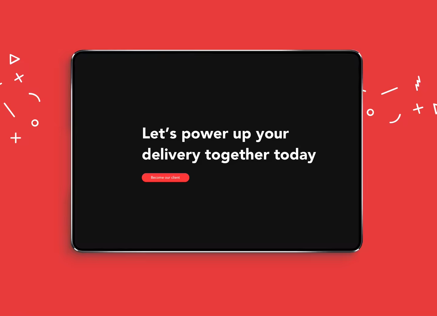
Styles
We decided to move away from the standard vision of logistic companies’ websites:
Bright colors, dark interface, bold fonts – this is how we see it.

Thanks for watching!
–
bananza.agency
bananza.agency
–
NMS — logistics