Mixed Reality Installation
Mixed Reality – On a way to
a perfect illusion
a perfect illusion
Oct 2017
Client:
Moscow
Government
Government
Event:
REW 2017
It is the Mount Everest of digital visualizations, a Star Trek-induced childhood dream, the ultimate challenge: the hologram. Although a true hologram has not yet been realized, there are many workarounds and approximations. One impressive holographic installation has just recently been put into reality for the Moscow City Government. Inty team was able to design visually stunning content that emanated true plasticity on three image layers – the PG hologram, backdrop LED screen and the floor projection mapping.
.
Idea & approach
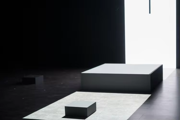
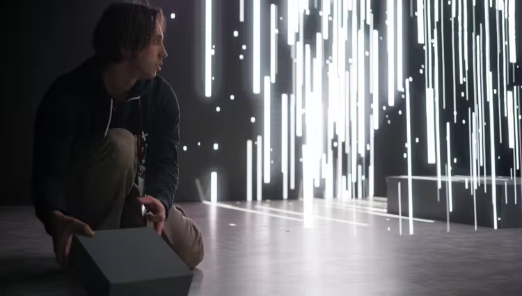
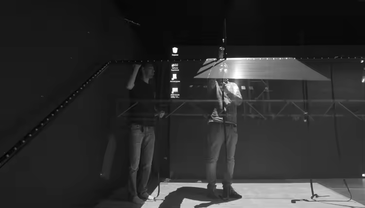
We used the traditional Pepper’s Ghost concept which dates back to the early 19th century. PG is based on the reflection of an image onto glass or foil. Since the transparency of the glass/foil allows the viewer to still see everything behind the reflected image, it appears to be floating in mid-air.
.
Setup
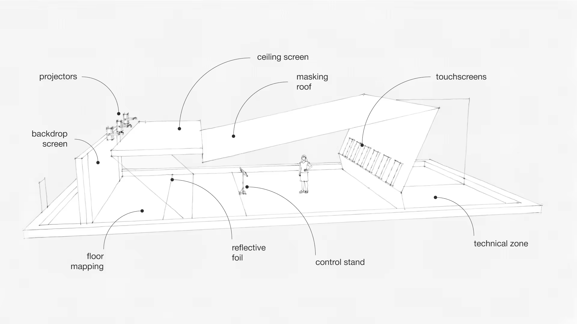
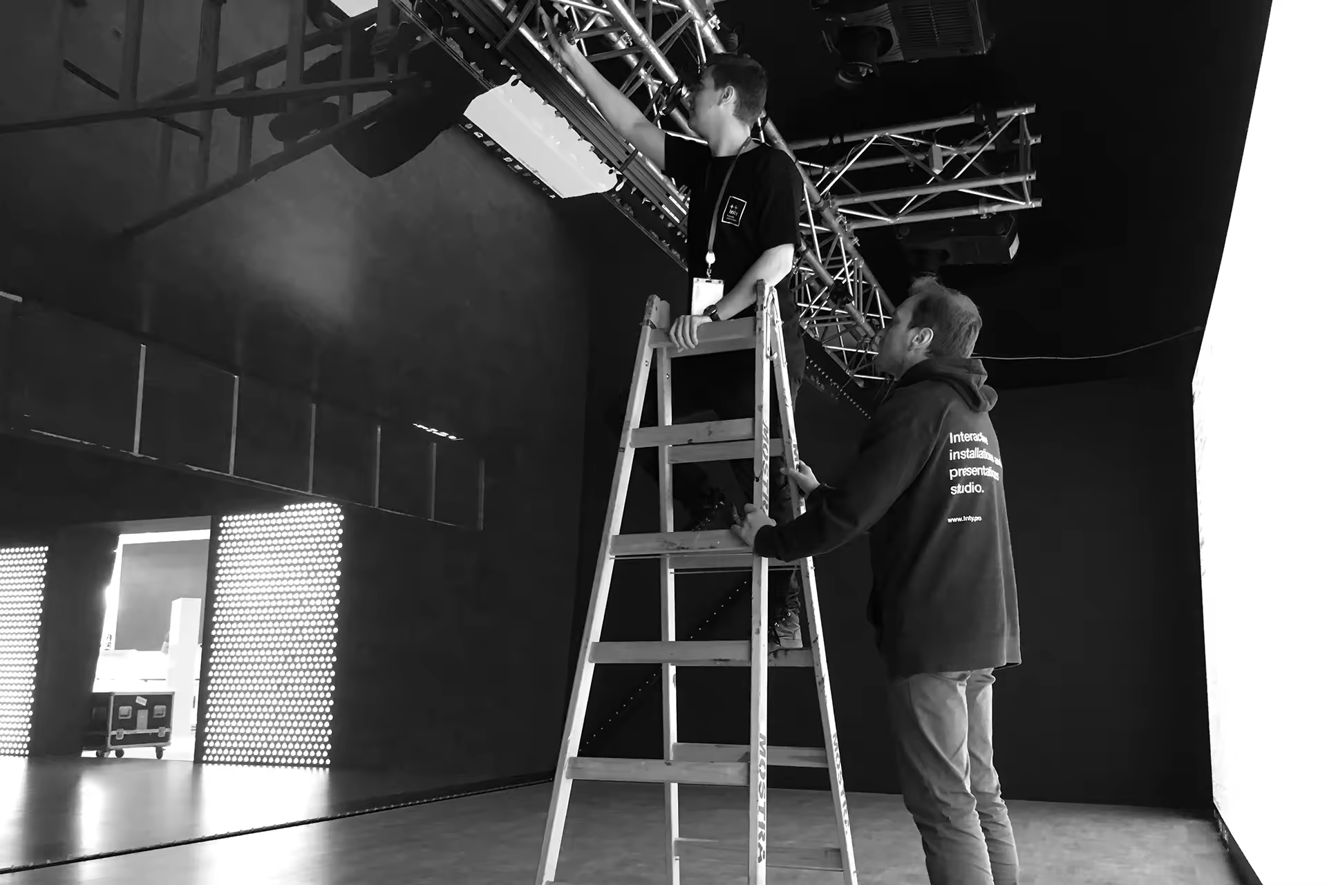
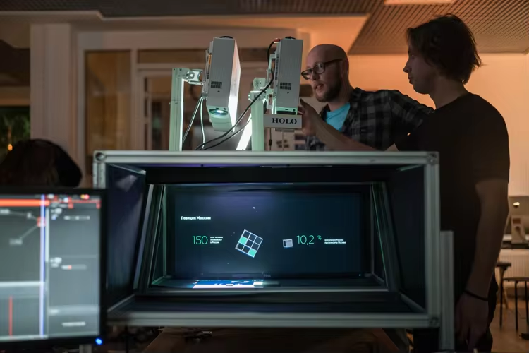
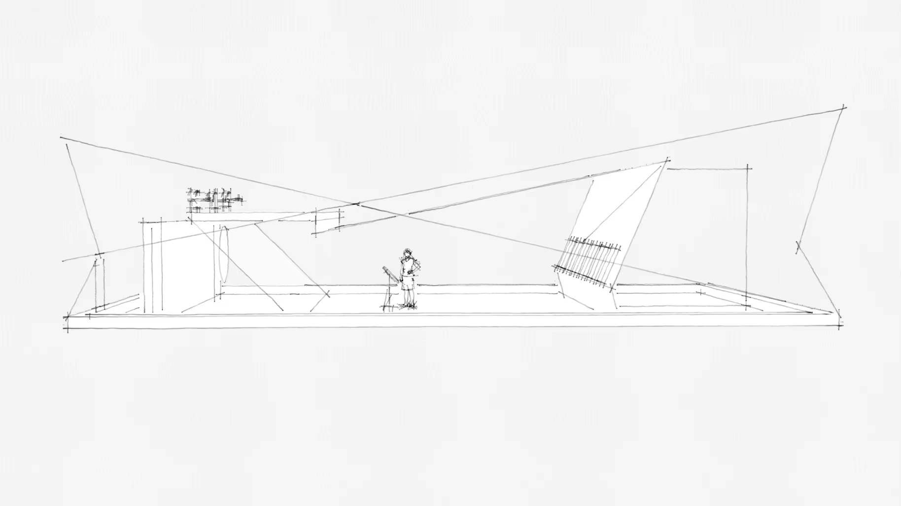
The setup itself consisted of an LED backdrop wall, three projectors for the floor and video wall mounted to the ceiling. Usually the image source is embedded into the floor underneath the foil, but we wanted to have the audience stand on the same level as the hologram. Putting the hologram on an elevated stage would have weakened the illusion.
.
Novelty
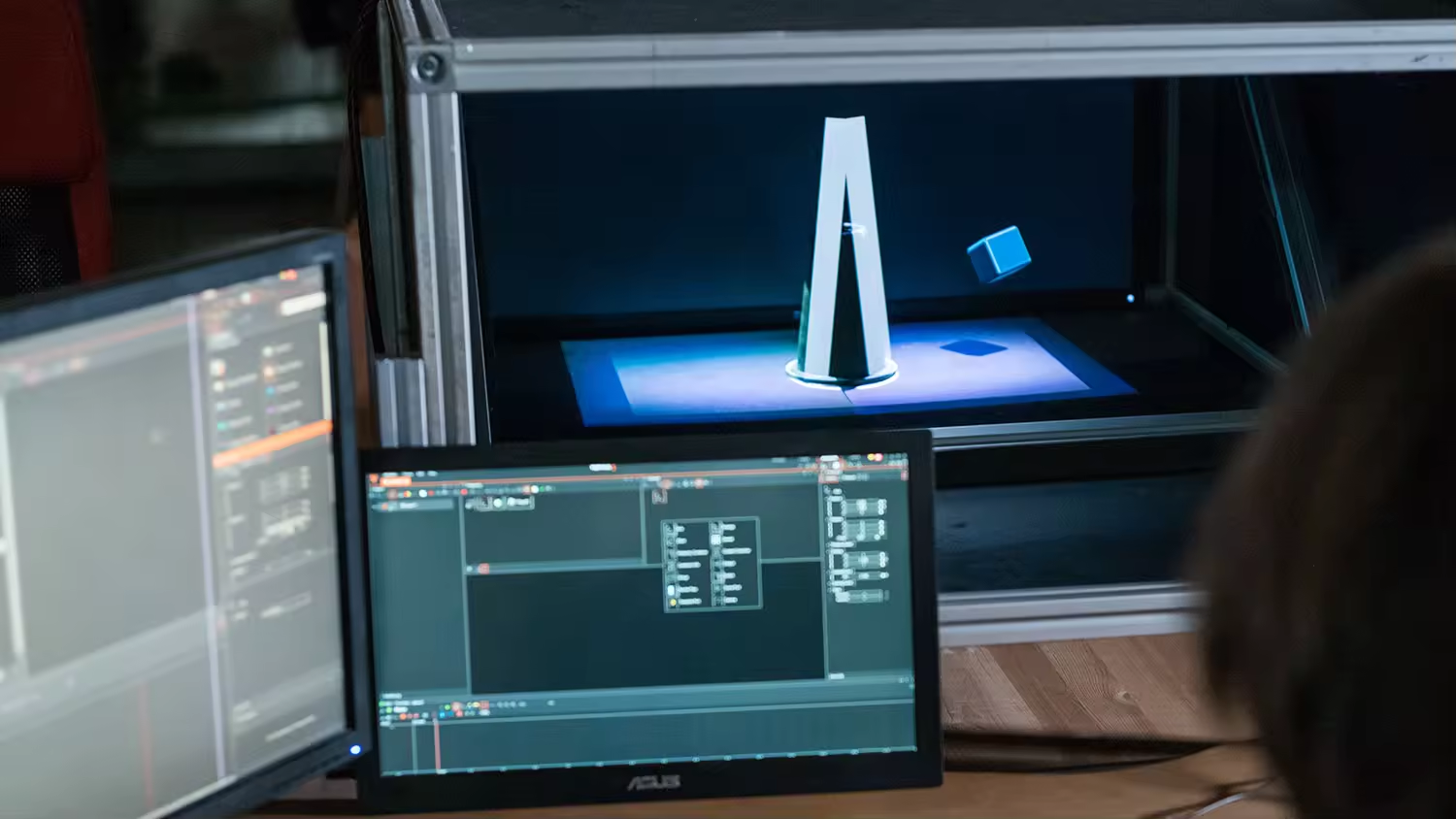
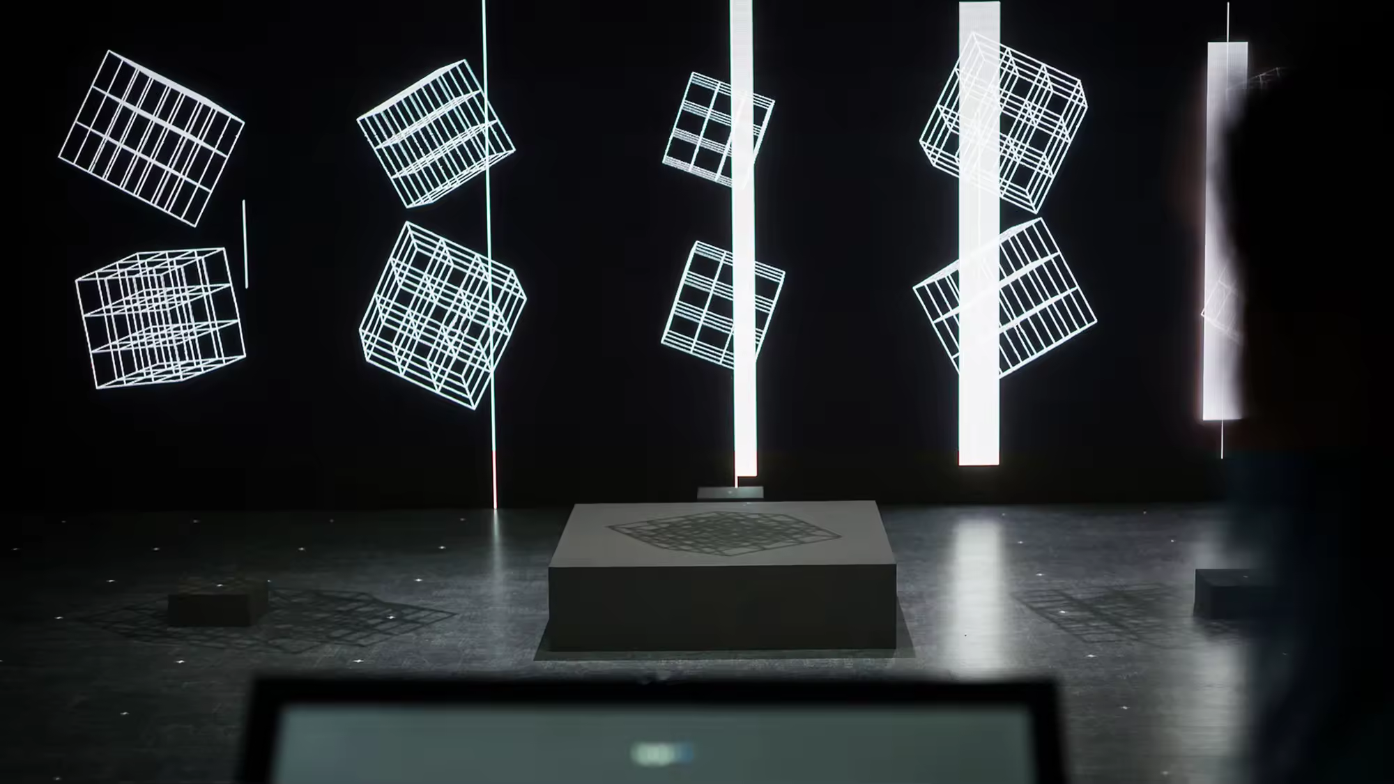
This is especially true if one looks at the purpose of the projectors. On the one hand they gave the opportunity to extend animations from the backdrop wall via the floor onto the holographic foil, thereby transcending from display into holography. On the other hand, they added plasticity to the hologram by providing it with an animated shadow – a simple idea that made all the difference.
.
Visualization
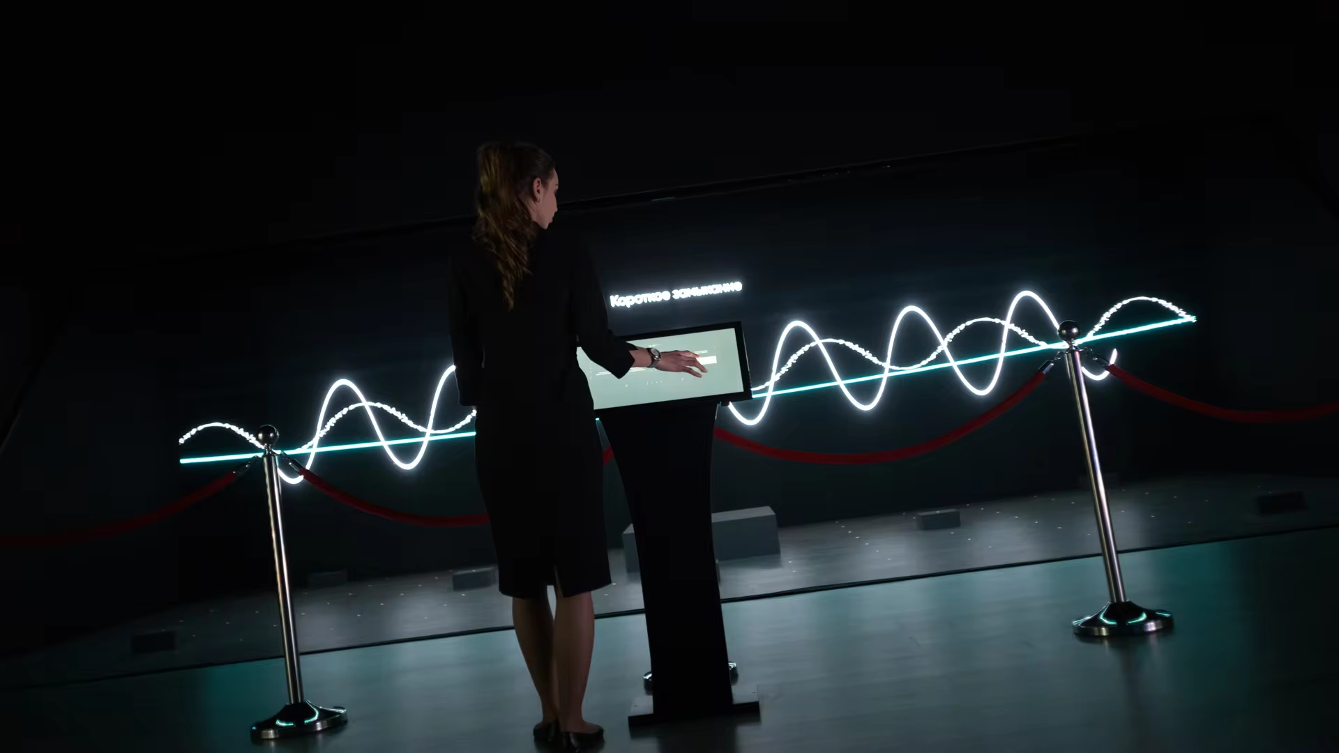
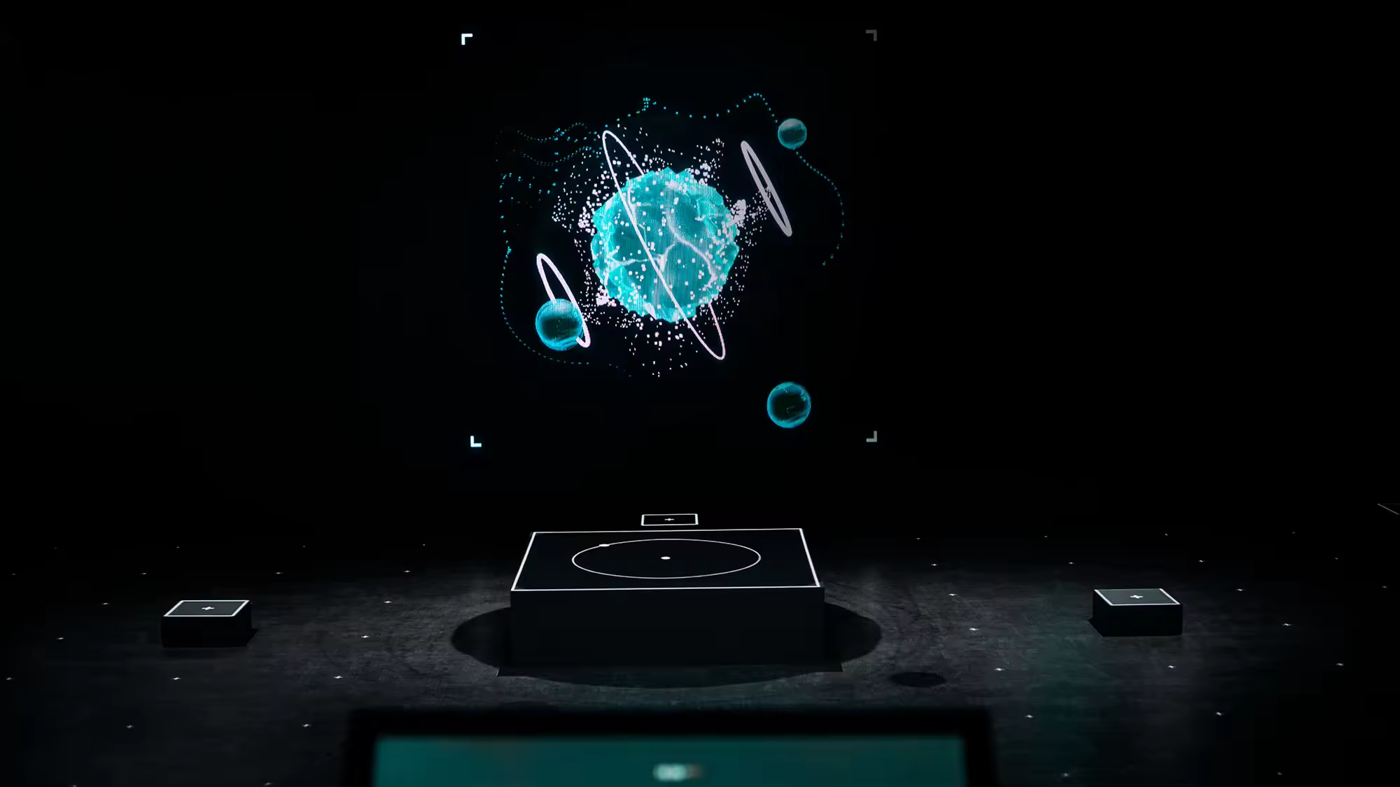
In terms of content, we were faced with the task to visualize rather abstract topics, focusing on the energy policies of the city of Moscow, such as price optimization and energy convergence. We divided the content into eight segments and used individual design approaches and animations for each. For some segments, facts and figures were shifted to the backdrop wall and the hologram showed 3D models. Other segments, spread the visuals across all three layers, creating spatial impressions and 3D animations like bar charts rising from the floor.
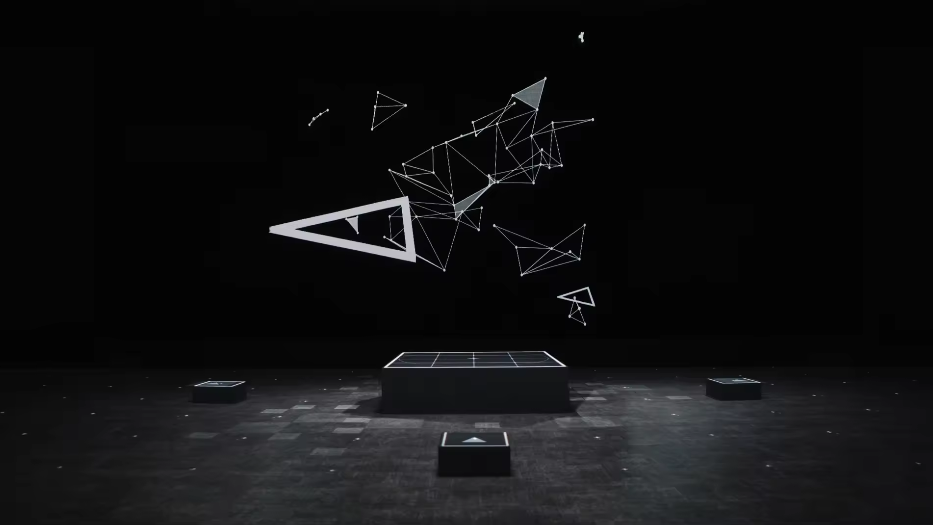
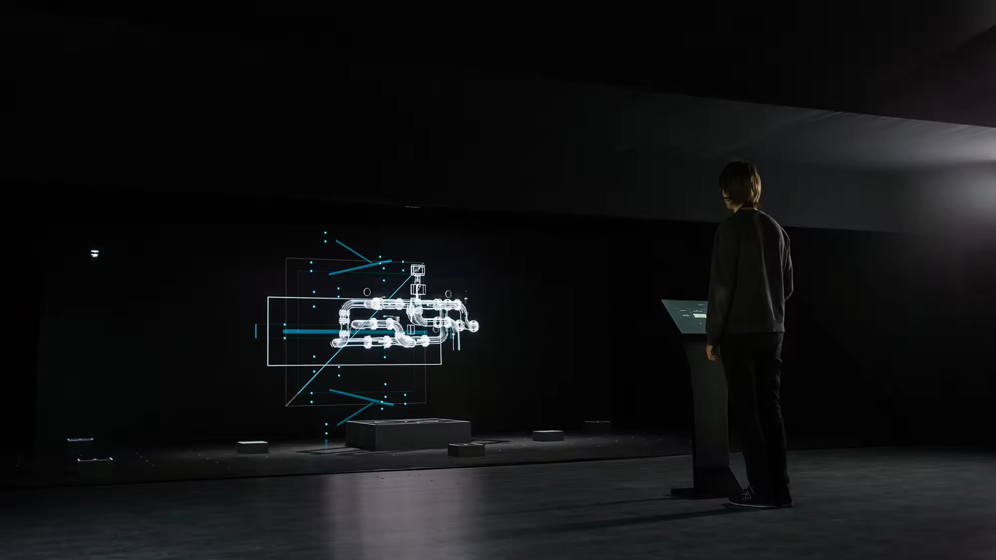
To make holograms look as much 3D, we had to use alpha channel and avoid using glare effects, flares and blurs. Too much details also damaged the illusion and made the image look too flat. We had played about two weeks before we defined a proper recipe for 3D graphics workflow.
.
Production
With three individual image sources, the content production in turned out to be quite intricate. Synchronization was a bit of a problem, not so much in terms of playout, but rather during the design process. We didn’t want to create three separate animation channels. Instead, we created one project with one animation timeline.
For that purpose we created user interface for a designers team which showed each individual layer plus the entire project in a fourth window. This allowed us to create the content as a whole. With different markers and parameters, we then distributed the content to its corresponding machines.
For that purpose we created user interface for a designers team which showed each individual layer plus the entire project in a fourth window. This allowed us to create the content as a whole. With different markers and parameters, we then distributed the content to its corresponding machines.
.
Booth concept
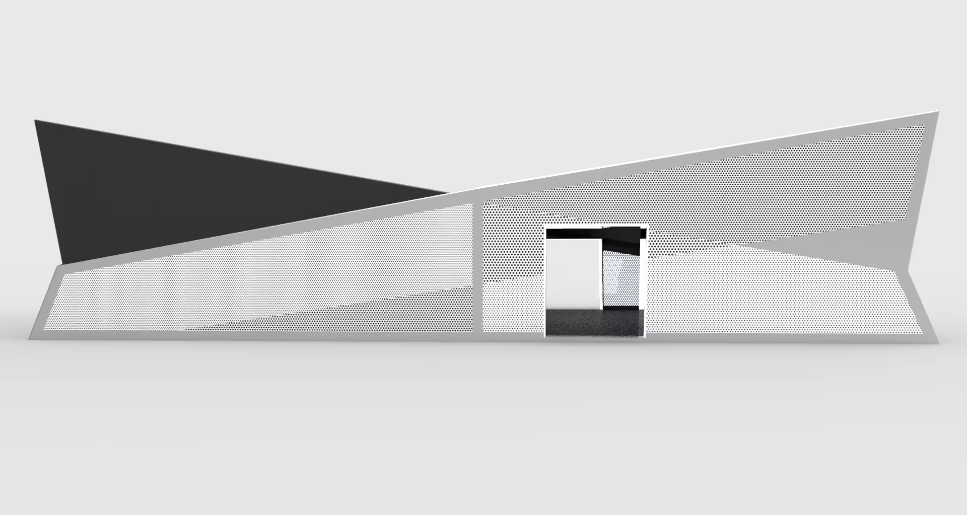
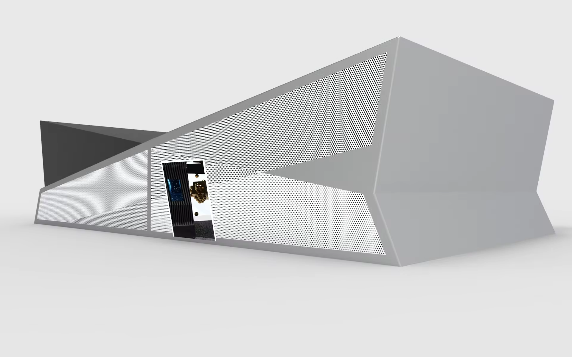
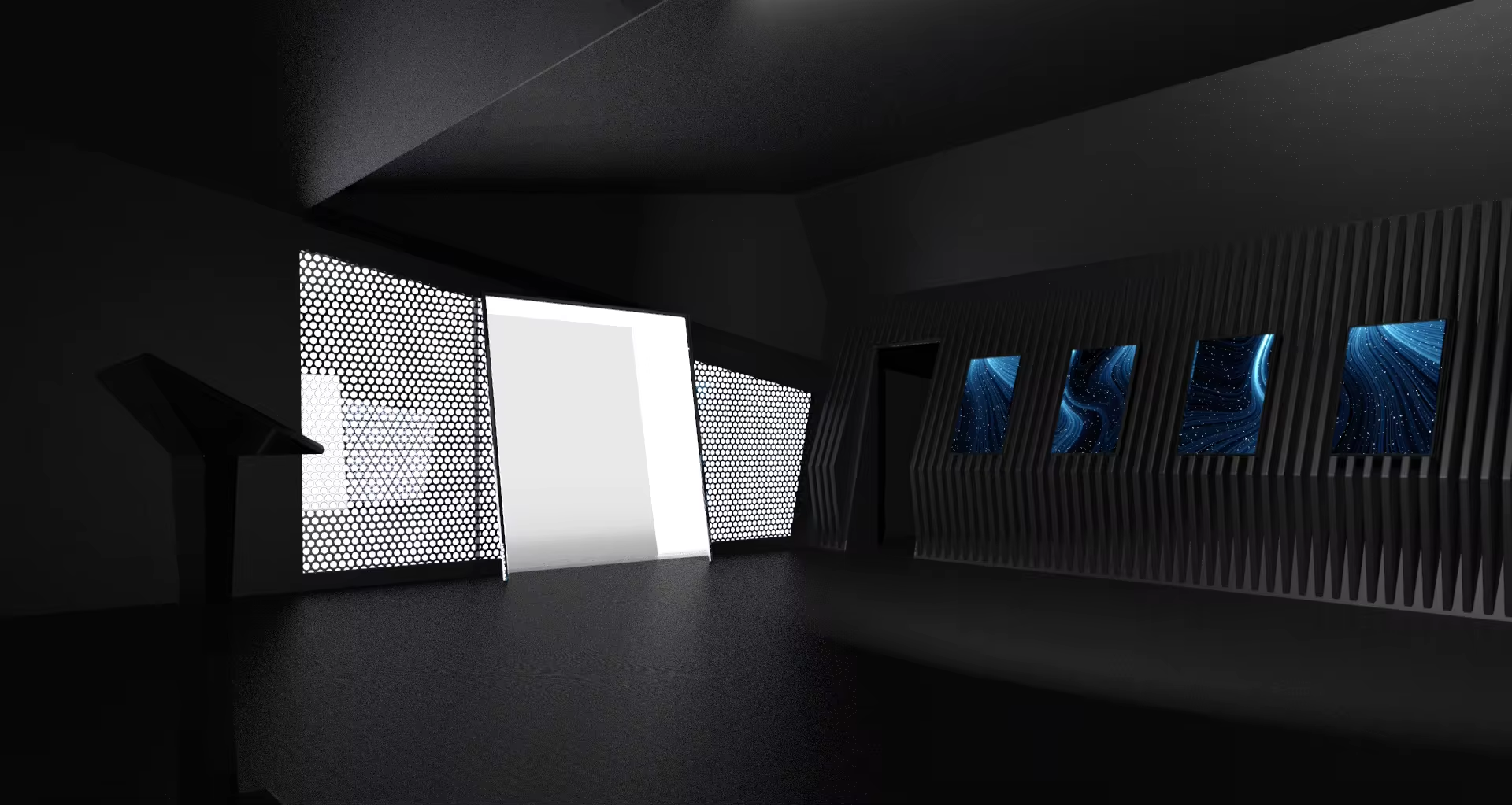
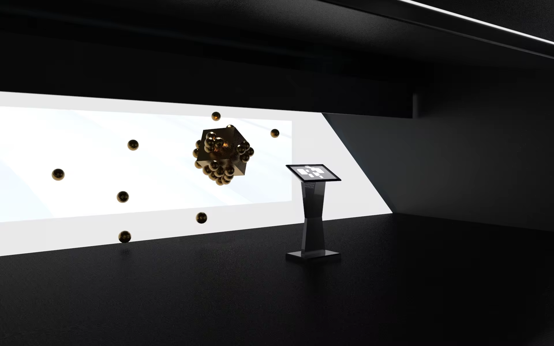
The booth was design from the origin of setup. The form of all inner structures of the mixed reality setup was the main reference for the outer shape of the booth. To mask the LED-screen on the ceiling we decided to make an inclined roof so it looks more natural. All the inside design was make dark to focus spectators attention on the installation itself.

.
Experiments
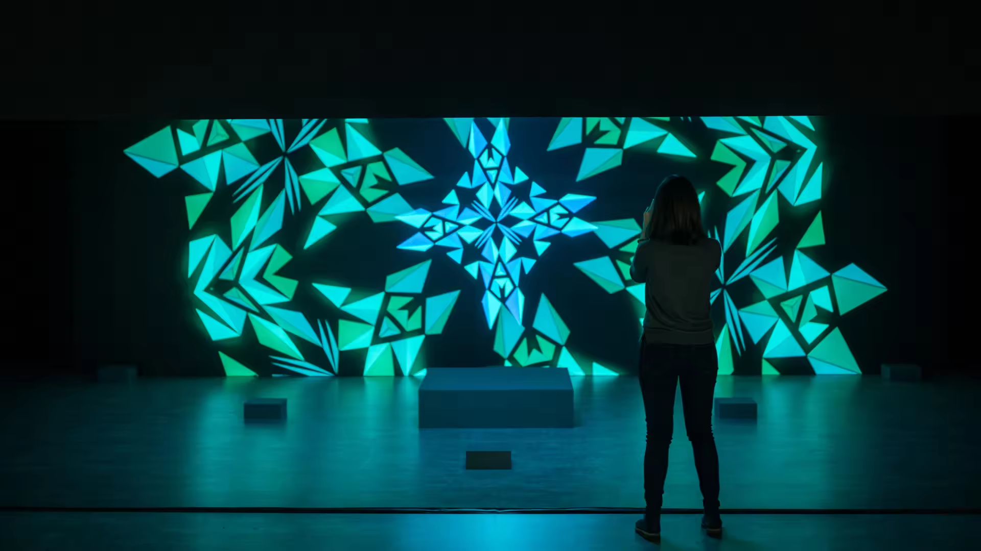
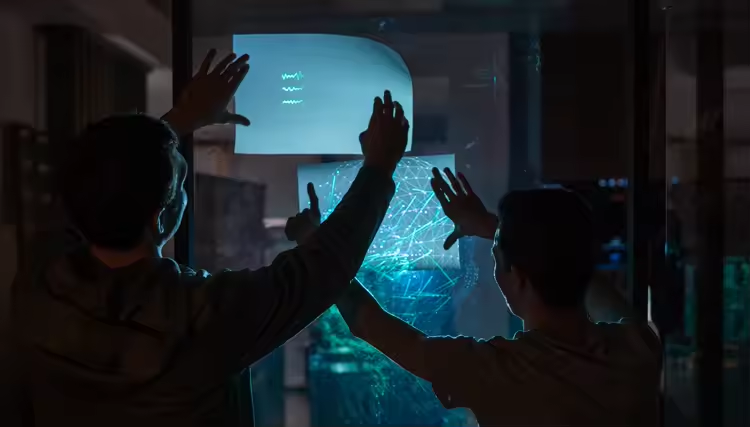
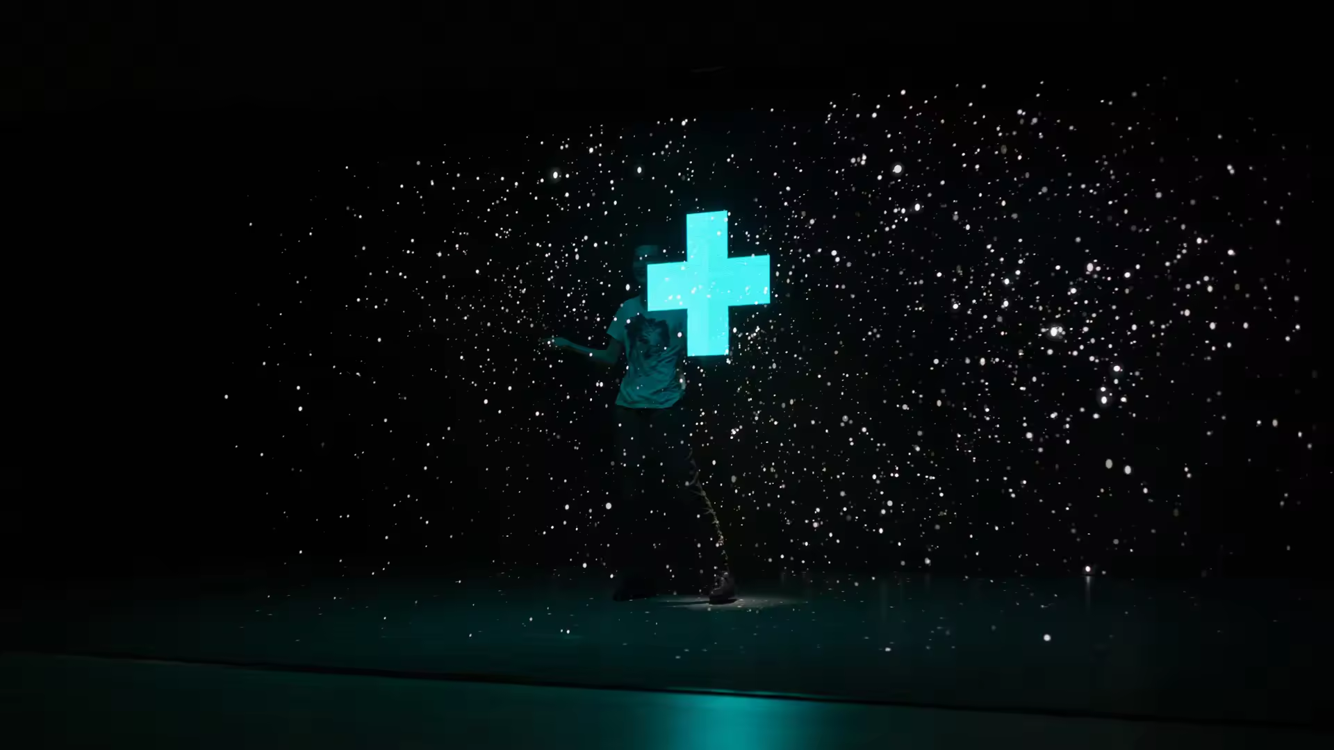
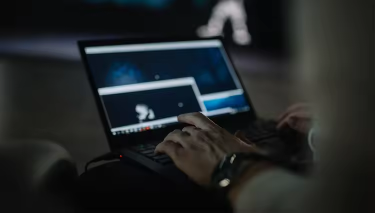
To get some more visual inspiration we tried out different graphic sketches with particels, color patterns and shapes within the night when the exhibition was closed. We came up with the idea of holographic fighting game with realtime shadows and tried our betta version made in Unity.


.
Touchscreens
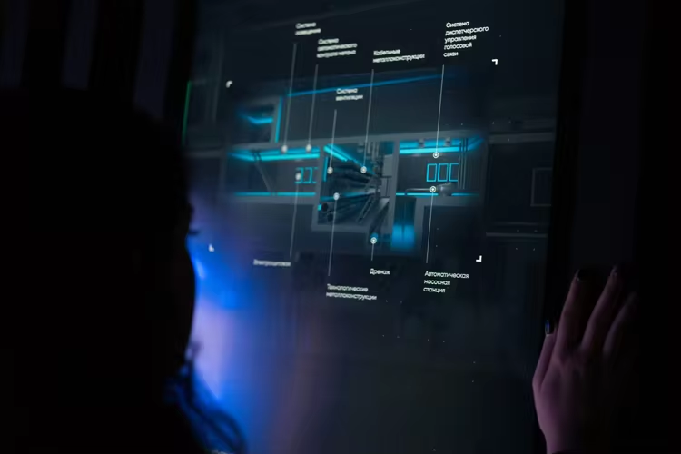
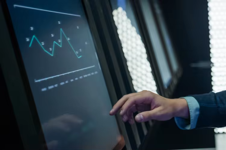
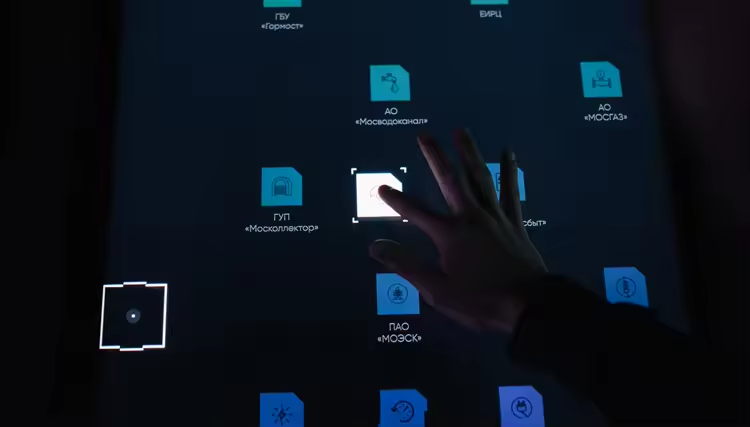
To demonstrate tons of secondary information we have placed 6 touchscreens in the backside wall of the booth. These were animated poster-like presentations which introduced the energy efficiency program of the Governmental companies.
.
Sound Design
To round off the experience, we added a custom sound design. Apart from the background music, each event inside of Ventuz fired an individual sound that was connected to an object or animation. This created an audio picture that accompanied the visuals and served for a striking atmosphere.
.
Credits
Project Manager Andrey Ustinov
Creative Producers Alexander Volkov, Sergey Startsev, Denis Nikitin, Daniel Kosinsky
Art Director Alexander Volkov
Realtime Artists Denis Nikitin, Alexander Volkov
Graphic Design Liuba Metelica
Technical Producer Sergey Startsev
Engineers Savva Mihaesku, Roman Filin
Technical Director Dmitriy Kargin
Sound Design Tim Aminov, Andrey Poison
Filming Alexander Golovkin, Iliya Kozhevnikov

Mixed Reality Installation