Grado
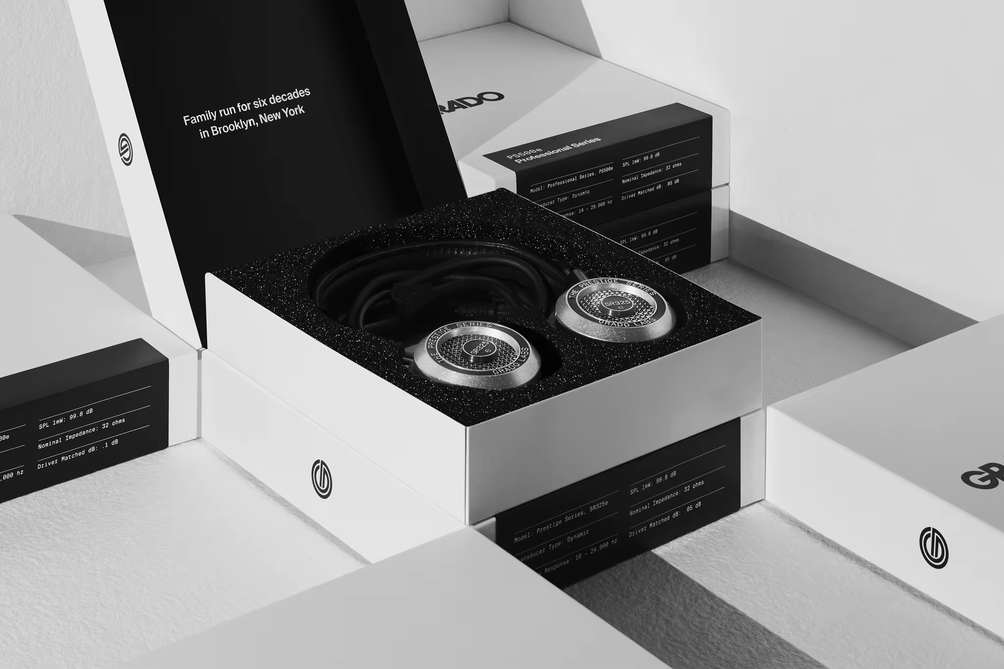
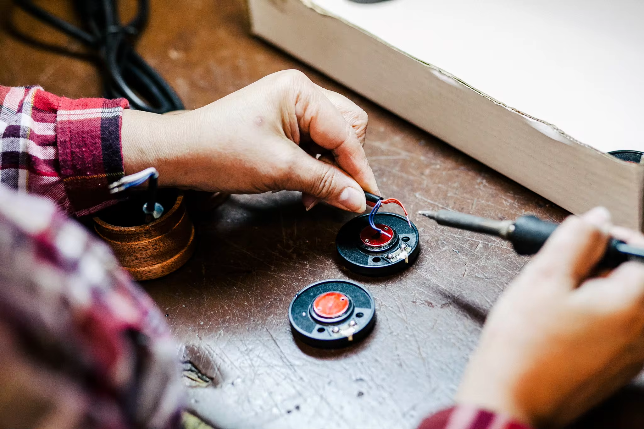
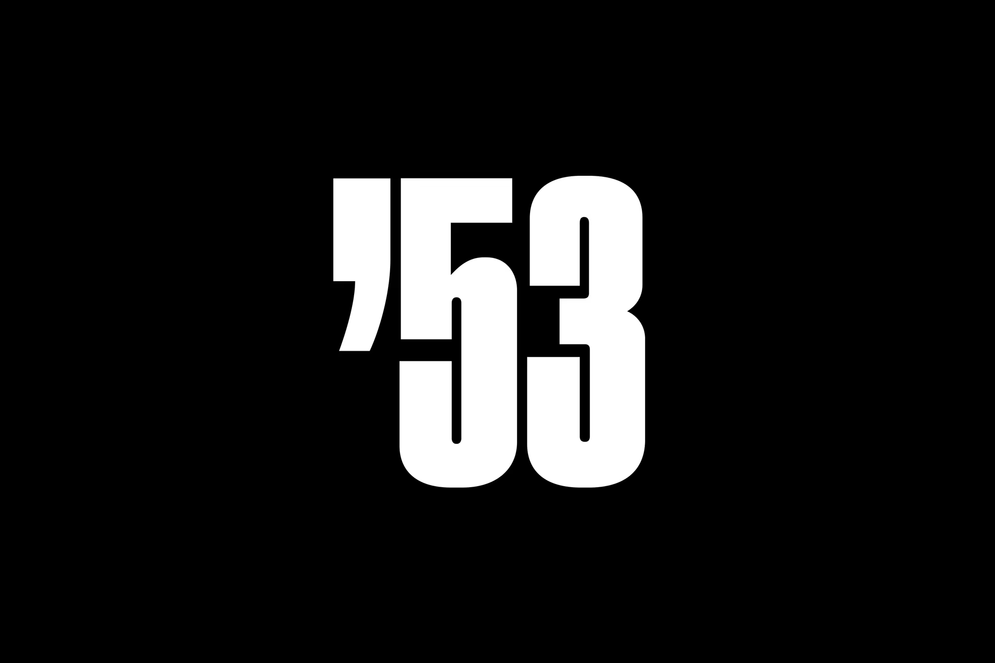
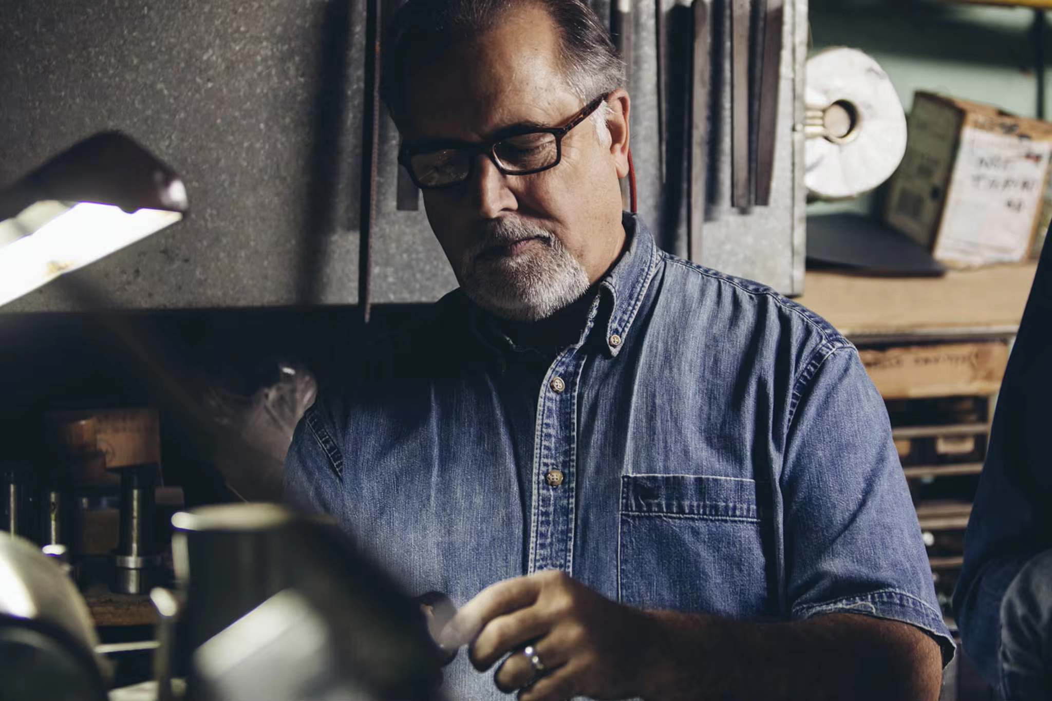
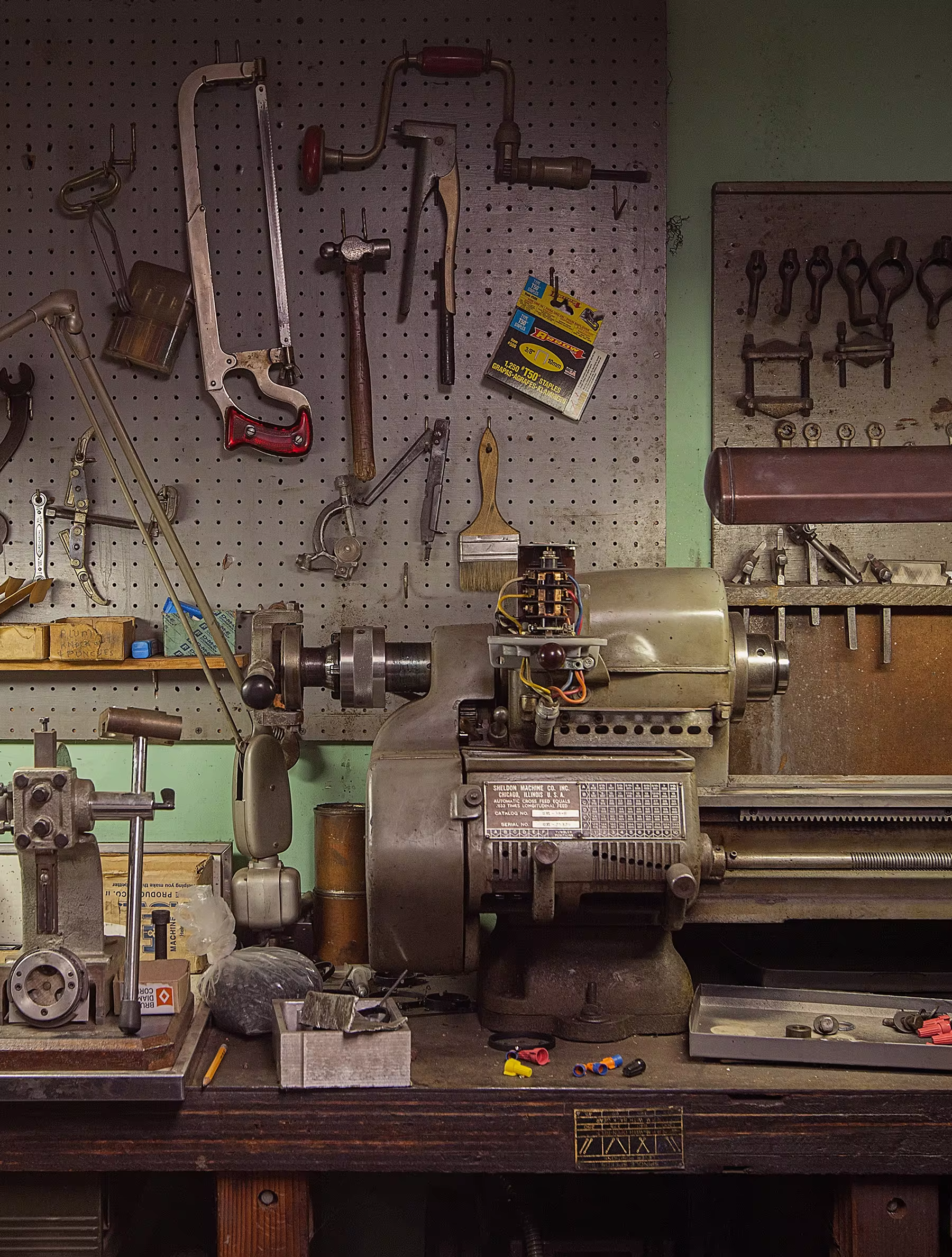
Since 1953, the Grado family has been hand making headphones, phono cartridges, amps, and accessories out of a narrow townhouse in Brooklyn. Now in its third generation, Grado Labs continues to make the best headphones for the world’s most discerning ears. Historically, the Grado family has let the product speak for itself, but in 2018, they turned to High Tide to reinvigorate their visual identity and branded touchpoints.
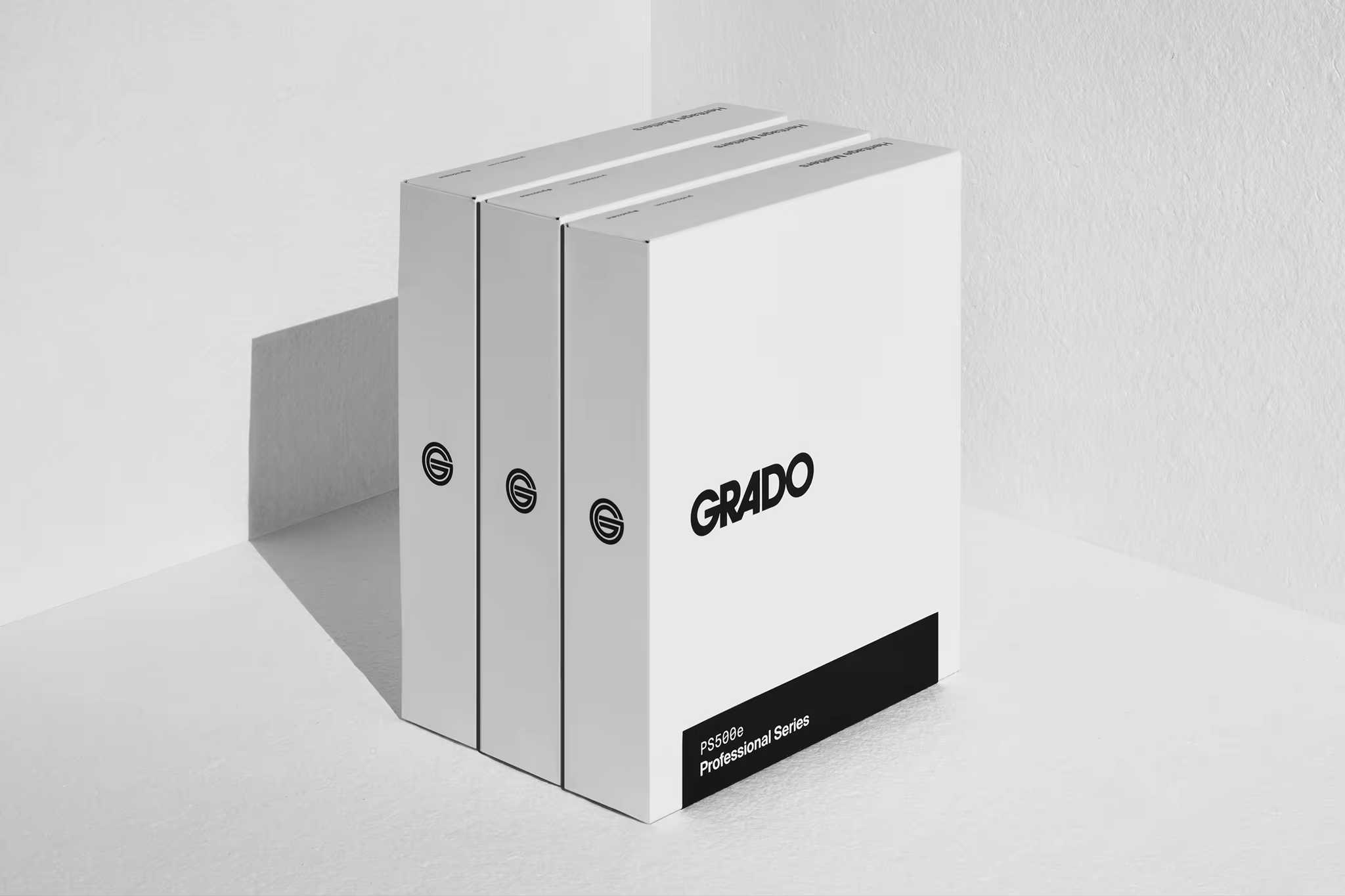
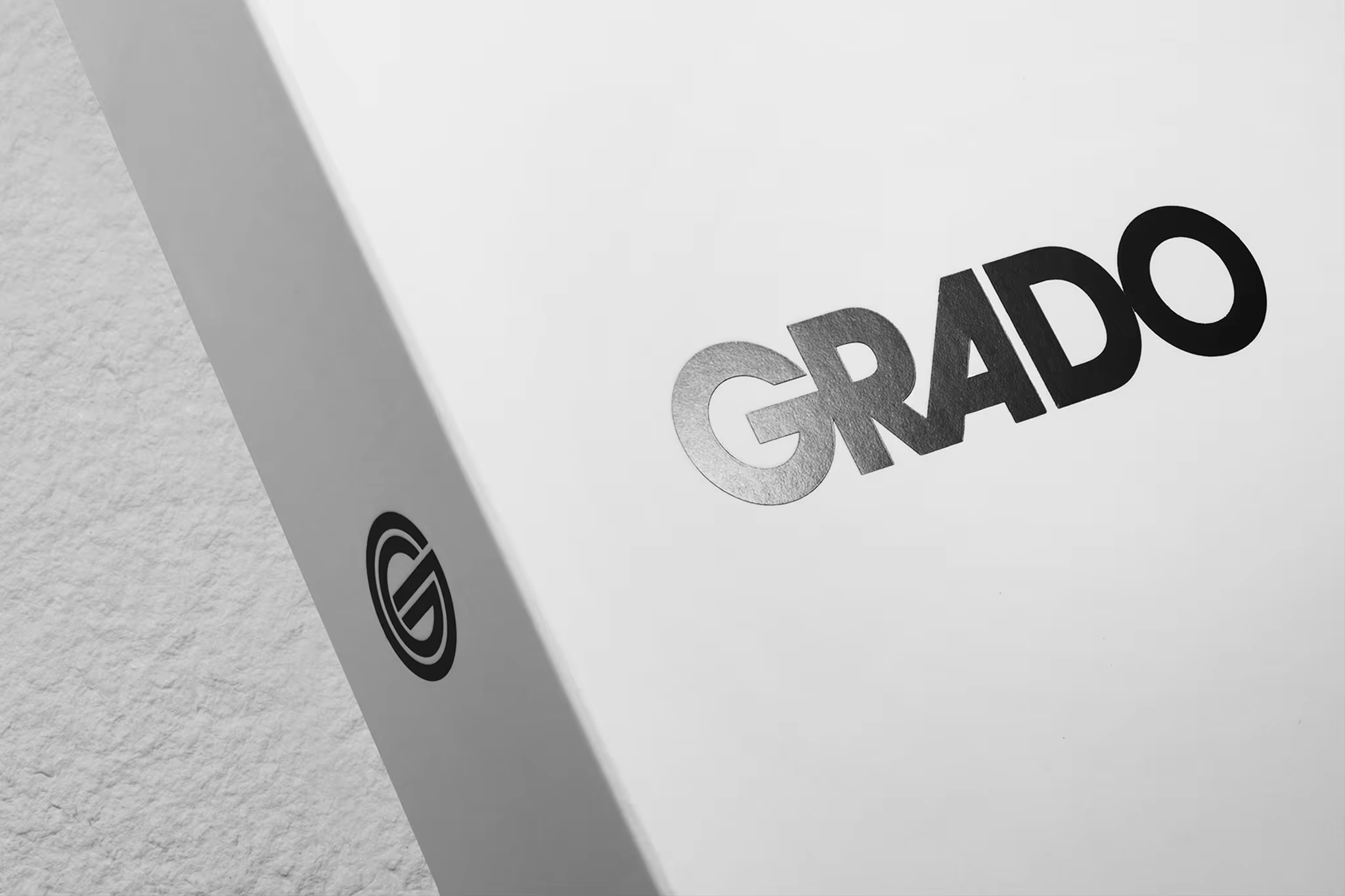
Drawing our inspiration from the timeless simplicity of the headphone designs themselves, we were guided by a mid-century aesthetic that seems just as at home today as it would have in a 60’s recording studio — using only the essential elements.

The original Grado logo, created during the 70’s, deployed Herb Lubalin’s iconic ITC Avant Garde Gothic typeface. To impart a more modern feel, we added slight customizations to the type and played with how the letters connect to each other, just as the creator had intended. The final version pays homage to both the original Grado mark and Lubalin’s idiosyncratic letterforms, yet is re-interpreted and optimized for the modern consumer.
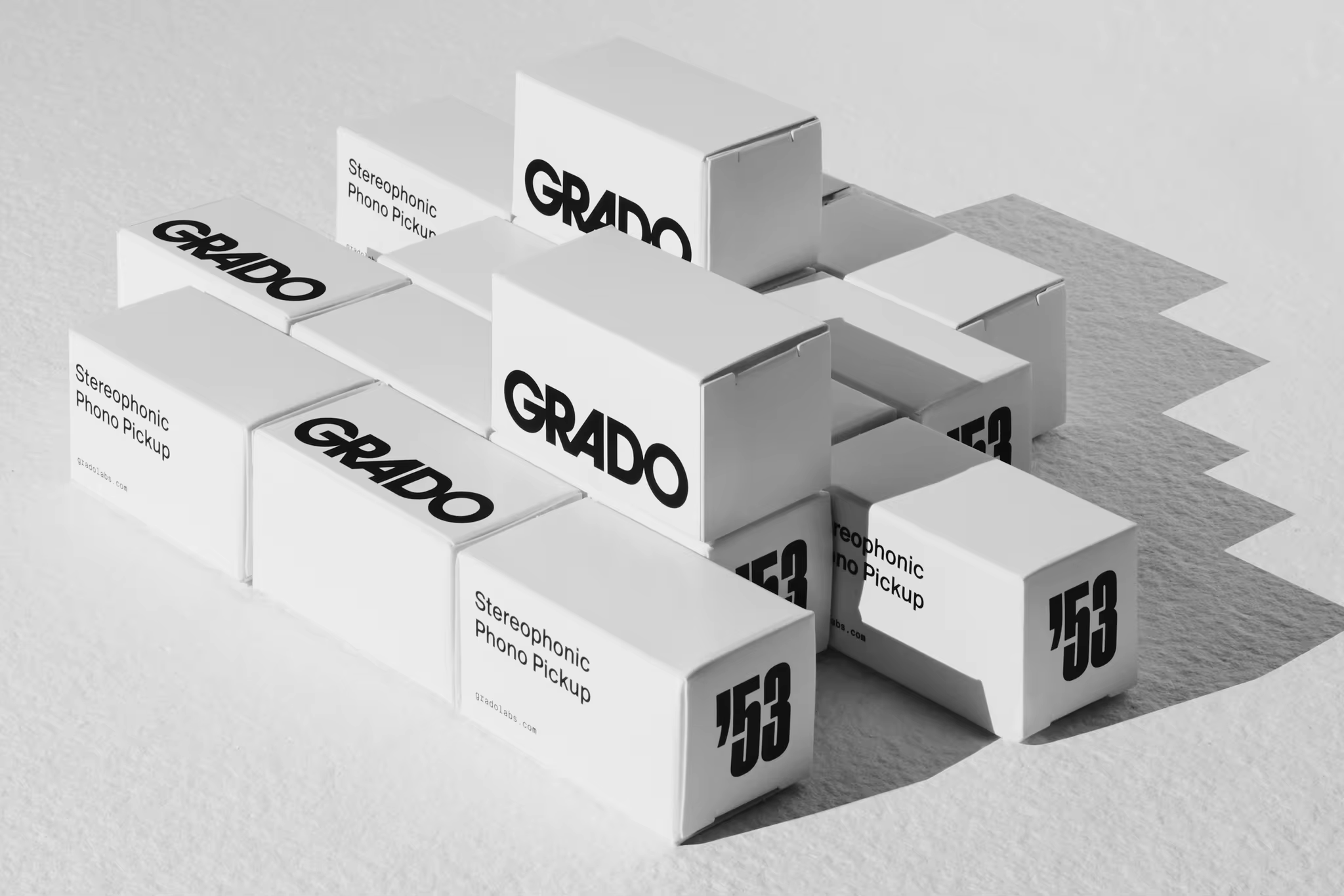
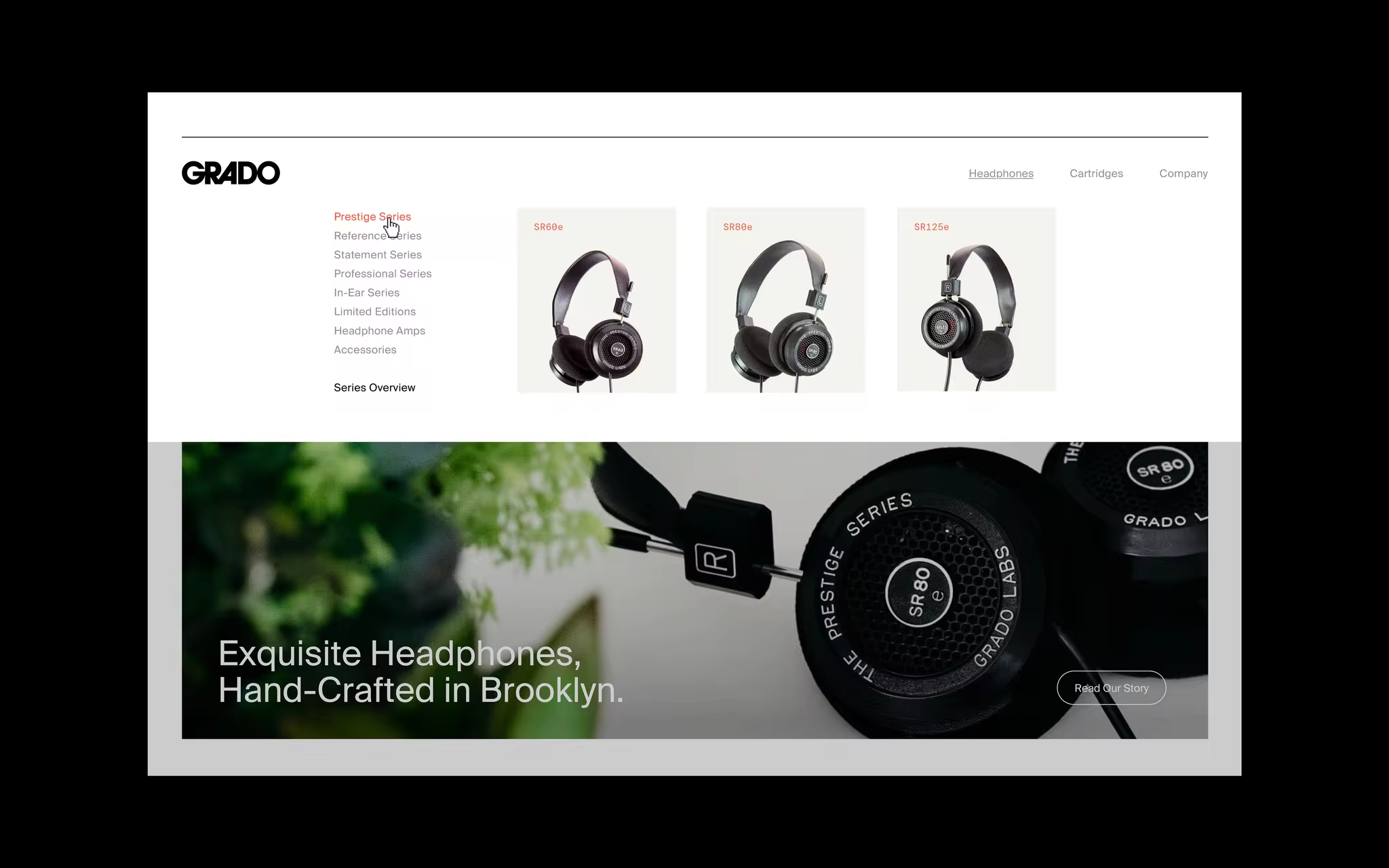
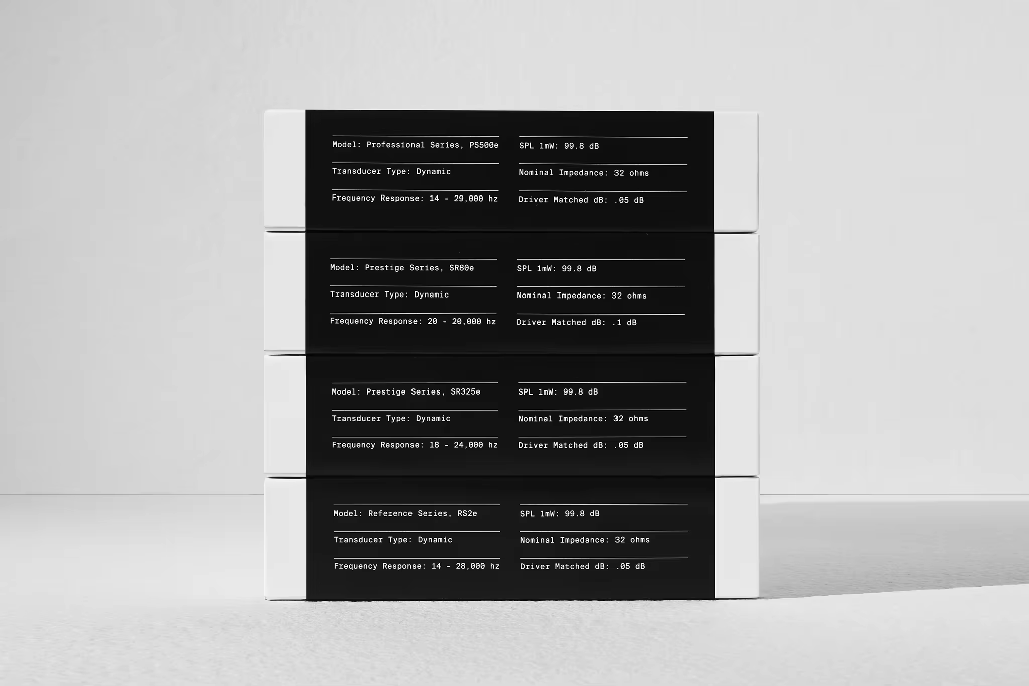
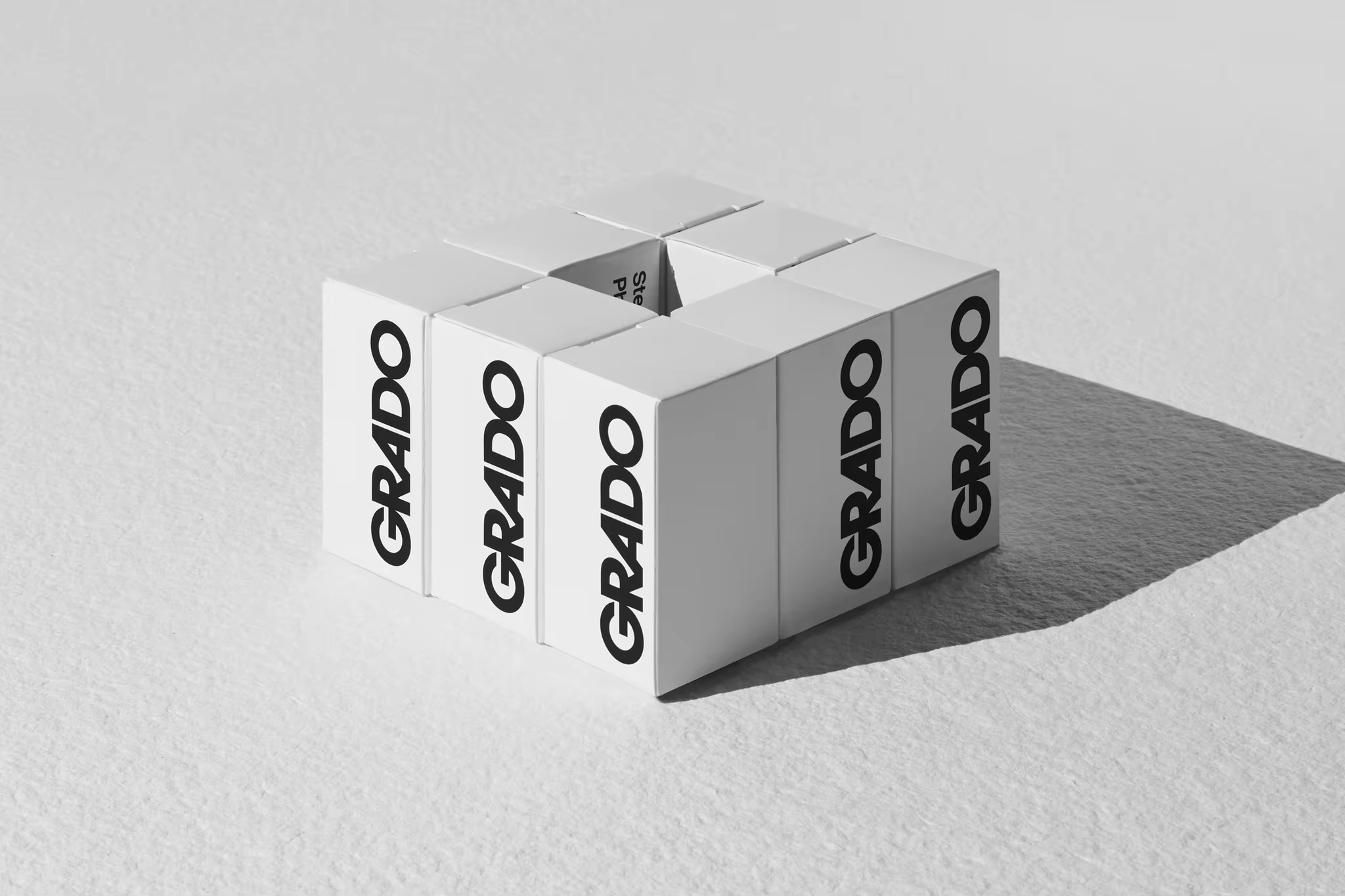
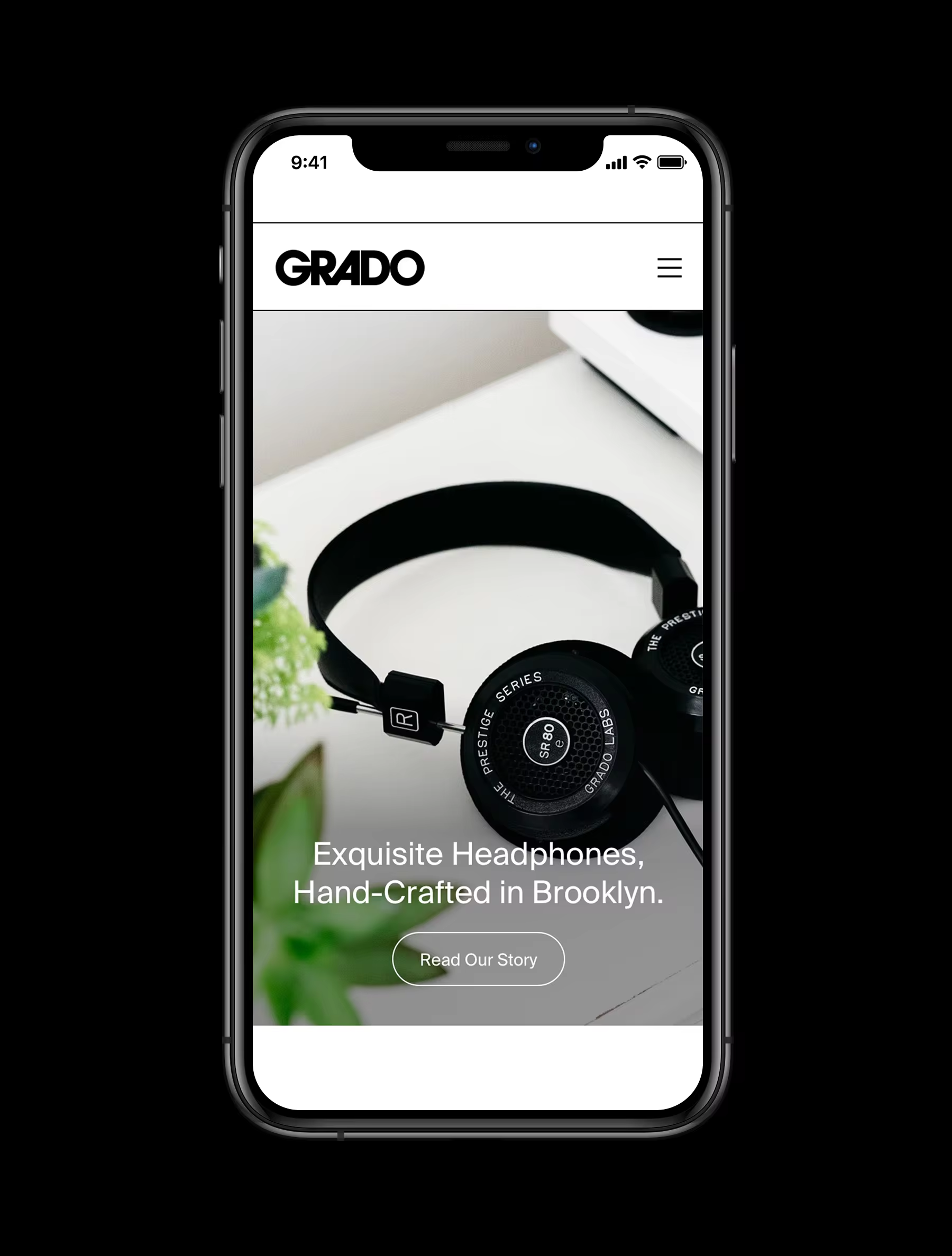
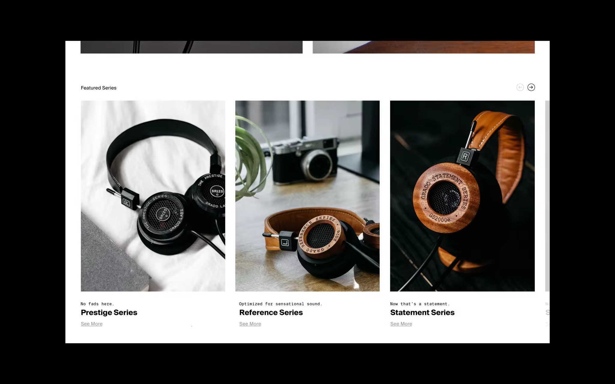
Aiming to honor the 65 years spent perfecting the Grado sound, we worked across both Grado’s physical and digital presence. We translated the identity to a fully responsive website with an animated icon, created a new iconography system to communicate the more technical aspects of the products, compiled a robust type system, and produced exquisite packaging to match the crisp clear sound.
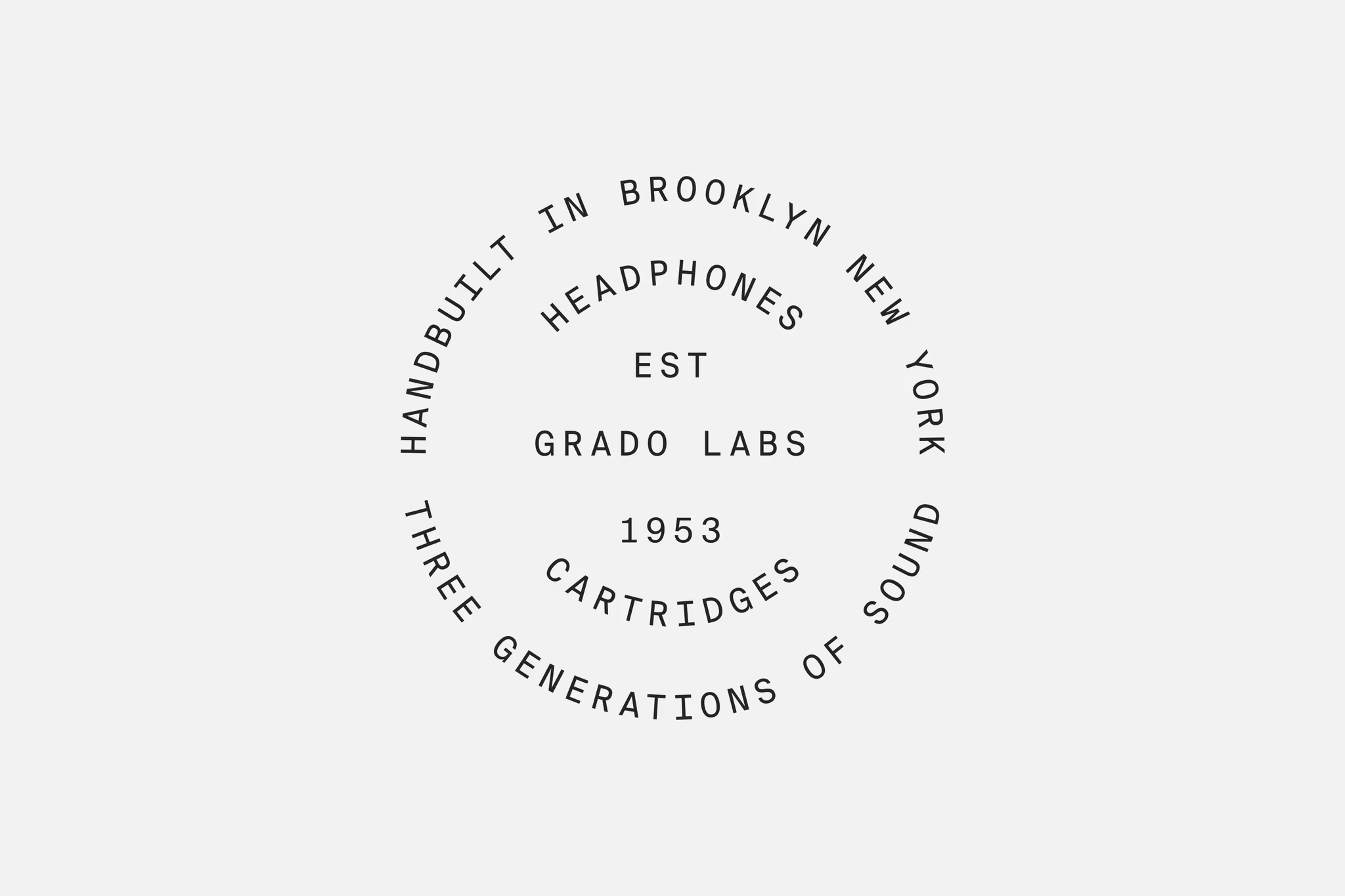
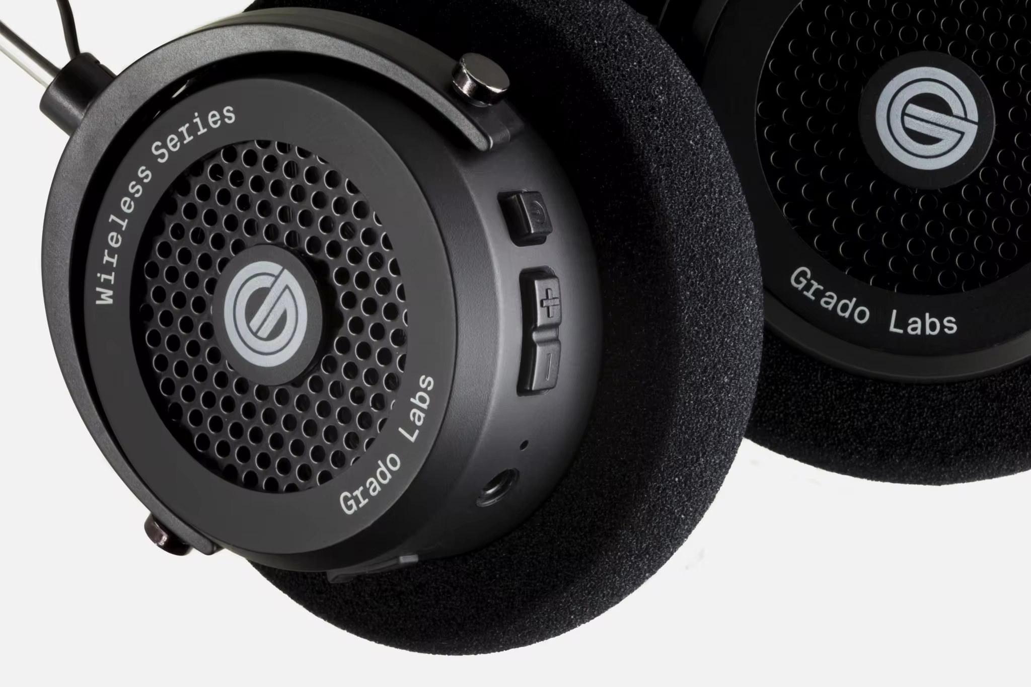
This all leads to a modern identity that pays homage to Grado’s well-heard past, but will hold up for future generations to come.
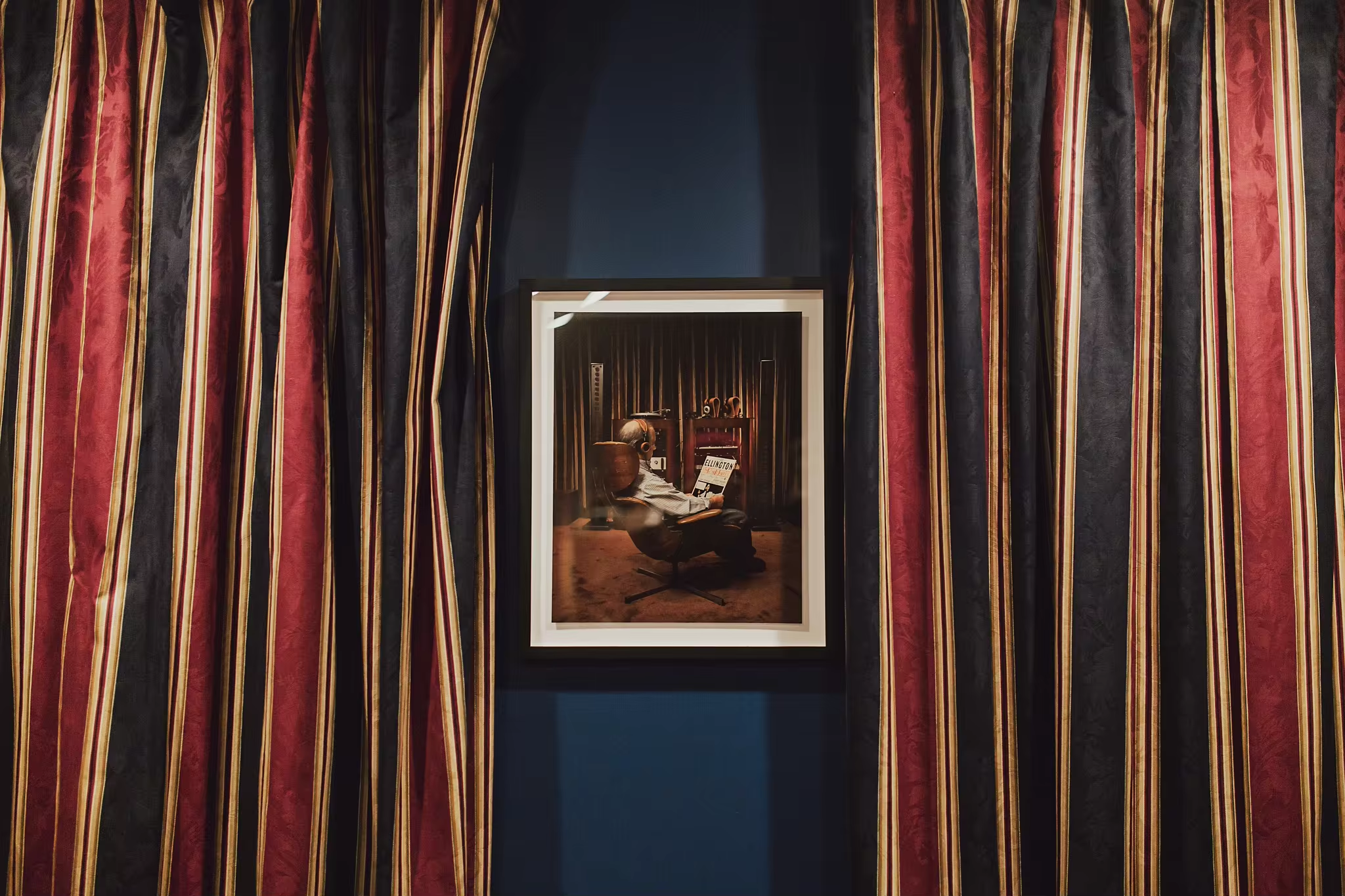
Photography: Kevin Kunstadt & Jonathan Grado
Grado