Cristina Prats Arquitecta | Identity

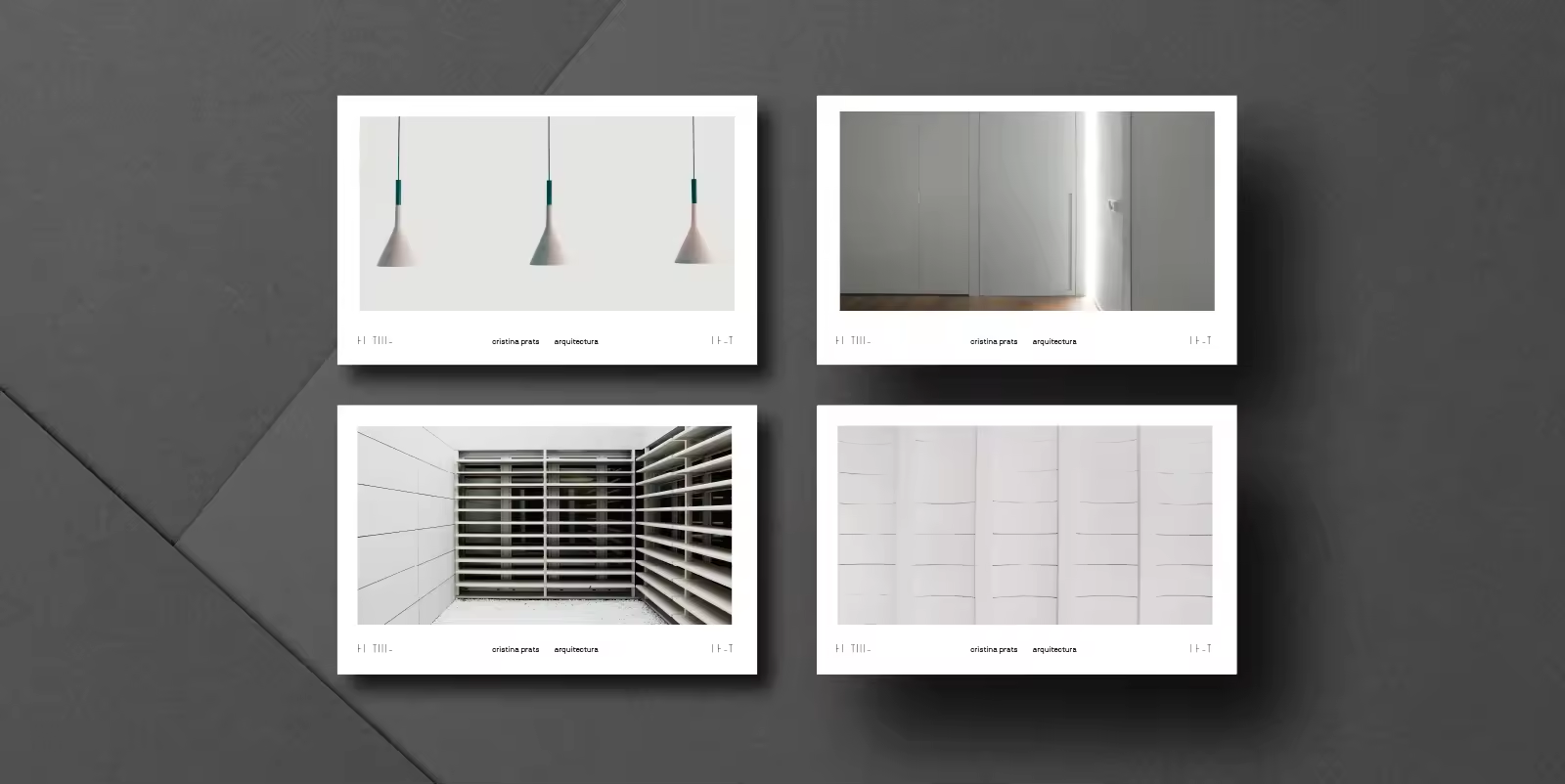
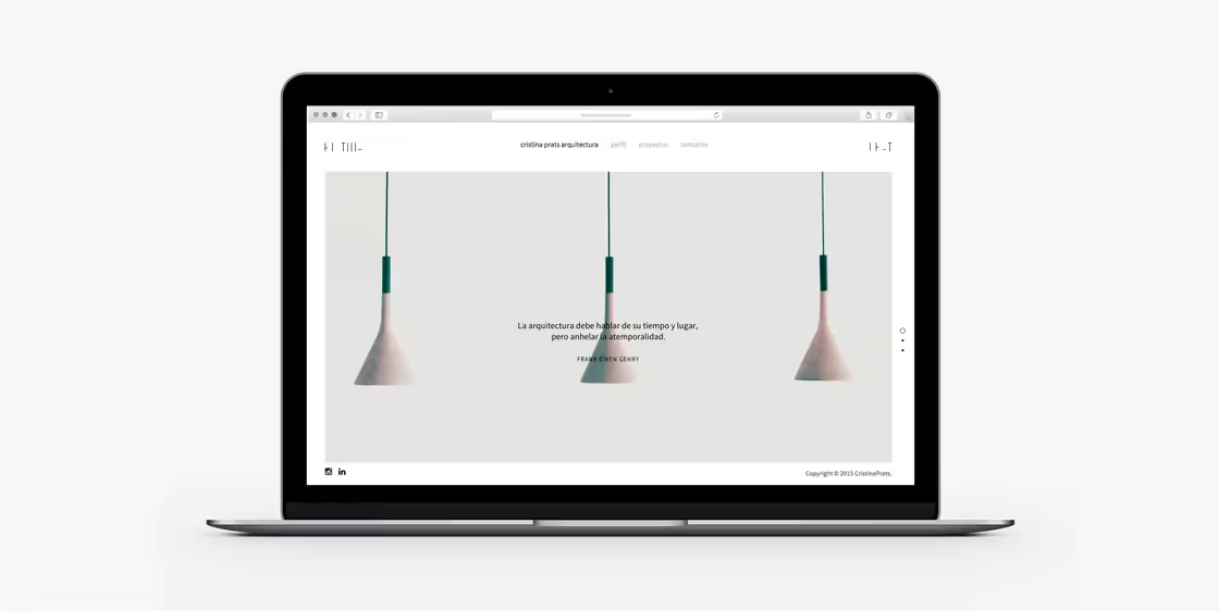
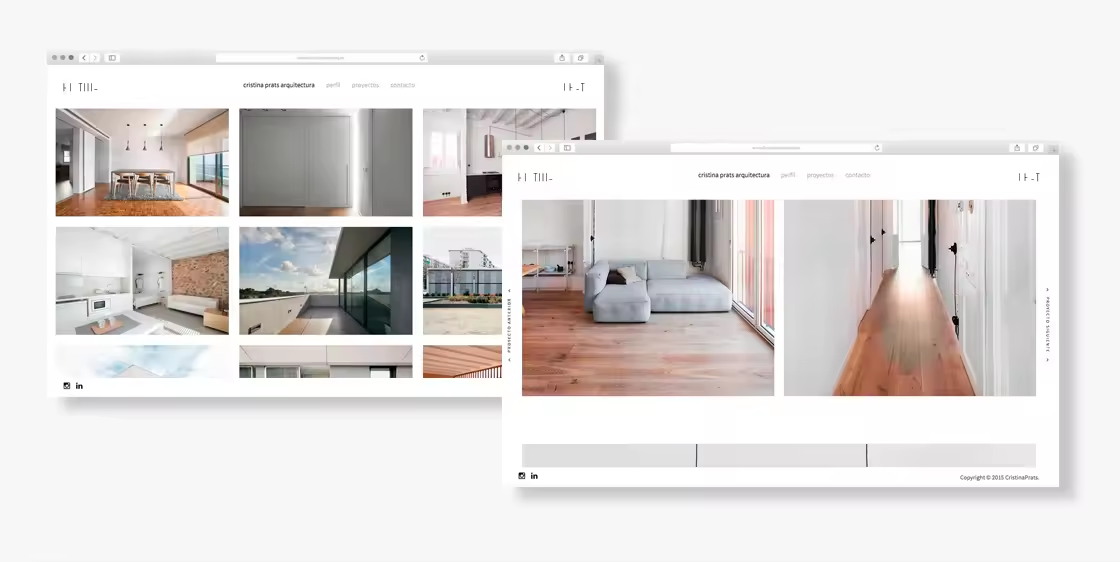
Cristina Prats Arquitectura make bold architectural work, often using horizontal and vertical grids along with light rays. They came to us to help develop a visual identity for their logo which reflected their unique style.
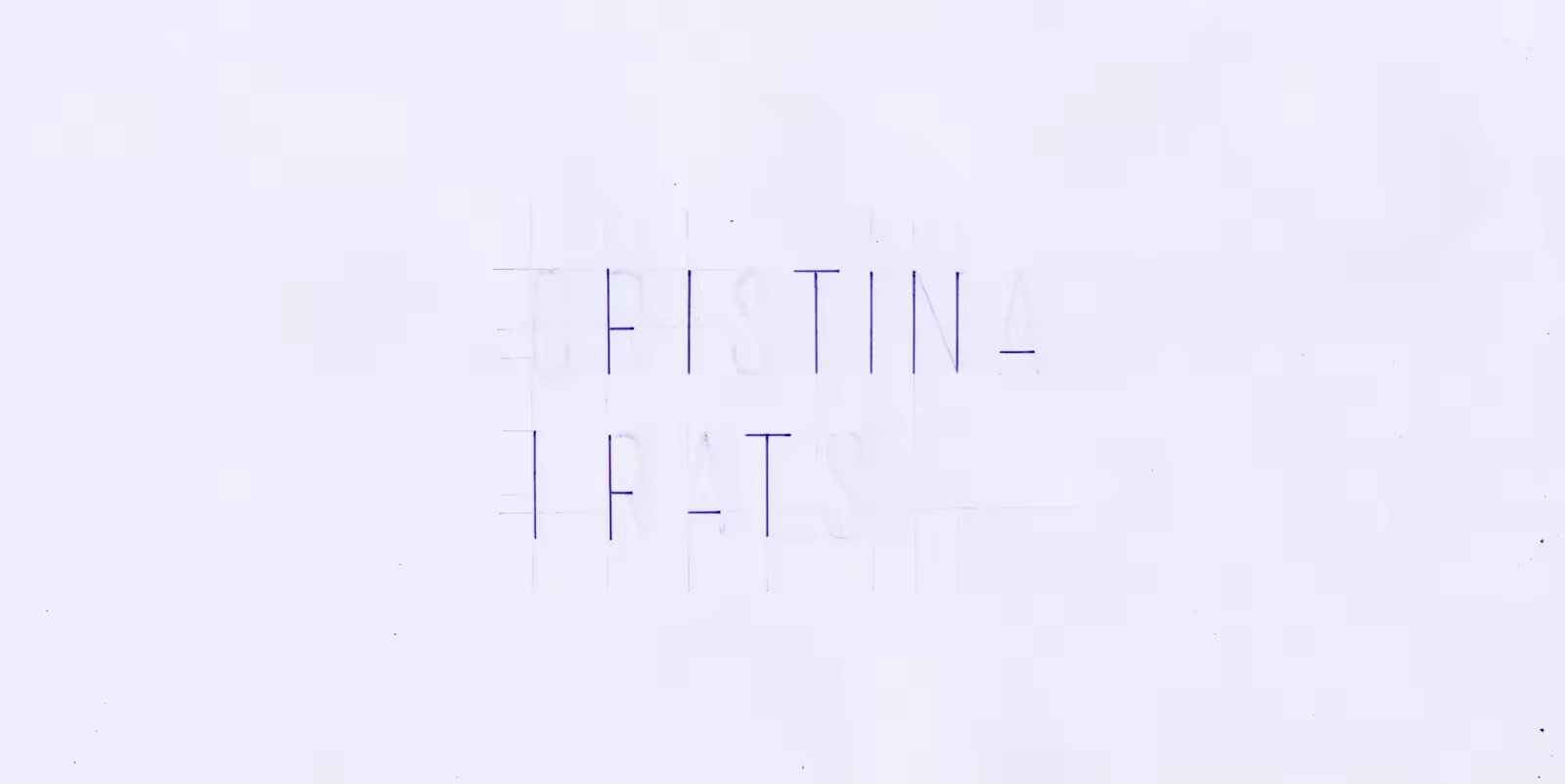
Inspired by the studio’s work, we developed a logo using only the vertical and horizontal lines overlaying of the letters of Cristina Prats’ name. We wanted this to look like it was another architectural piece of her work. A window frame that lets light into a room.
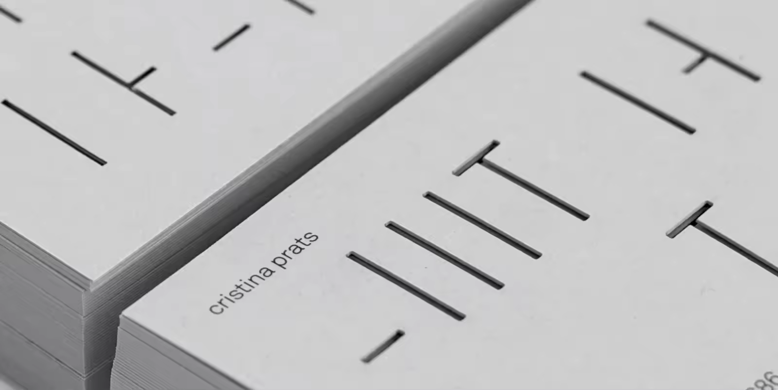
For the Cristina Prats Arquitectura business cards we decided to die-cut the logo in order to better communicate the subtlety of the studio’s work. The result is a business card which appears like a wall with slits where light can shine through, inviting their clients to project three-dimensional spaces.
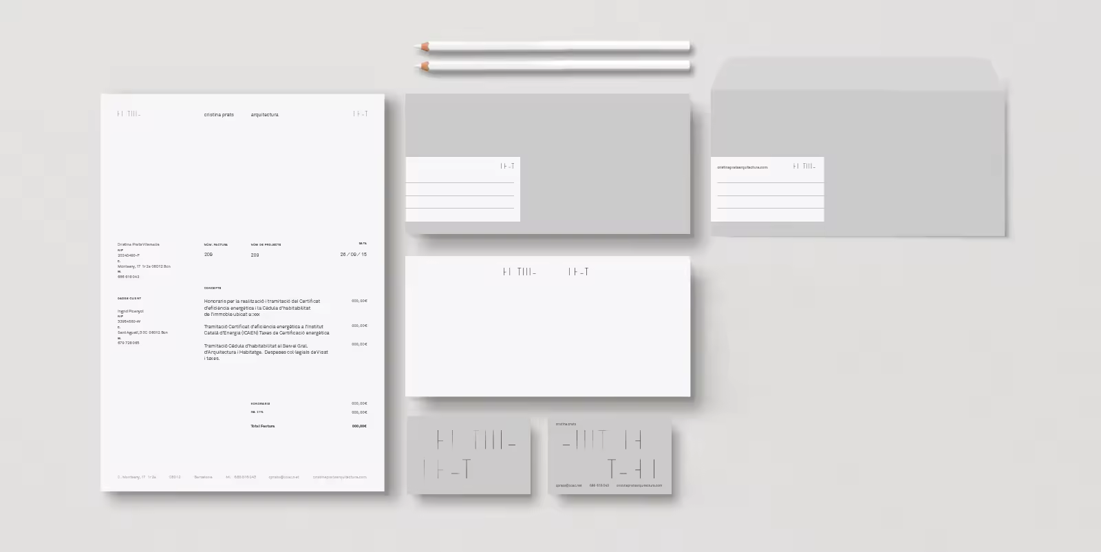
The design of the logo and identity—the stylised structures ‘Cristina’ and ‘Prats’—provide the chance to be indefinitely combined. The design is completed with a sophisticated neutral colour palette. We feel that the design effectively reflects the bold and radical work the Cristina Prats Arquitectura creates.

Cristina Prats Arquitecta | Identity