Ricolta Restaurant, Brand Identity and Packaging
ricolta
Brand Identity and Packaging
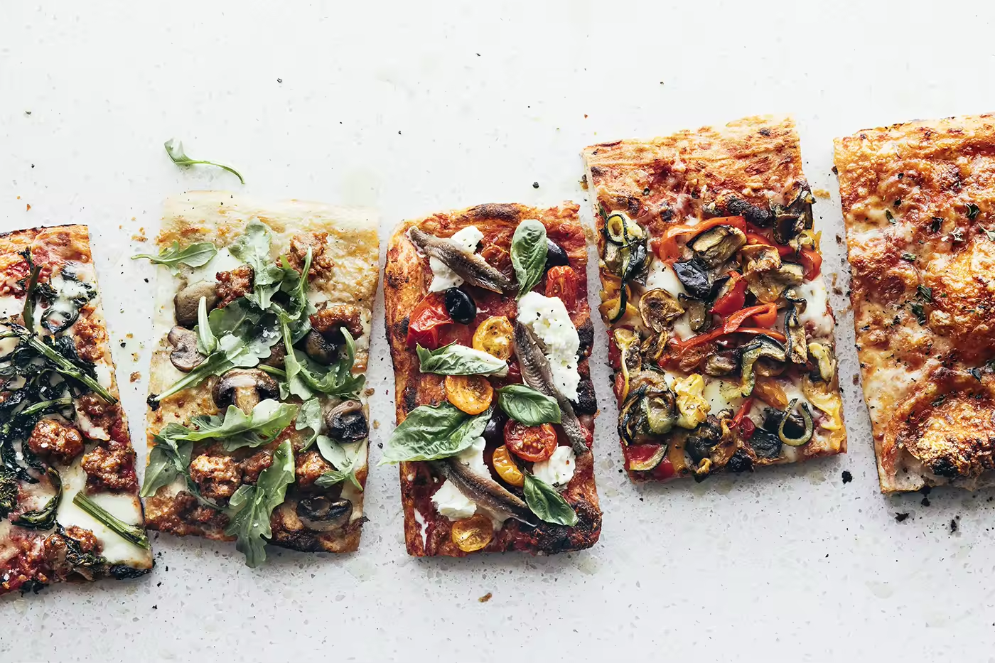
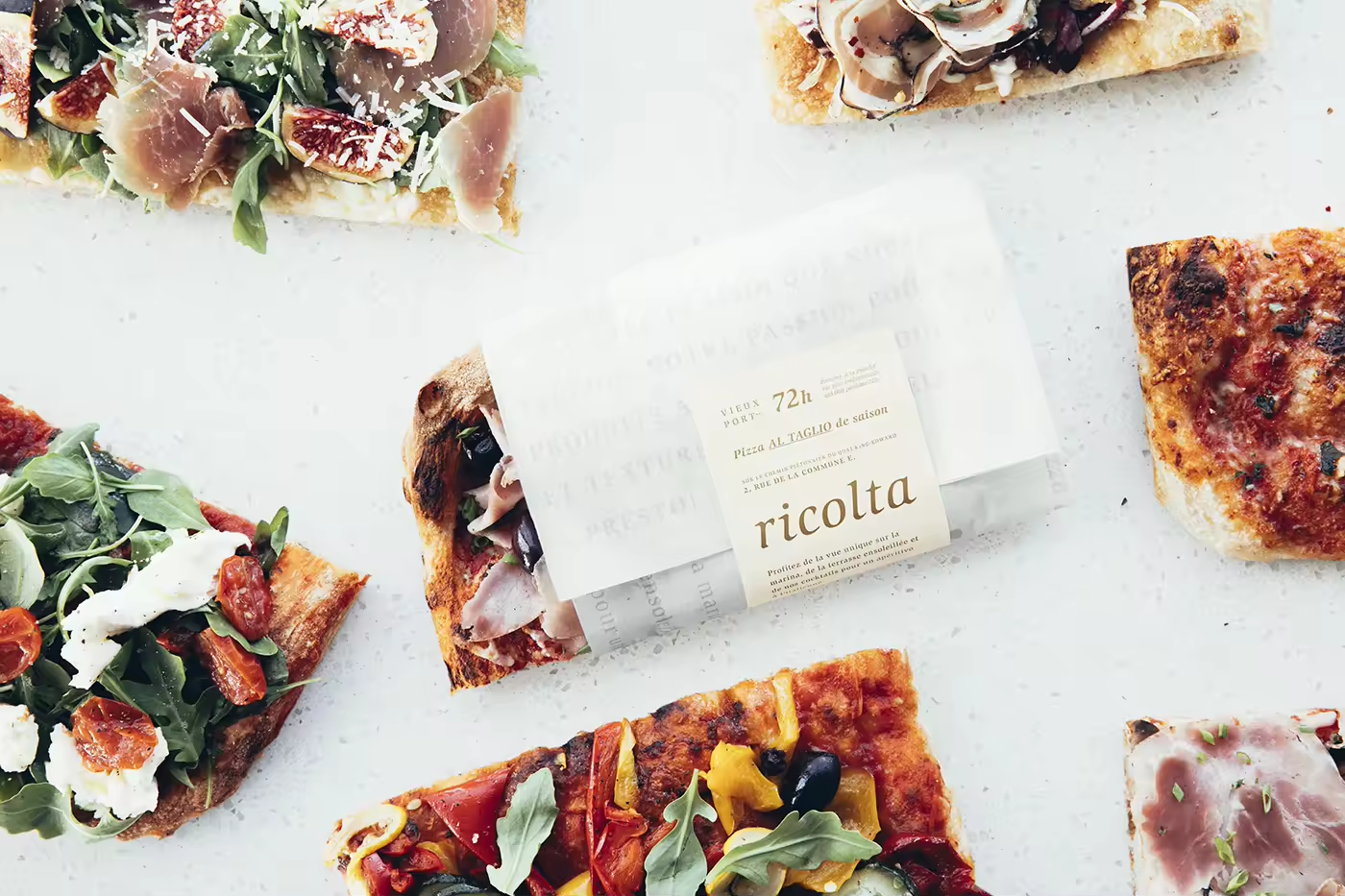
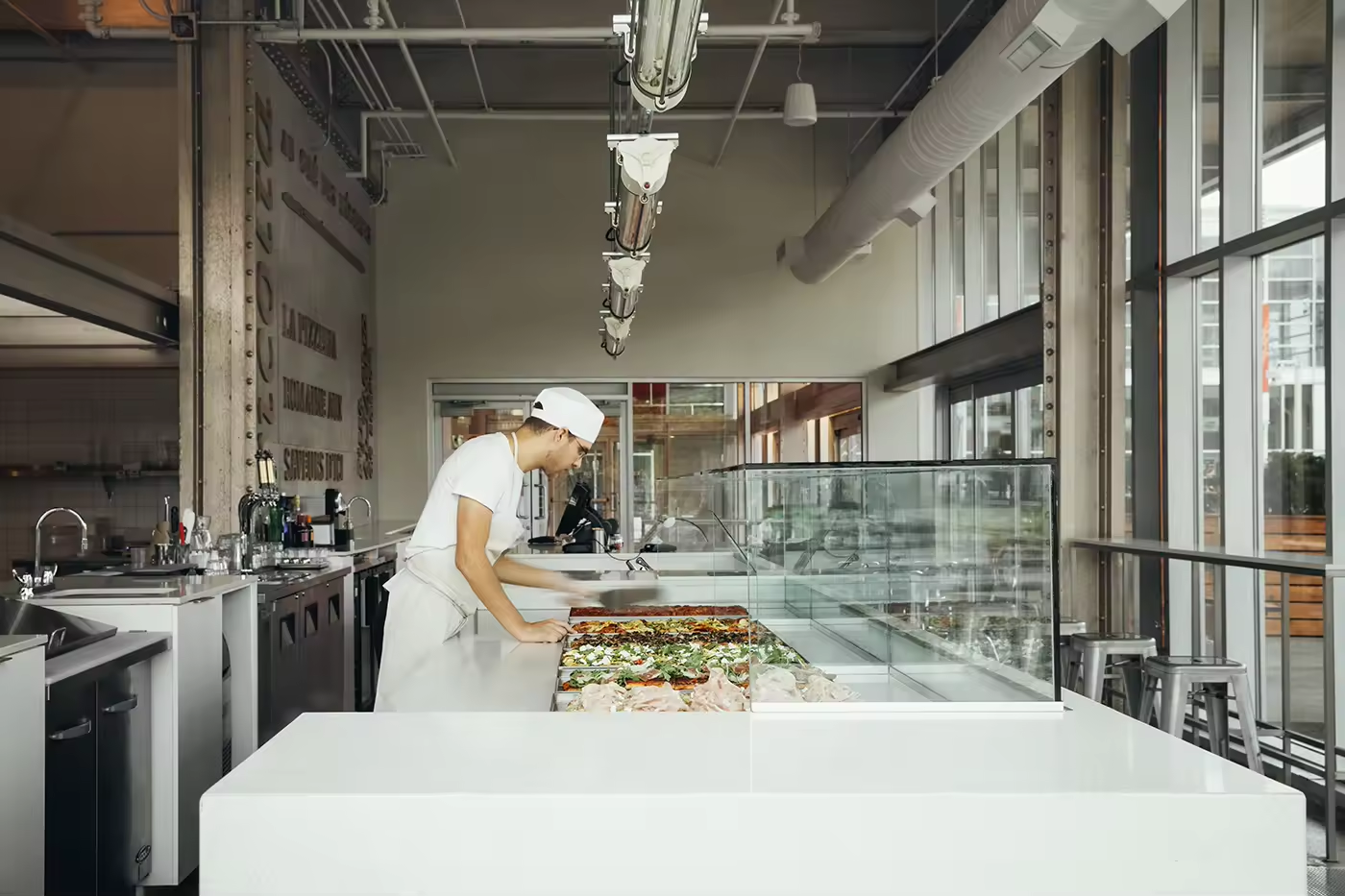
The real pizza al taglio (“by the slice”) has made its official entry into Montréal at Ricolta! This Roman-style pizza is famous for its 72-hour dough that results in a uniquely airy and crackly crust. After being garnished with seasonal ingredients, the pizza is 80% baked before going into the display case. The baking process is completed just before serving. The result is an extremely high-quality pizza at an affordable price that is also perfect for take-out.
Since the objective of the brand identity was to present Ricolta as a new Montréal institution that is here to stay, we used uncluttered, timeless communication tools like the Slimbach font and the distinctive imagery of food photographer Virginie Gosselin.
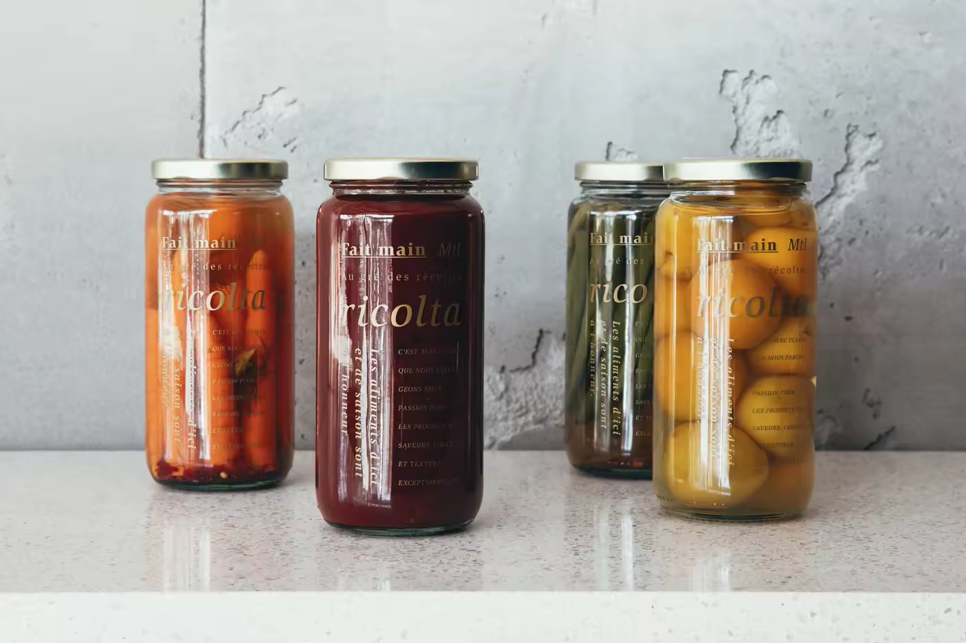
The message presents the offer’s appetite appeal, focusing on the farm-to-table concept. The graphic layout of the blocks of text were inspired by the pattern of rows of crops as seen from above. The copy is directly aimed at a foodie public, and the materials and raw, natural colours are a subtle evocation of the farm environment in an urban setting.
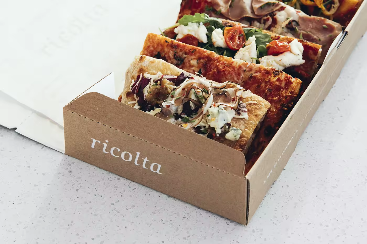
The new brand is also distinguished by its customized take-out packaging. Everywhere in the world, pizza al taglio is carted around in cumbersome generic pizza boxes that are square and flat. Ricolta’s new signature box is deeper and rectangular—and big enough to transport eight slices, with enough space for a salad container. The new recycled and recyclable box is truly multifunctional: take the cover off and you’ve got a serving tray.







Credits
Brand Strategy, Brand Identity, Art Direction, Naming and Copywriting: Rachel Lecompte and Gabriel Lefebvre, ethos
Photography: Virginie Gosselin
Programmation: Phil Malboeuf
Interior Design: Appareil Architecture
Apron and tote: St.Denis
Photography: Virginie Gosselin
Programmation: Phil Malboeuf
Interior Design: Appareil Architecture
Apron and tote: St.Denis
Pizza box advisor: Patrick Leboeuf, Matrice Montréal Dies
Thank you.
FOLLOW US ON INSTAGRAM
Ricolta Restaurant, Brand Identity and Packaging