HOGENT – rebranding
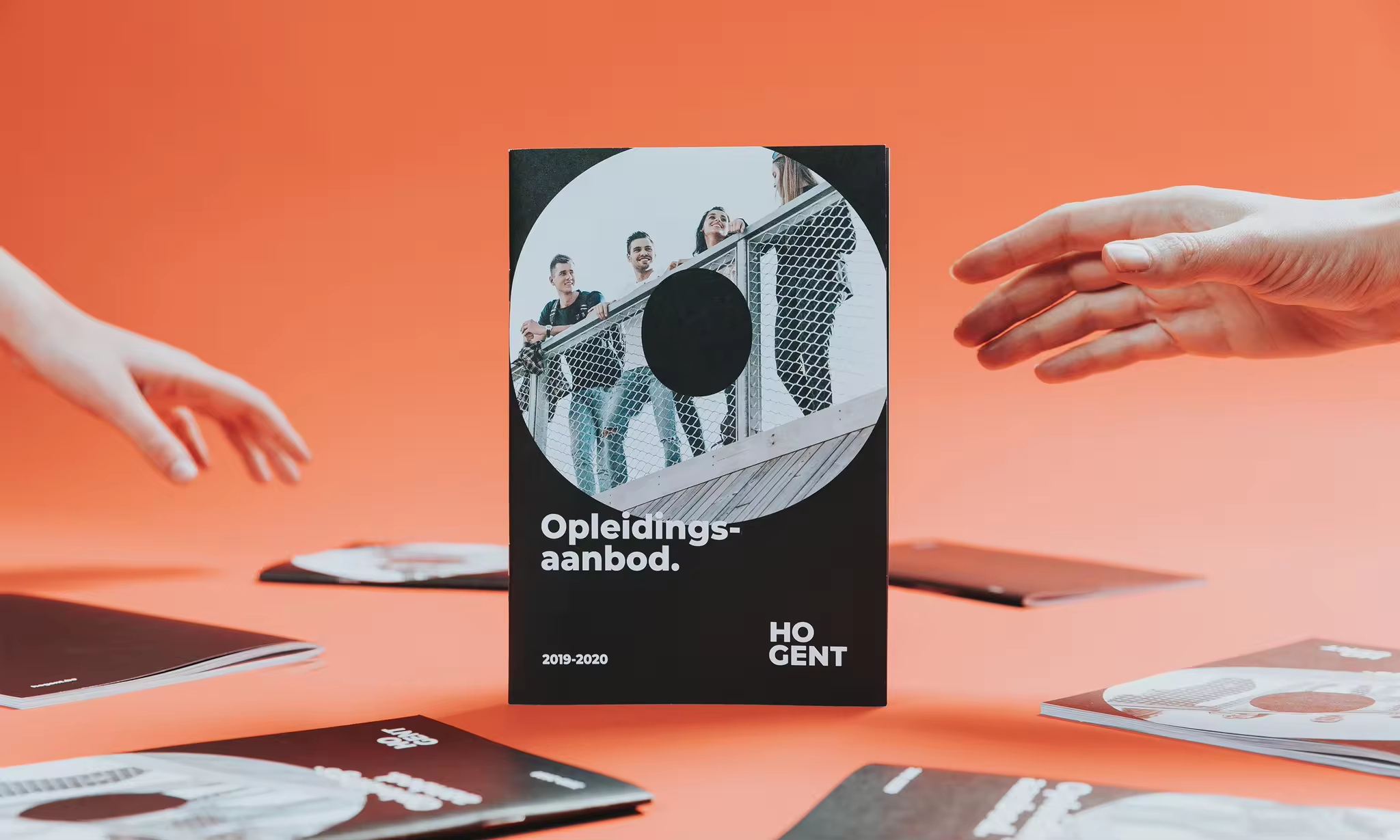
a special type of
branding for HOGENT.
Hogeschool Gent, also known as HOGENT, is a college for students with character. Students who wish to make their own mark on society. Over the academic years, HOGENT has become an extensive organisation in which, each year, 13,000 students develop their futures.
There is no denying the fact that the evolutionary growth of HOGENT caused a natural proliferation of communication styles and types across the many faculties, courses and departments. The existing house style felt dated and was no longer aligned with its key audience: the students. It was time for some expert refinement of HOGENT’s identity with a complete rebranding.
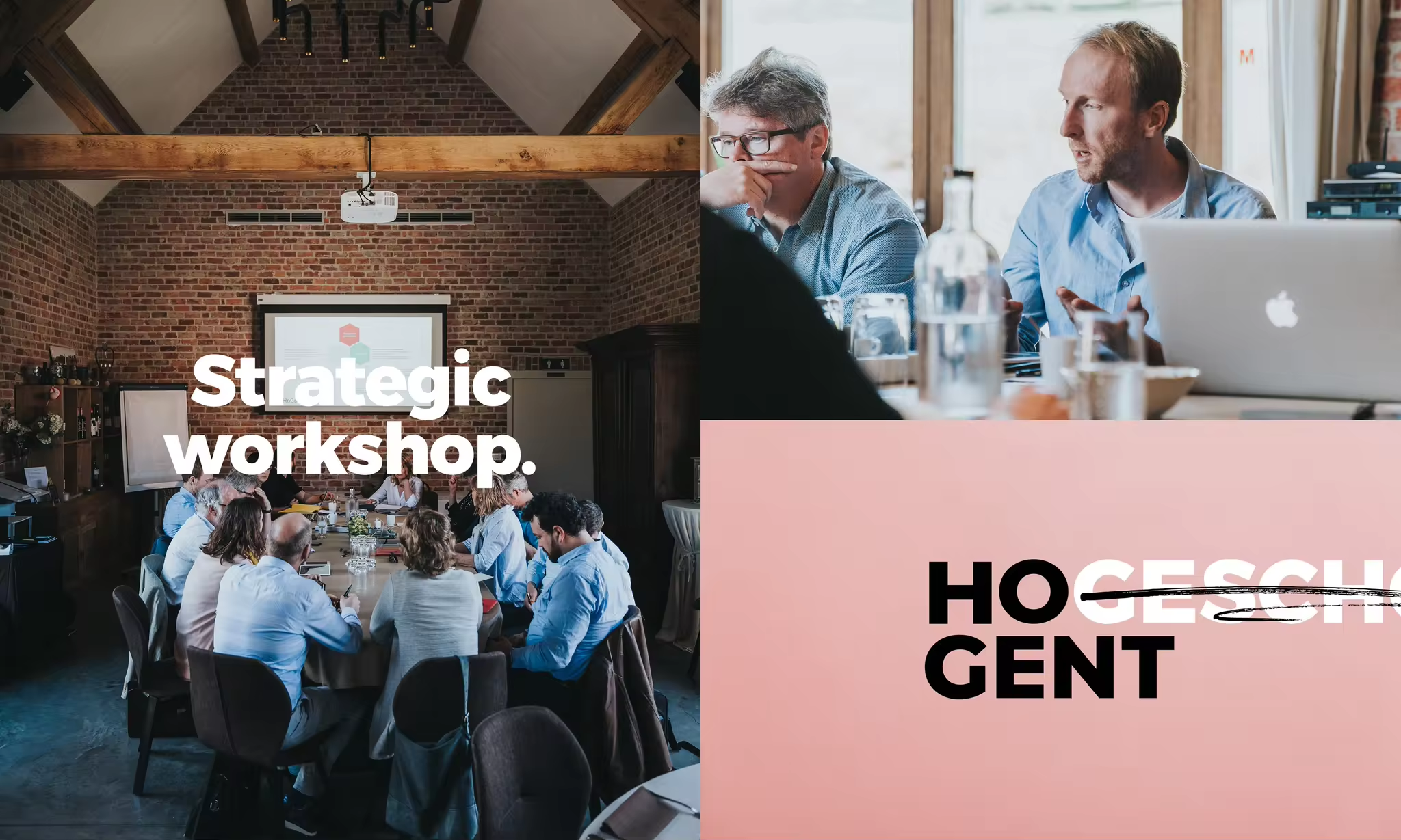

one clear
brand concept.
As a branding agency we were entrusted with the task of challenging the organisation both creatively and strategically. To collaborate, as a neutral party, on the development of a single brand identity by critically challenging HOGENT to consider itself from different angles and to make bold choices where necessary.
We began by organising an intensive strategic preliminary phase to create the brand foundations and identify all touchpoints. The goal was to state clear brand values and a clear brand promise as the basis for one powerful brand concept. HOGENT was reduced to its purest form and individual character. Character quite literally.
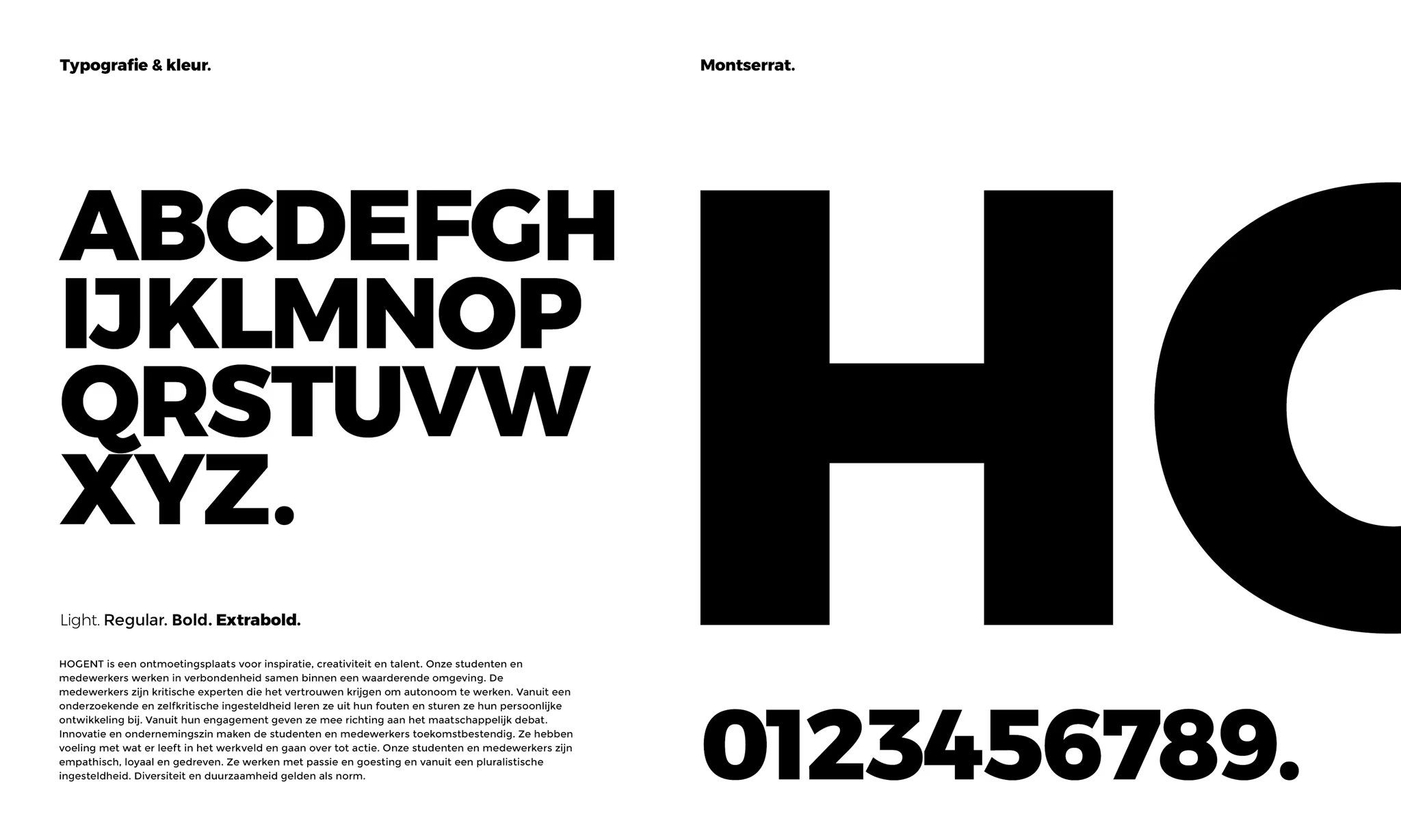
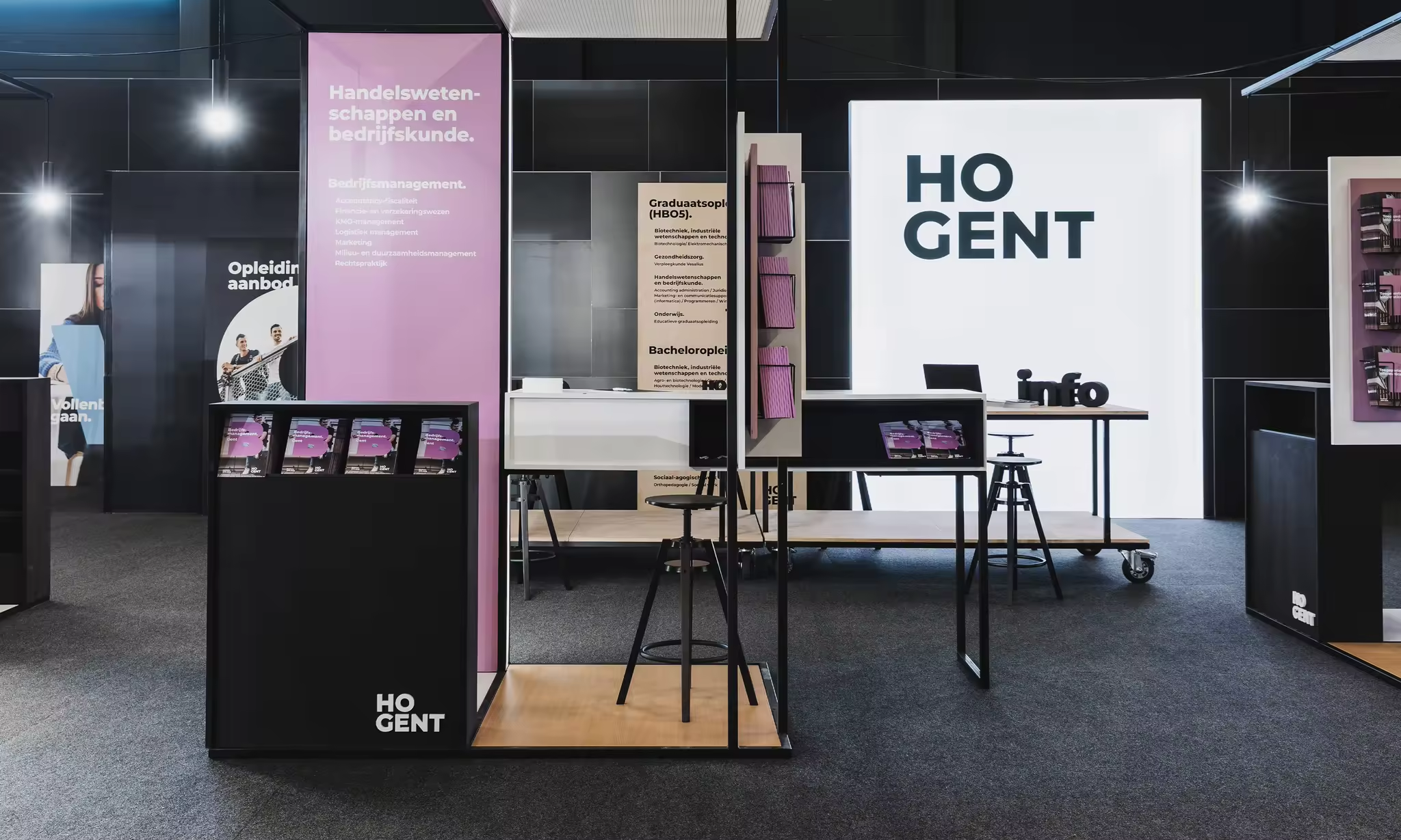
characters create
the brand framework.
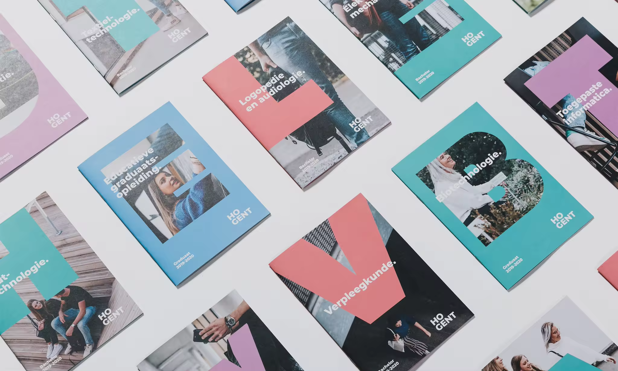
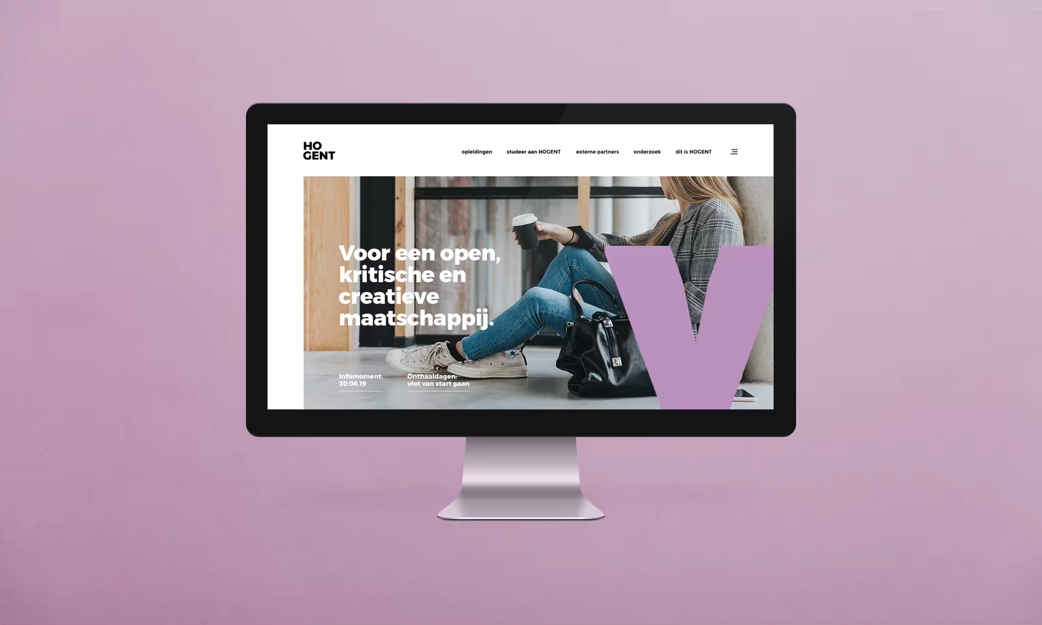
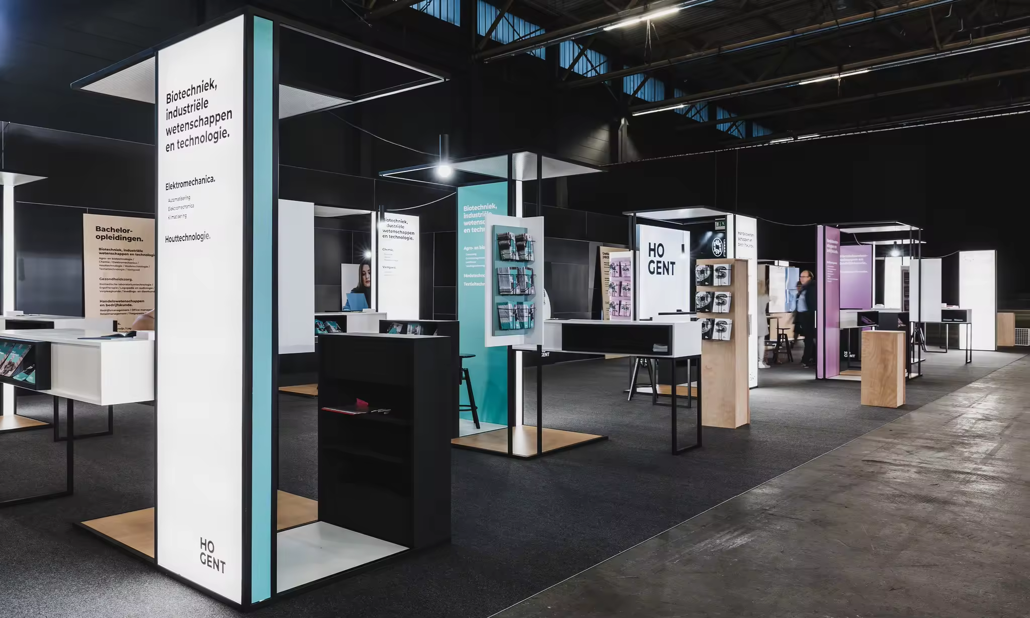
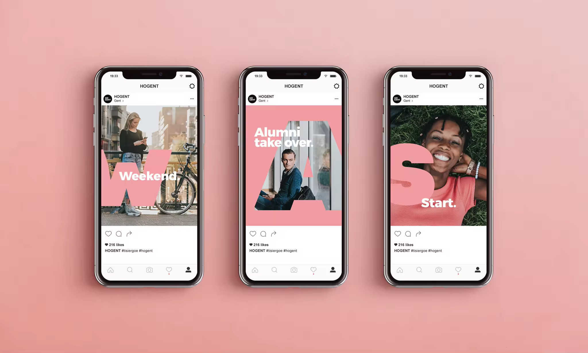
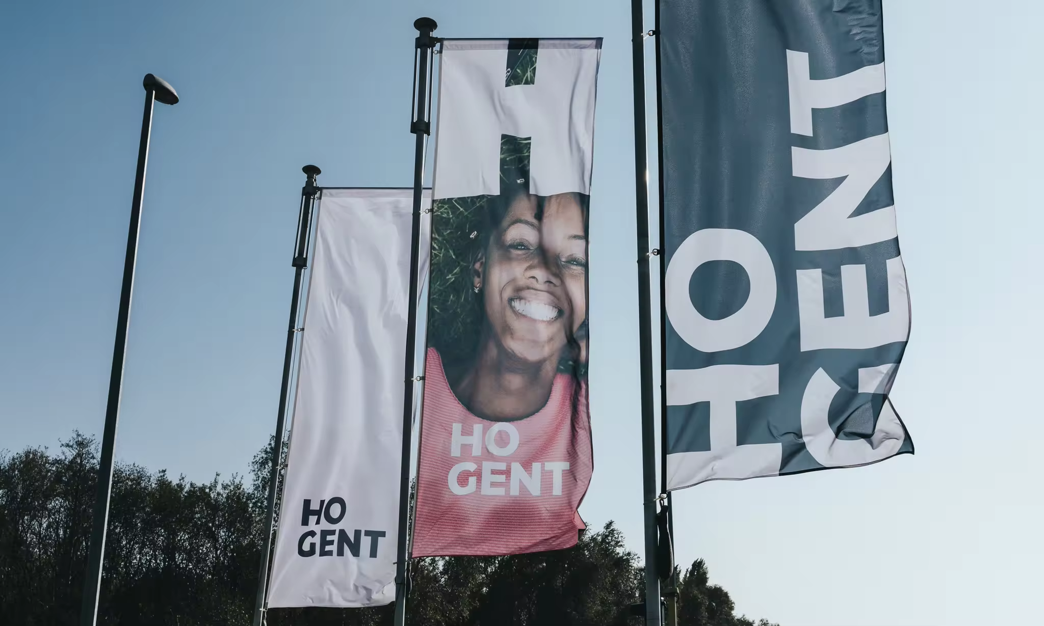
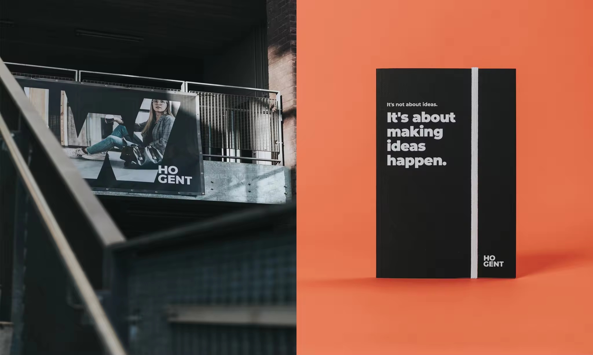
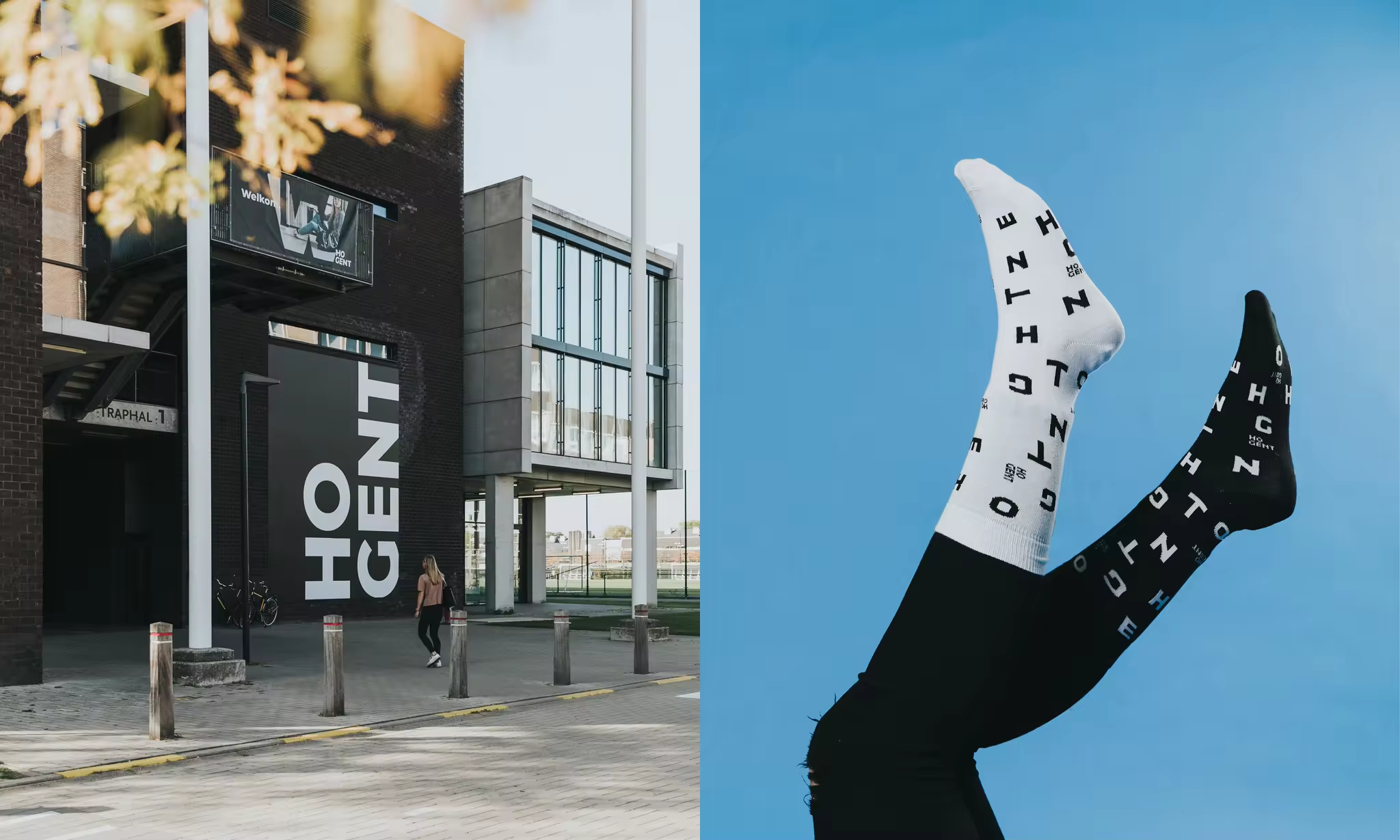
Powerful typography plays the starring role in the new visual identity of HOGENT. The letters represent the graphic building blocks of the brand concept. These offer a vision of the school, society and the multifaceted world of its students. They form the heart of the brand framework that can be applied in every context. They exude simplicity, never detracting from the impact of the message.
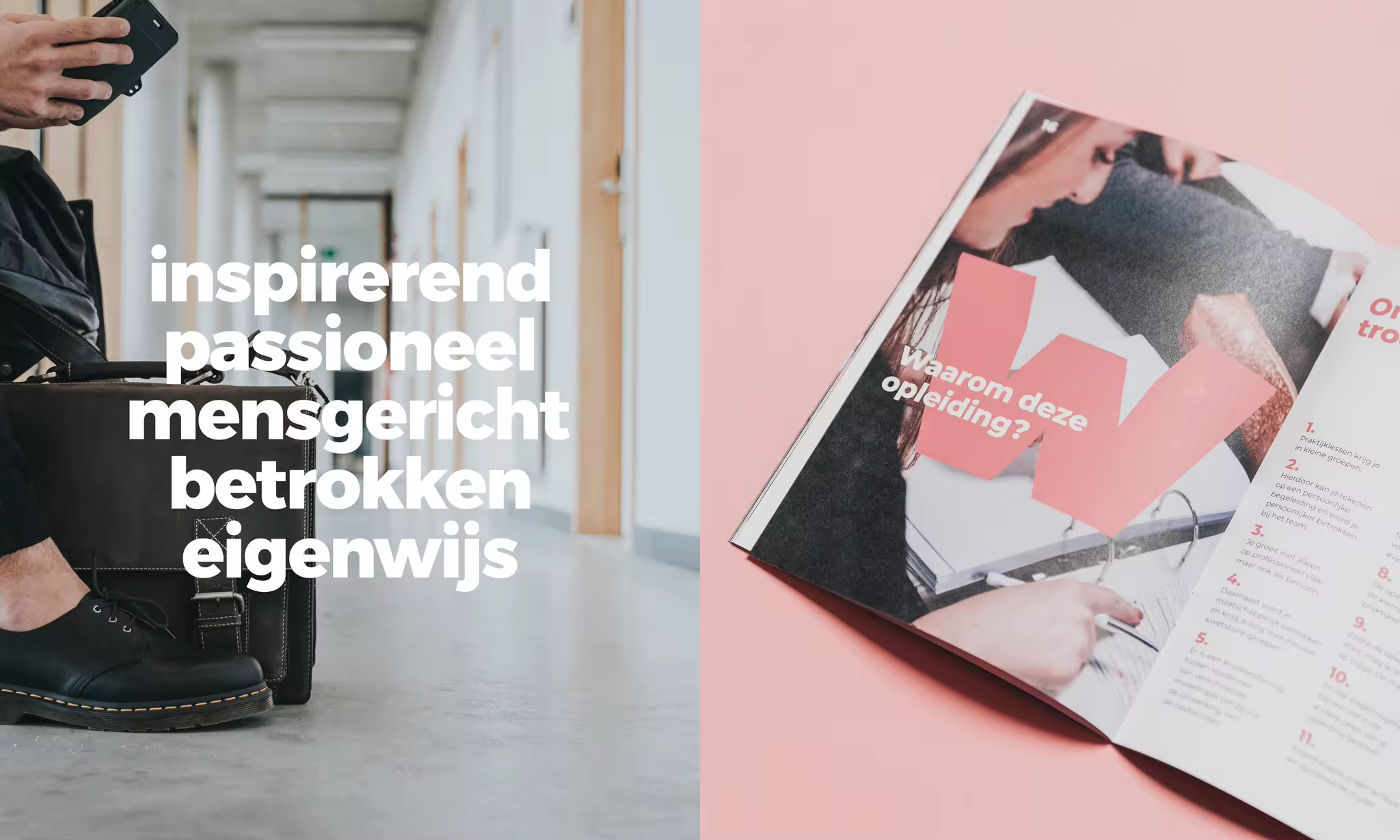
Of all the different companies and organisations with whom we have enjoyed working, few have had such an influence on society as HOGENT. ‘People make the difference’, during their studies and particularly afterwards, in the work environment.
Therefore, the HOGENT brand movie, a production made by 87seconds, also portrays people beyond the school walls. A diverse group of students, graduates and employees, all keen to go all the way!

colour & diversity
make the difference.
Life at HOGENT is a colourful affair. It is where you are encouraged to stop thinking in terms of black and white and to develop a strong identity of your own. ‘A colouring book with plenty of room for creativity‘ was something we already heard in the brand movie.
The colours used in the visual identity are also intended to enliven all facets of the brand. These colours are linked to the basic typographical elements in order to establish a system from which all communication channels in all their diversity can flow.
from environment
to image style.
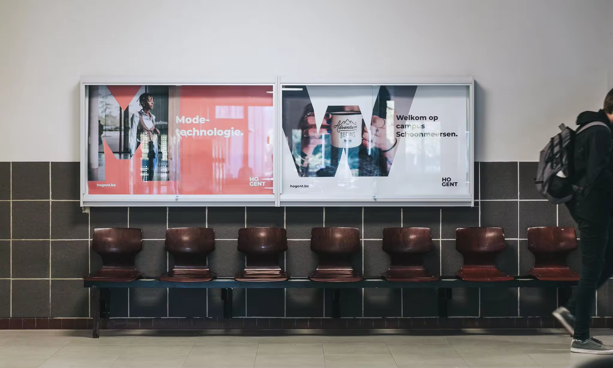
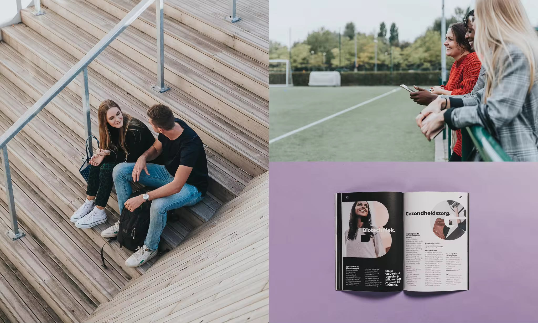
The brand framework within a large organisation must be multifunctional and flexible in its application. Besides typography and colour, it is the images that define the mood and allow the brand to continue reinventing itself. Besides developing a customised colour grading for HOGENT, clear photographic guidelines have also been established.
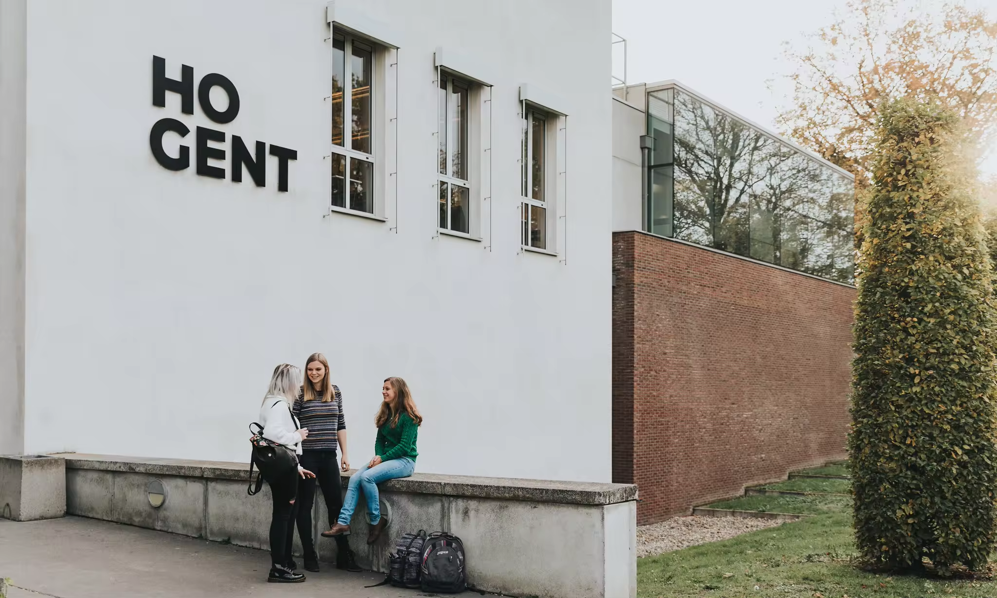
HOGENT’s recognisable photography shows people in their own environment. Students as they are, and not necessarily in school surroundings. Their individuality is recaptured in the images by photographing them from interesting angles and atypical cropping in post-production.



non-stop engagement
and experimentation.
Similarly to the strategic preliminary phase, the rollout of HOGENT’s rebranding is an intensive journey that we are approached in a transparent and phased manner together with the Communication Department at HOGENT. As well as renewing all communication channels we were working as a proactive partner, as a brand challenger. In order to challenge HOGENT and ourselves to look further in strategic, creative and communication terms. For all those students, employees and people connected with HOGENT who want to make the difference.


HOGENT – rebranding