Descript Brand Identity and Marketing Website
The Story
Descript is the world’s first audio word processor. It can be used to generate transcripts linked to voice media, and then edit the media by editing the text. Descript makes media production as fast and intuitive as writing a document.
When our CEO Denis said that we are going to start a project with Andrew Mason we were very excited. And that was not just because Andrew Mason is a founder of Groupon — the product we know, and probably everyone knows. When you collaborate with someone, who has a story of success you always have a chance to learn something new. That was the case with Descript project.
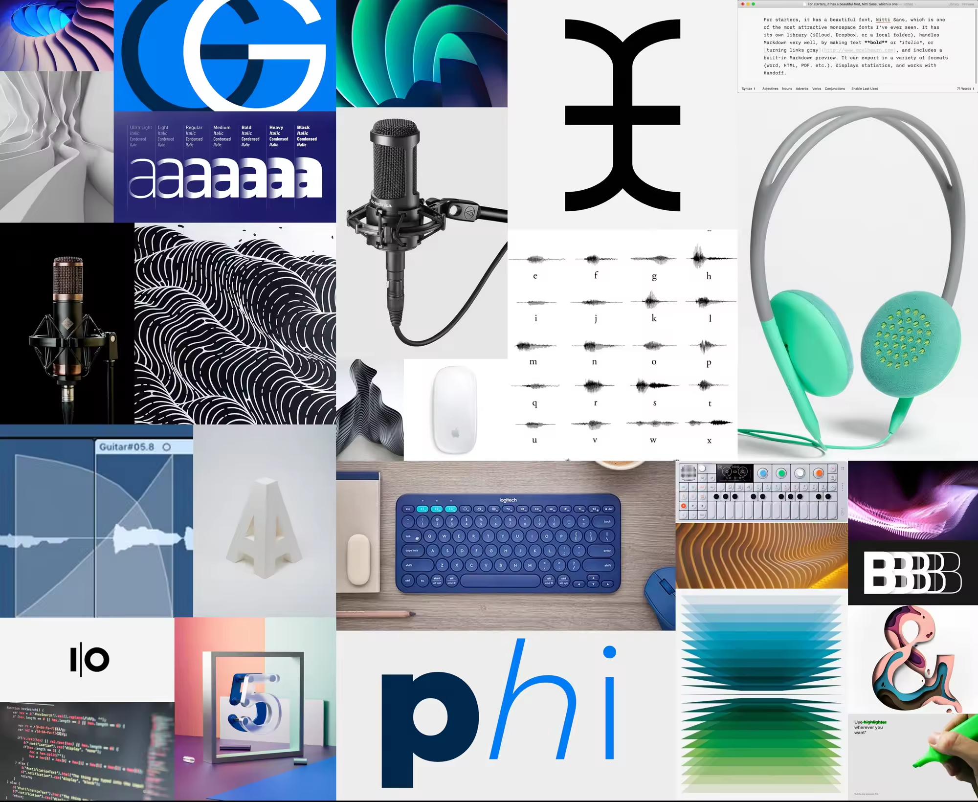
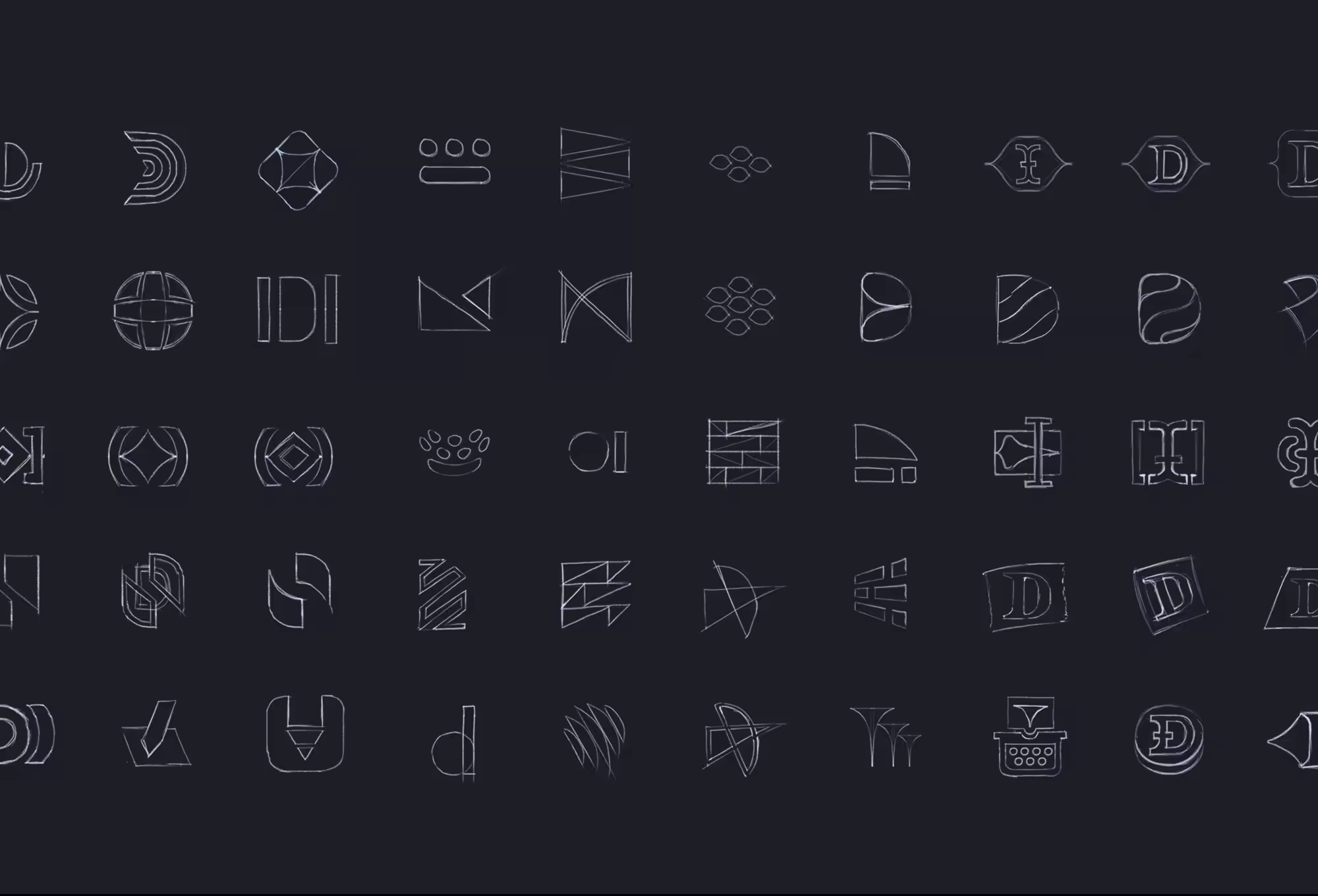
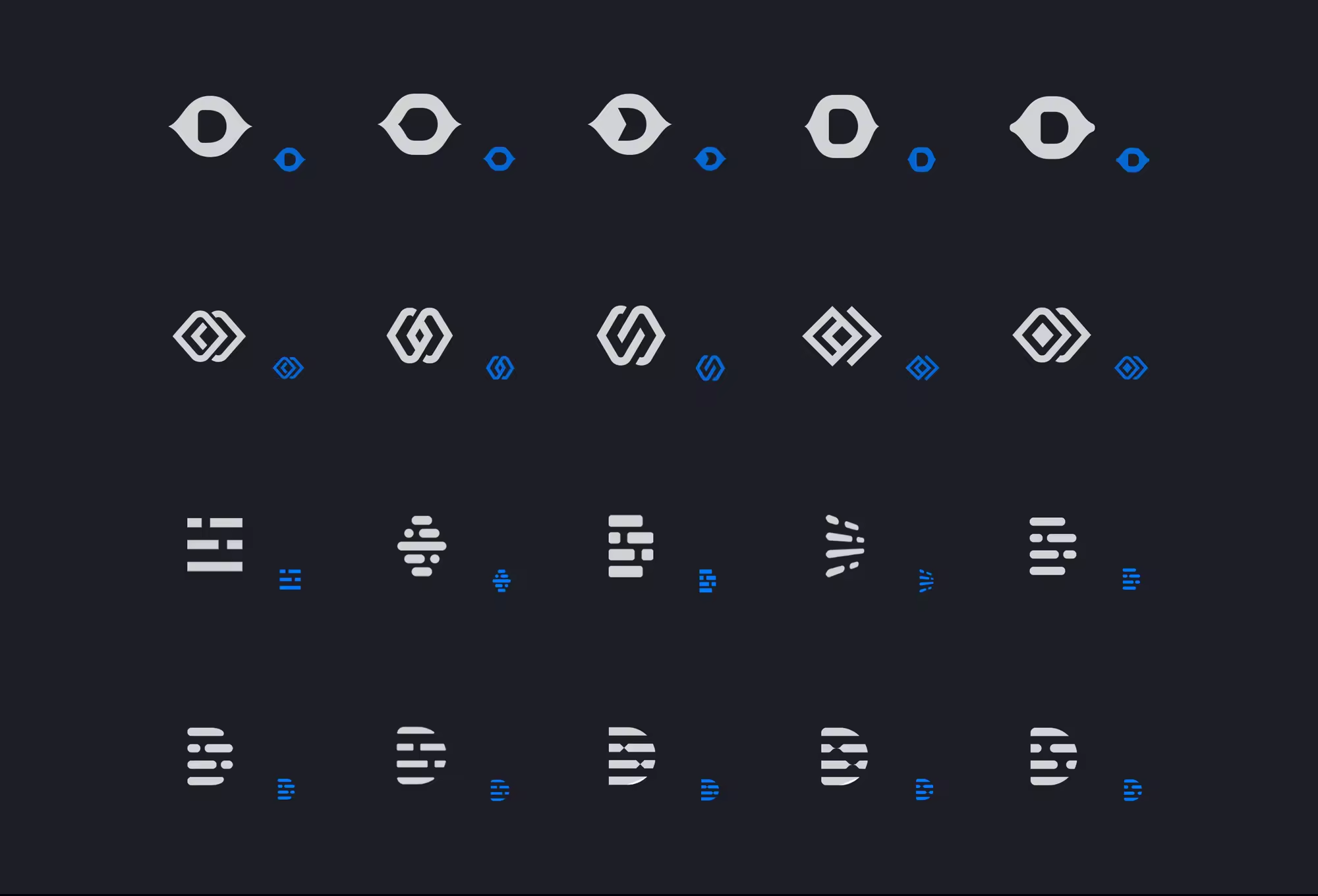
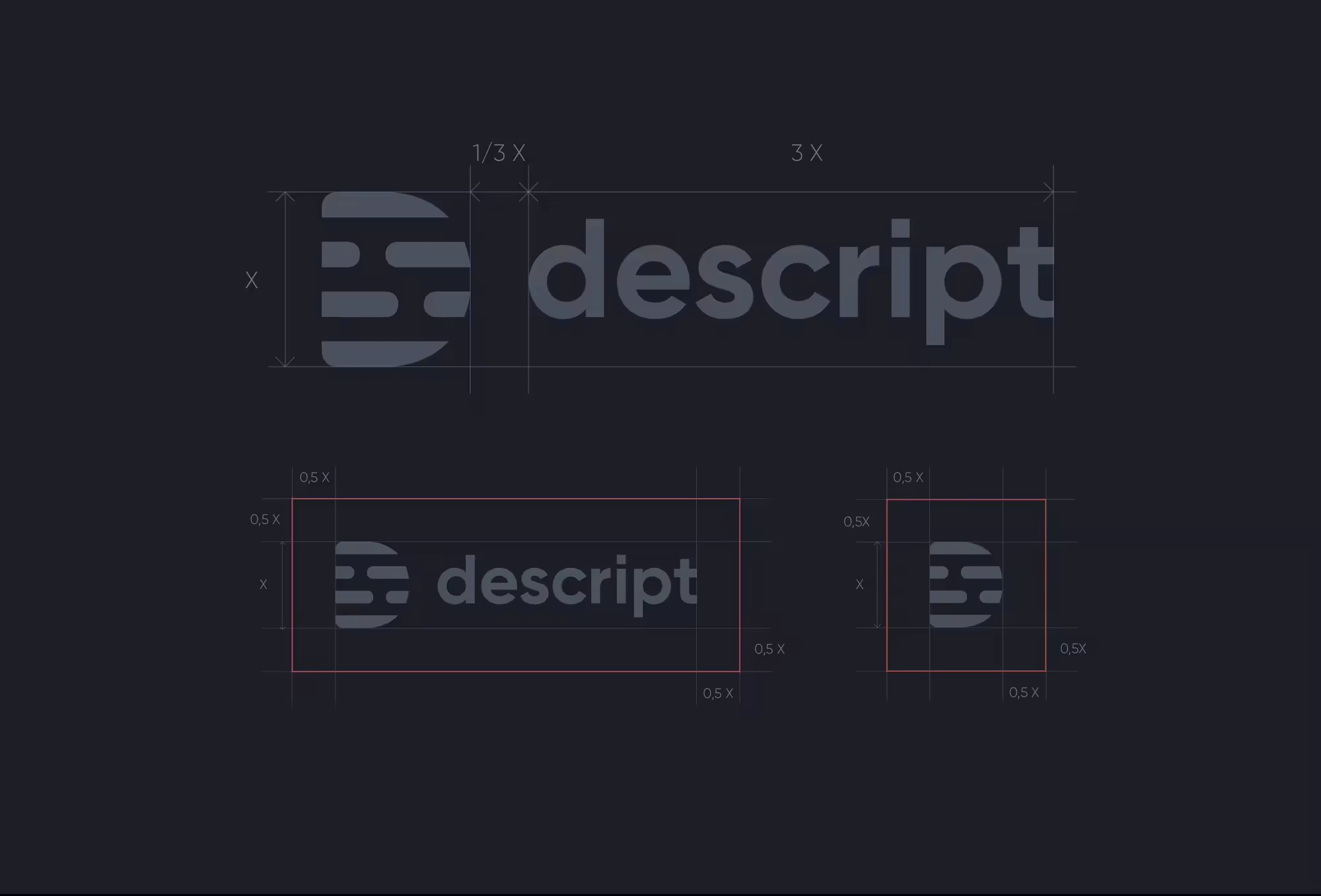
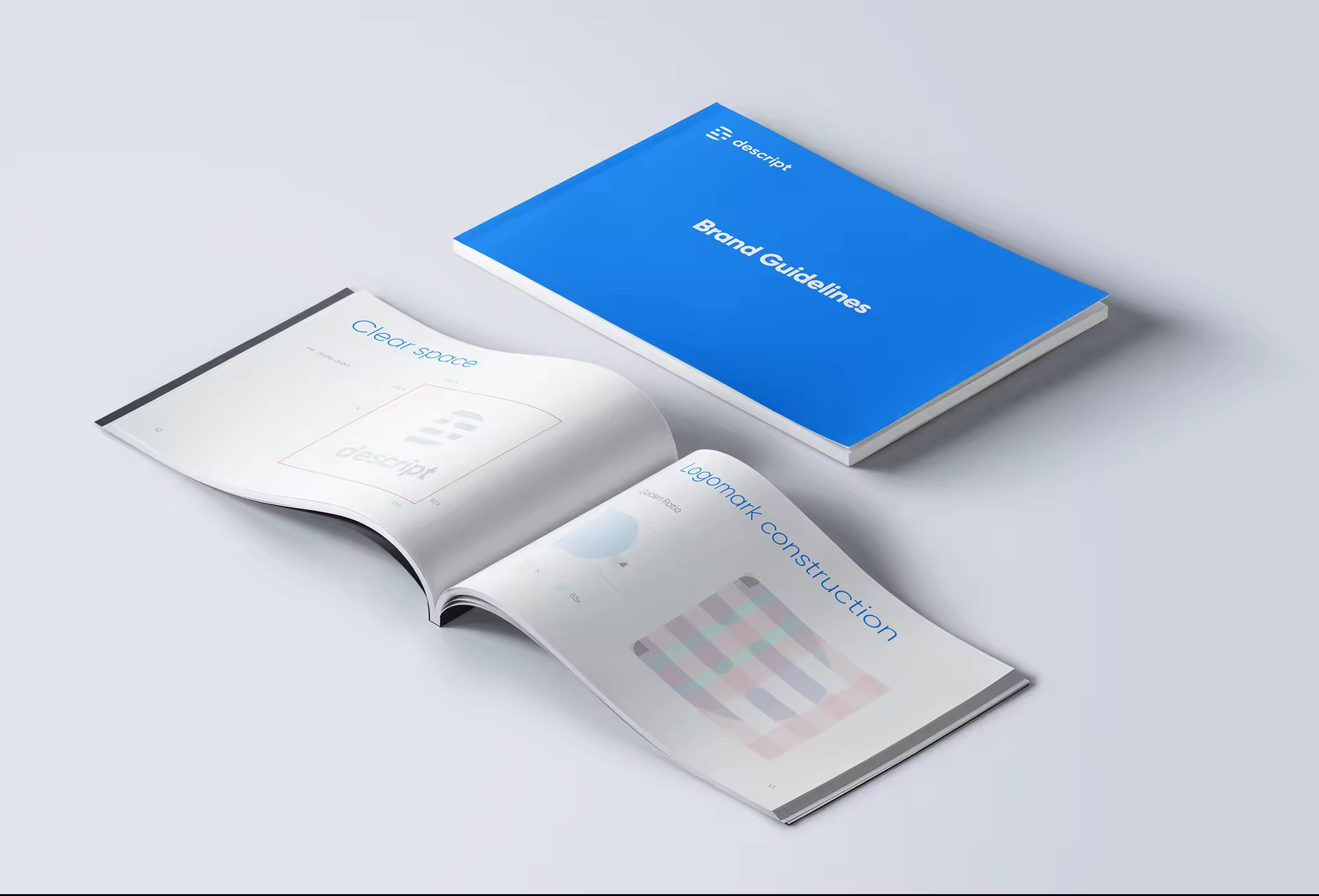
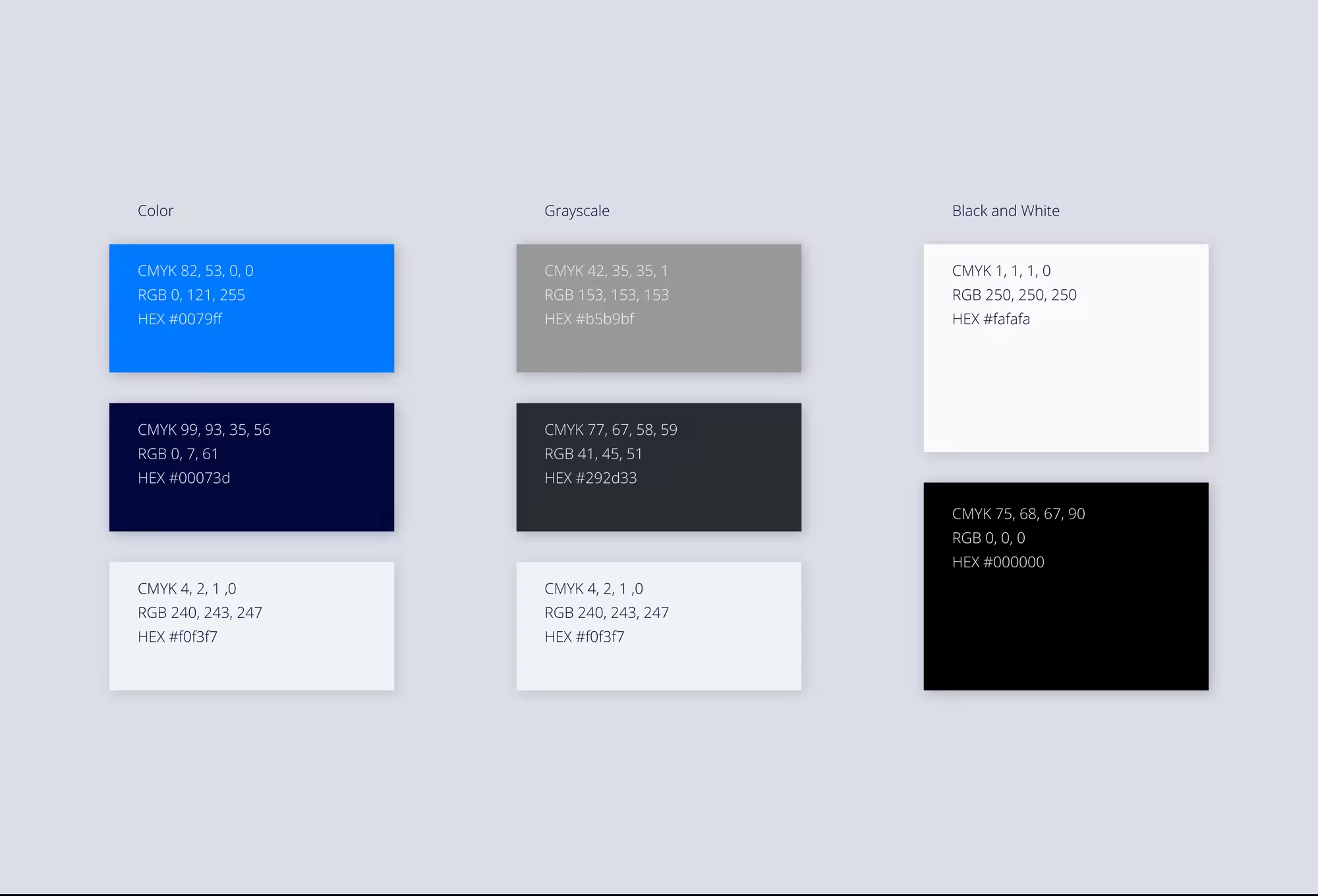
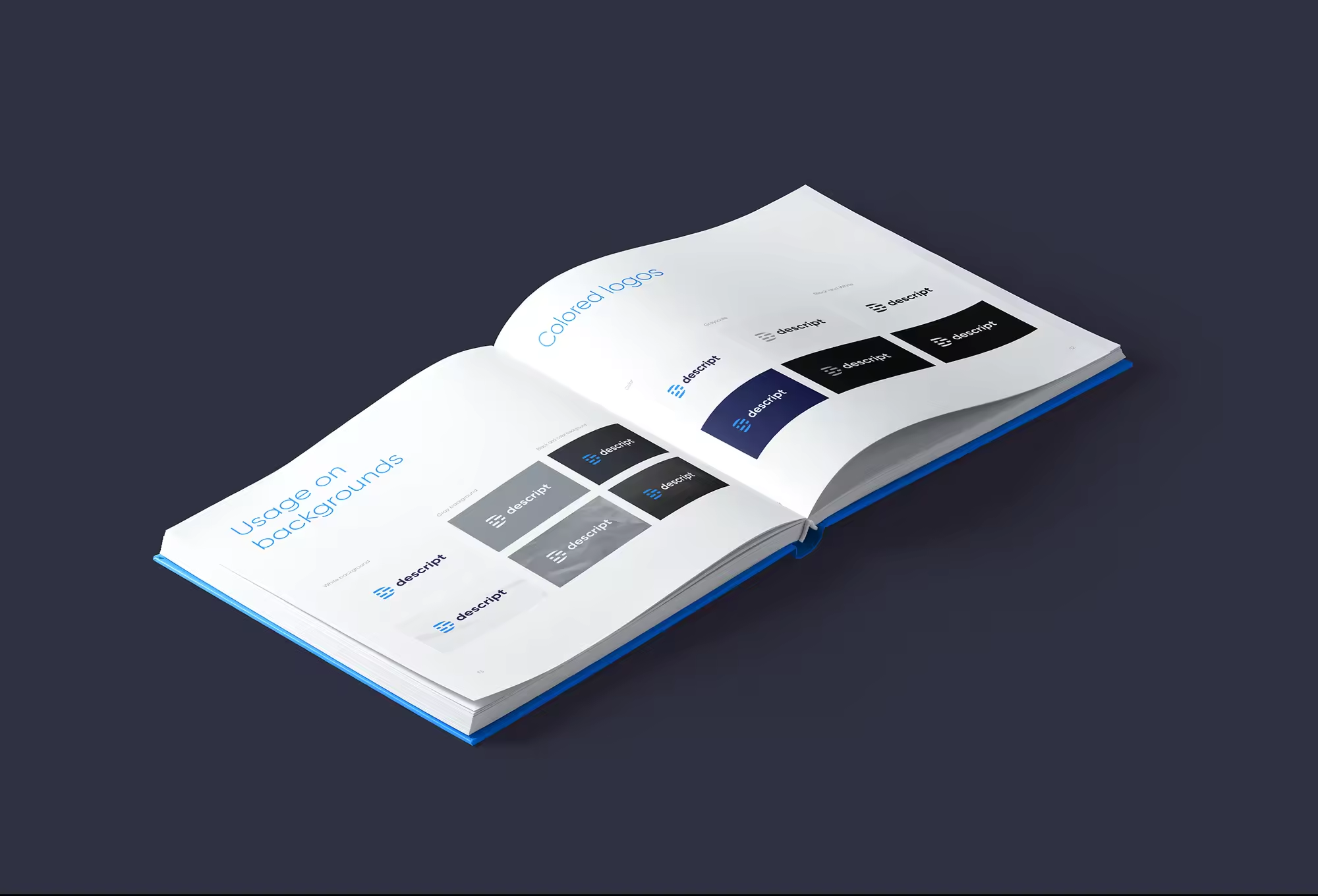
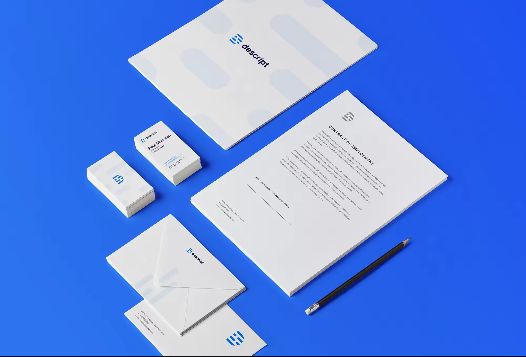
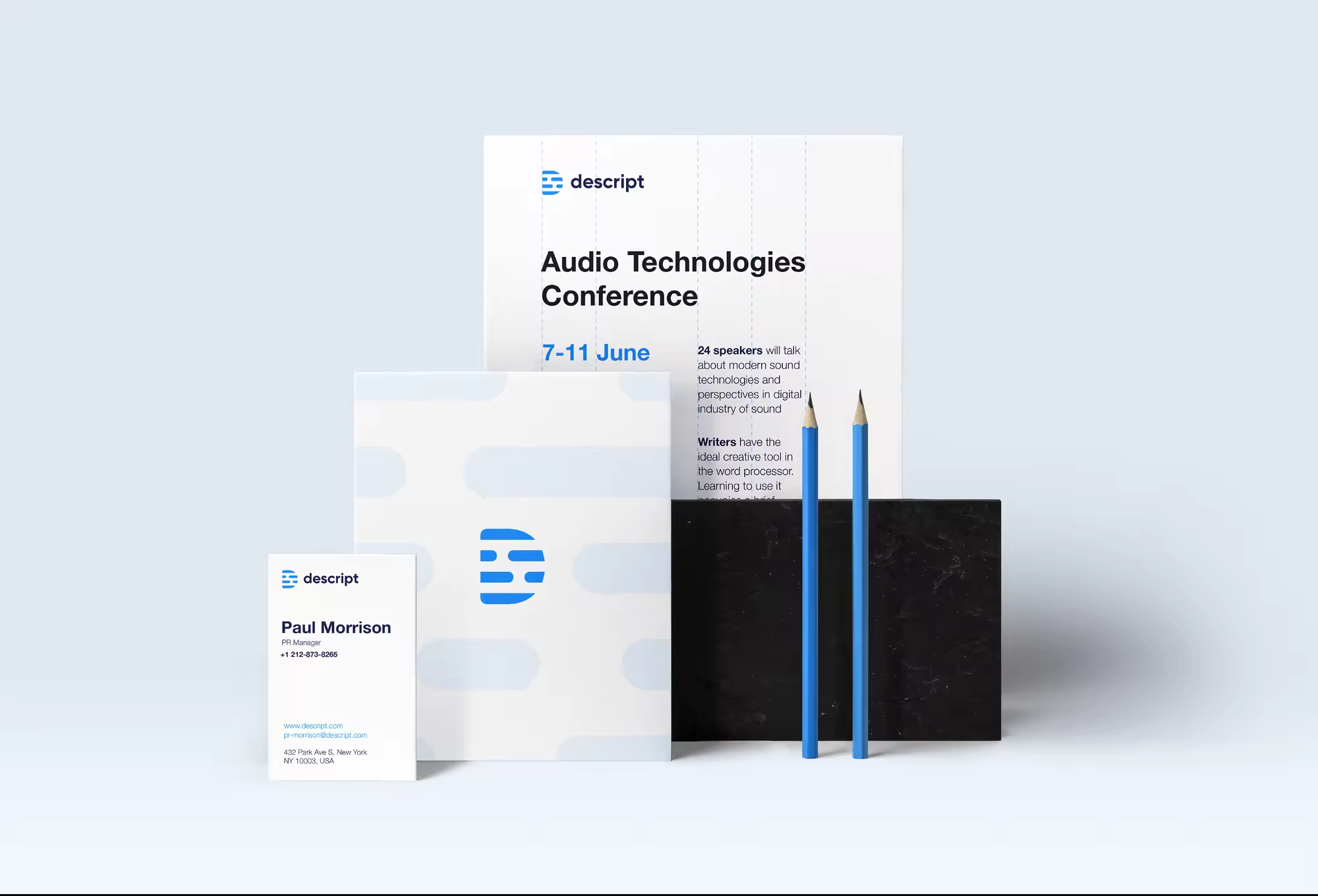
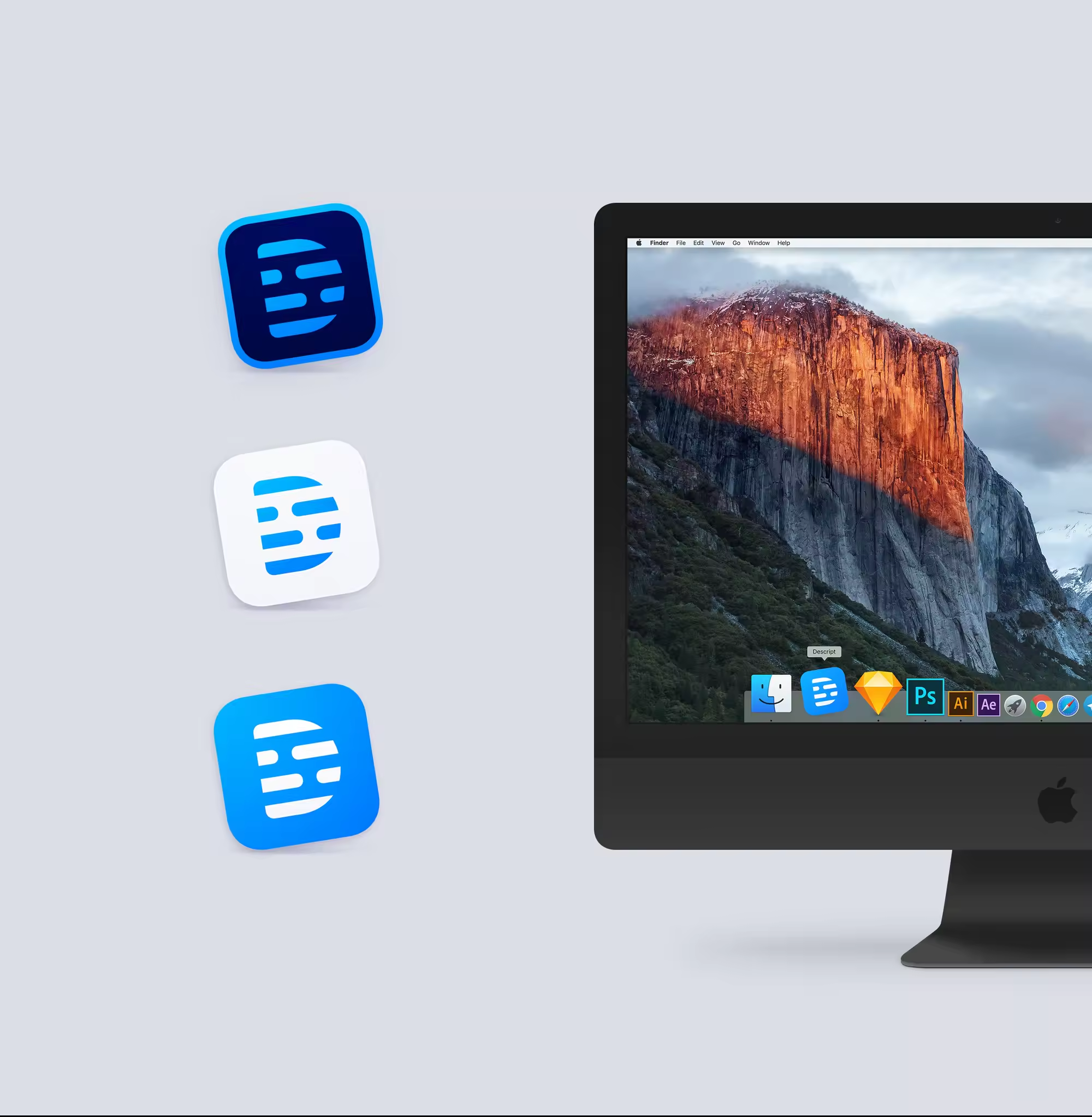
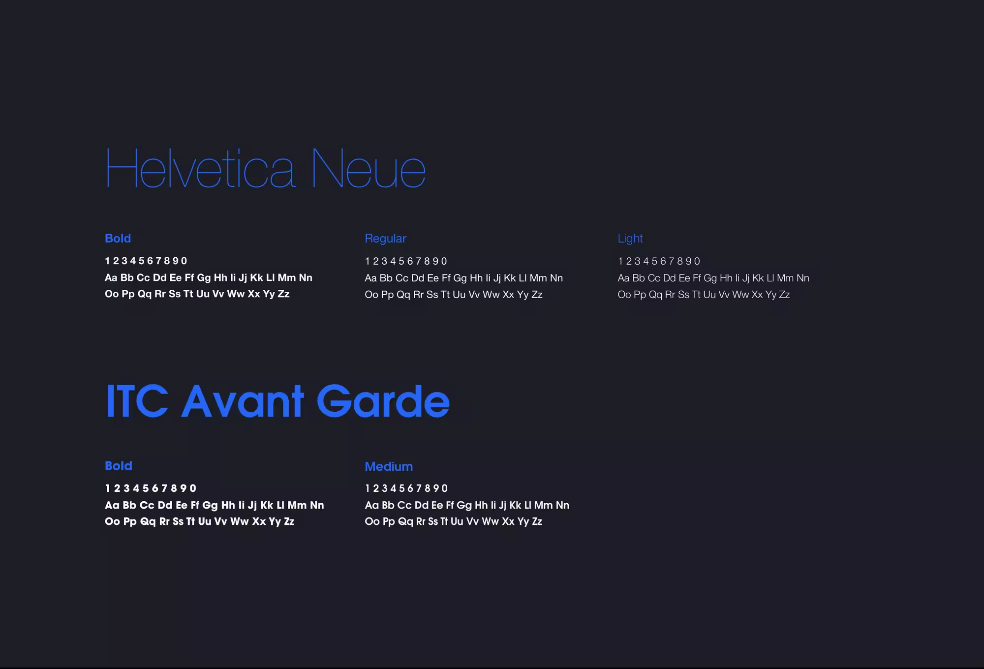
The ultimate goal of the project was to create a strong and recognizable visual brand identity and design a consistent and descriptive marketing website to let the potential customers download the product. When it comes to a marketing project like this, we usually recommend starting with the brand identity part. We have our unique approach to visual identity design. We call it “design funnel.” It is a gradual process with clear tasks and valuable outcome on each step. We usually start with visual positioning based on the information we know about competitors, industry, target audience, and the product tone of voice. Once we sync our vision with the client, we move forward by exploring shapes, colors, etc. (you can find more about the “design funnel” approach in our other cases 1, 2, 3, 4, 5).
This project is a story of our collaborative work with Andrew and Levi (Product Designer @ Descript). When you read Behance cases about design made by an agency or independent contractor you should always keep in mind that at least 40% of the success of the project depends on decisions made by the product owner. You can be a fantastic designer with strong creative vision, but if the product owner rejects all good design solutions/options and proposes something different, it leads to failure. Fortunately, Andrew played a perfect role of the product owner. He communicated his business goals and expectations yet gave us a freedom to provide professional design solutions.
As being said, we started with the branding part. Andrew and Levi have just a little experience in this area so that we were leading this stage of the project. The “design funnel” approach we use requires a certain level of joint work with a client. At some point, we show options and ask to share thoughts and feelings about each of the options. This feedback loop helps to move forward and create a visual identity that the product owner will love. We believe that it’s essential to make a visual identity that resonates well with the client’s sense of aesthetics because it makes him more confident in marketing the product.
On the next stage, the landing page design, Andrew, and Levi were leading the process. Levi as a product designer helped us to create an interface layout that correlates well with the end-user, and he played a huge role in converting business requirements from Andrew into design tasks we had to accomplish. That was helpful especially considering the fact we were doing the front-end development as well. We still support the team with the front-end and some small design tasks.
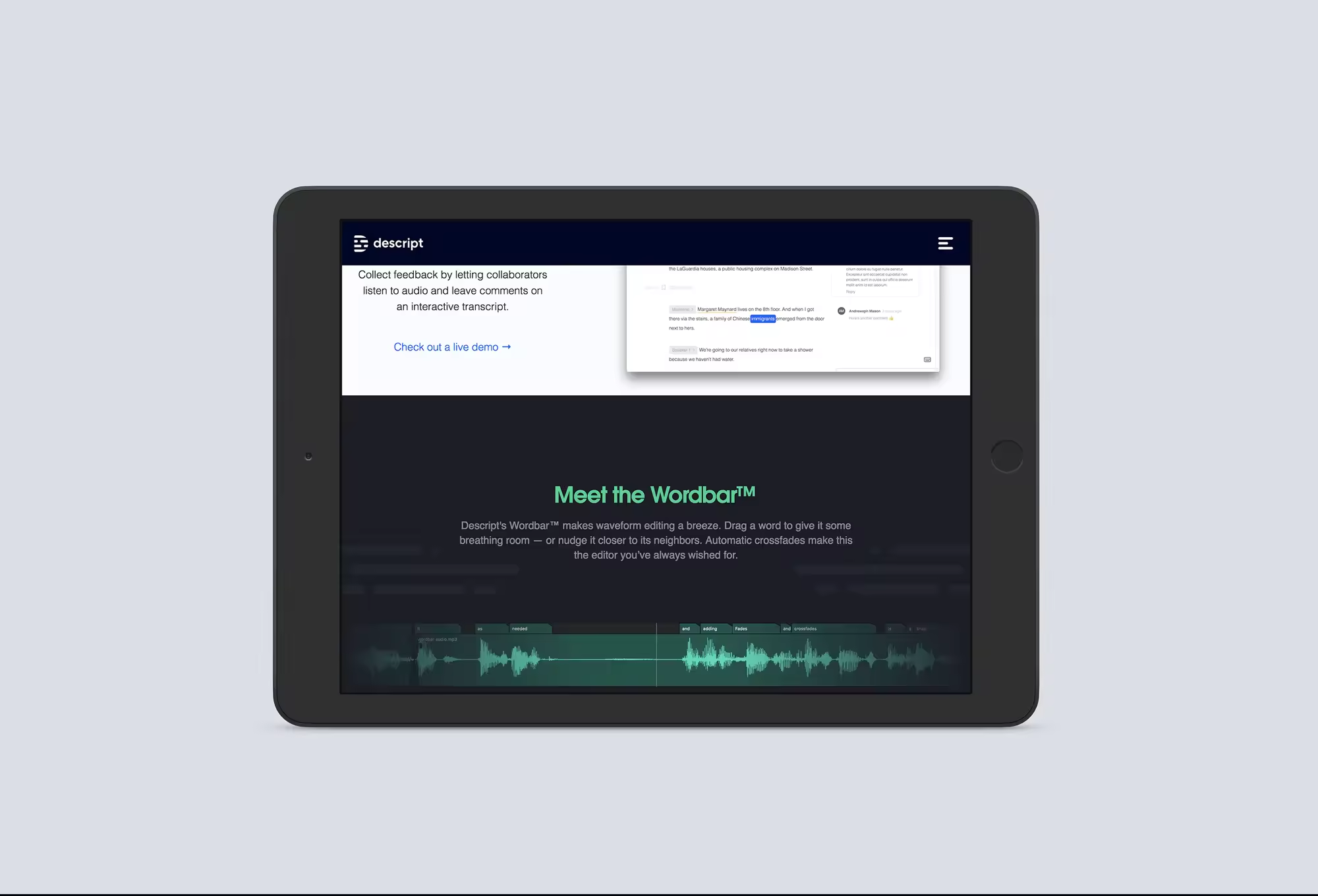
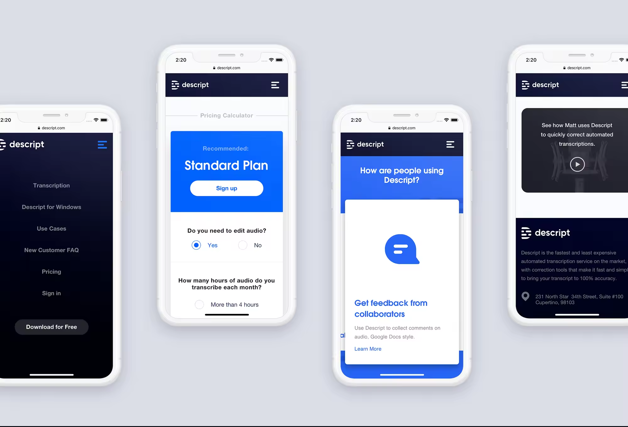
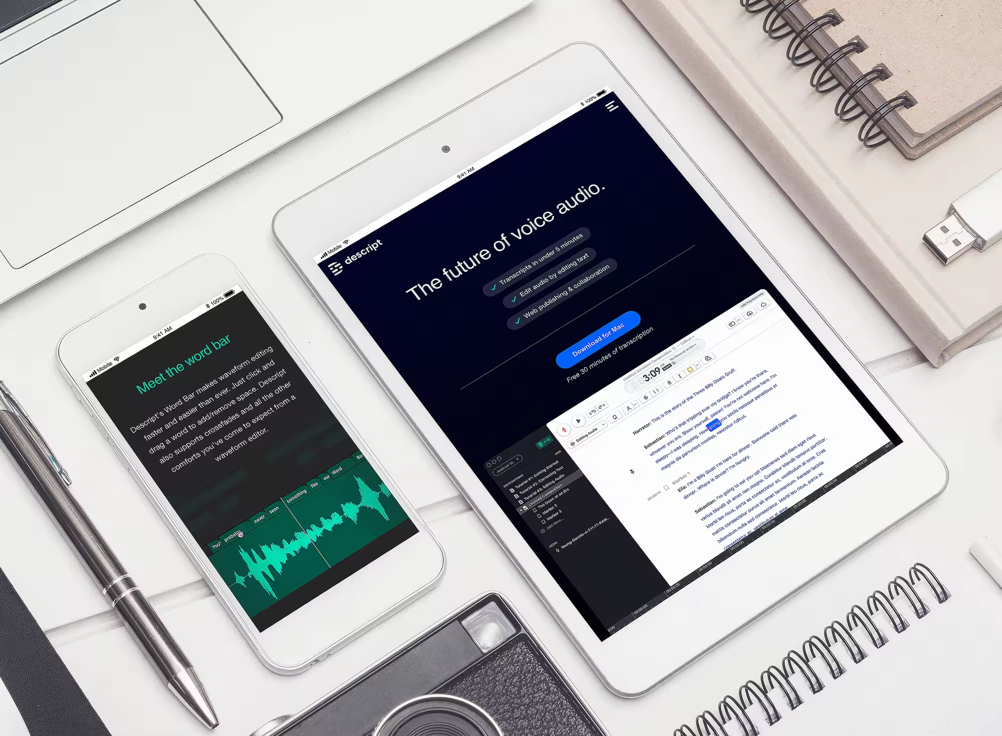
The product is live now, and you can check it at descript.com.
We were happy to do this project together with such an incredible team.
We were happy to do this project together with such an incredible team.



Thanks for Watching!
We available for projects
Descript Brand Identity and Marketing Website