ACRONYM – Website design concept
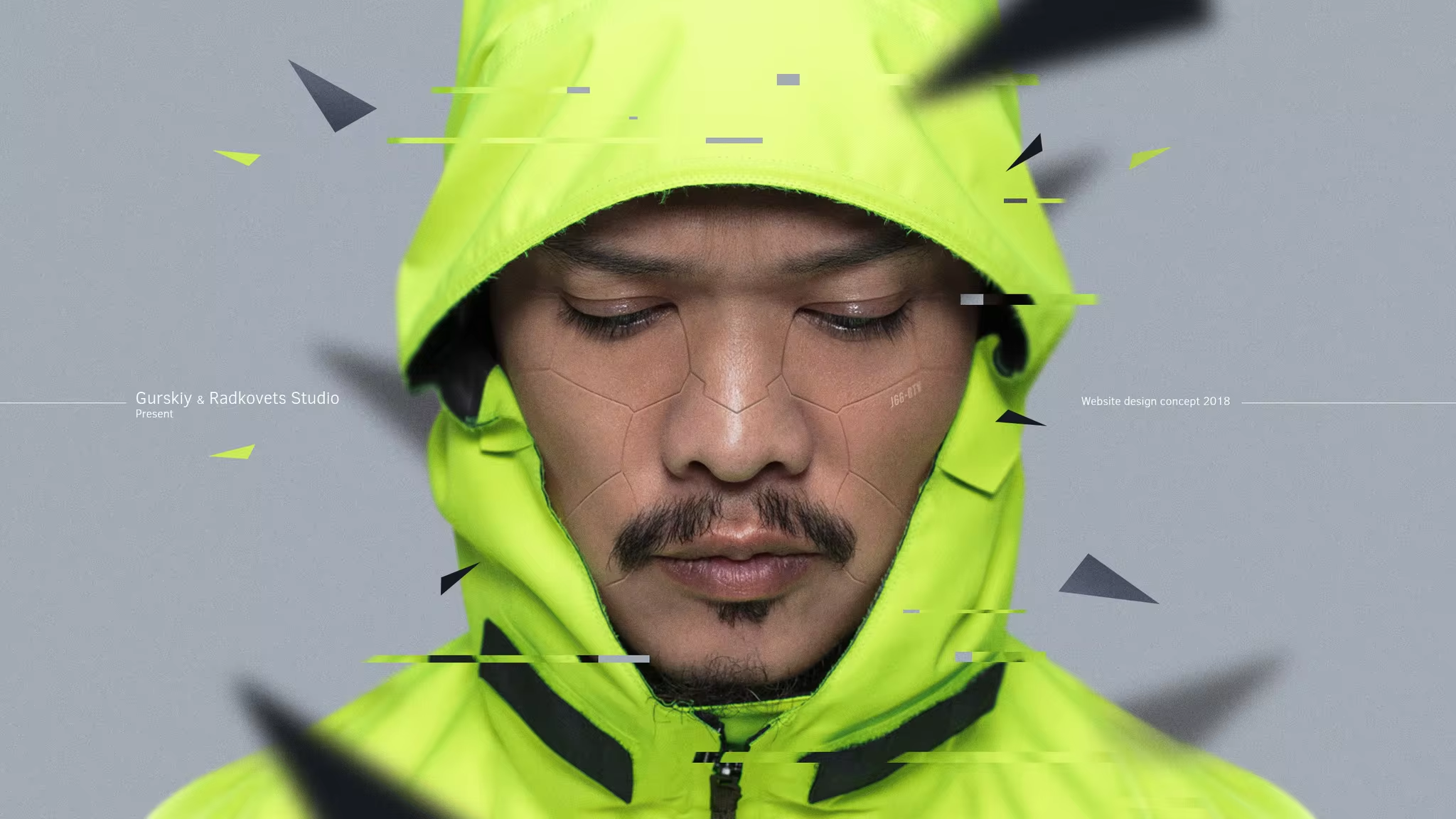
ACRONYM
_
Hey everyone! Today we will talk about such a movement as “Cyberpunk”. This is a kind of artistic mixture of science fiction, fantasy and anti-utopia.
If we talk about this movement in design, it is always first and foremost simplicity, functionality and usability. The style often looks very laconic. That’s why it’s interesting to use in design.
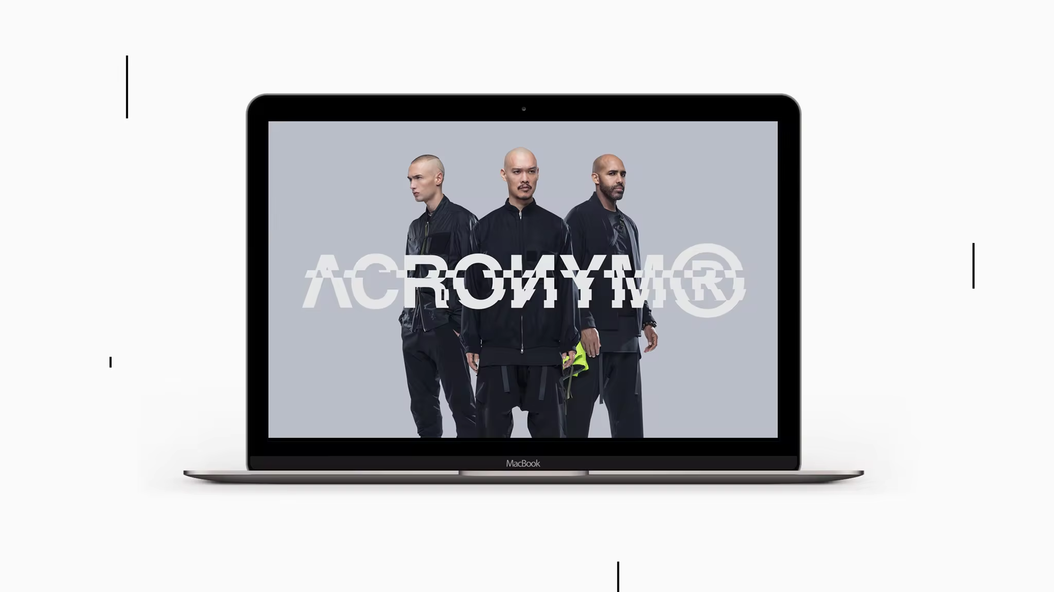
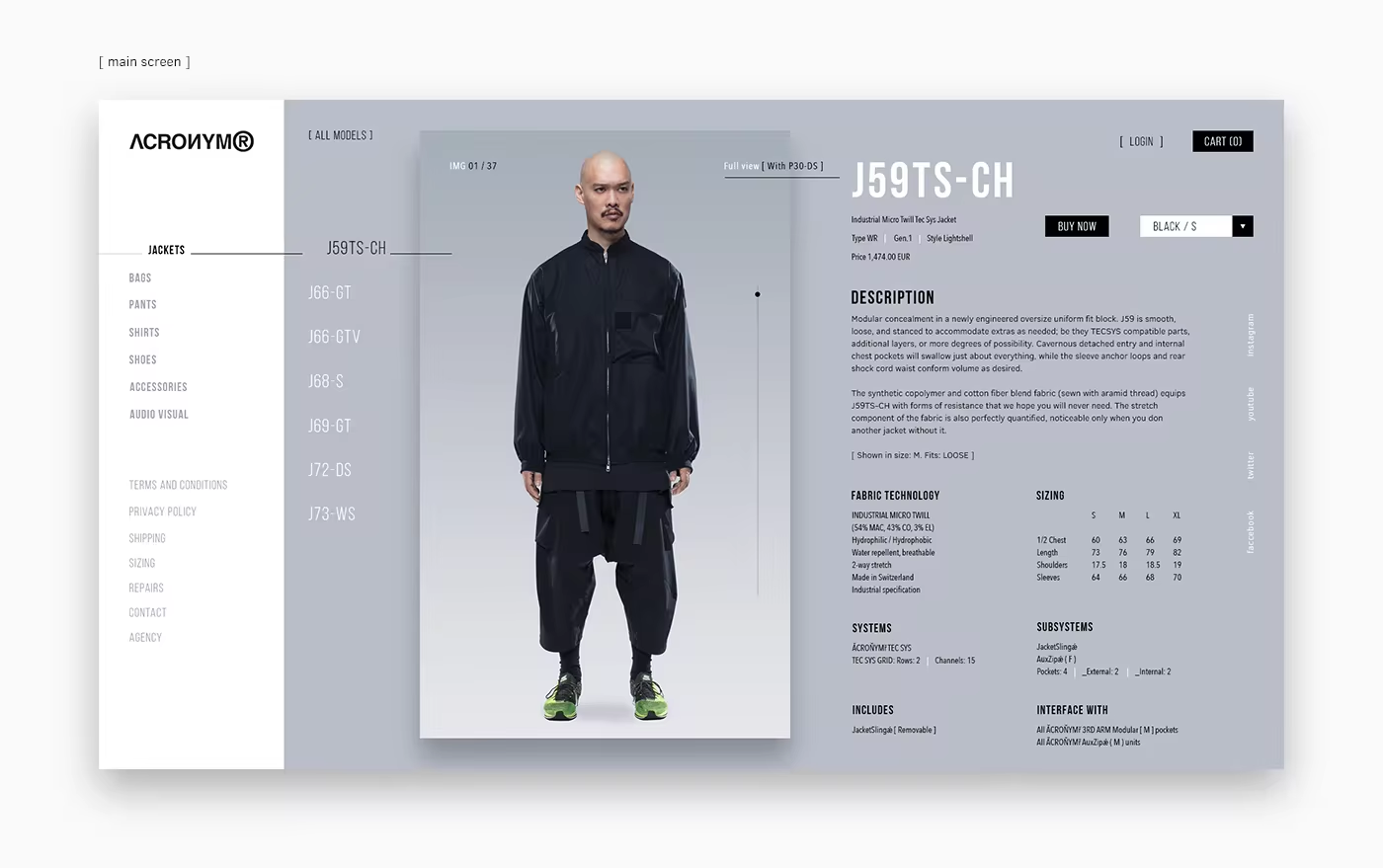
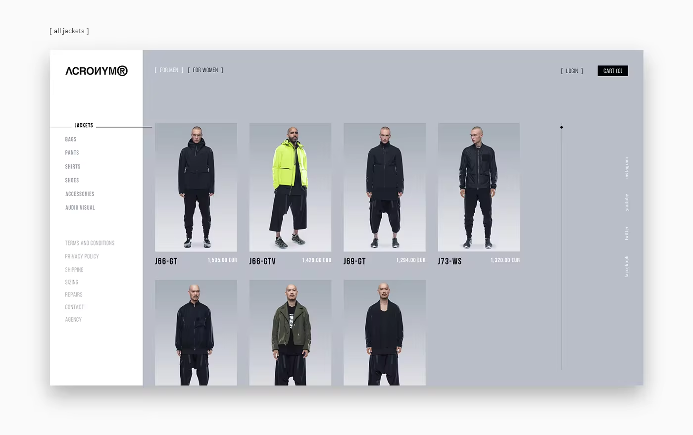
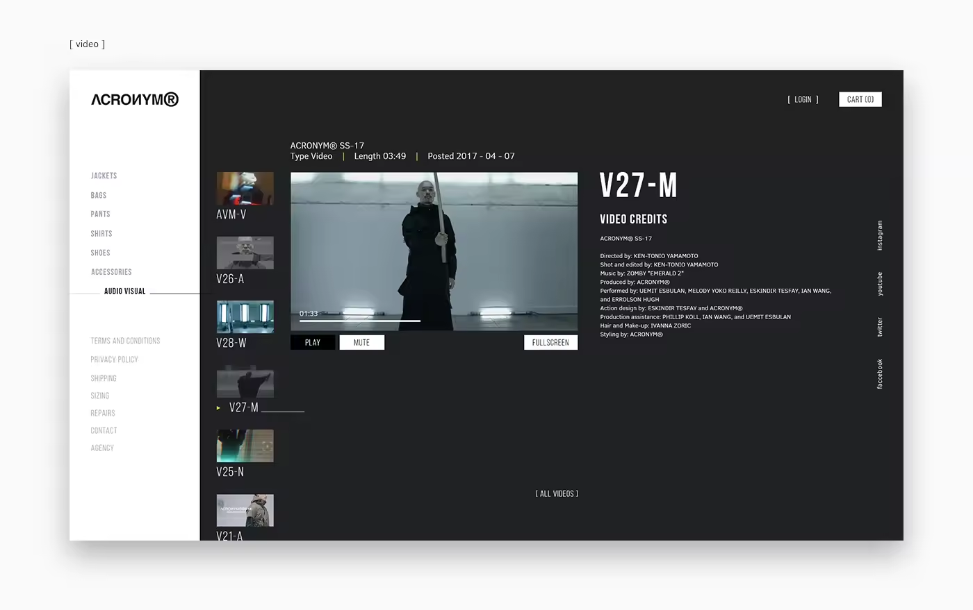
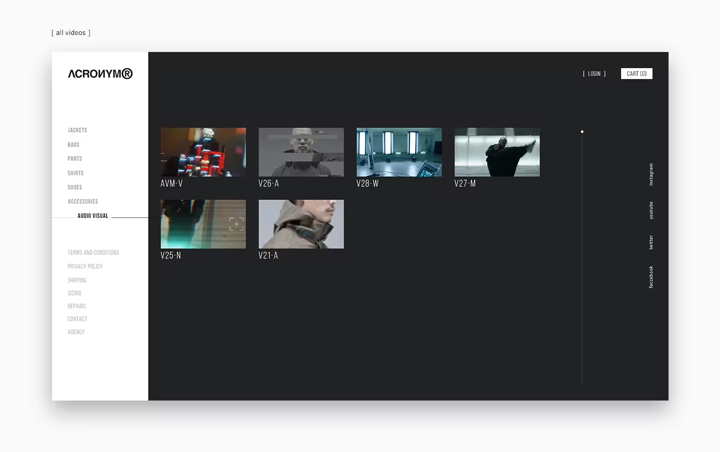
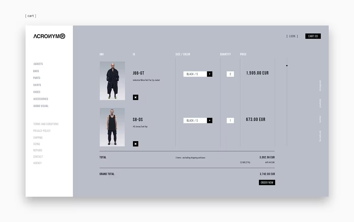
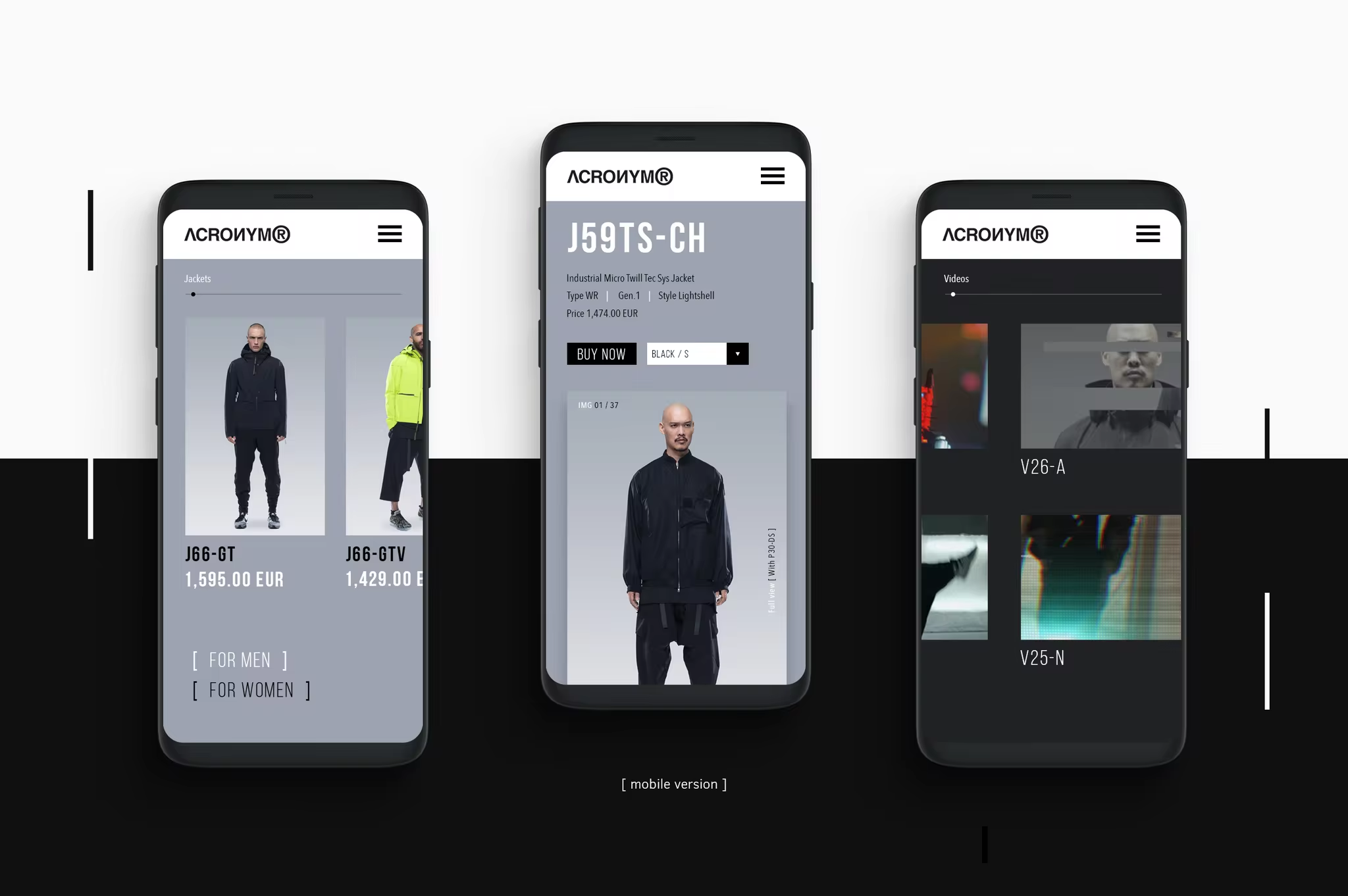
I would like to bring to notice the brand name Acronym which presents this movement in their works very successfully and finely. Their clothes combine all the attributes of cyberpunk culture. I was inspired by this brand to develop a website that was understandable, simple and convenient for any user, which would reflect the company’s approach.
Nowadays Acronym already has a website that is why I’d like to present to you my concept.
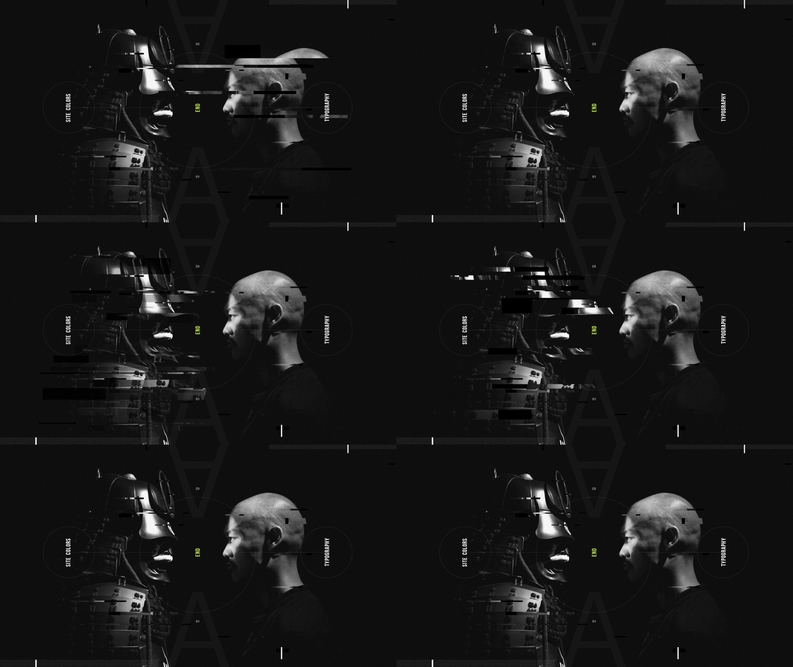
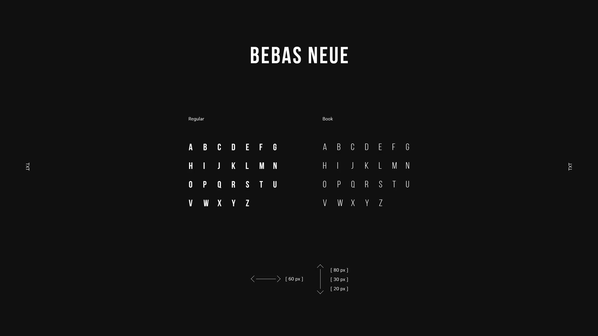
The redesign will change all the navigation and interface but retain brand recognition. Happy viewing!

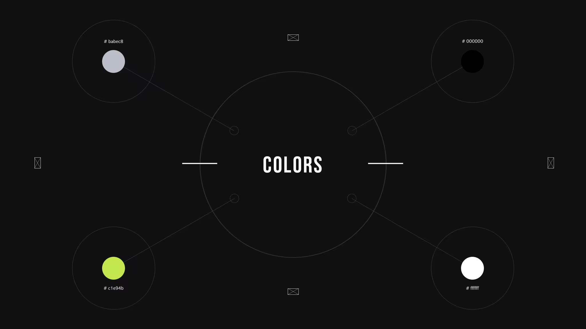


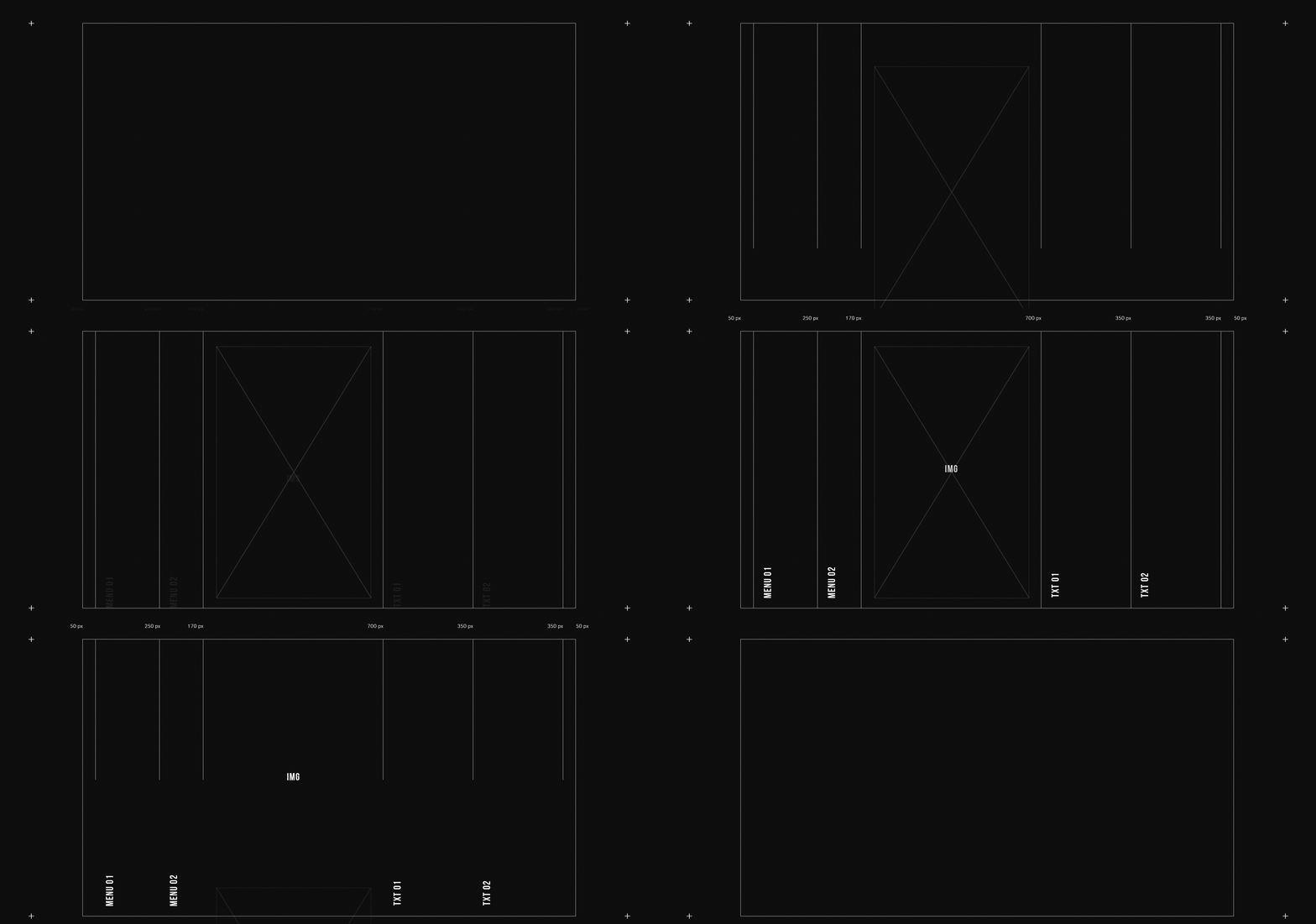




[ grstudio.art ]
[ instagram ]
[ facebook ]
ACRONYM – Website design concept