SPACE – Windows 10 Redesign
space /speɪs/
A continuous area or expanse which is free, available, or unoccupied.

Not just space, space!
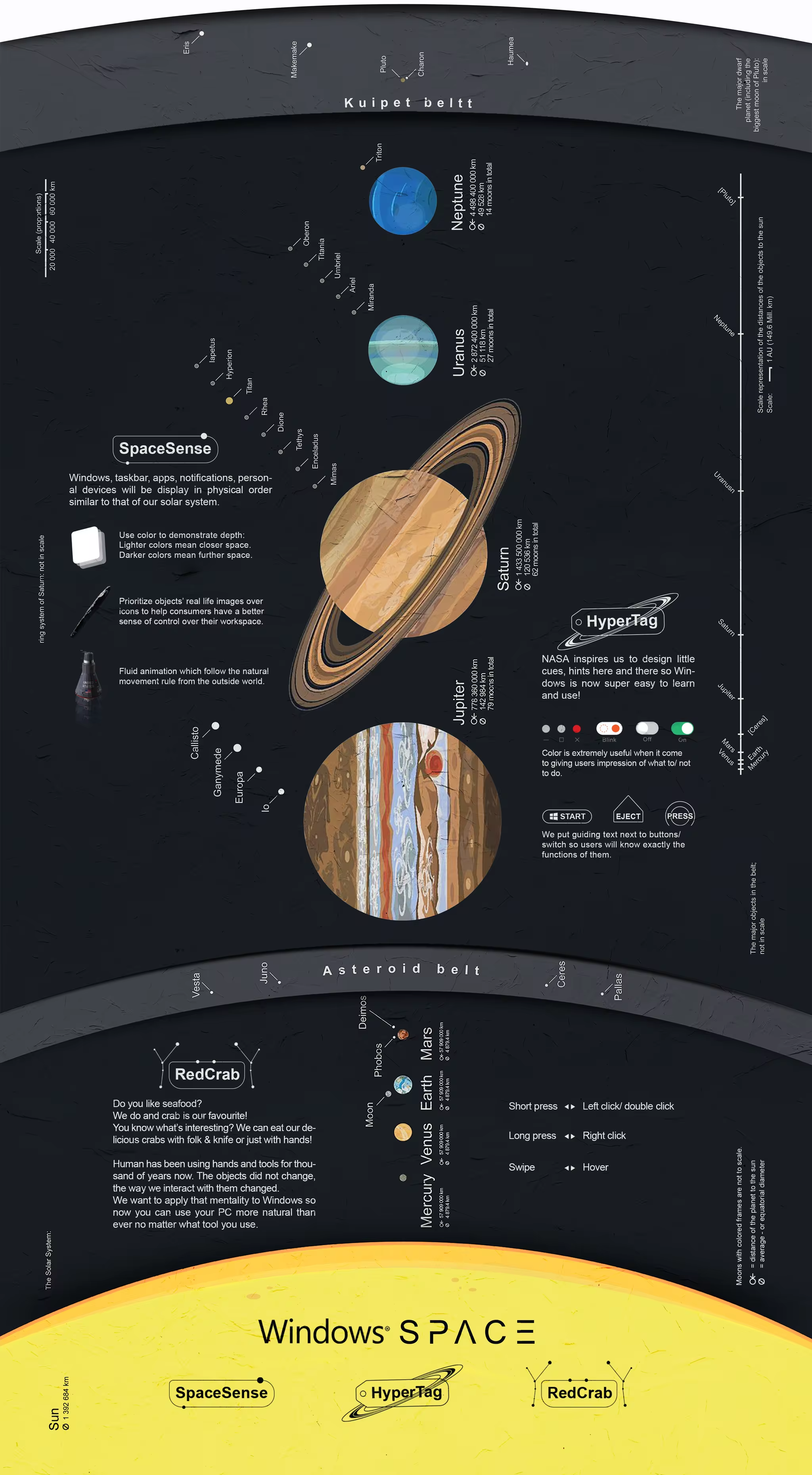
Inspired by the hard work and beautiful minds behind space missions at NASA, the most powerful OS on planet earth is about to launch itself higher into human’s next technological advance – space. The new Windows comes with reinvented UI which contains design cues provide information, navigation and assistance. It feels just like having a space suit. And the best part is you don’t have to read manual to wear it thanks to all the specifications printed on the suit itself.
Everything in the universe is finite, just like how much work we can do over a period of time, how much stuffs we can put on the desk or what’s going on in the environment around you. We need excellent management skill to make those things work for and not against us. Windows recognizes that and is making lots of changes both in software and hardware to make sure that it now optimizes your workflow, embrace your tools/devices to deliver maximum efficiency.
Startup screen
The iconic four colors
Windows is never mono-colored. The red, blue, green and yellow boot screen has amazed us since the very beginning of the PC era. There is something nostalgic about it that we cannot stop gazing at, doing nothing but waiting to start using the computer again.

Design language
Refined, unified
Windows’s User Interface kept innovating and renewing itself over the years. Each version was carefully crafted to make it simple and fun to work with. However, we didn’t do a very good job of unifying them. When we moved to a newer UI, the old one’s elements still presented in the system. Over time, things became a bit confusing for users.
In Windows 10, Classic UI is still being applied for settings like Disk Management, Device Manager etc. File Explorer is using Aero style layout. In Start menu, Metro tiles and Aero list fight to gain users’ attention. We think it’s time we created one consistent design language.
Start menu
Let’s go back to start.
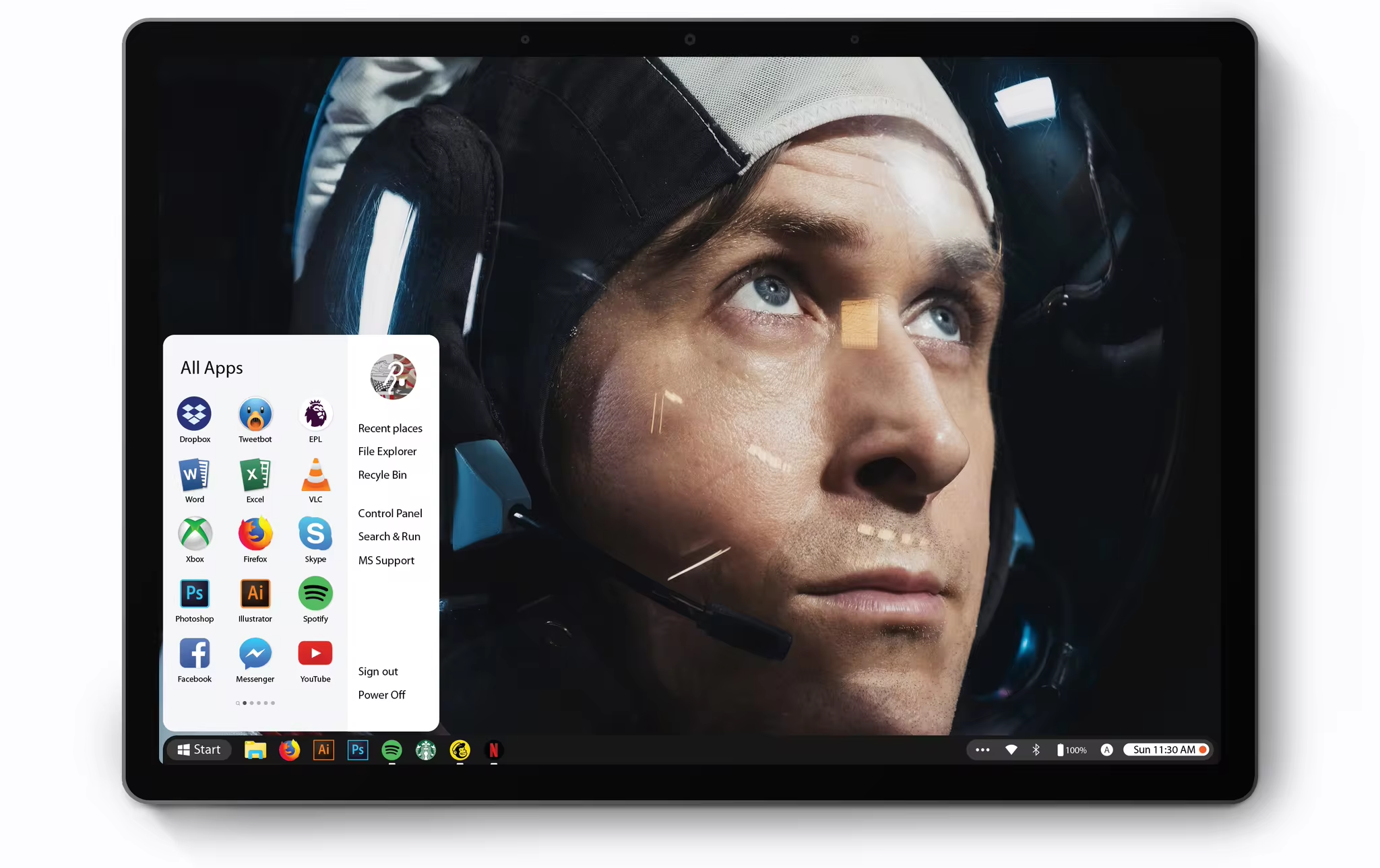
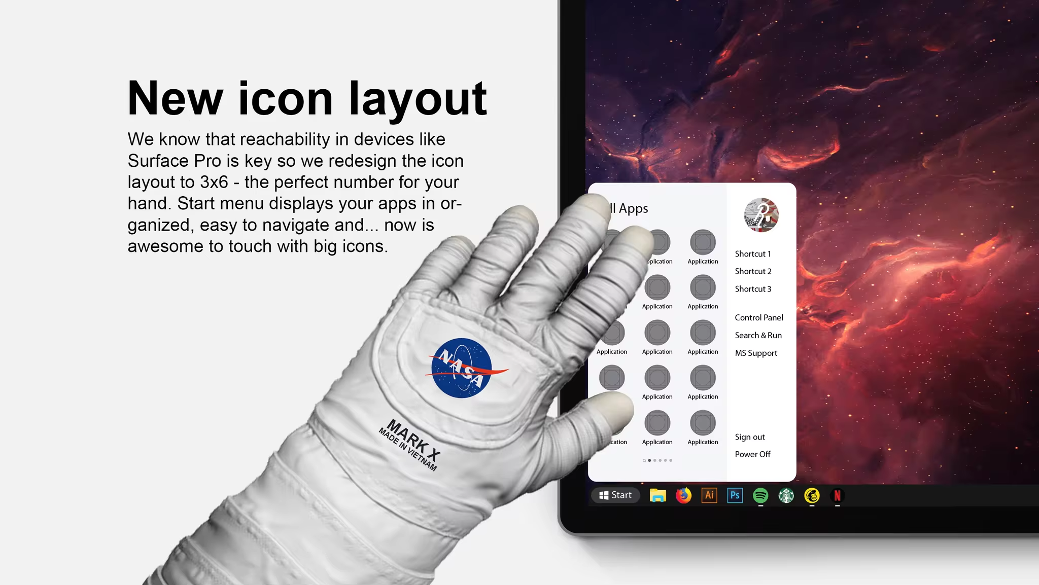
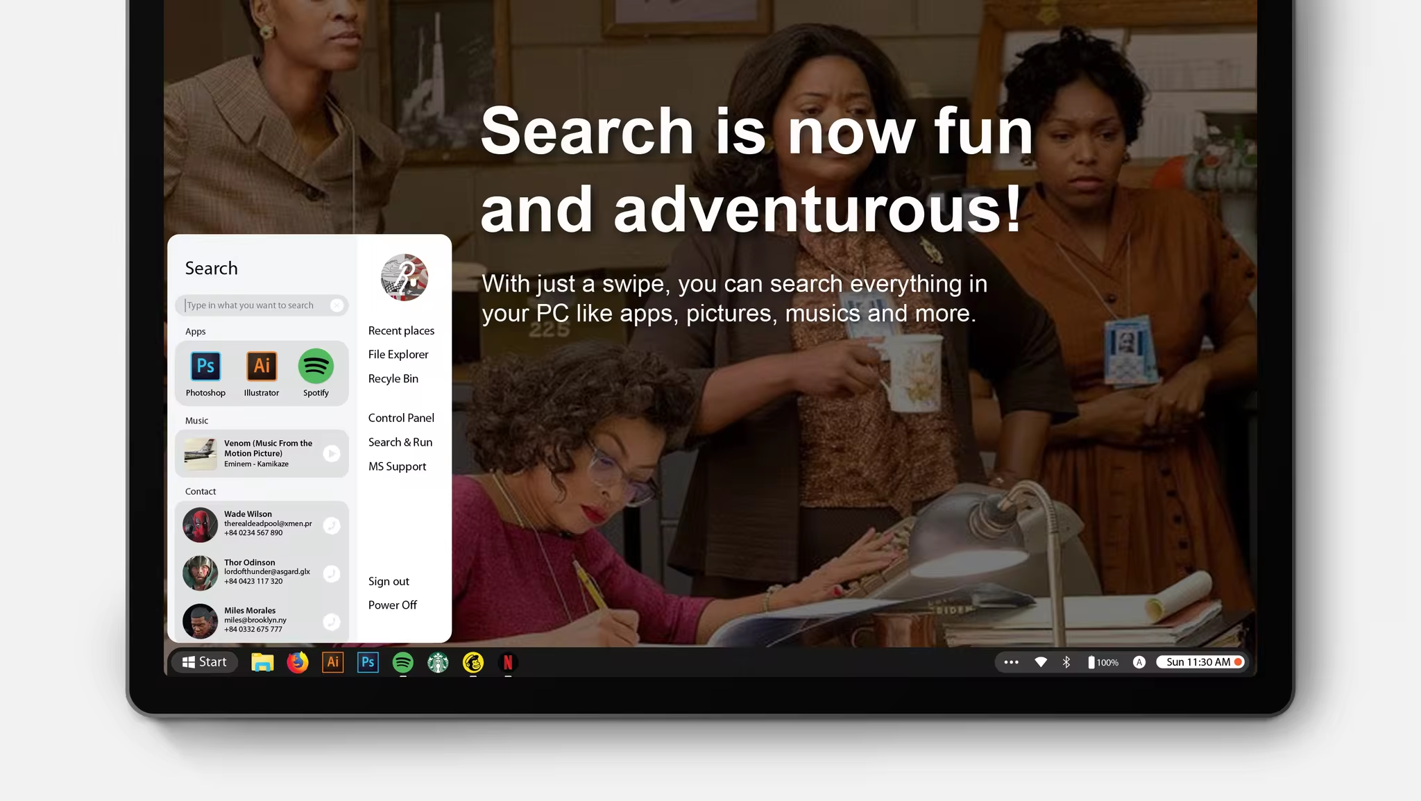
Start is the go-to place users navigate through the entire system. It started as the heart of Windows and over many later versions of Windows, we realize we have lost our path.
So this is the long over due Start menu that all of us want.

Taskbar
All new but very very familiar
Windows brought into the world the true definition of multitasking with the taskbar in 1995. Today we bring to the world the best version of the it yet.
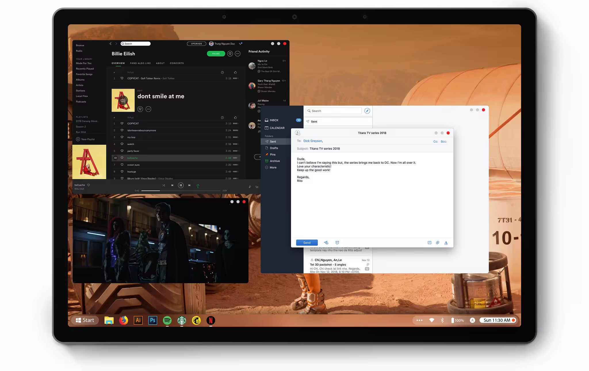
Curved corner: We realize that the taskbar is present all the time it did not look like a part of the desktop with the black rectangle running across the entire screen. So we carved out the upper corners a little bit, letting just enough information of the background through. So you could have a better sense of what you are doing and where you are – that’s pretty much the whole point of multitasking.

Sections: Start – App icons – Status bar are organized in visually separated part of the taskbar.

Touch Optimized: Every touch element has a minimum size of 44x44px

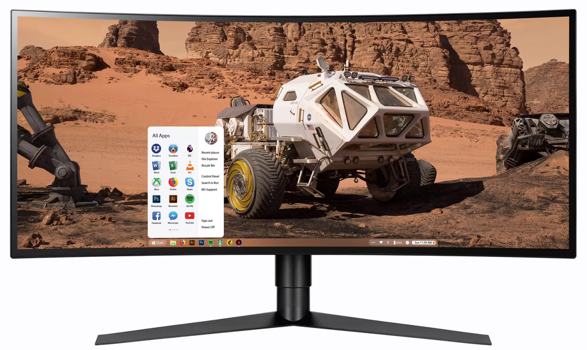
Adapt according to screen size: Windows automatically recognizes different sizes of your monitors therefore adjust the width of Taskbar accordingly.
No more infinite stripe at the top nor the bottom of the screen 😉
Status bar
Now organized and spacious.
The whole purpose of Windows Space is to bring forward all things around your workspace.


Notification
Swipe up!
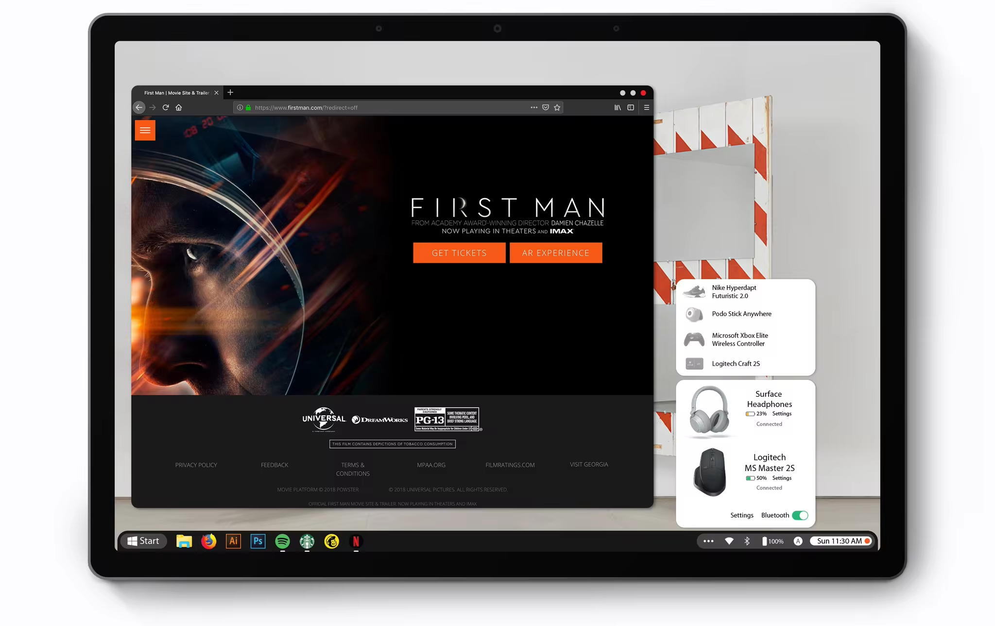
Introducing the new Notification Center. Just swipe up/down to enter/exit it.
The orange notification dot will blink softly when there is a new notification. This design cue is taken directly from space ships control board which has tons of buttons and the blinking light indicates that a function is active.
Control Panel
The whole powerful Panel
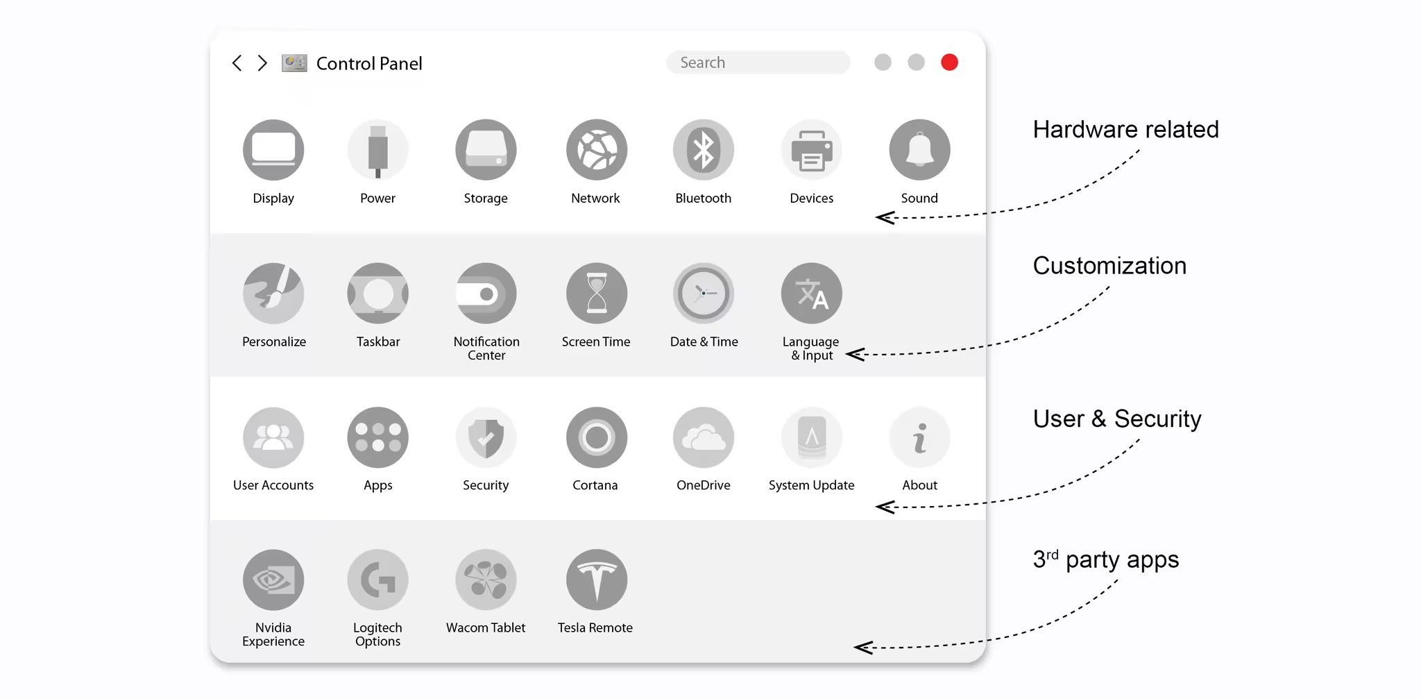
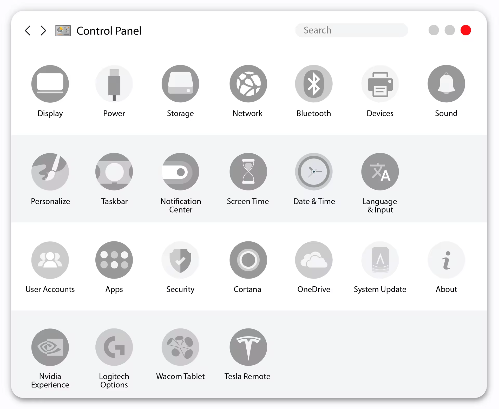
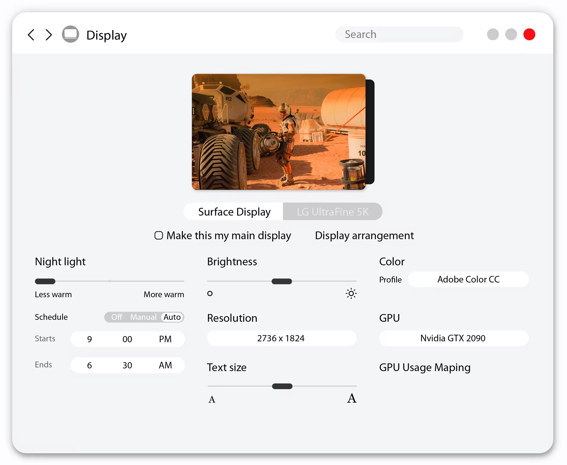
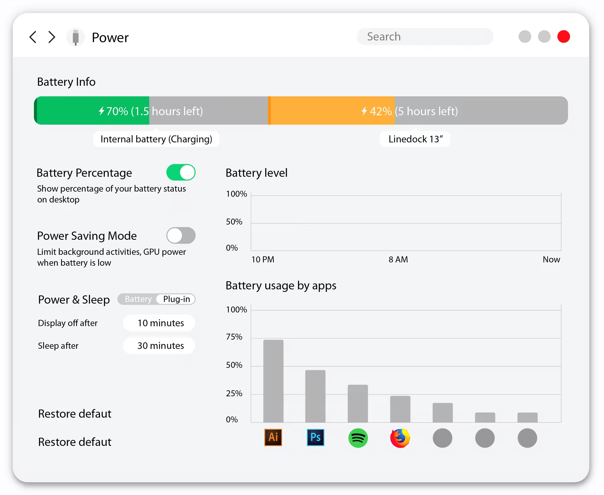
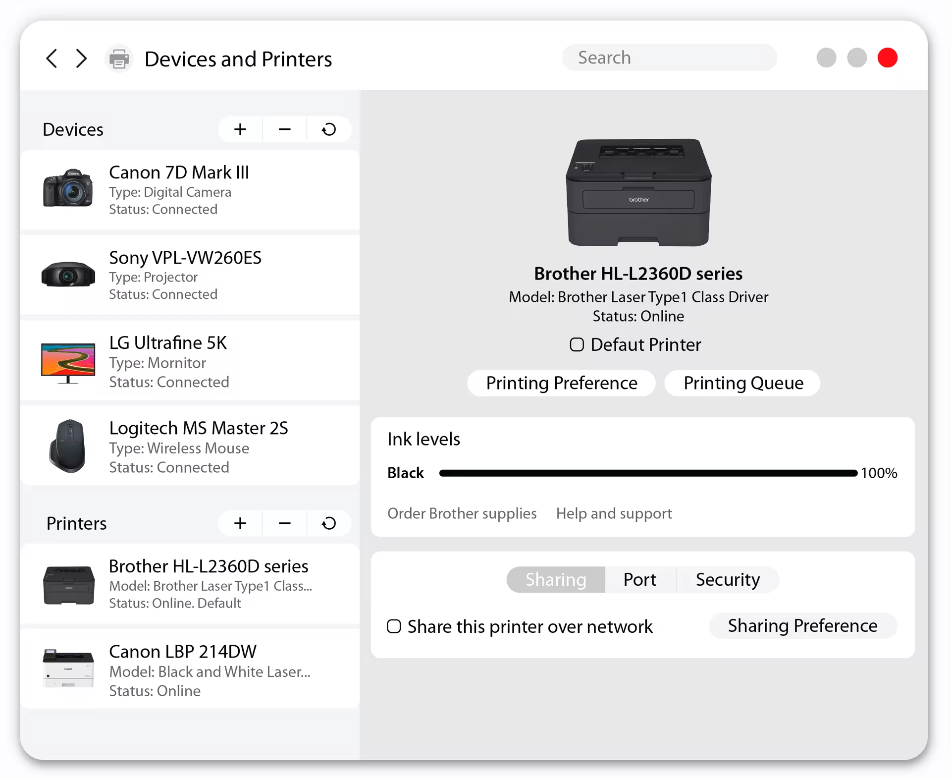
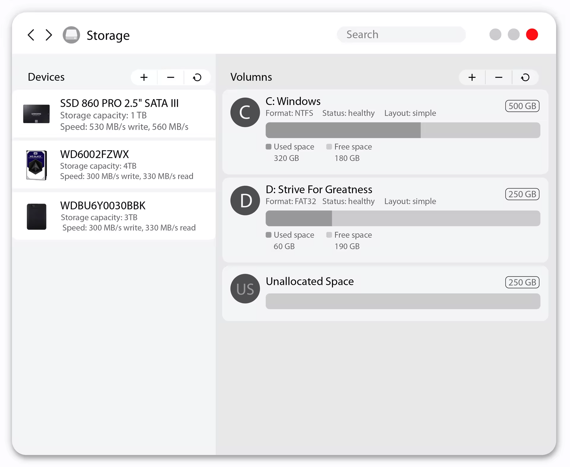
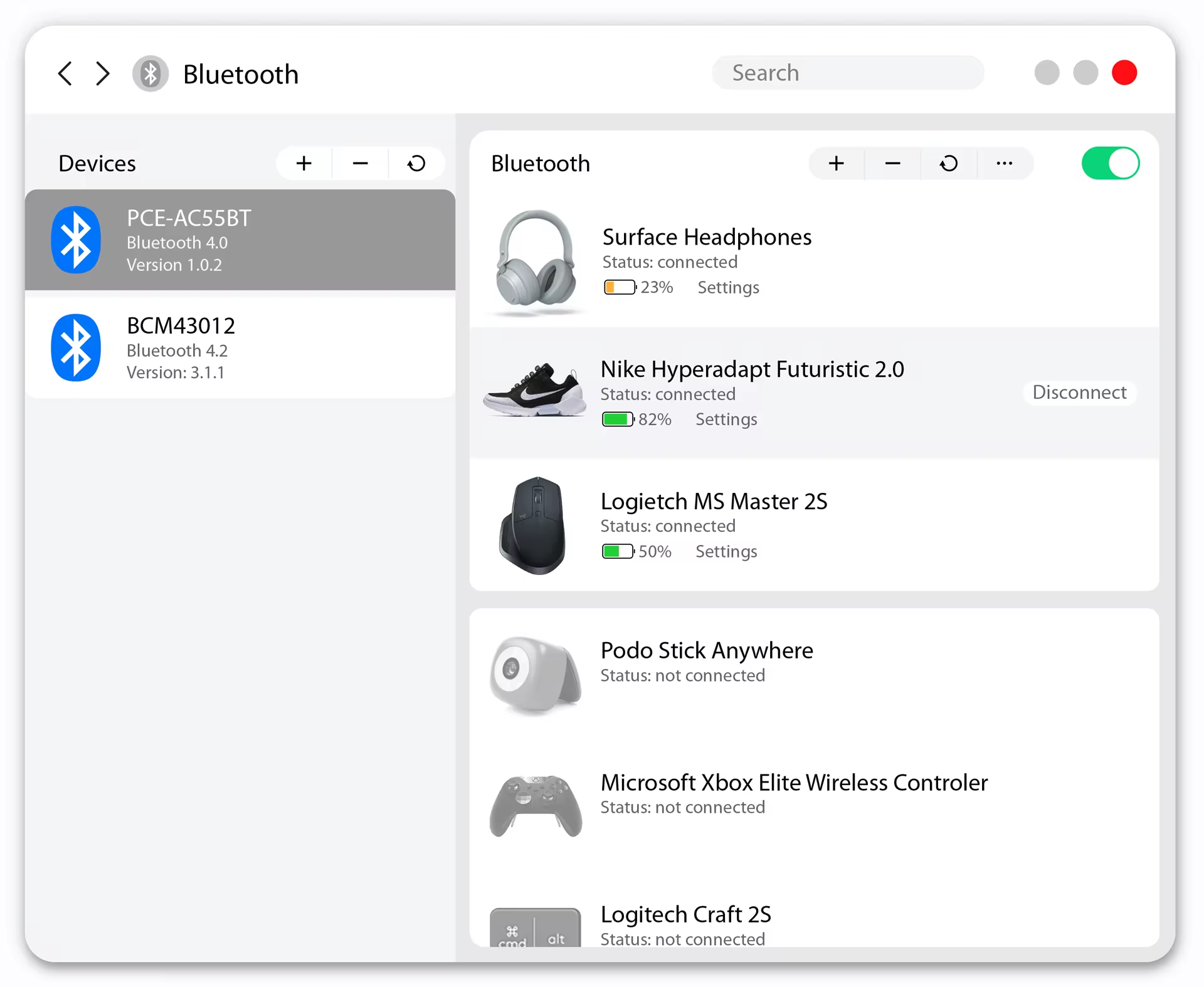
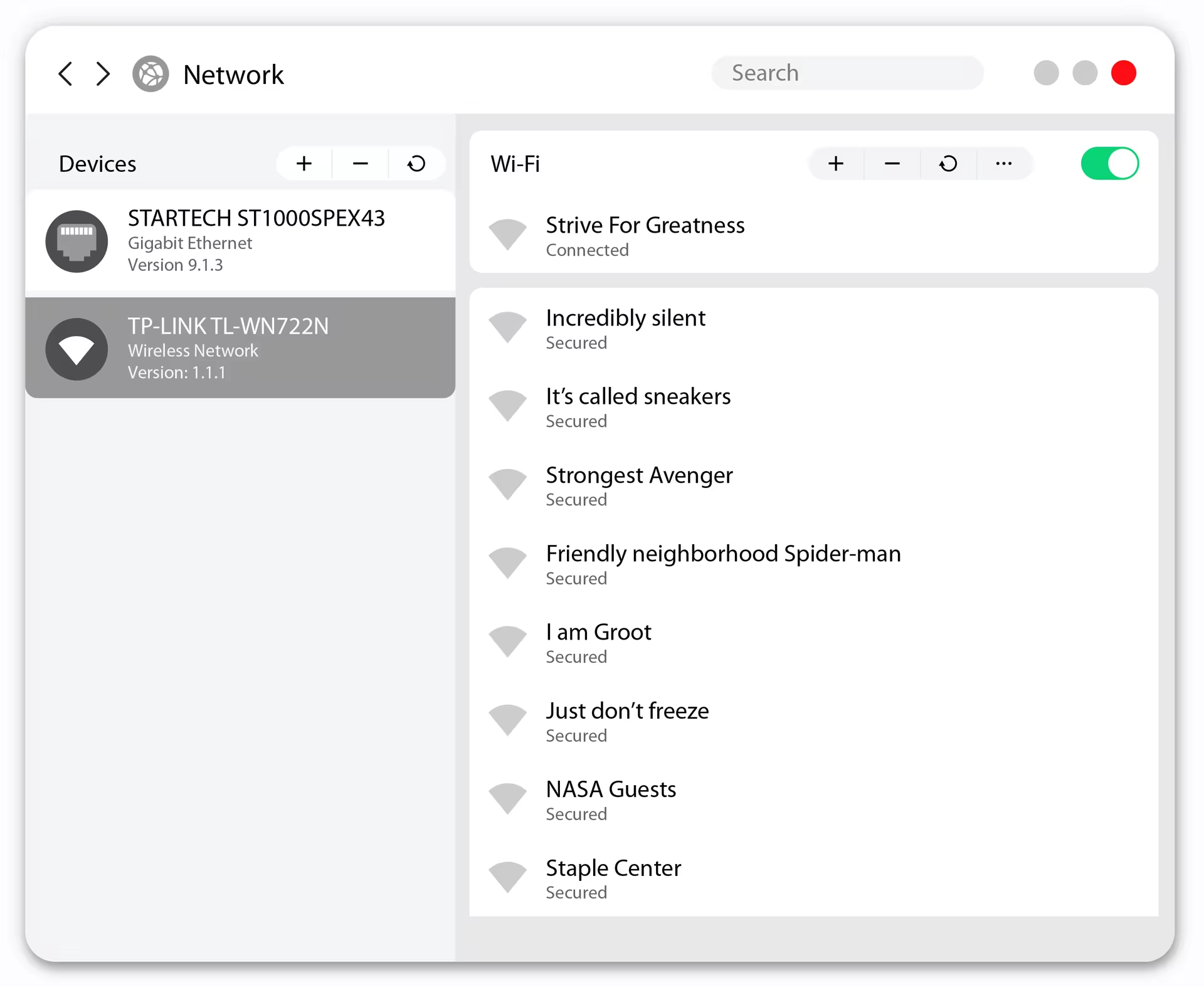
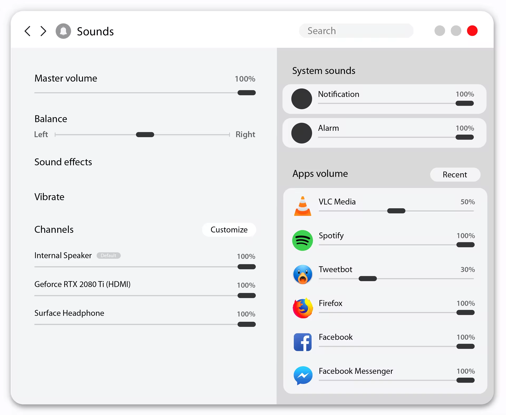
Our top priority is to bring the ability to control the machines to users’ hands. We do that by merging the current Setting app and the old Control Panel into one. Making managing your computer is more simple and easy than ever. Not stopping there, Control Panel continue SpaceSense philosophy to bring your devices into Windows in a very lively way.
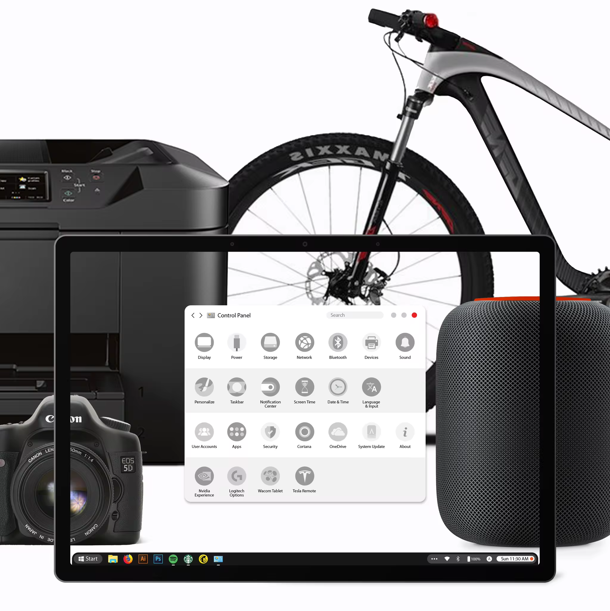
Settings are divided into groups so you can access Control Panel more quickly and accurately the more you use it.
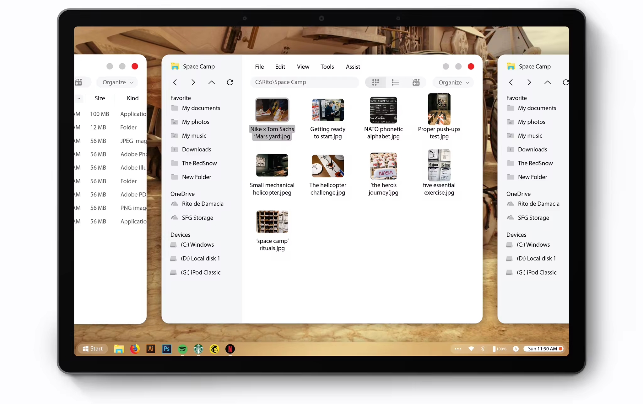
File Explorer
To infinity and beyond!
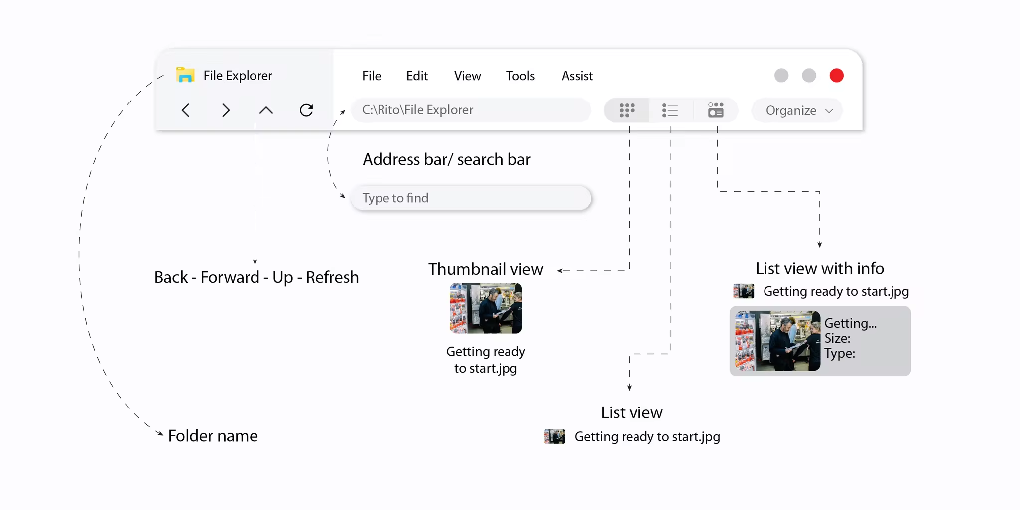
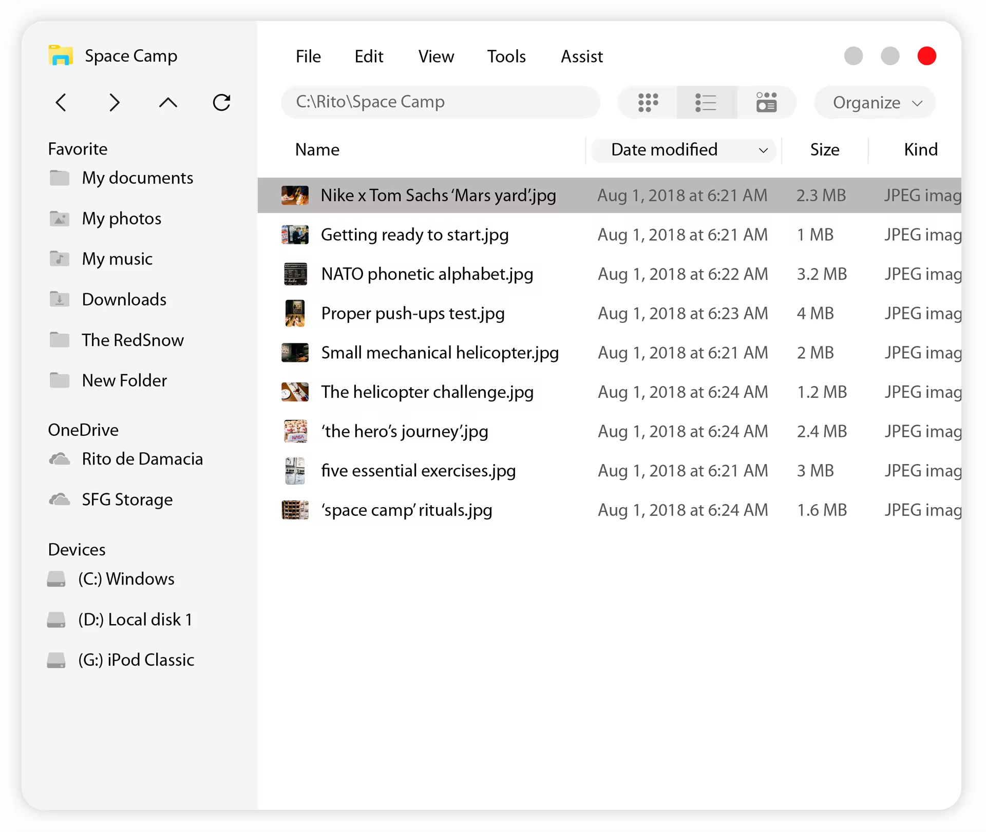
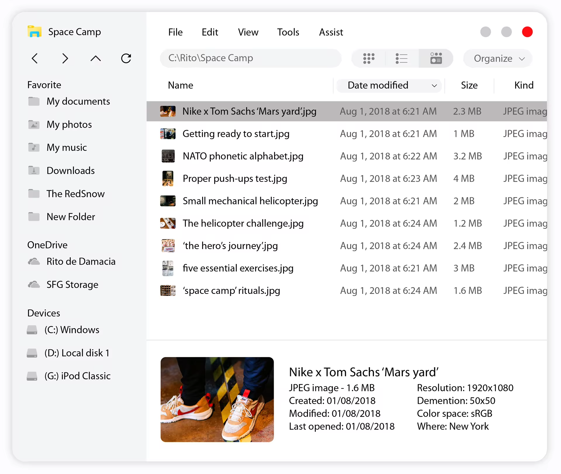
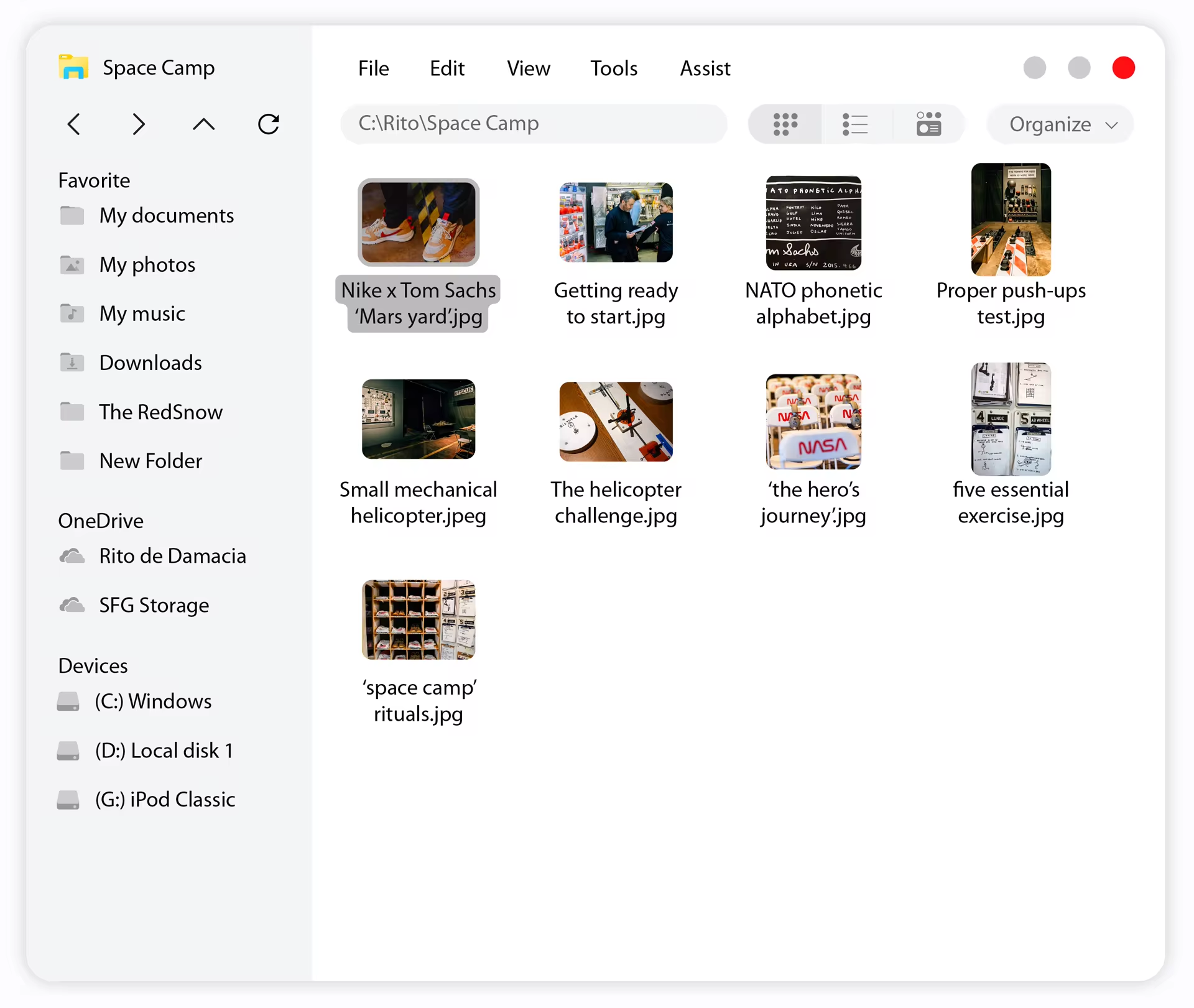
Redesigned Space Explorer… eh, File Explorer make browsing, storing and working with files an ease.
For behind the work of Windows Space, visit our publication on Medium: https://medium.com/@ritodedamacia/behind-the-work-windows-space-windows-redesign-concept-702b1c28f026
Please feel free to share what feature you love to see in Windows in the comment section below ???
Thank you!
SPACE – Windows 10 Redesign