Studio Sahil Branding & Brand Positioning

STORY
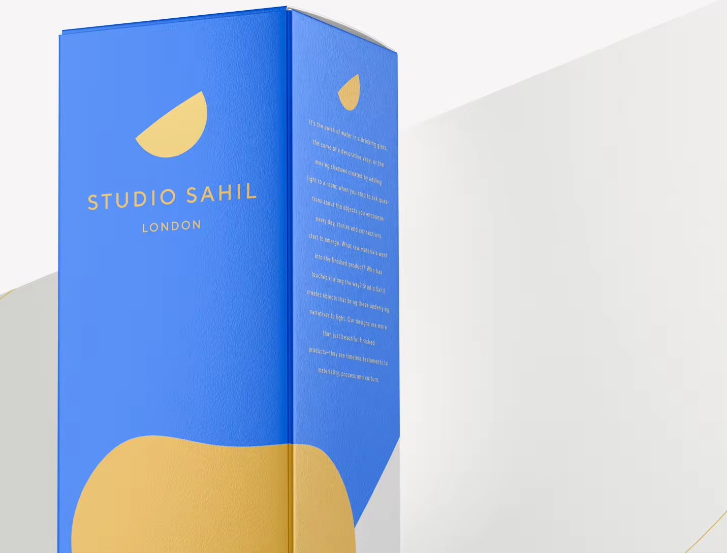
It’s the swish of water in a drinking glass, the curve of a decorative vase, or the moving shadows created by adding light to a room; when you stop to ask questions about the objects you encounter every day, stories and connections start to emerge. What raw materials went into the finished product? Who has touched it along the way? Studio Sahil
creates objects that bring these underlying narratives to light. Our designs are more than just beautiful finishedproducts—they are timeless testaments to materiality, process and culture.
Sahil is the Turkish word for coast or shore. We look to the natural phenomena, complex patterns and continuous evolution of seaside landscapes to inspire and inform our practice. Each piece is handmade from organic materials by Rezzan Hasoglu and local artisans, using materials and techniques that respect the environment. We pay
attention to how our designs connect with our daily experiences, how they narrate a story and how they draw attention to the often-unnoticed details of everyday life.
LOGO
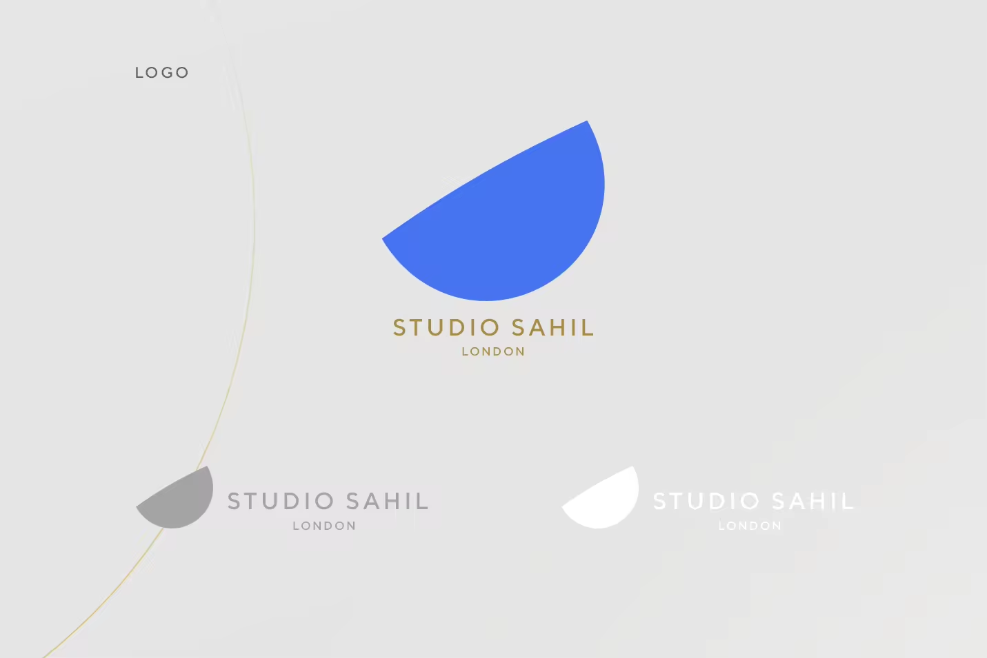
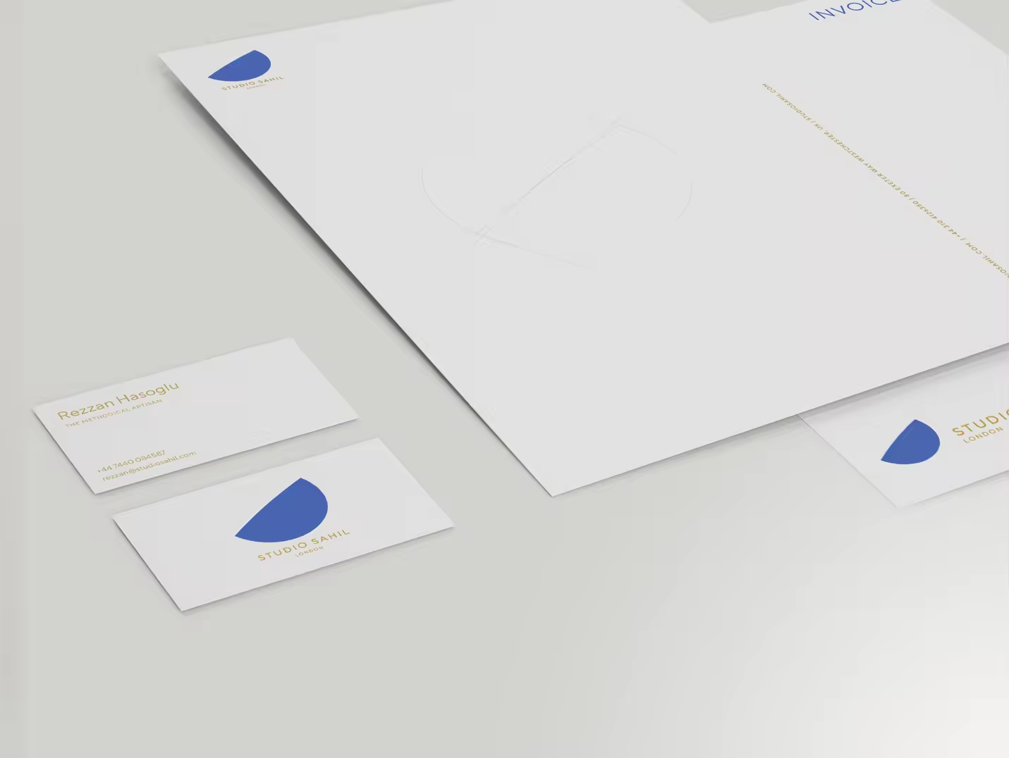
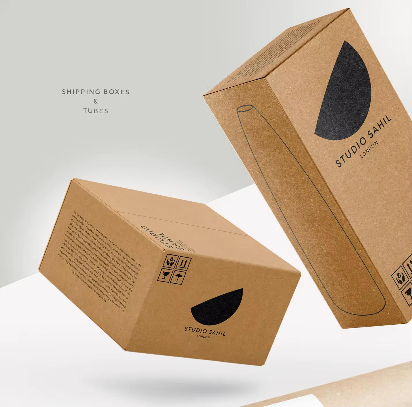
We look to the natural phenomena, complex patterns and continuous evolution of seaside landscapes to inspire and inform our practice. Our logo represents that continuous evolution and the attributes that define Studio Sahil. It is curious yet intentional in its curves, poetic and social in its feel , thoughtful and conscientious in its presence. Simplicity at its core, we looked at the sea and shore relationship and designed a form that is hinting on the ever-evolving side of a ‘whole’, where your eye will try to complete the other half each time you look at it.
COLORS
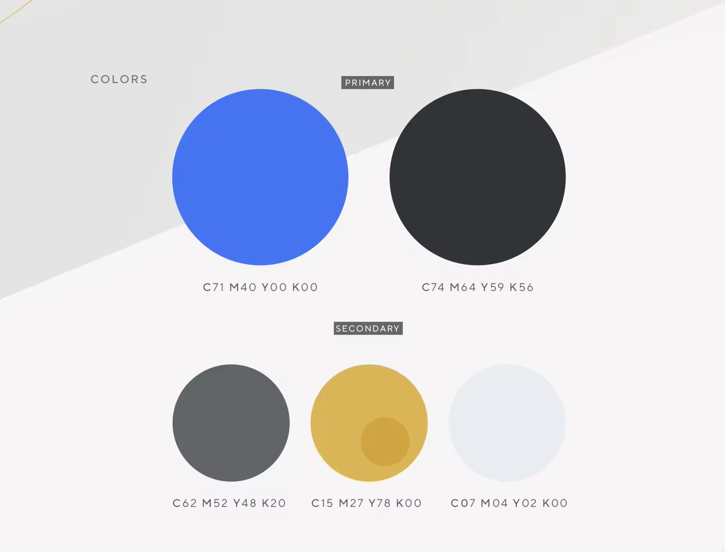
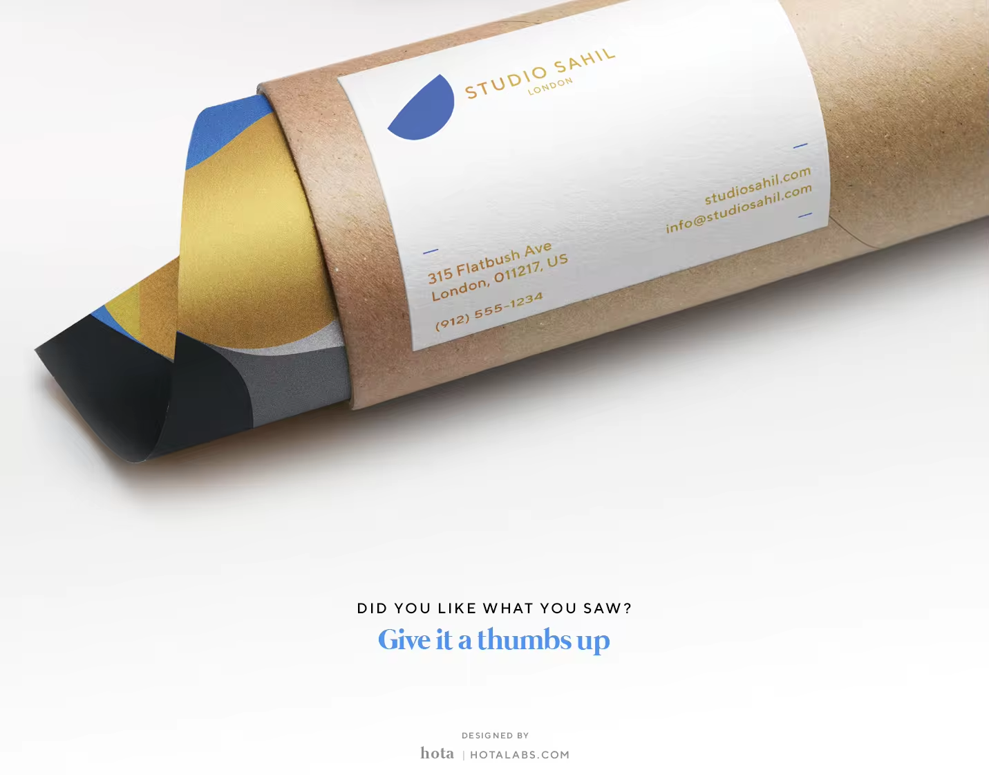
Our designs are timeless, eschewing trends—and meant for lasting use and appreciation. So as our colors. Nature, culture, earth, sophistication and timelessness influenced and shaped our choices in colors. Greys are for sophistication, Gold for elegance and the Mediterranean dusk blue for confidence, trustworthiness, and evolution.

Studio Sahil Branding & Brand Positioning