FLOR Rebrand
FLOR
MODULAR BRAND DESIGN FOR THE CULT FAVORITE IN CUSTOM RUGS
With stars in their eyes and major growth on the horizon, FLOR was in need of a comprehensive rebrand—new logo, new messaging, a top-to-bottom overhaul of their identity system and a refreshed strategy for 20+ retail stores nationwide.
As longtime fans of the custom rug company, we were up for the challenge. And with FLOR eager to find a true collaborator for the project—a team that wouldn’t dictate, but arrive at solutions together, it was a match made in design heaven.
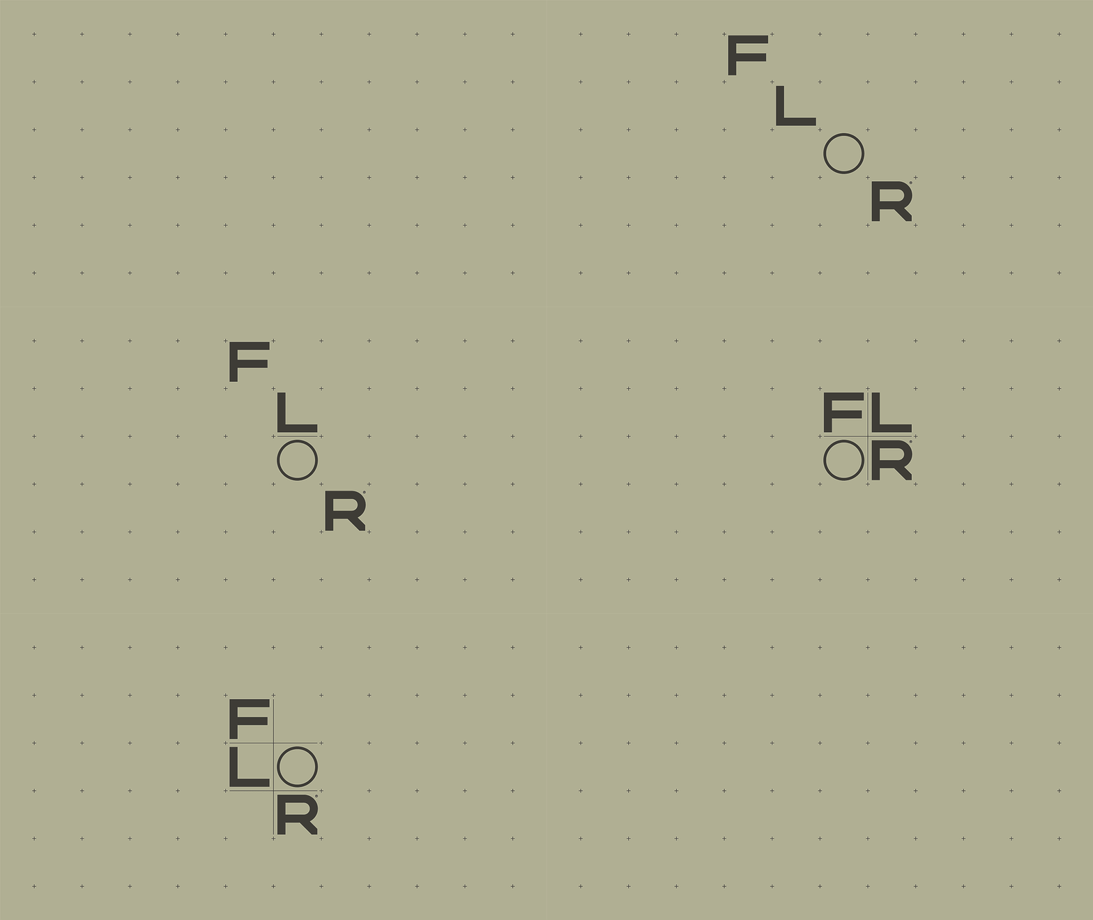
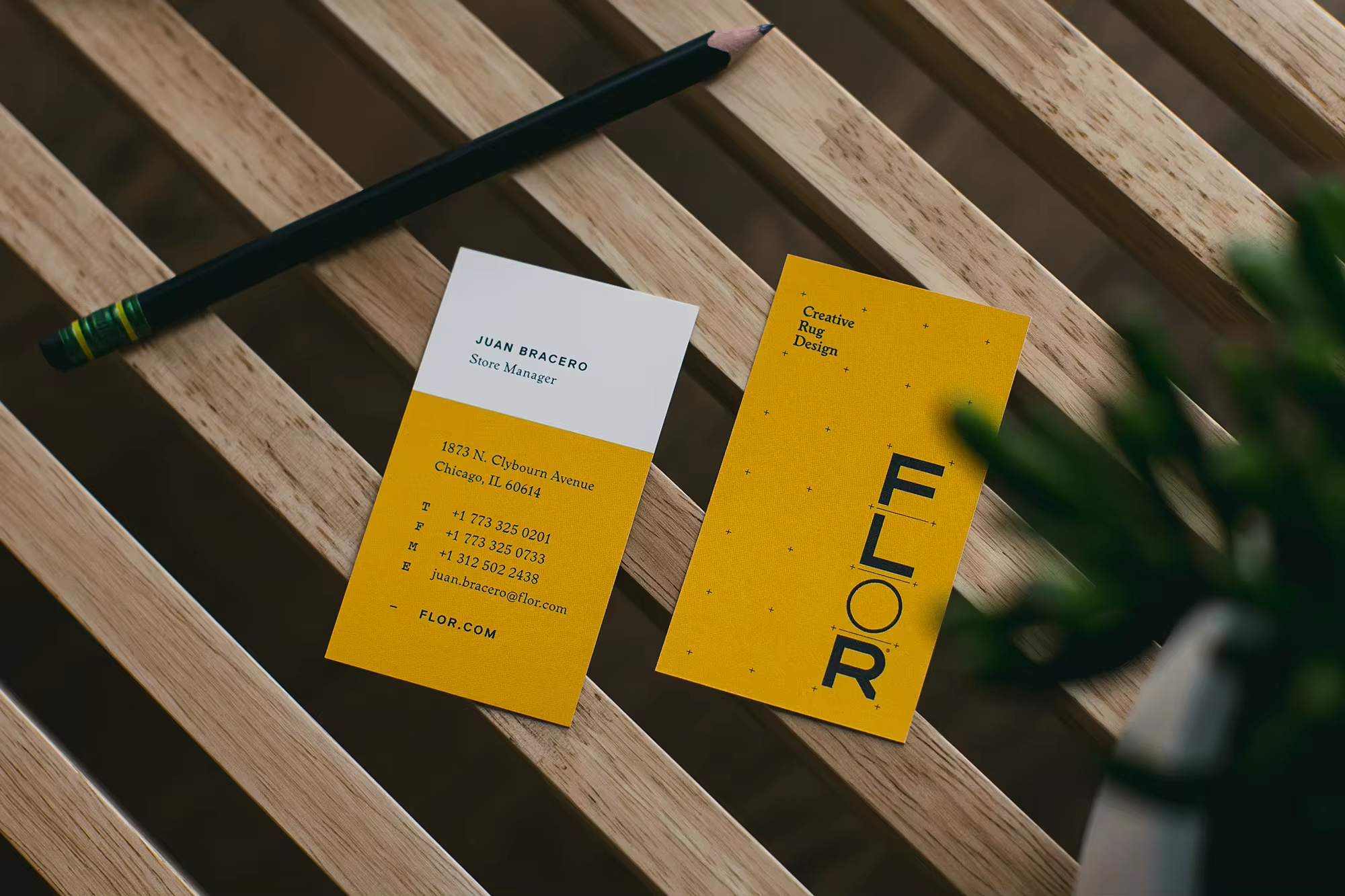
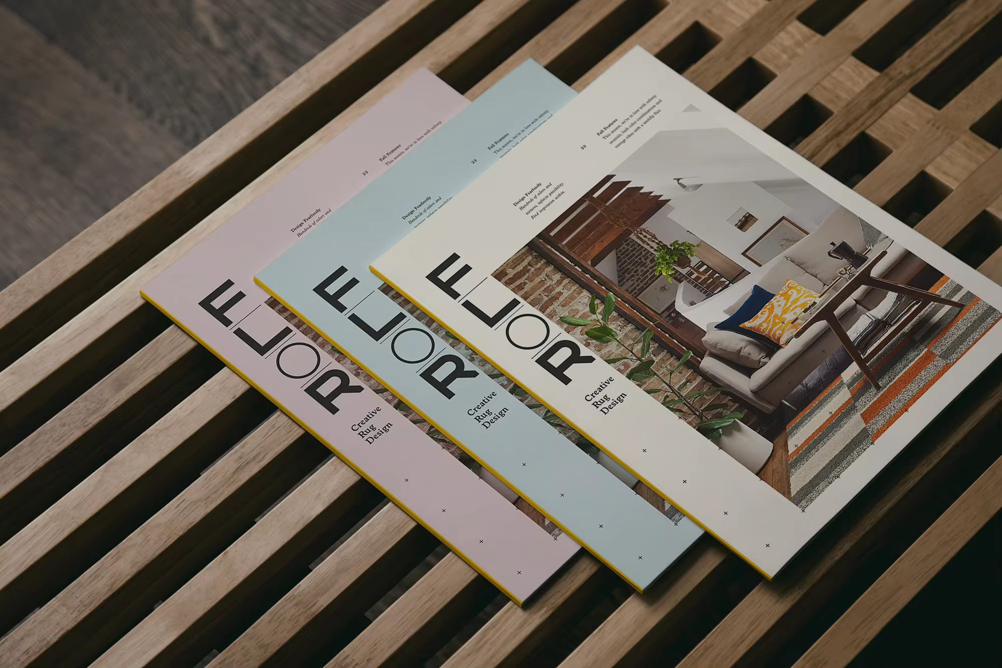
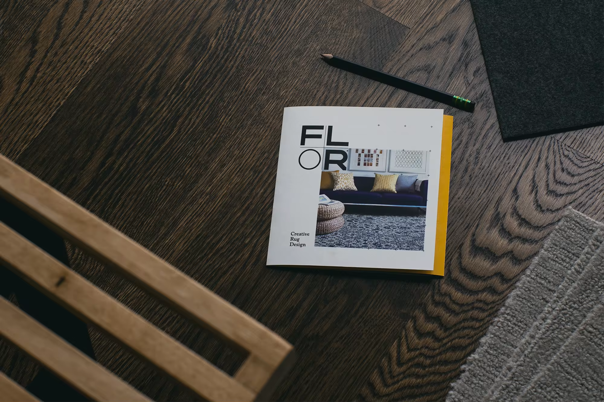
Together, we set out to refine FLOR’s story, sell the design experience and convert browsers to brand loyalists. After a thorough language audit and intensive store research, we found lots of room to strengthen the brand and consumer experience. We began by crafting a short, memorable tagline—Creative Rug Design—and a lively logo to convey FLOR’s sense of freedom, play and flexibility.
And that was just the beginning.
I.
BRAND & IDENTITY SYSTEM
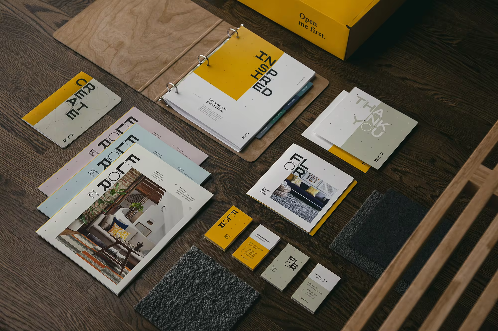
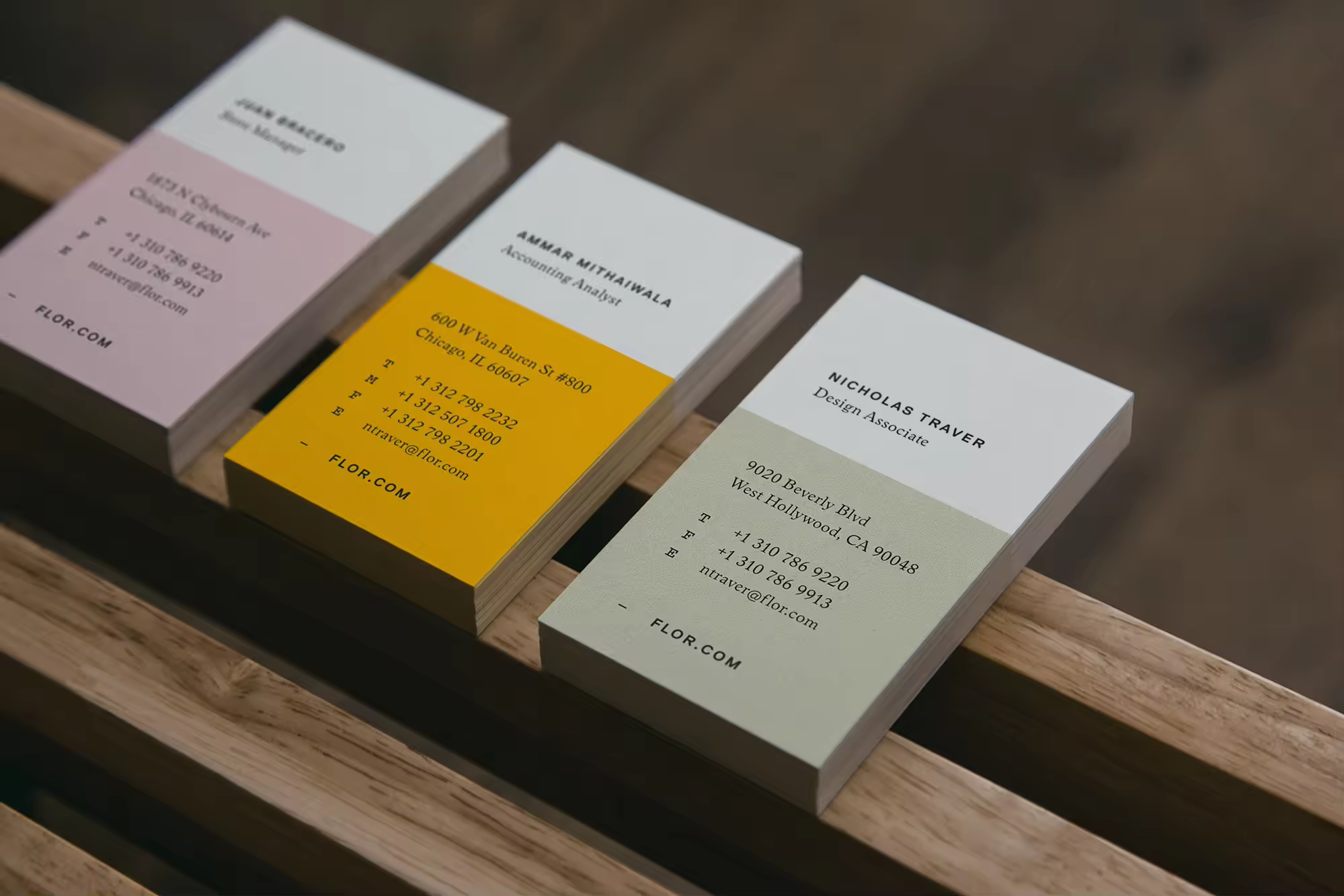
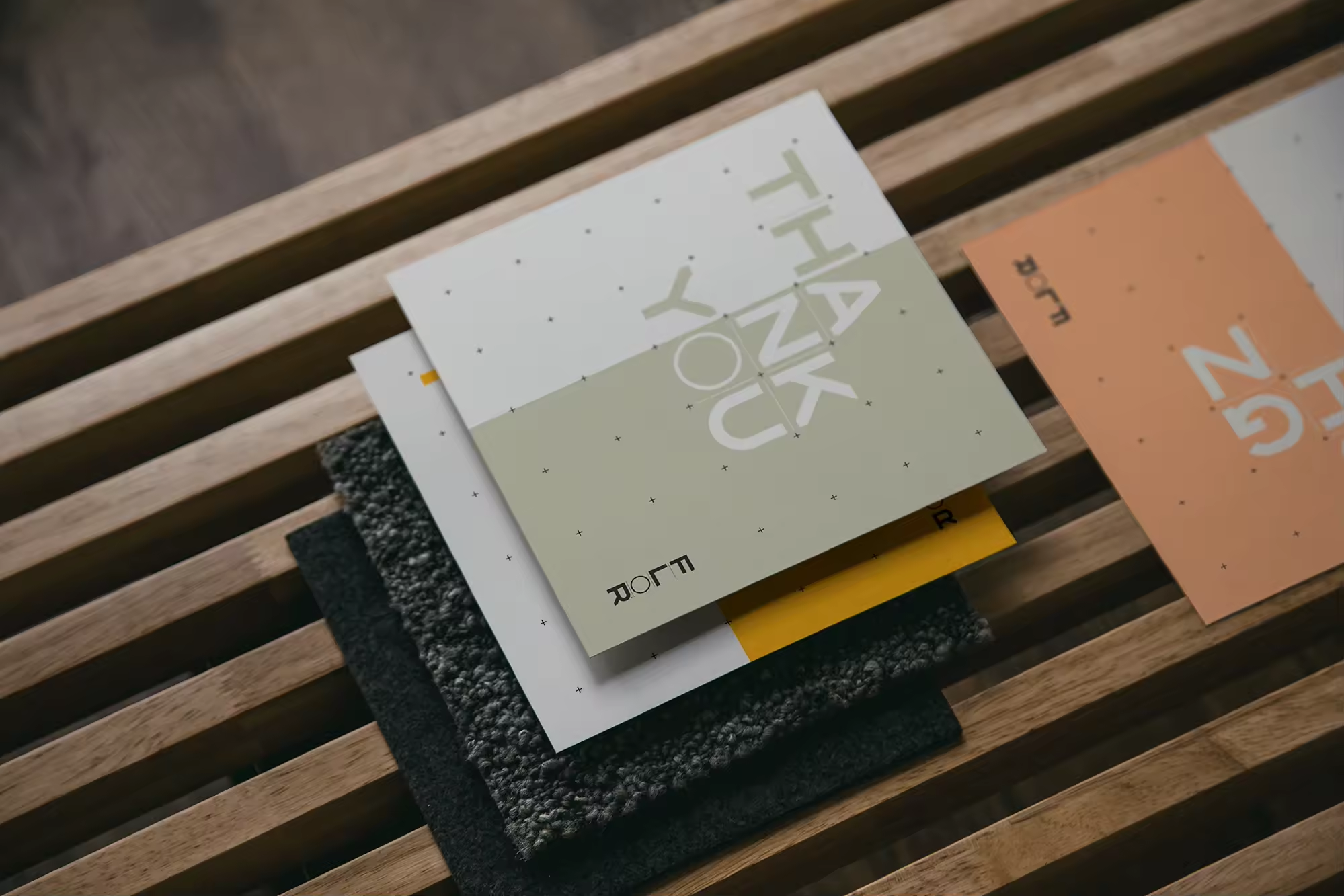
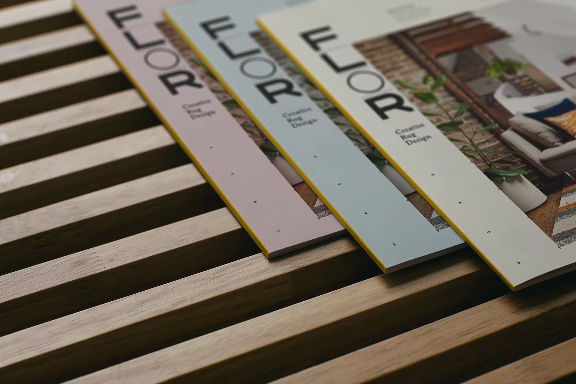
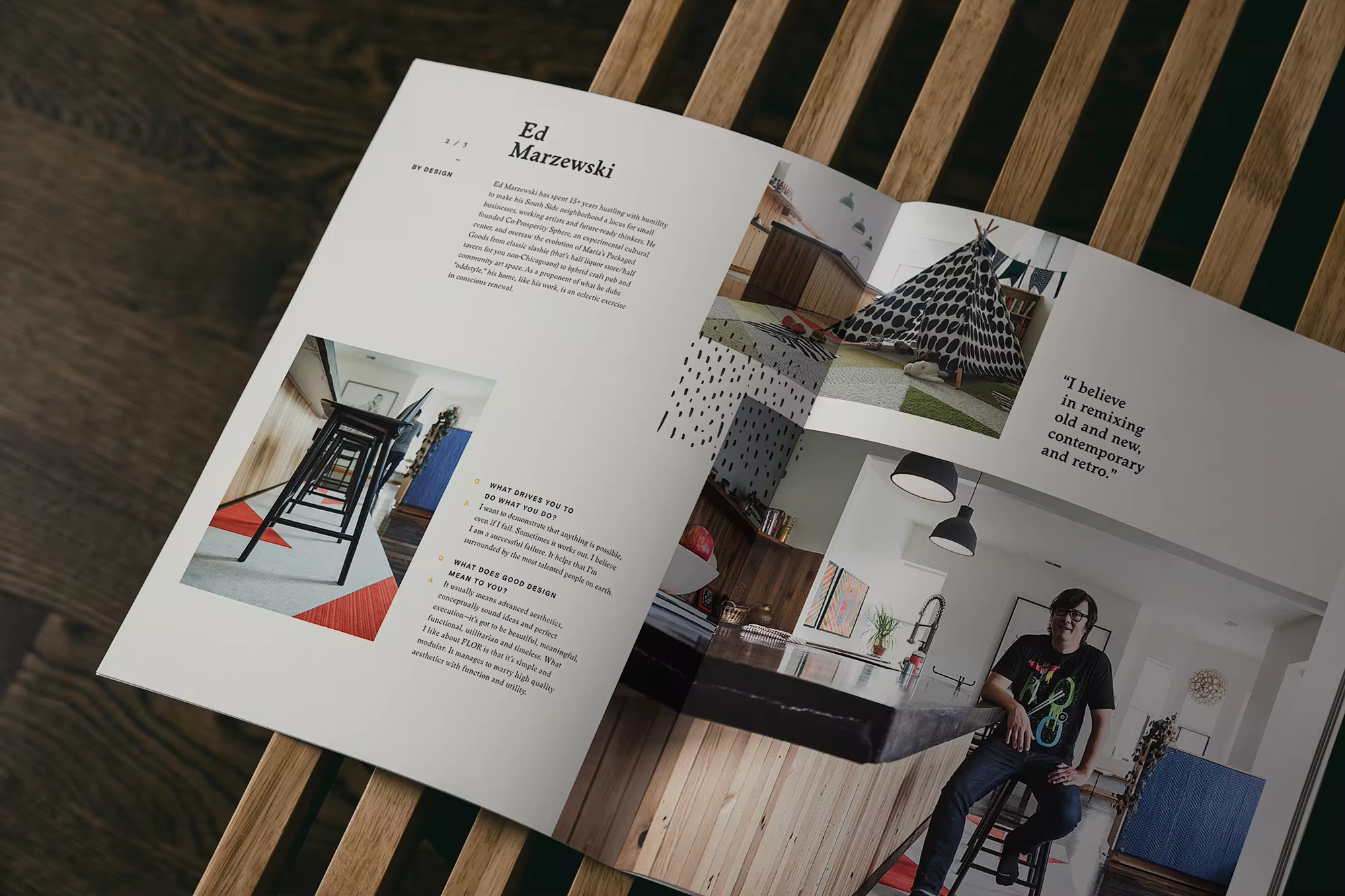
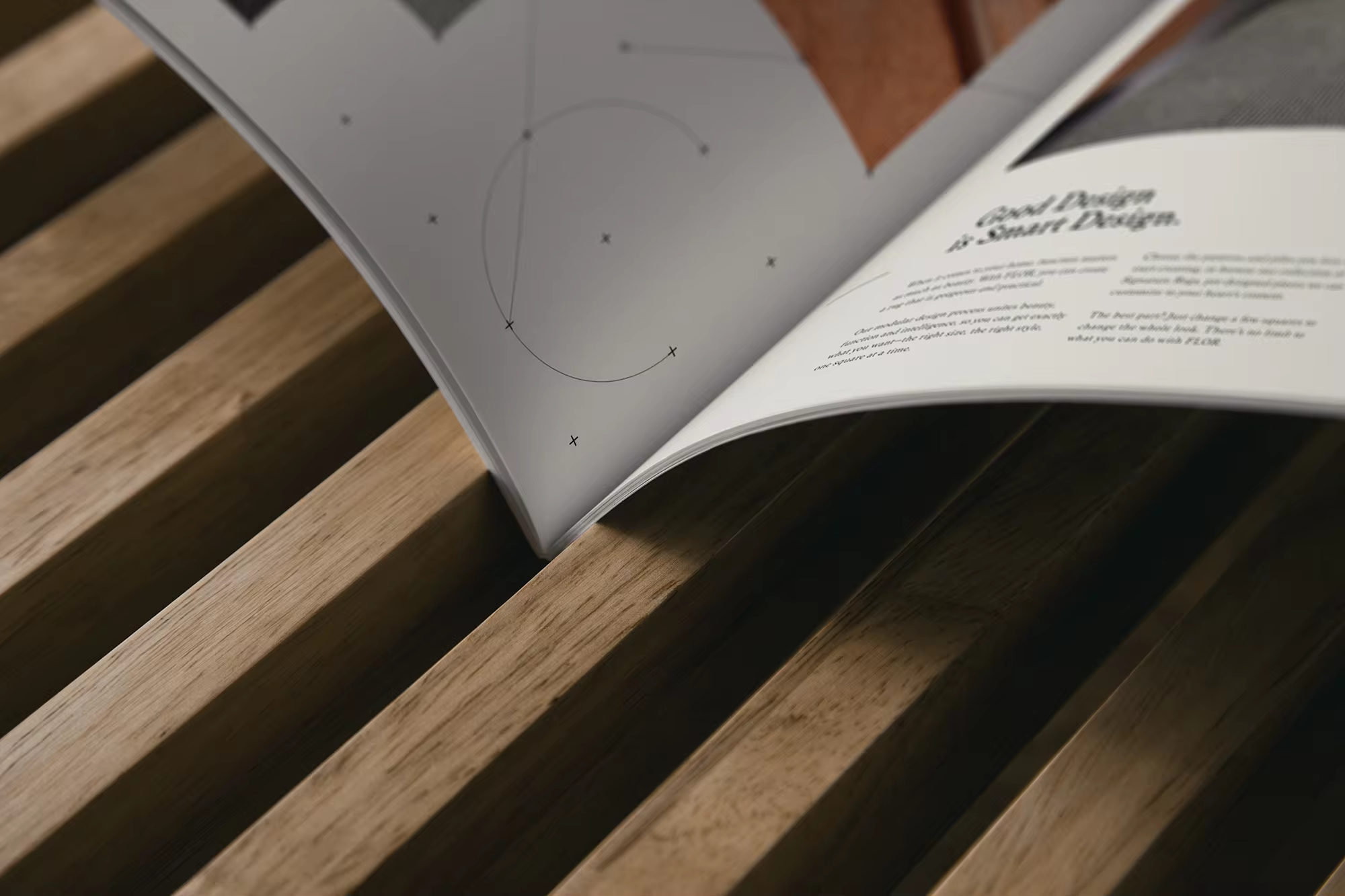
There’s a reason FLOR has such a fervent cult following; they put a lot of time into developing relationships with everyone who walks into their space. From seasonal catalogs and event invites to business and thank you cards, every piece of print collateral plays a part in connecting people to the brand.
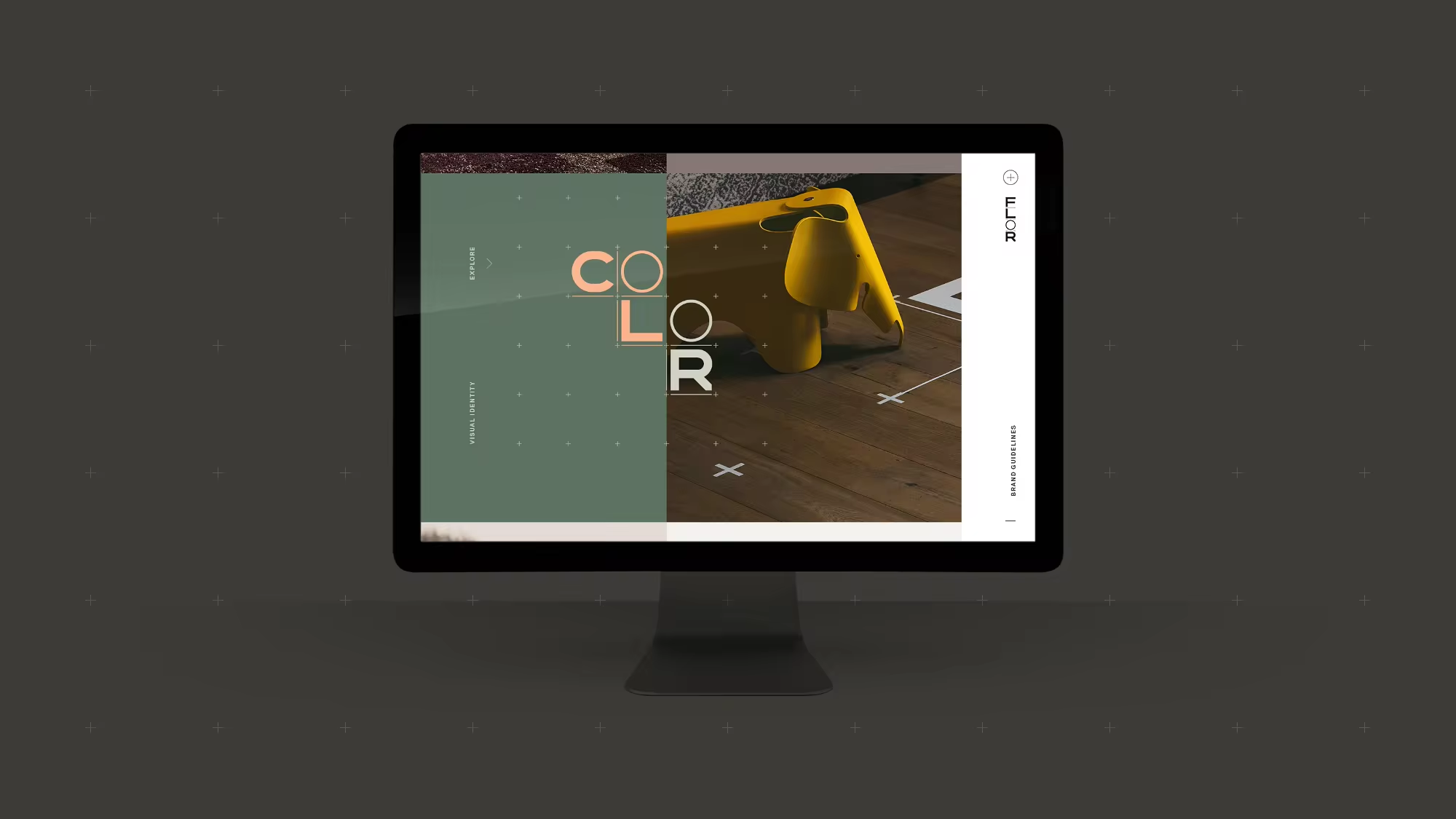
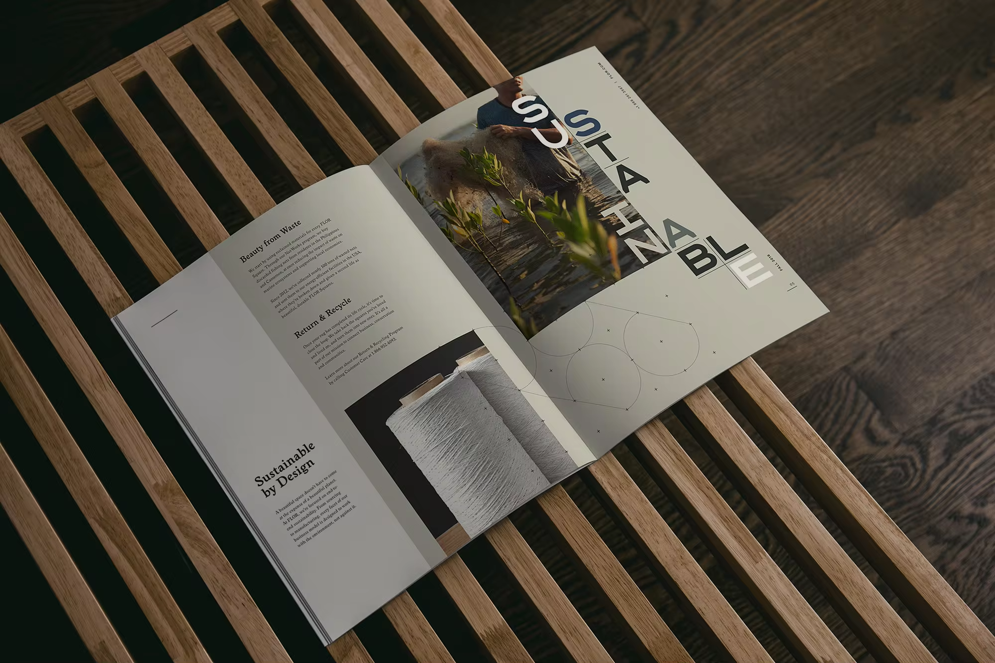
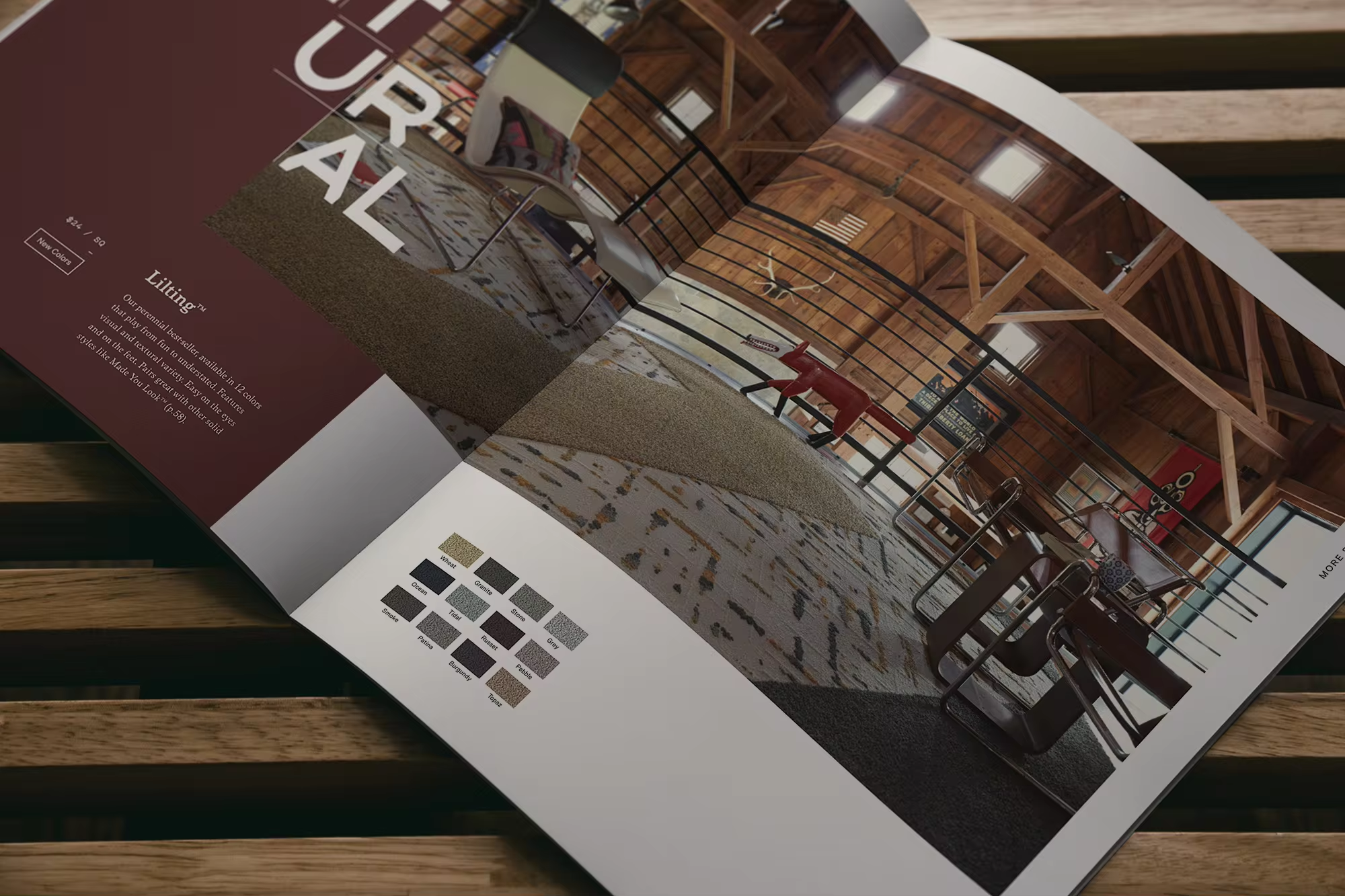
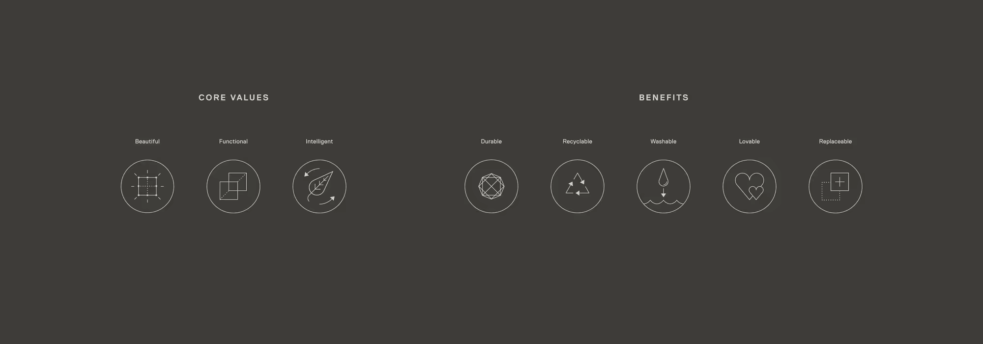
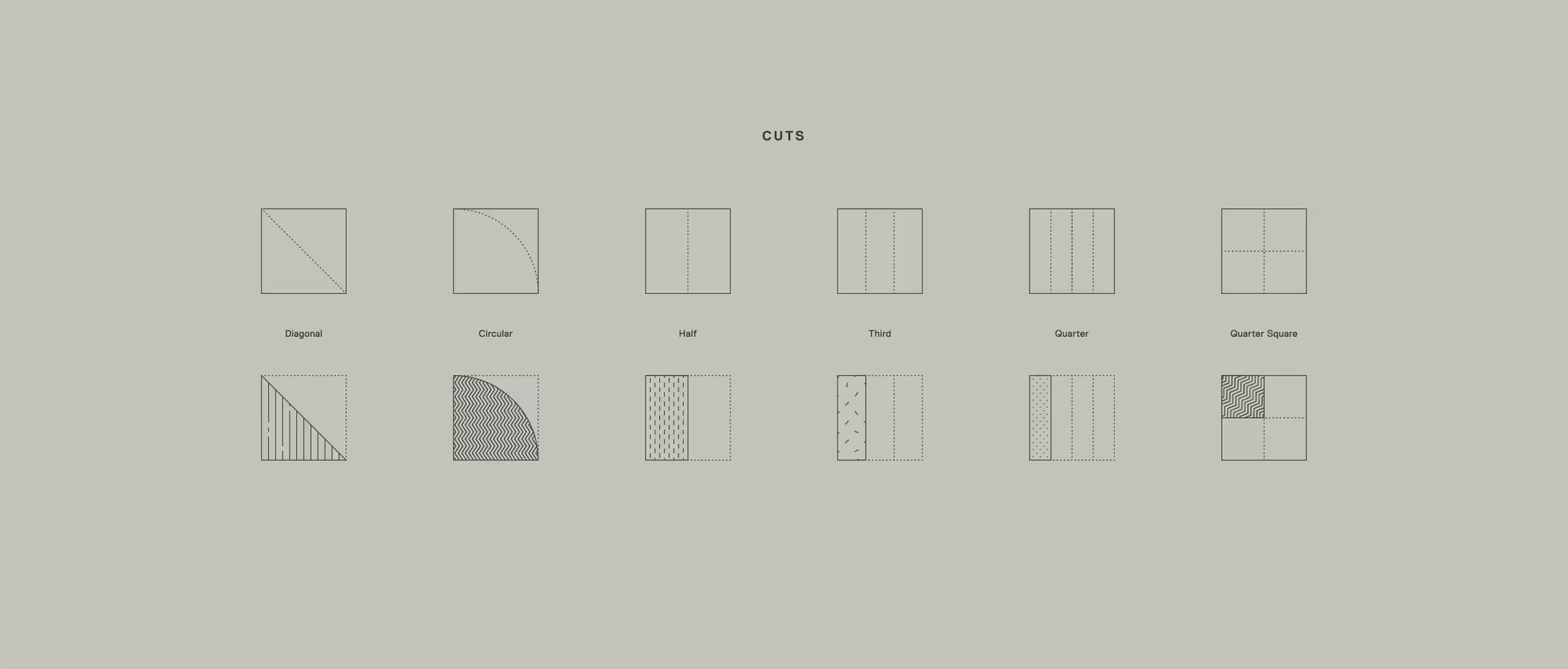
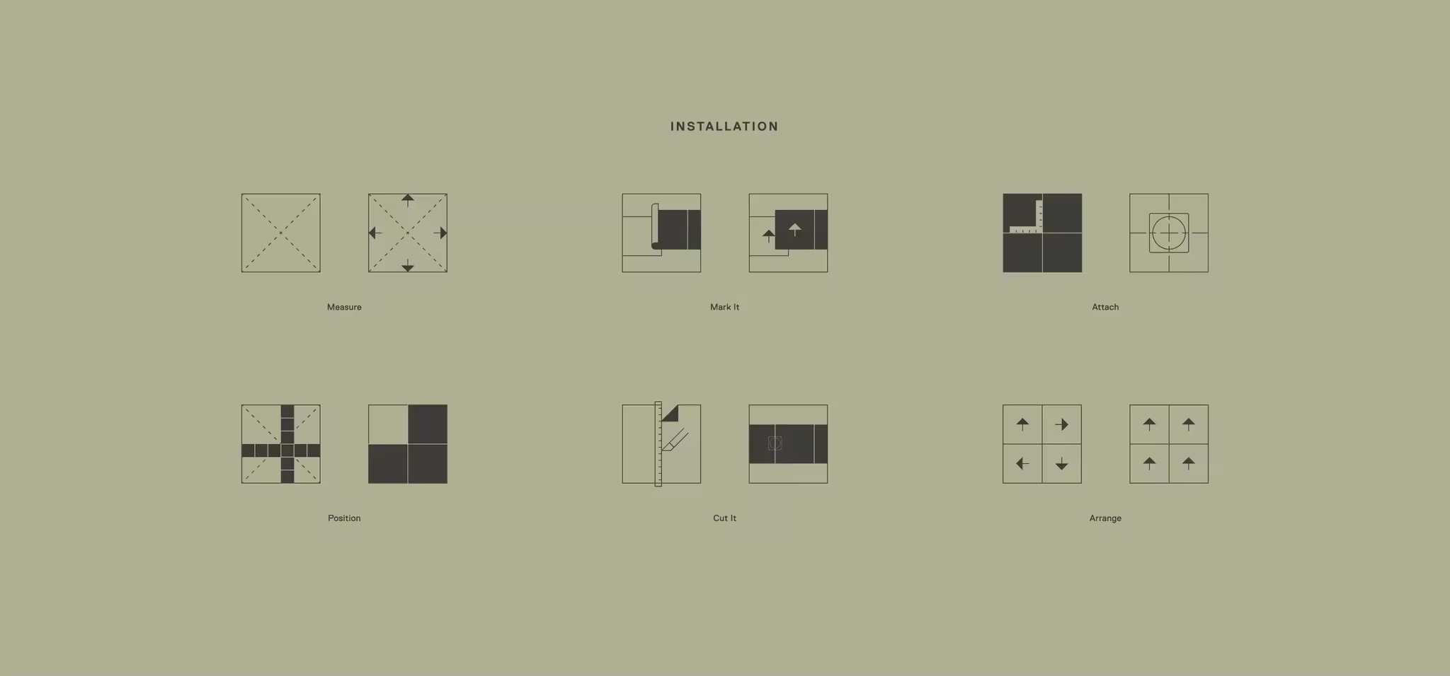
We developed a robust system of thoroughly modern, modular elements, including a broad, beautiful palette of brand colors and undertones, grid-based system of custom marks and suite of icons that captures the clever simplicity of FLOR’s product and process. With both a print and interactive digital brand guide, we provided in-depth instructions for using and combining elements in unique configurations, so every piece feels personal, colorful and undeniably FLOR.

II.
CREATIVE TOOLS
As we dove deeper into creating the ideal consumer experience, we quite literally put ourselves in a new customer’s shoes, going on a secret shopping mission to map specific needs and obstacles throughout the design process.
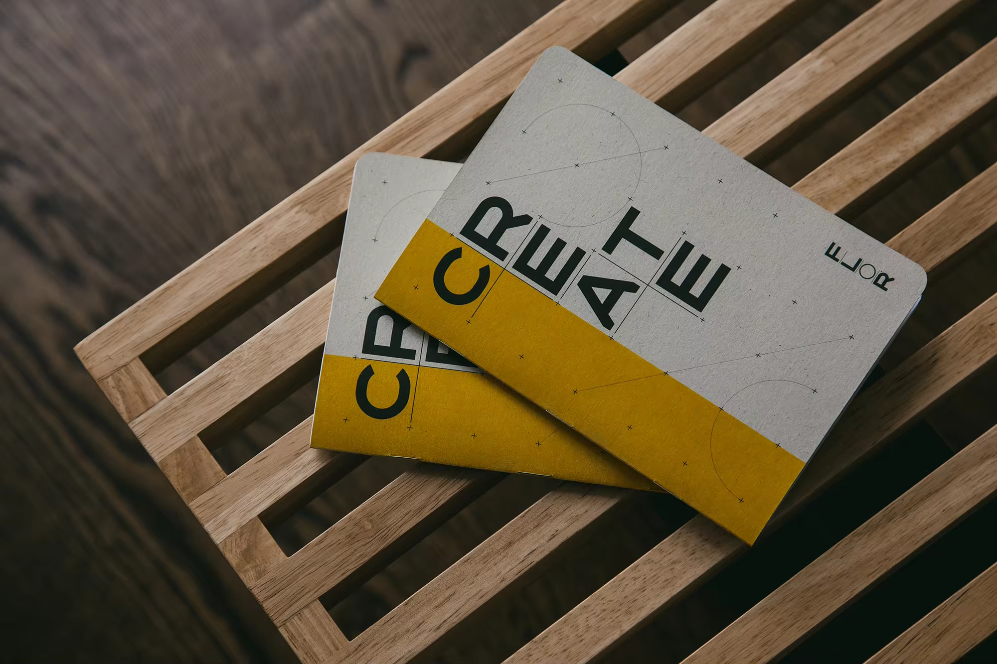
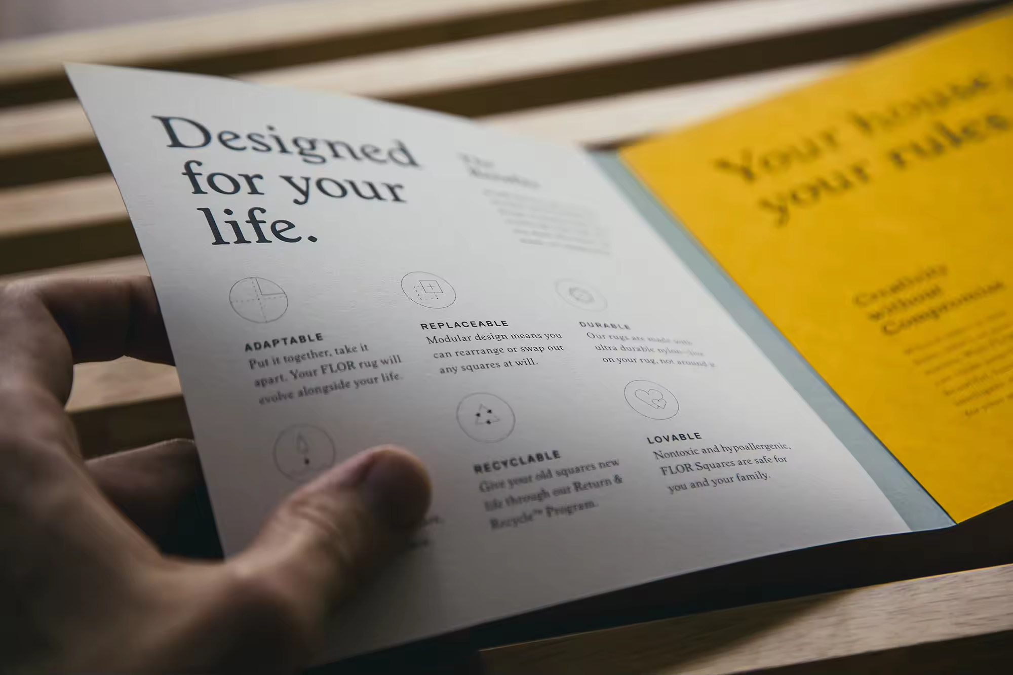
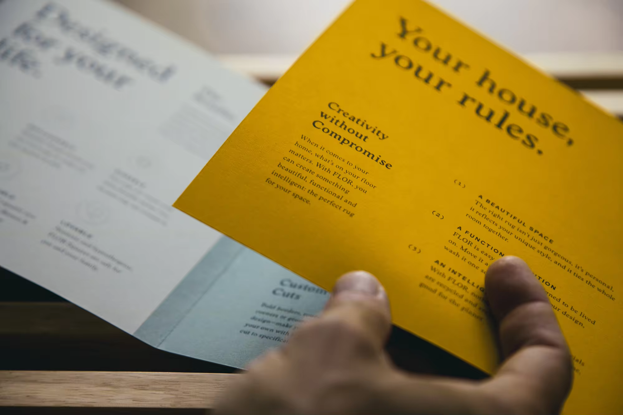
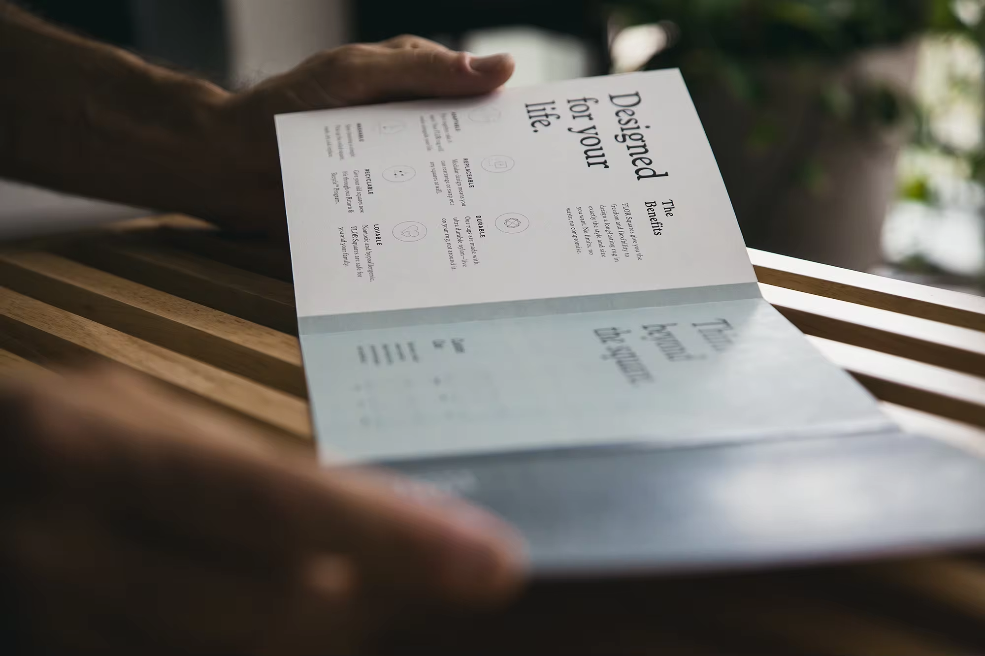
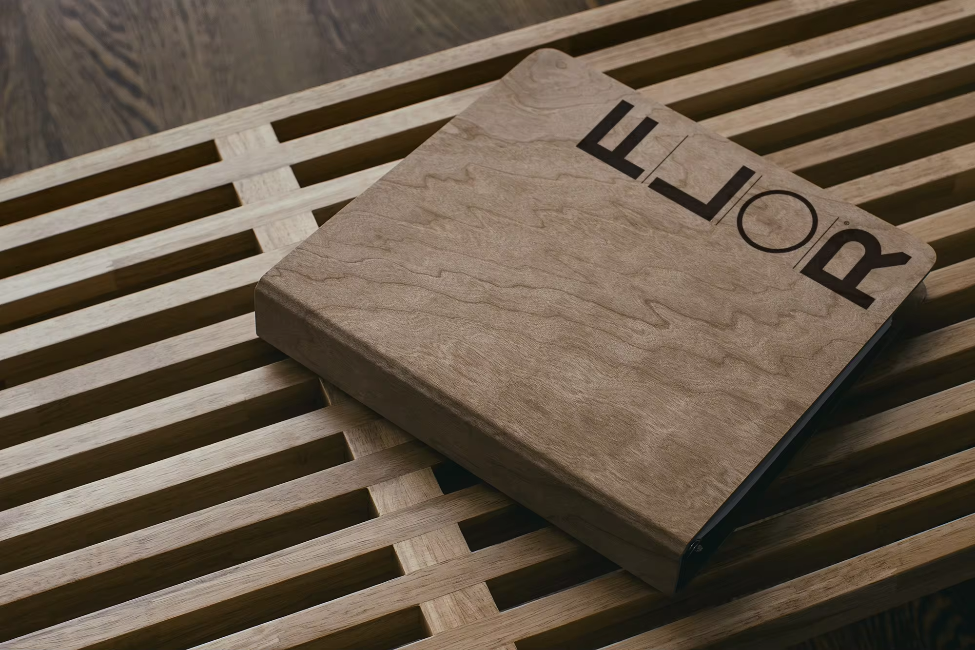
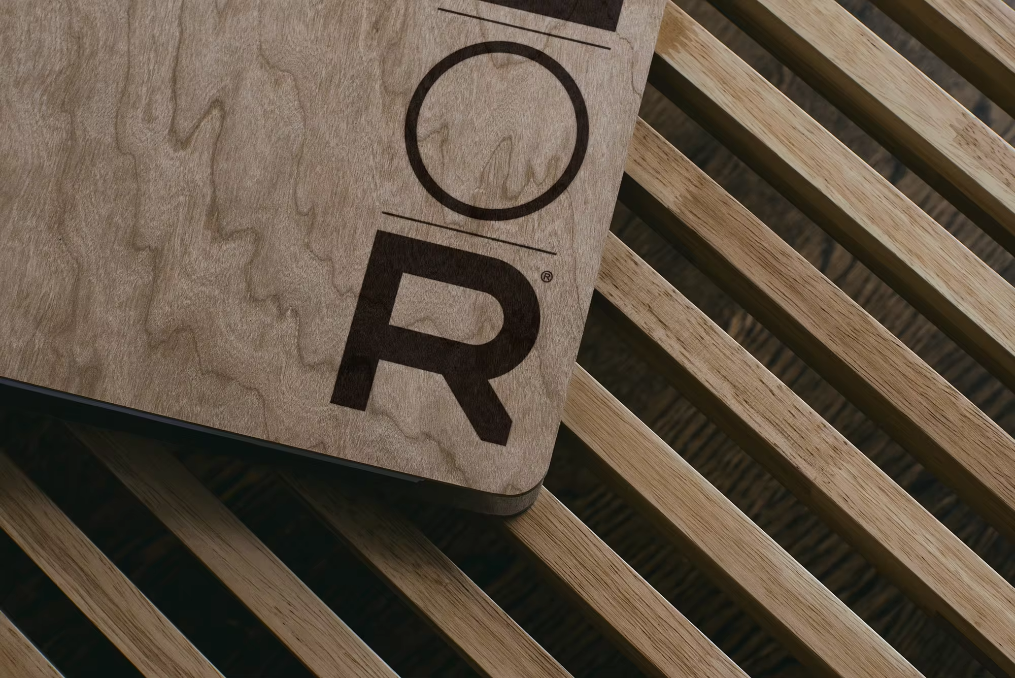
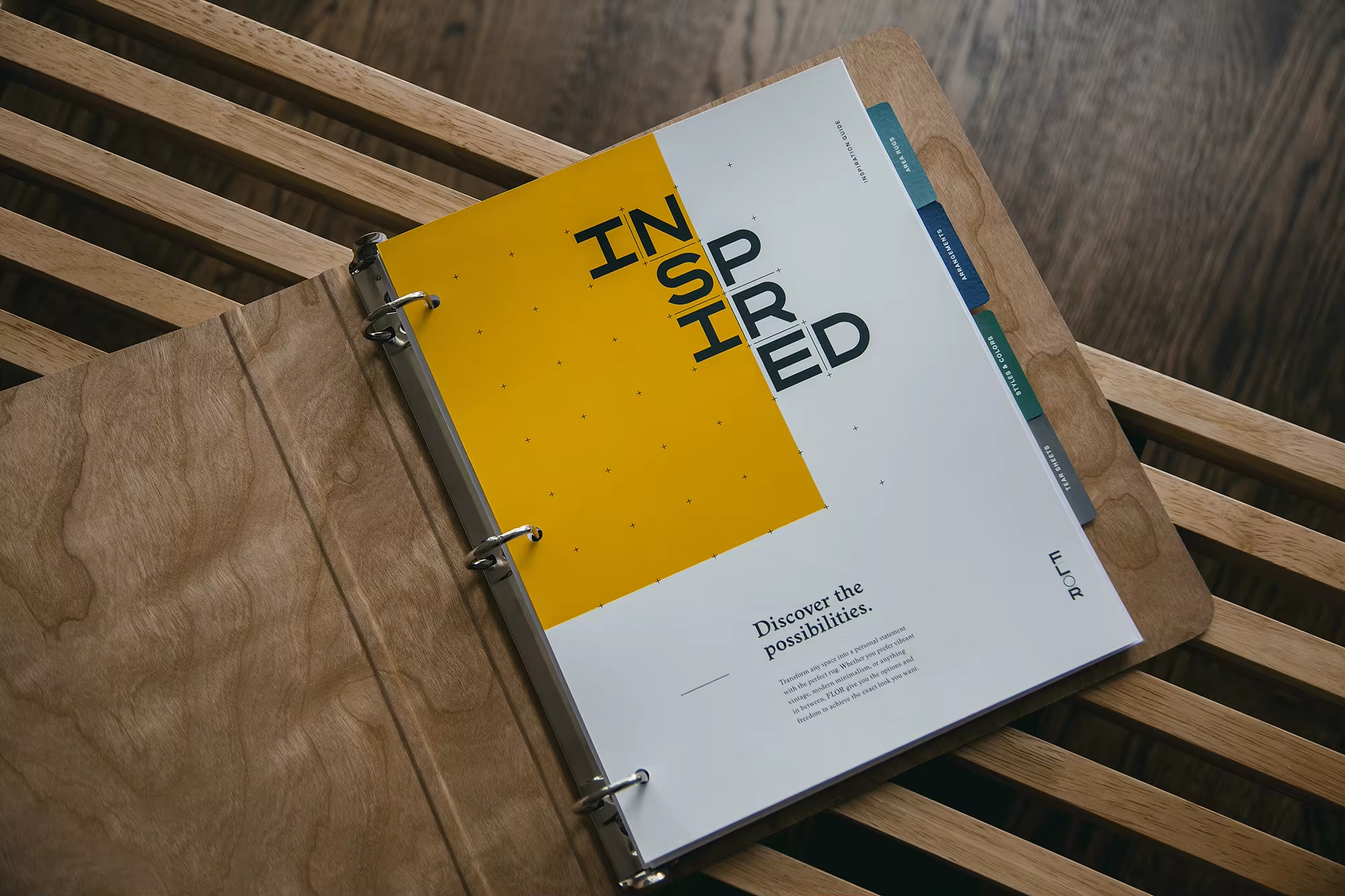
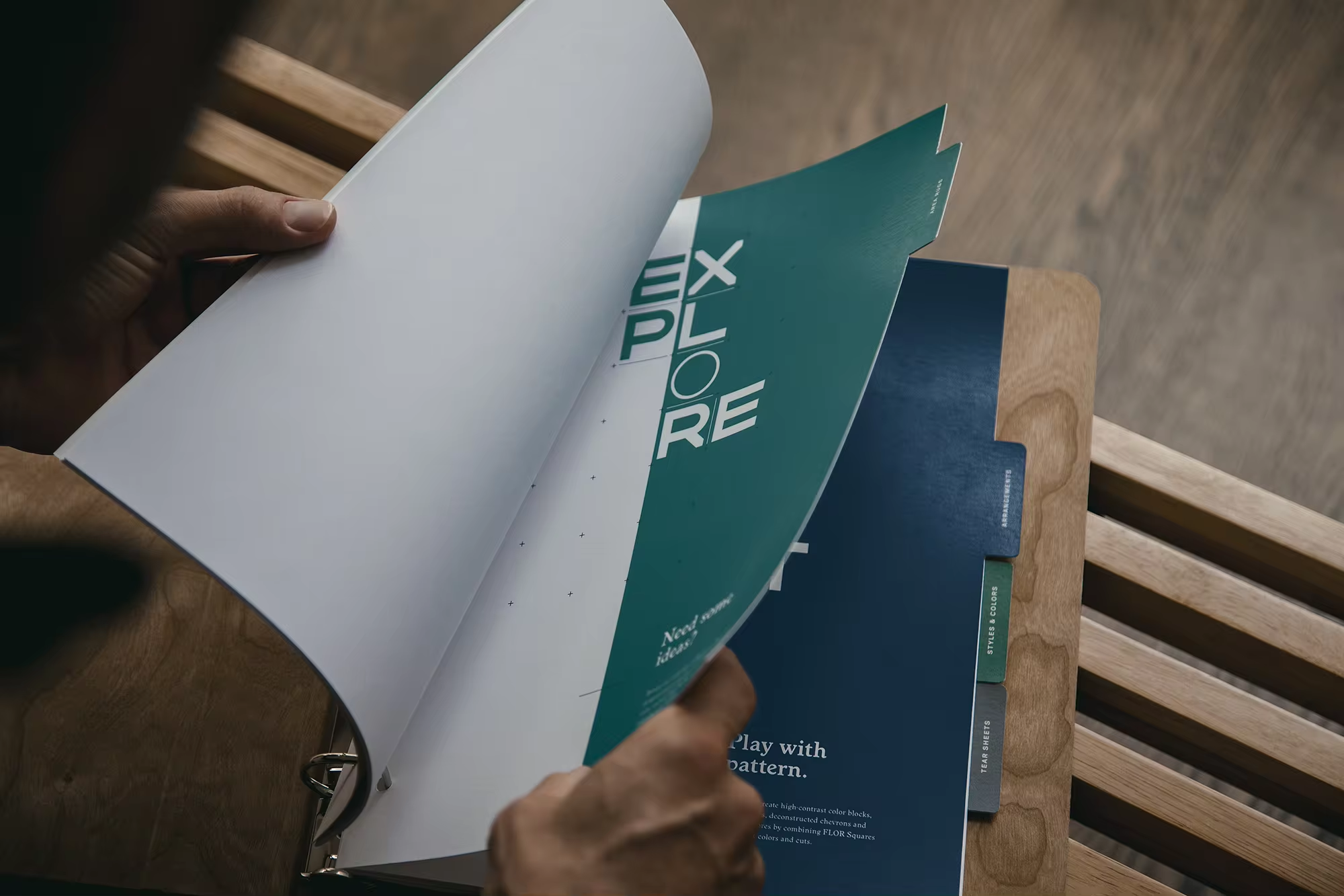
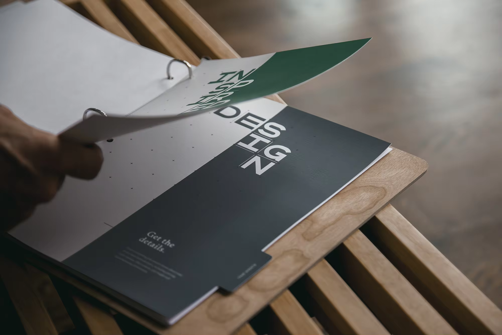
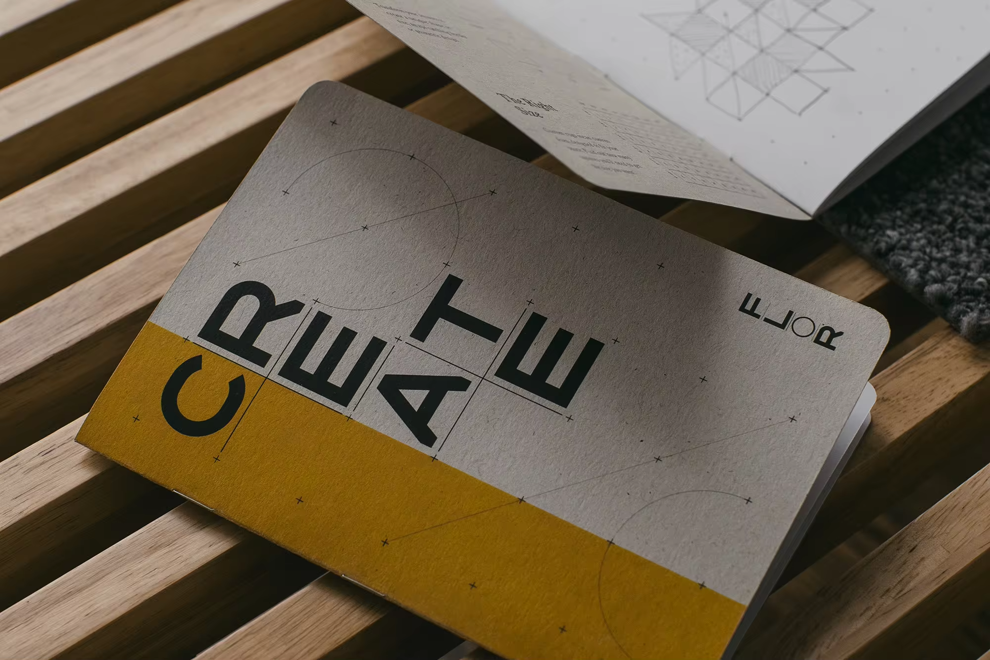
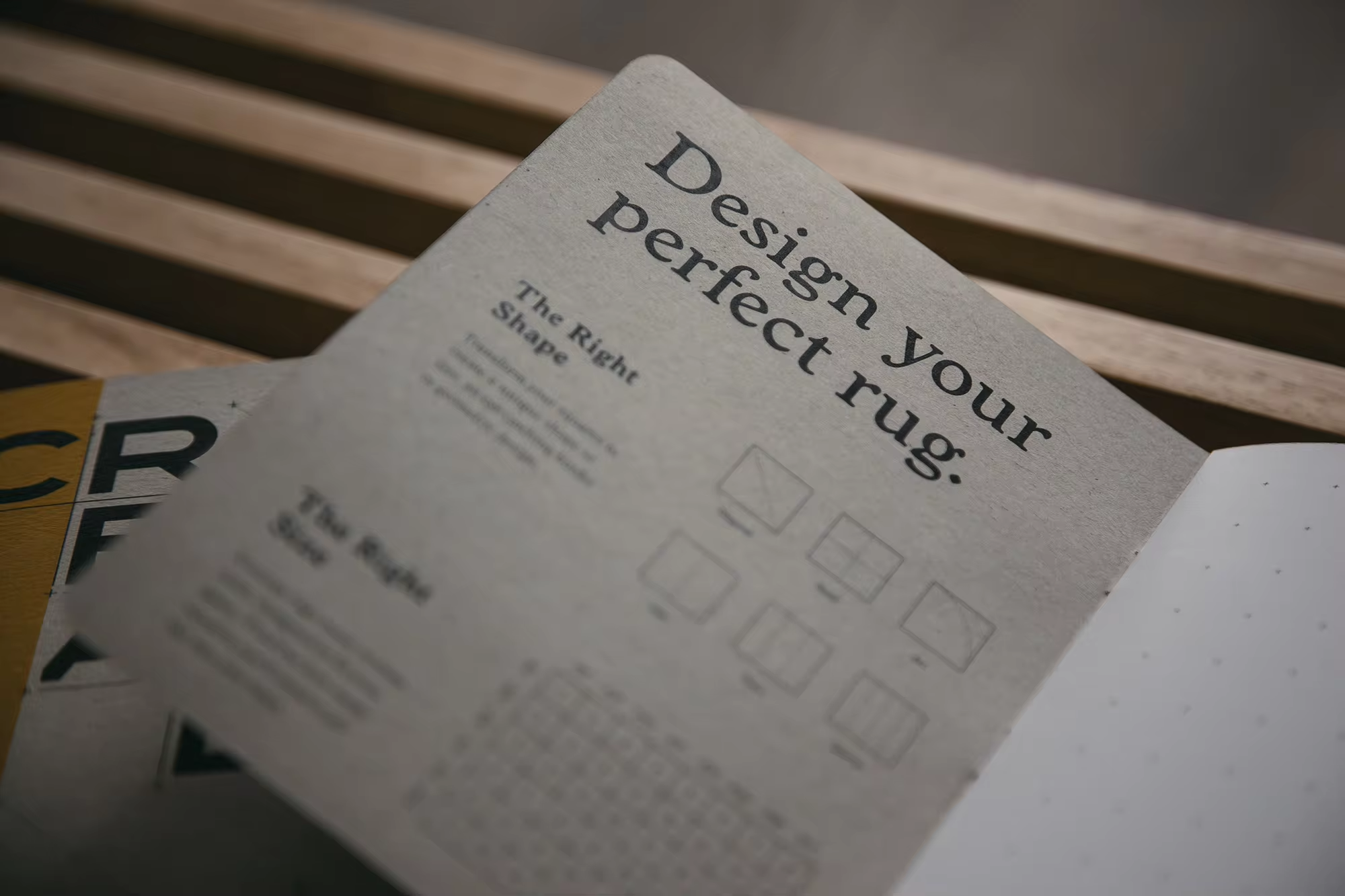
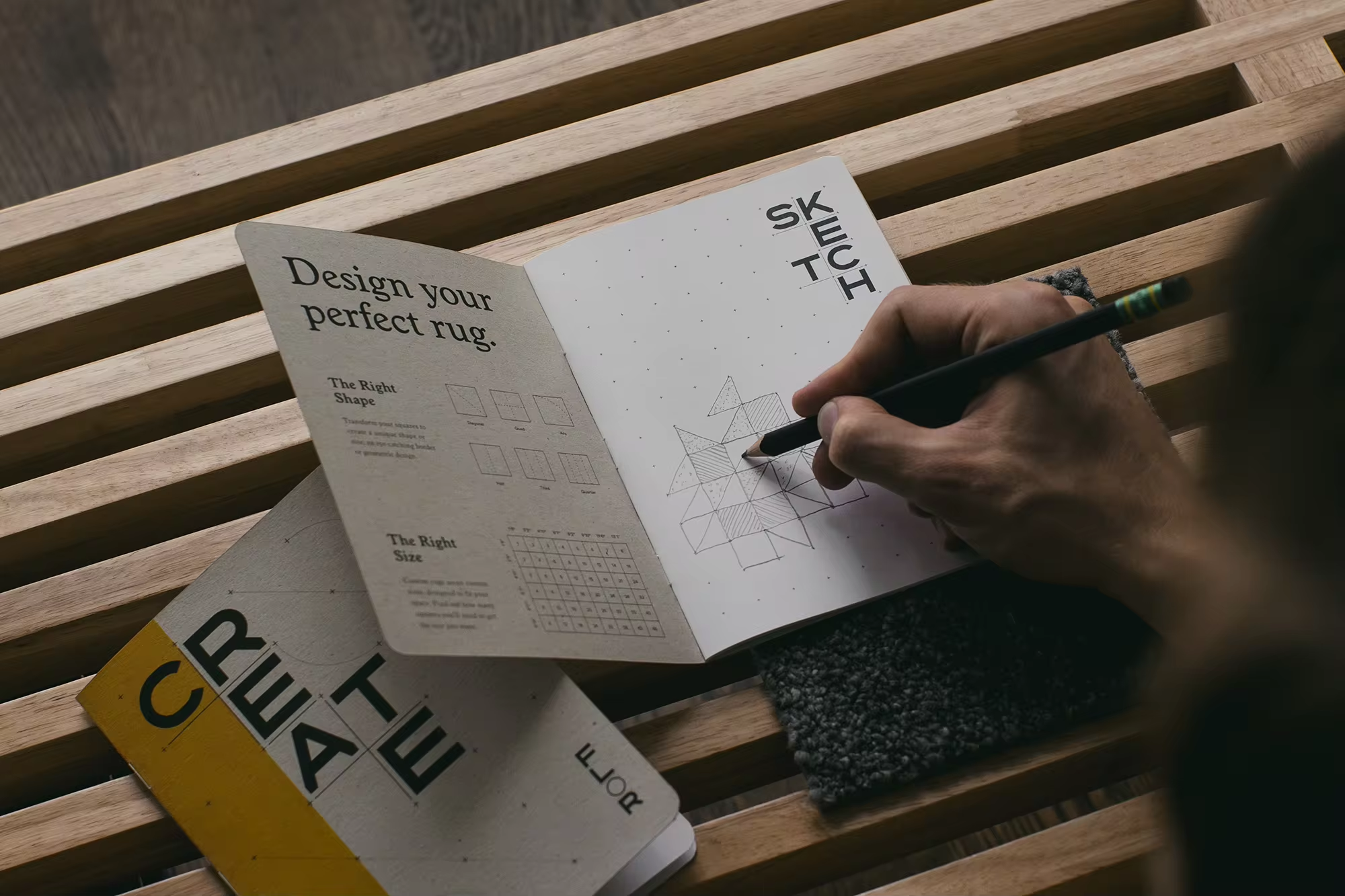
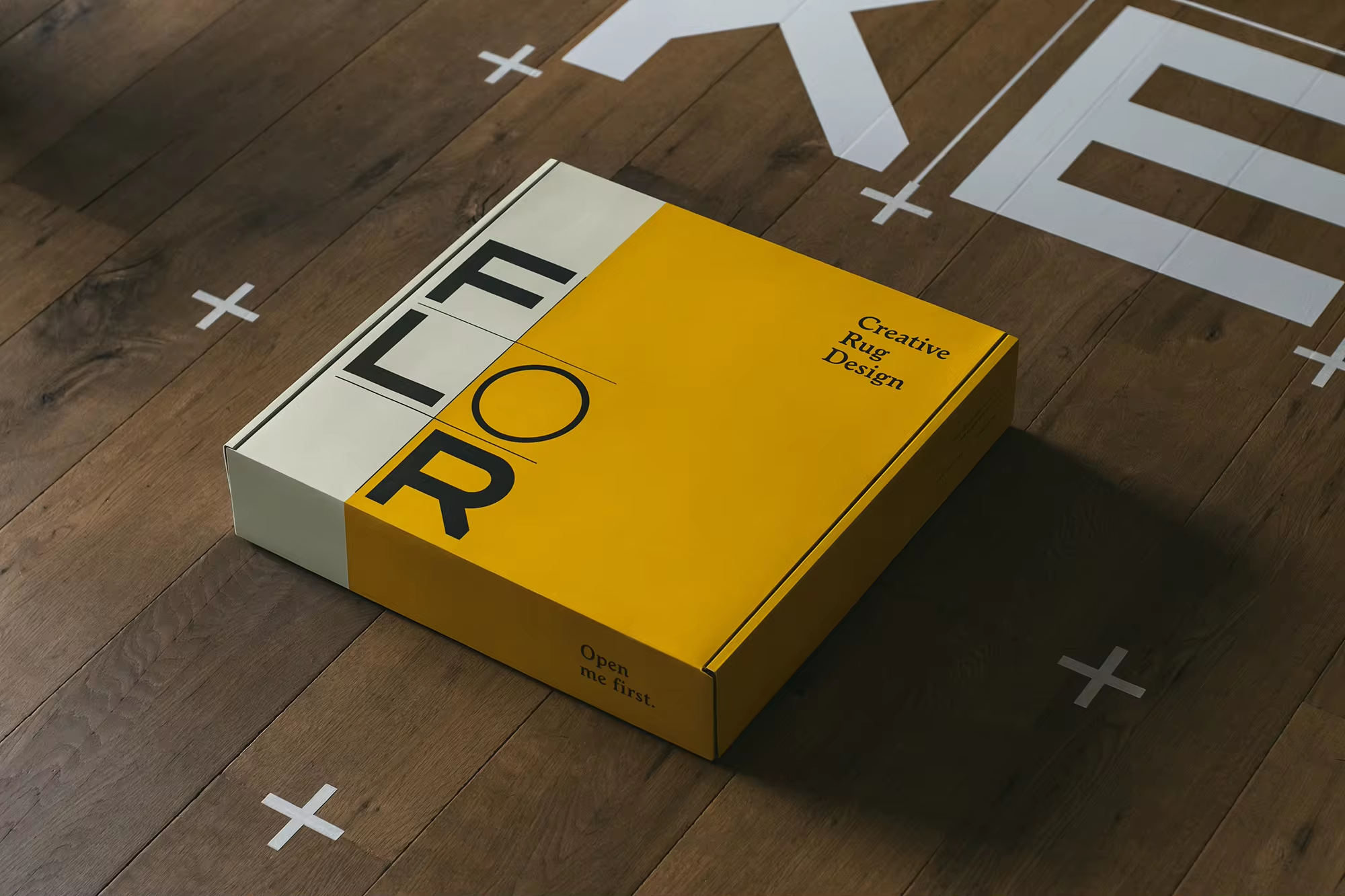
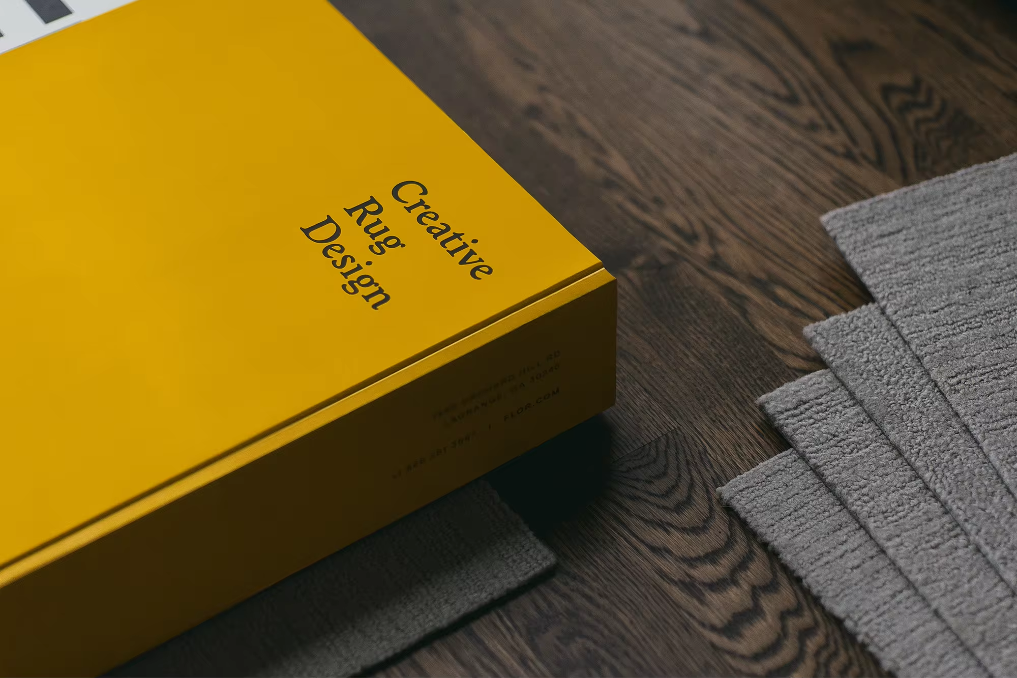
Understanding firsthand the value of timely support and specific information at different touchpoints, we drafted and crafted a family of user-friendly design tools: meticulously organized Inspiration Binders, a handy how-to piece, product packaging and a pocket-sized sketchbook—a must-have for doodlers everywhere.

III.
TYPE & MESSAGING
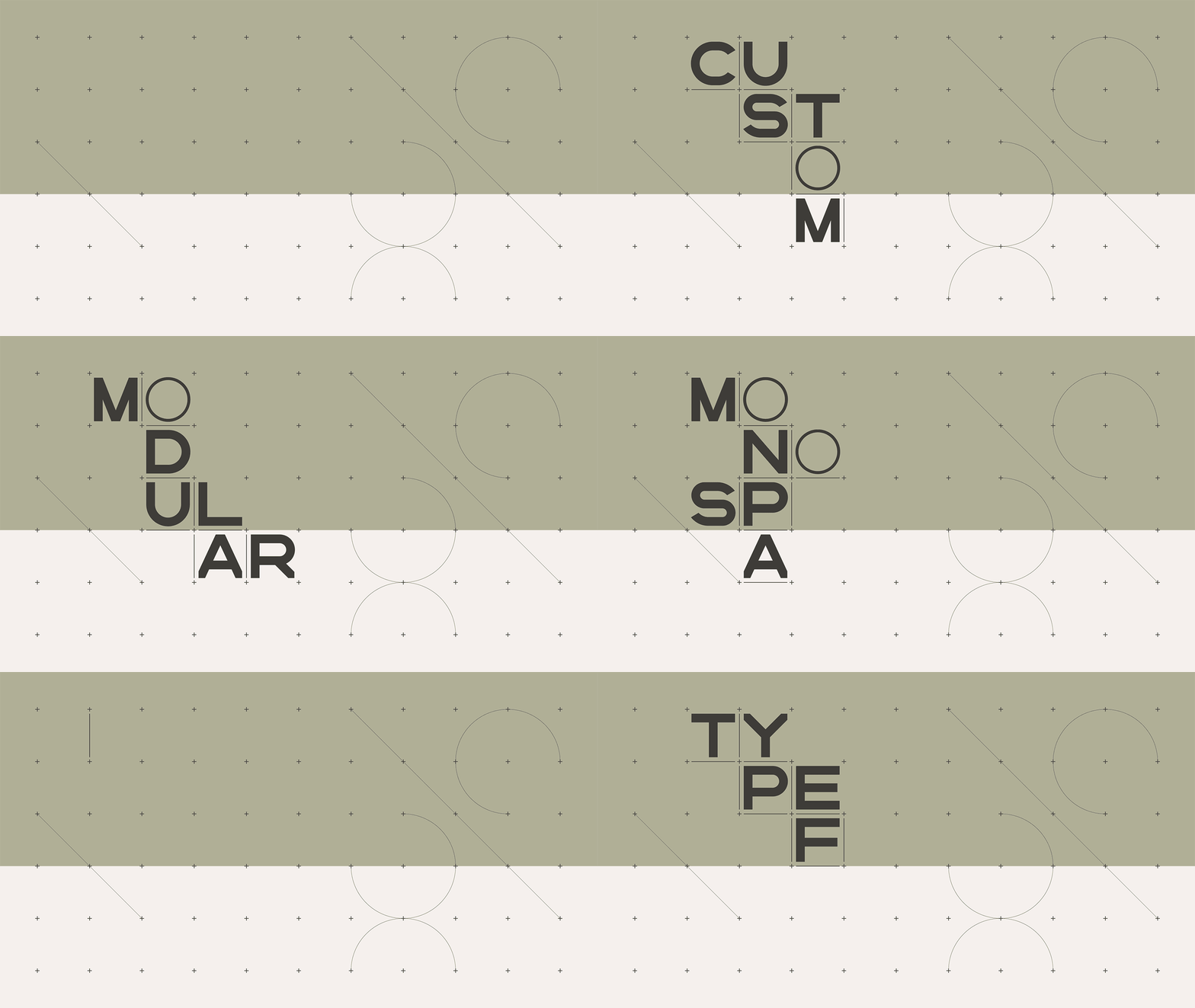
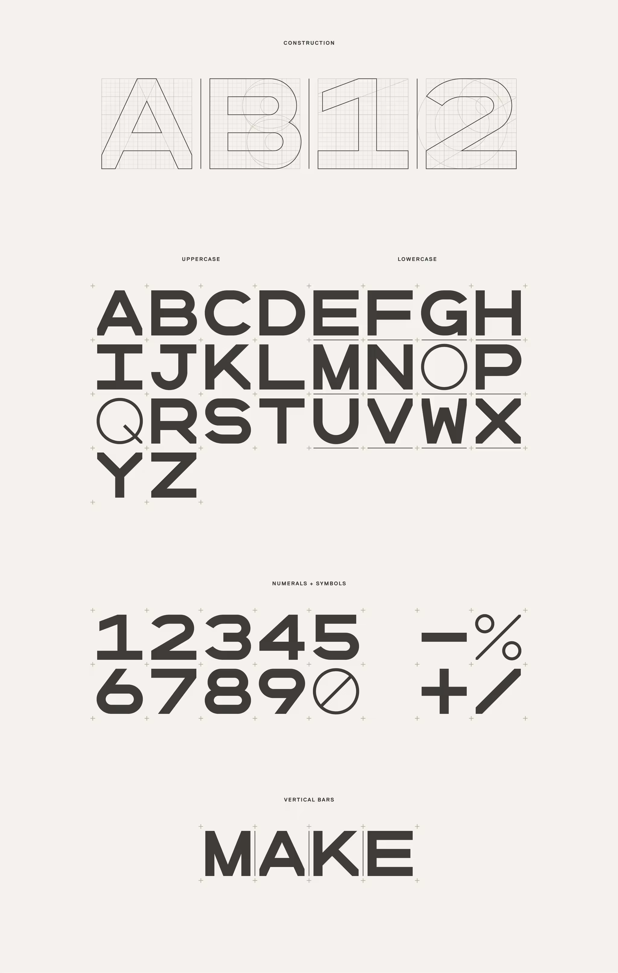
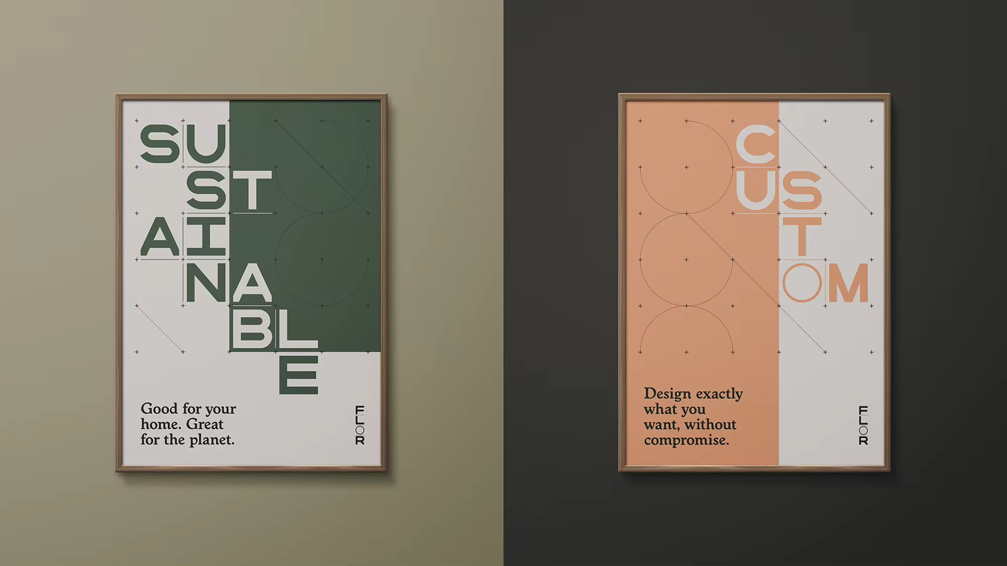
At the heart of FLOR’s refreshed identity is a killer type system, built around an ultra-kinetic custom alphabet, gamely dubbed “FLOR Mono.”
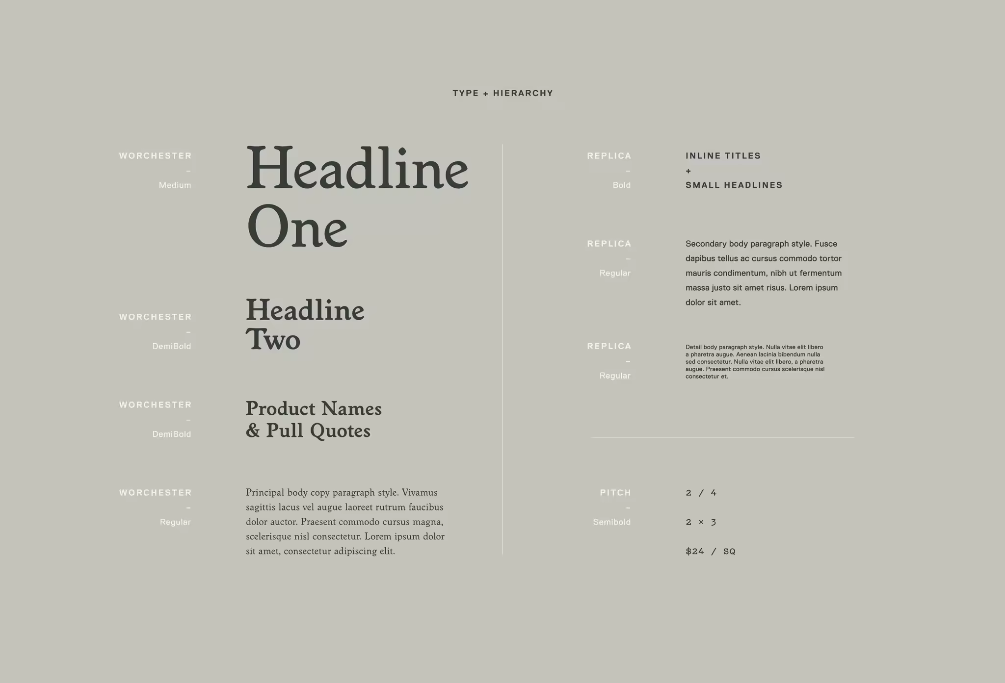
The system is thoughtfully structured to scale at any size and carefully balanced to hit the right notes at the right time: Worchester EF infusing core copy with warmth and humanity; pragmatic, pleasant Pitch for user-friendly specifications; and no-nonsense Replica to provide supporting details. We developed a clear type hierarchy and put it to practice right away, creating a suite of in-store messages that call out and clarify what makes FLOR so awesome.
IV.
STORE
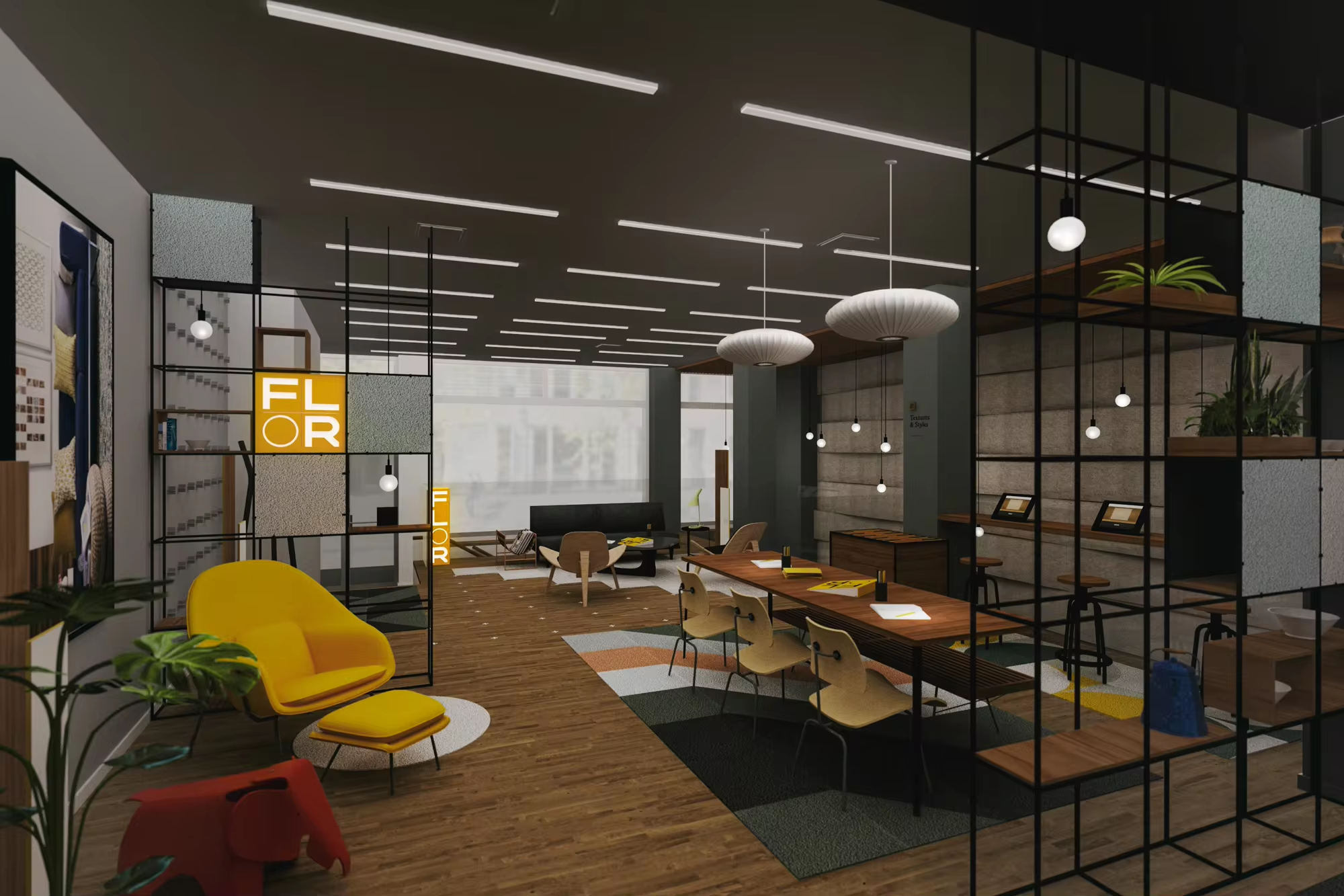
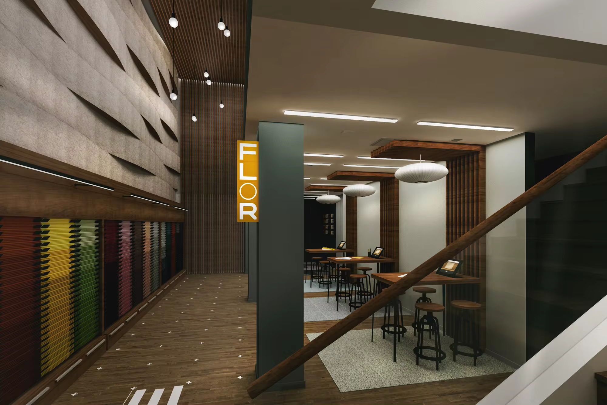
Finally, we brought it all together to re-envision each FLOR store as an interactive design studio—an inspirational, functional space for makers of any stripe, where you can picture the possibilities, then get to work bringing your vision to life.
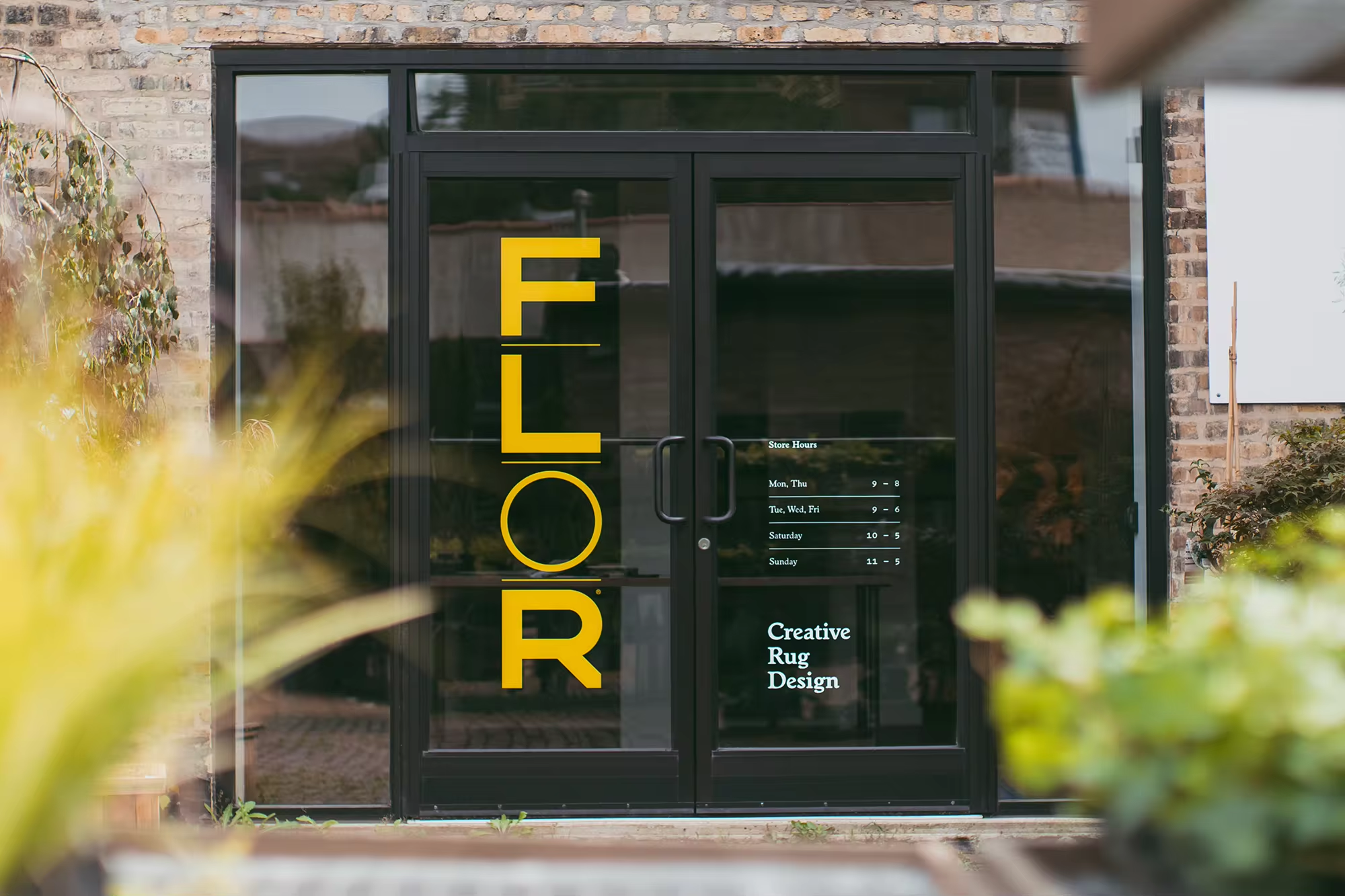
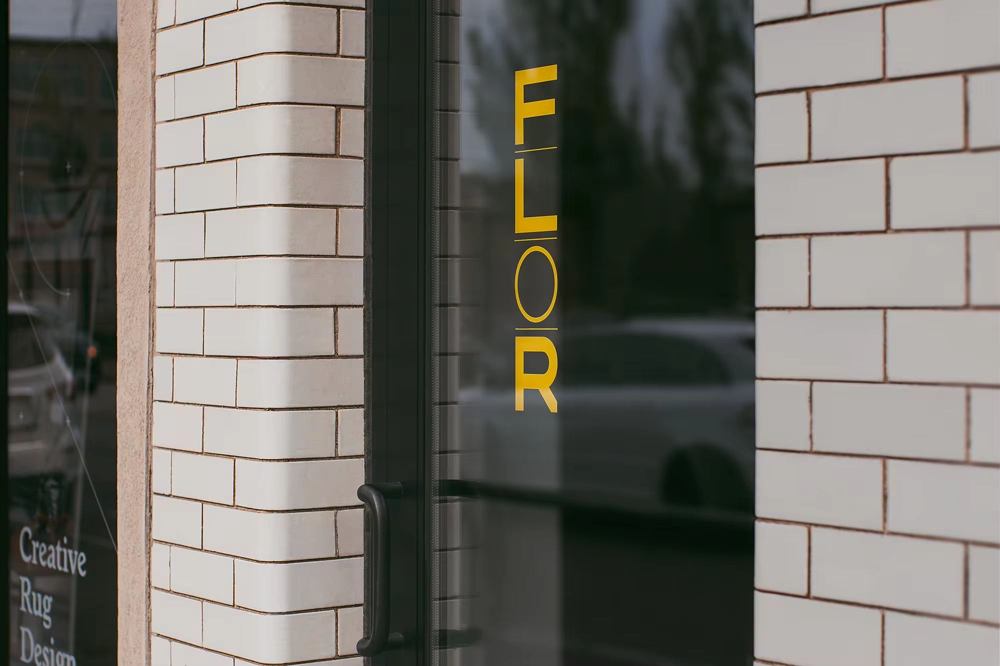
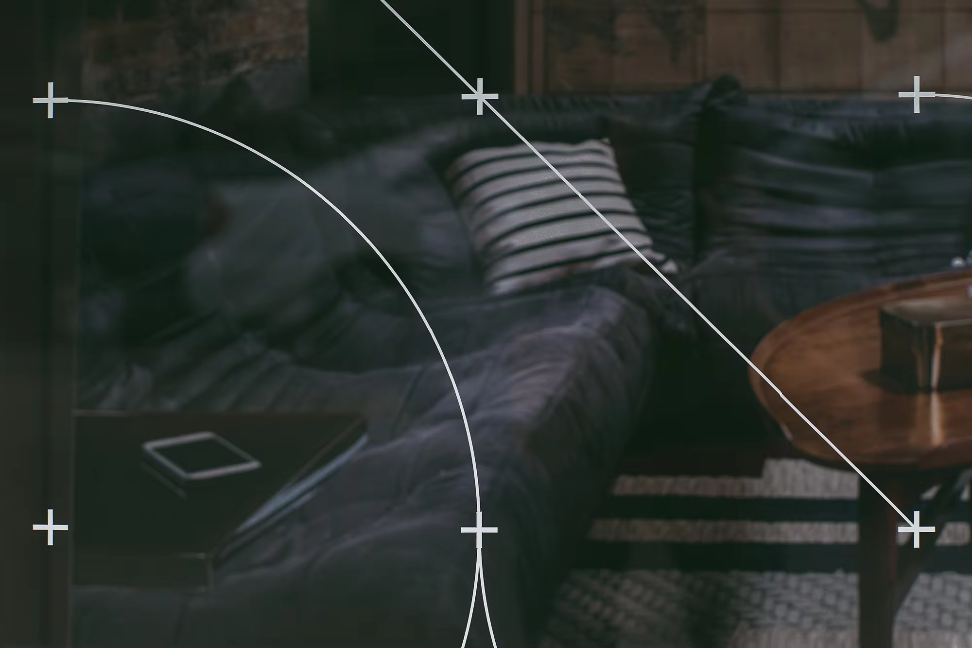
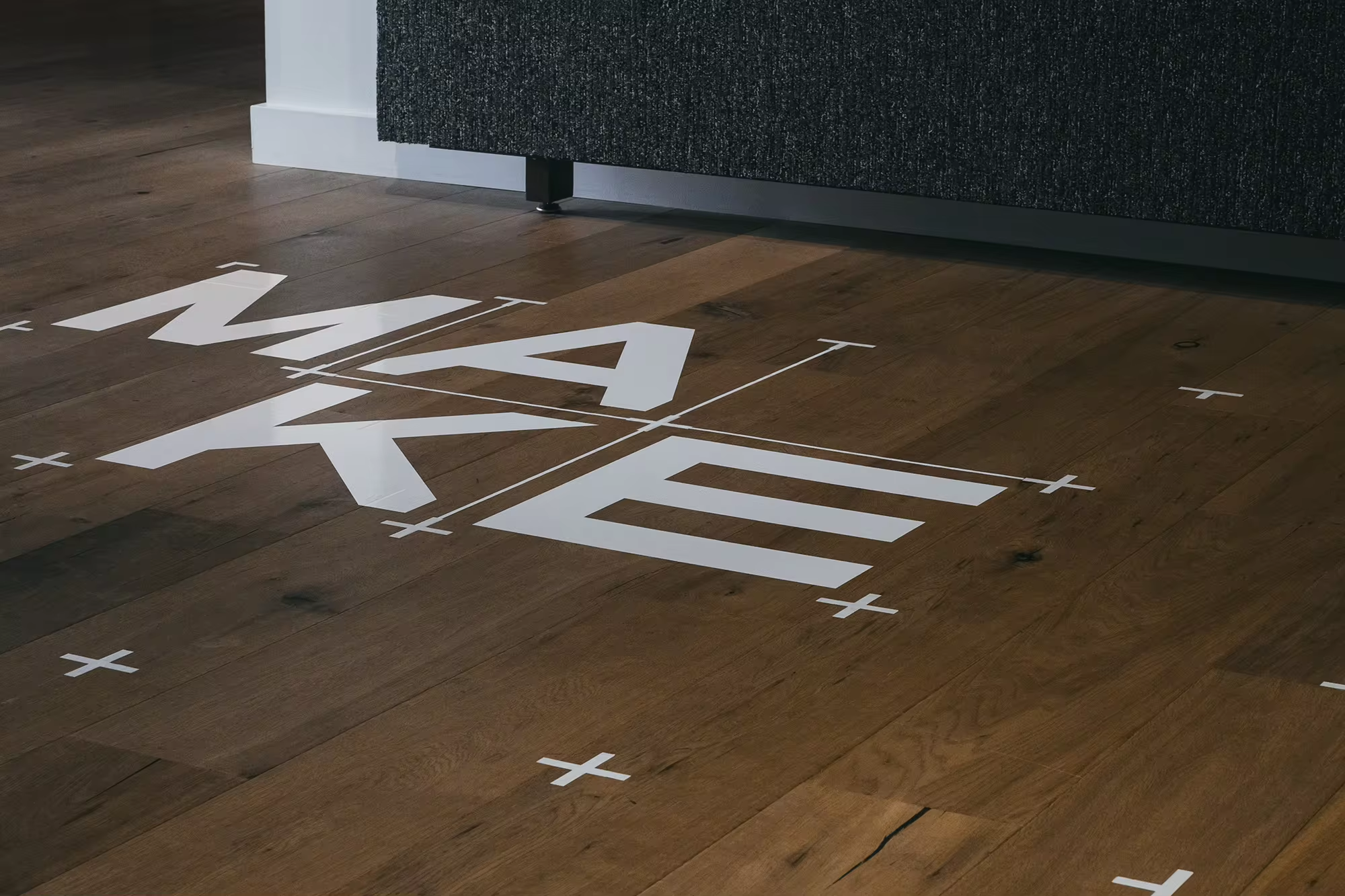
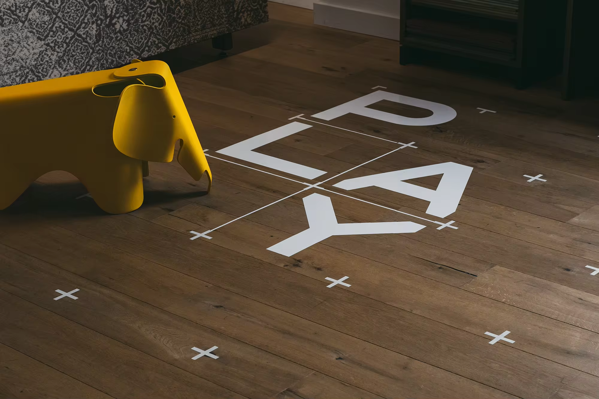
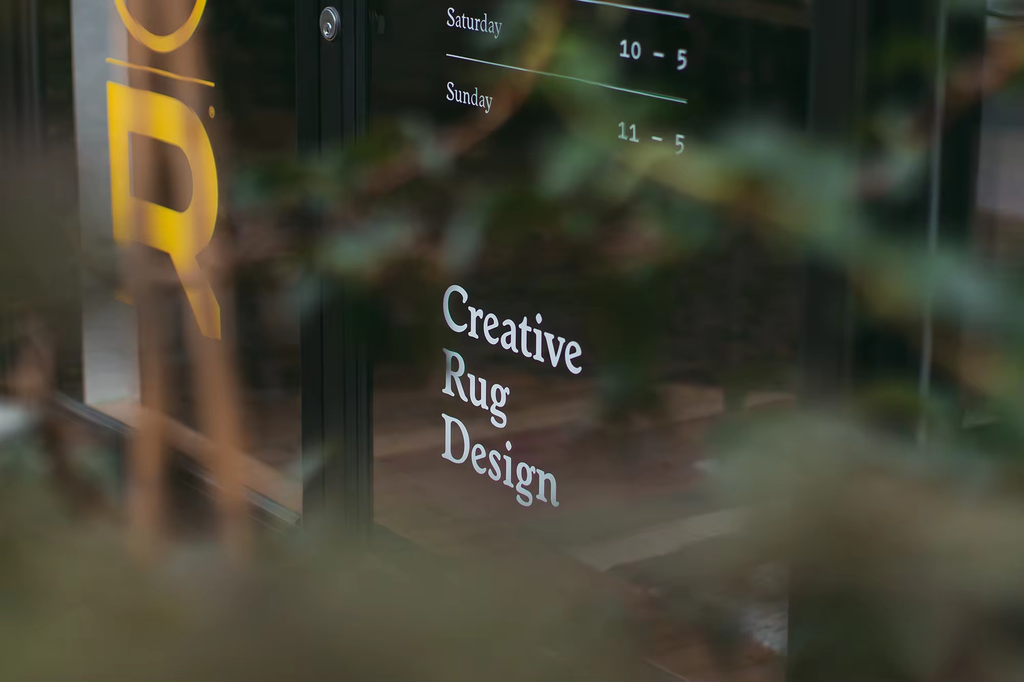
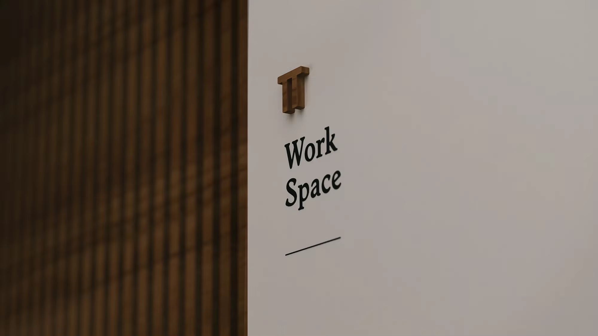
The interior design prototypes, still in production phase, show how purposeful use of space and attention to texture and material can help turn a store into an experience. New window and signage systems, smart furnishings and fixtures, an updated cash wrap—we left no detail untouched. We worked with FLOR staff and partners to revitalize every inch of the space, with a focus on creating aspirational “vignettes,” featuring work from local artists and craftsmen, tying back to the company’s approach to thoughtful design and mindful living.
From our first conversation with FLOR’s creative team, our partnership was a true collaboration. Together, we pushed and prodded at every idea and whittled each piece to its strongest form, ultimately achieving new clarity and giving customers the confidence to design fearlessly.

FLOR Rebrand