Argo

A start-up seeking to become a leader in the management of property development, Argo were looking for naming and visual identity. With a strong history in the property and built environment, Argo’s offering is unique and niche, and deserved to be acknowledged through their business name. Through deep exploration the result was a combination of the founder and terminology used within the group.
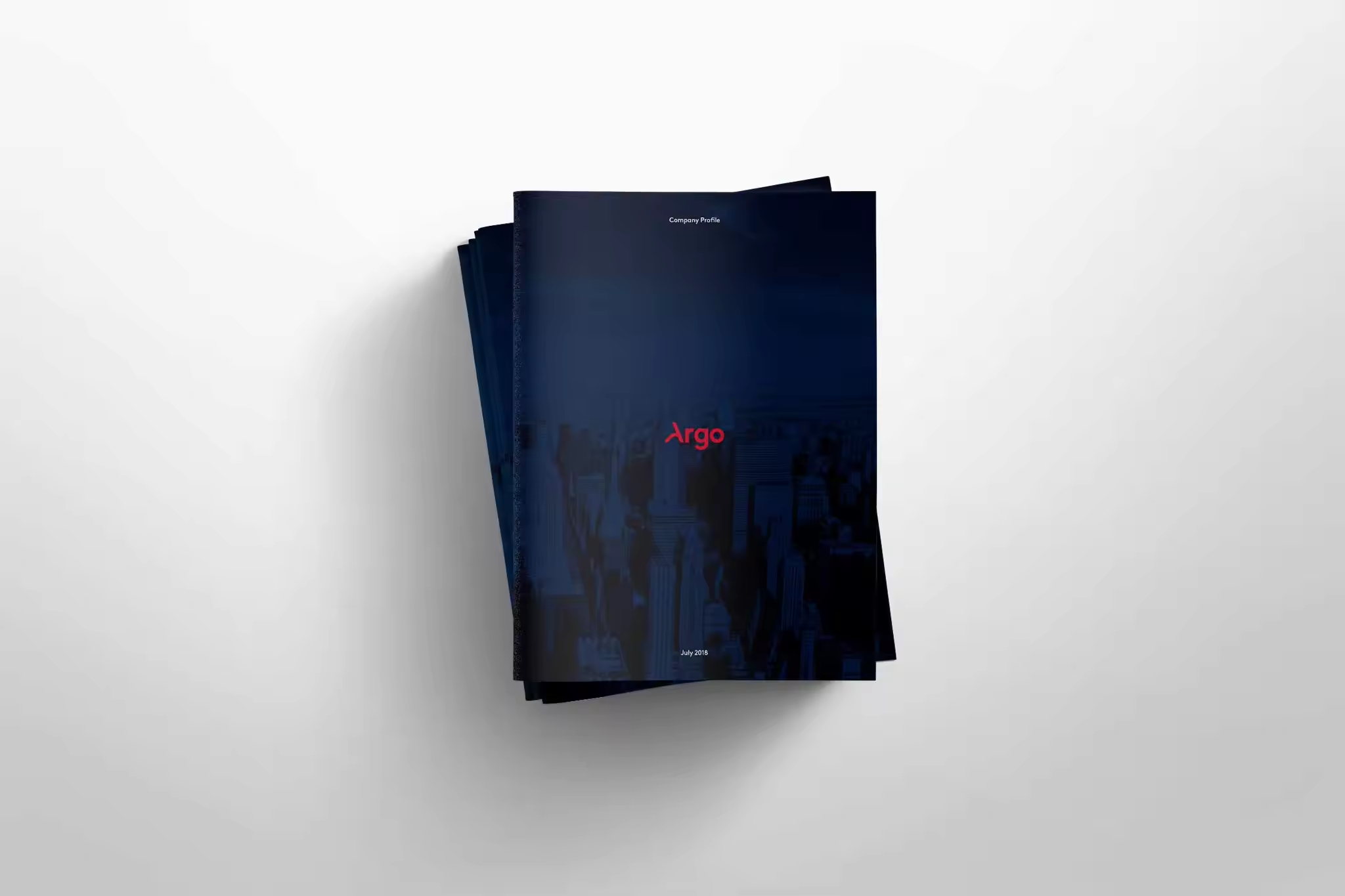
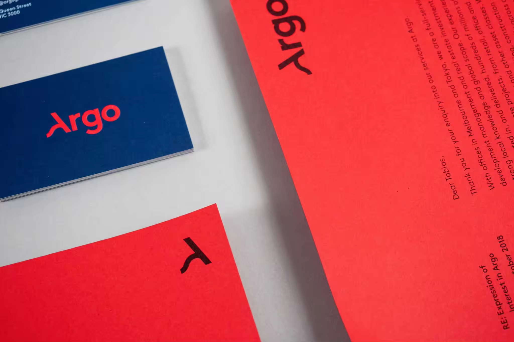
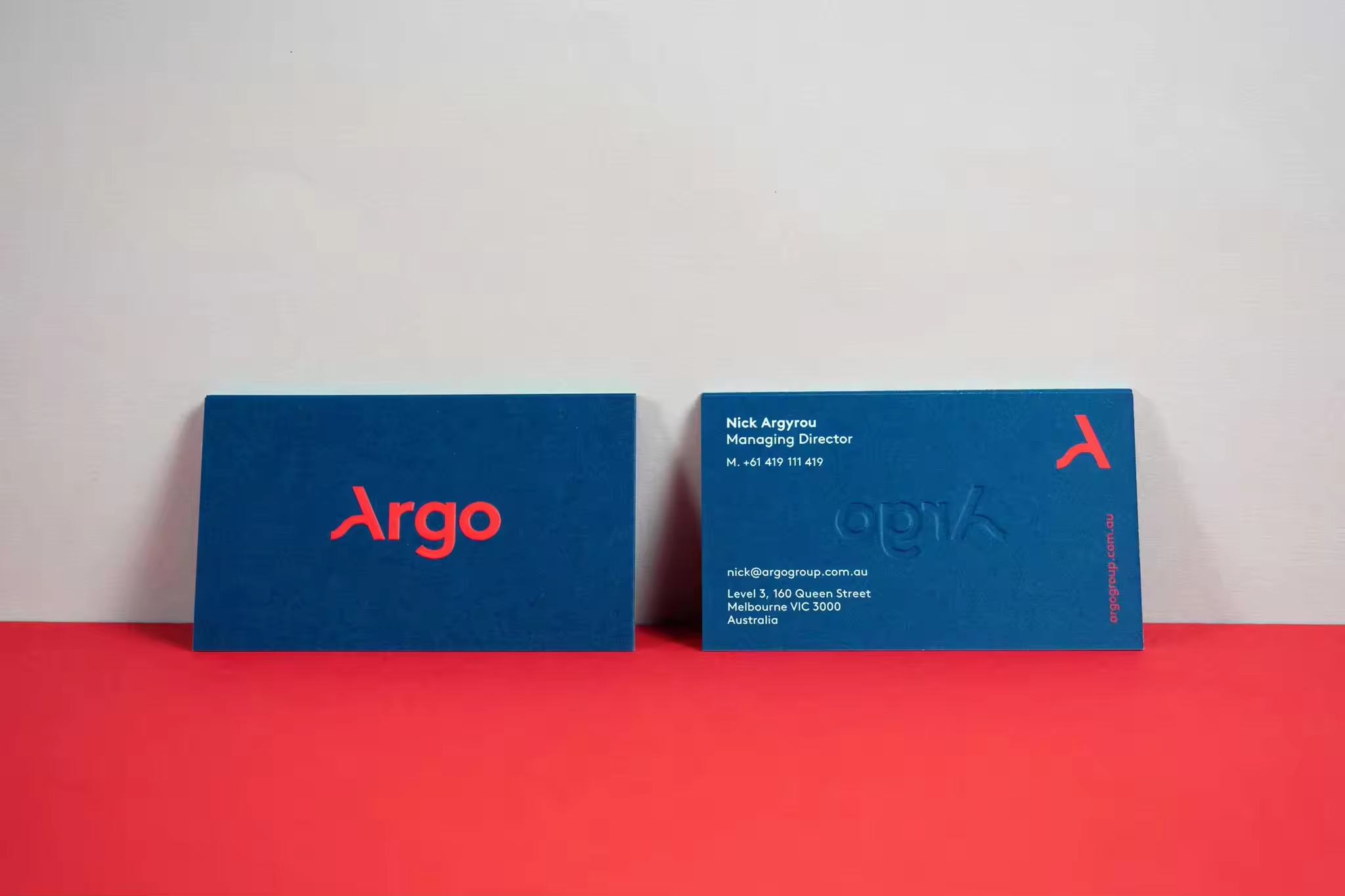
Key themes and values were explored and communicated through a custom wordmark. The structured typography represents the output of building and architecture, whilst the flow of the brandmark’s ‘A’ shows the agility and flexibility of the company. The contemporary yet sophisticated feel was achieved through bold use of colour.




Argo