P’cakes
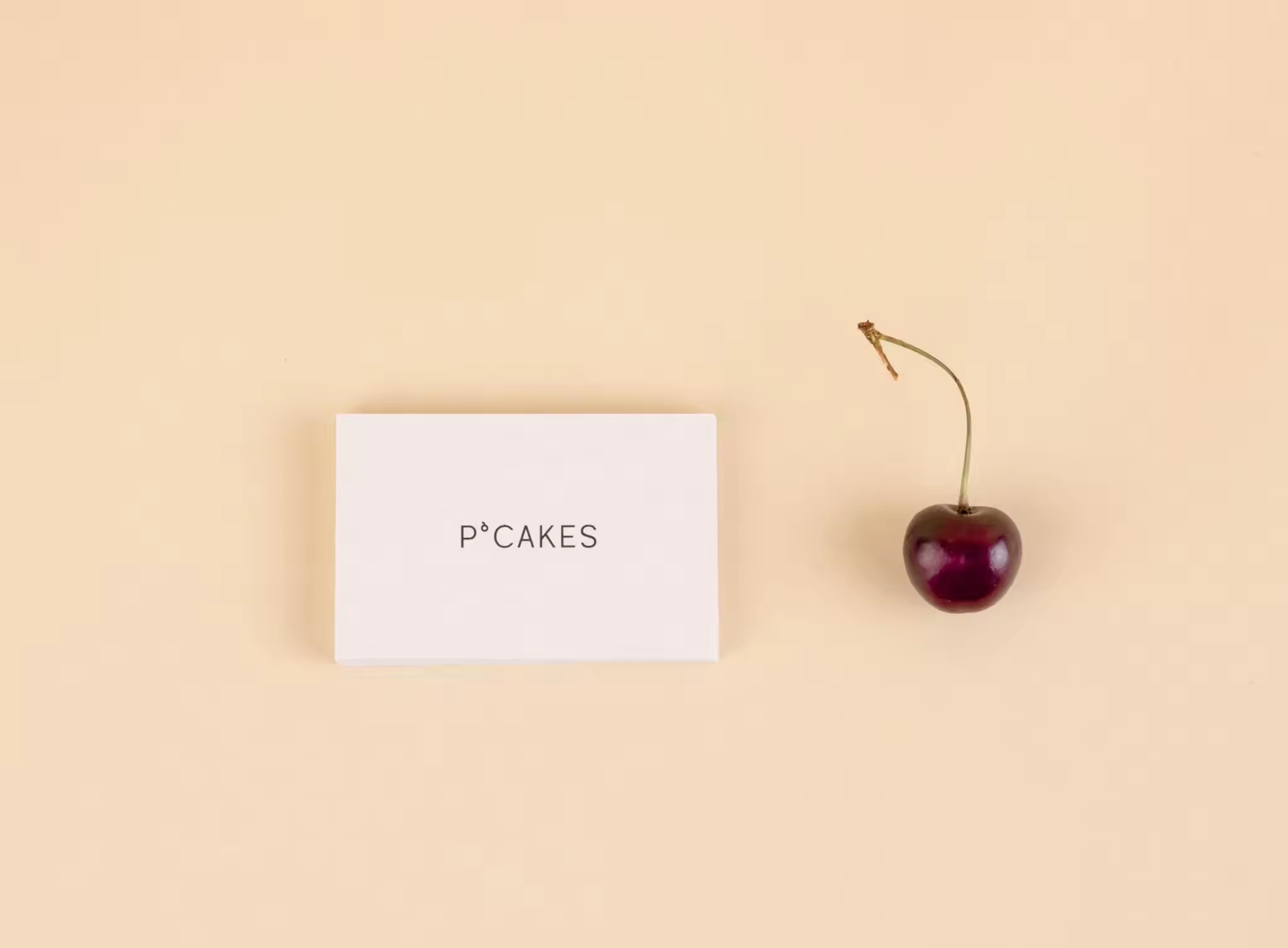
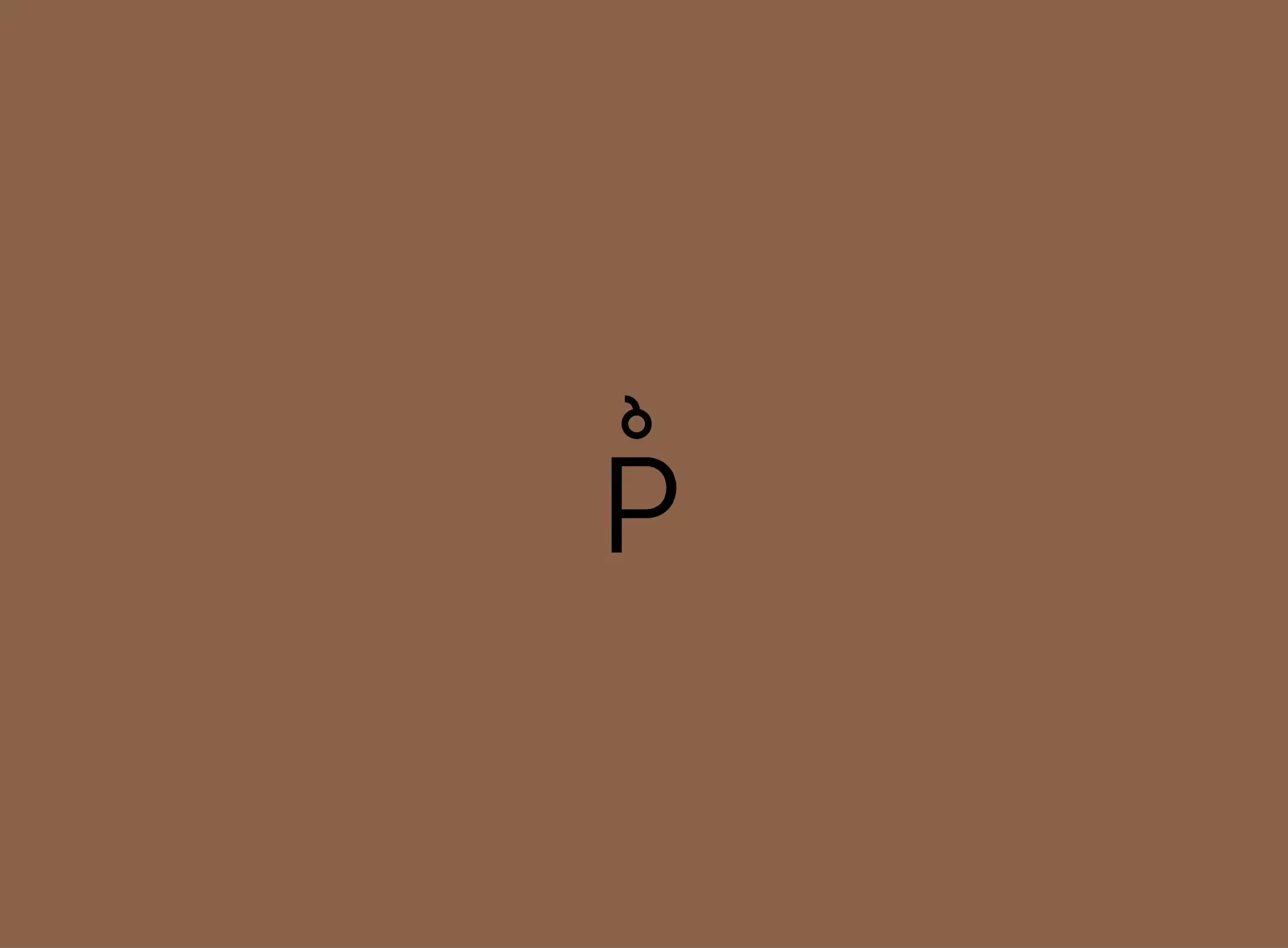
P’cakes (Petra’s cakes) is a brand of creative cakes and sweet stories. Petra’s approach to creating reflects her personality and lifestyle. Her approach incorporates natural decoration, which we wanted to highlight with the logo. Our inspiration for it comes from the apostrophe in the name (‘). If we look at it in a graphical sense the apostrophe replaces missing letters. We decided to turn it around and style it in such a way that it represents a cherry, which is often used in iconographic representations of cakes. The metaphor “the cherry on top of the cake” also symbolizes the “above and beyond” touch to a solution, which is a very appropriate brand value to communicate, as P’cakes always go above and beyond for their clients.
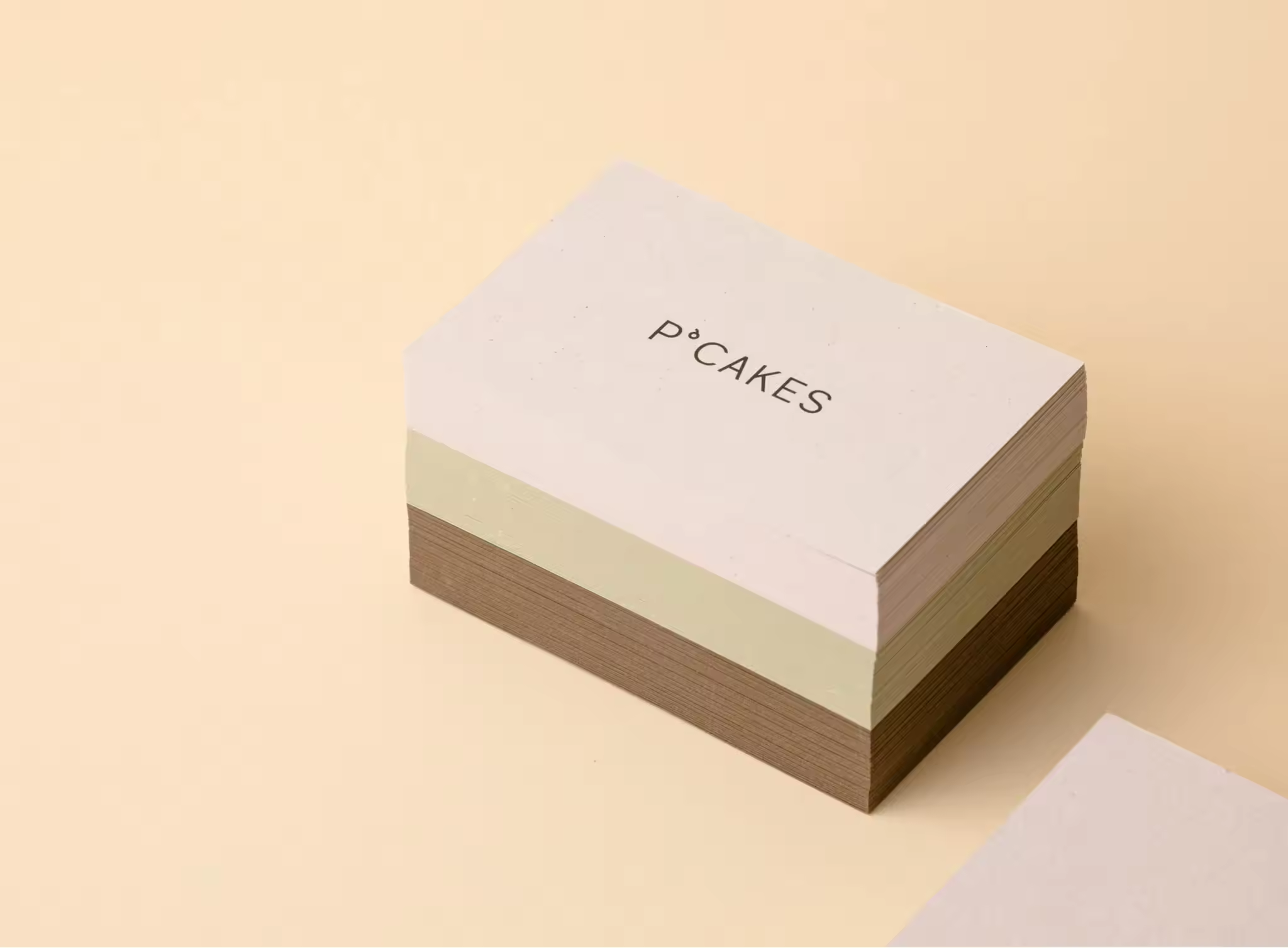
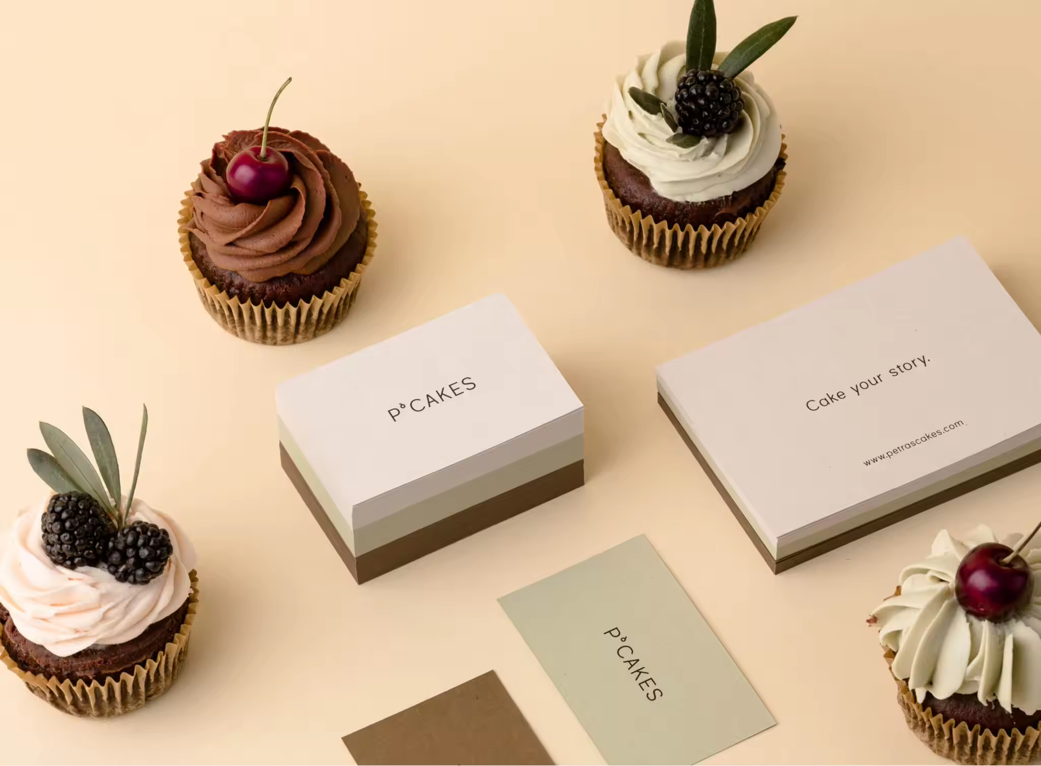
In our color selection, we found inspiration in the color palette of P’cakes, a forest theme, and berry bushes, which are all very close to Petra, the creator. Since her creations are very colorful and always different based on the occasion (weddings, children cakes, birthday cakes,…), we set the color palette in such a way, that different color shades can be used for different occasions.
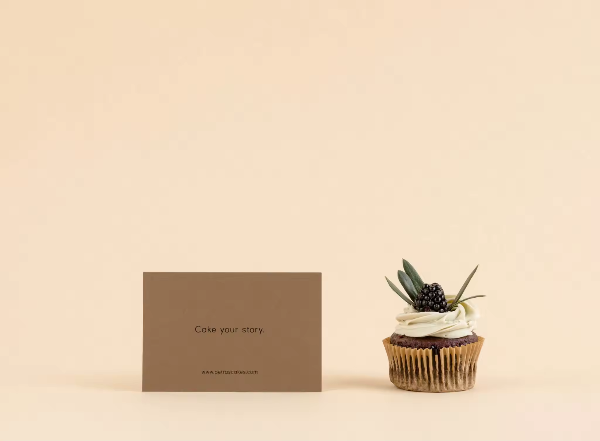
Finally, since every cake has it’s own story we also envisioned to communicate these stories through the slogan #cakeyourstory



P’cakes

